Recently I blogged about some new color ramps we have developed for the ArcGIS Online Map Viewer, and I said then that, although we have close to 400 available for you now, it’s unlikely that we can cover every potential use case.
Well, there’s nothing stopping you developing your own! I’ve been building color ramps for a few years here at Esri (and before that developing color palettes for other organizations), so here I want to take you through the processes that I use when I’m working them out.
What can you work with?
You can build a ramp directly in ArcGIS Pro (Go to ‘Symbology/Color Scheme/Format Color Scheme’, then save to a style).
In ArcGIS Online you cannot build a ramp/gradient as such. However, if you use a classification you can establish a default with one of our ramps, then adjust each color individually.
Regardless of where you work it’s useful to have a graphics program available for testing out color combinations. I use Adobe Illustrator, but anything that you’re comfortable with will be fine. A blending tool (to establish a color gradient across multiple objects) is really useful though.
You should also have a color blindness simulator available. There are plenty of options available online – I use Color Oracle
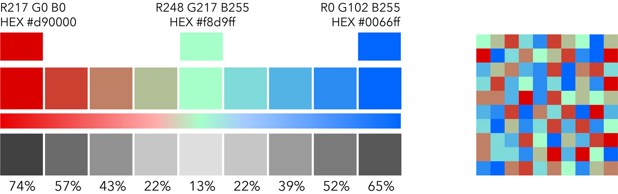
High- Low
Let’s start by looking at a single-color gradient (High-Low). This is the simplest case to understand, but much of what I describe here applies to all color ramps.
I start by setting the two extremes of the gradient. If you are working with a known quantity behind your ramp (a basemap or your background information), take that into account. You don’t want either end of the gradient to get lost in it.

_____
We usually work with ten fixed points for building ramps online. Ten is a lot! It’s difficult to get a strong visual separation using one color for this many categories, but it gives us a lot of control over the final appearance of the ramp. For you, select your worst-case (up to 7 or 8 are usually OK), and build your ramp based on that.
Here is a ten-color ramp using my 2 extremes, with equal color breaks between each step. Try to keep at least 3%, and preferably 5% grayscale equivalent between each of them. If you can’t achieve that adjust your endpoints:

However, there is a problem with this! Differences between colors are more difficult to discern as the saturation increases, and at the dark end of the gradient they are too similar.
_____
So, the interval needs to change. Here, a percentage decrease in the color saturation is used to lighten the colors from left to right:

This is ideal if you are prepared to calculate each color independently, but that is probably impractical. A compromise is needed.
_____
In this example a mid-range color has been set, and equal intervals used between it and the extremes. The interval between the darker colors is greater than that between the lighter:

______
This is the point at which you decide how much custom work you want to put into the construction. In this case, I’ve darkened the top end of the ramp and lightened the second color in the sequence to improve the contrast.

Adding a second color
With the nature of the ramp established, you can consider introducing a second color. This may be to improve clarity, imply something different between the top and bottom in your variable, or just to add some interest. Here I’ve changed the bottom end of the gradient to yellow, but kept the other control values in red:

And here I’ve adjusted the middle color as well so that the whole gradient takes on an orange caste:

_____
All of these options are available to you, and all will change the look of your final map in some way. It’s down to choosing the one that you think best conveys your message.
Here is a two-color example from an Esri map of Republican Party Affiliation

_____
Dark Backgrounds
Working on a dark background (such as the Dark Gray Canvas Map), can be very effective and impactful when used properly. A quantitative color ramp needs to be handled with care though.
We build color ramps specifically for dark backgrounds, and generally they are the reverse of what we do for a light background, with the highest value being light/bright and the lowest value being dark/subdued.

However, users may interpret it the other way (it’s how they’ve been conditioned) without strong signals to say that this is what we’ve done. Ideally there will be large areas of basemap/background visible to give the distribution a context. If not, a prominent legend (or similar device) may be necessary.
Here is an example from a Map of Noise Pollution in a Story Map by Esri’s Emily Meriam and Michael Dangermond. This is one that works well with or without a legend.

_____
Color Blindness
This is not an issue at all for single-color ramps (as long as your colors don’t clash with other features on the map). It shouldn’t be an issue for the two-color versions, because of the tonal separation between the colors. However, it’s always worth taking a look at the effects in a simulator to see if you are happy with the result.
Above-Below
Again, we normally work with a ten-color palette when we are building these, but for the sake of this demonstration I’ll use nine. That gives us a center value to work with.
Here is a conventional approach. I’m defining the extremes and the center value:

The middle color is created by blending the two extremes, then lightening it, so it should be a true ‘middle ground’.
_____
In this version, the middle is defined as neutral (gray)… but be careful! This may be a problem if your background is primarily gray – you may be implying ‘no value’ in the middle. (Some of the ramps we supply use white as the center, and these would be an issue if the background was white).

_____
There may be occasions when we want the middle to be distinctive rather than neutral. Here, a contrasting green is used in the middle. The colors blend from the middle value to each extreme.
_____
In this version the two values either side of the middle are also defined. This keeps the gradients ‘pure’ and picks out the middle value more clearly.

_____
Here is a comparison of a ramp similar to the one above (below the river) against one with a white center (above the river). This one was also used in my previous blog.

_____
Color Blindness
This should be a consideration as soon as you introduce a second color to the construction, and that is certainly the case here. We check this as a matter of course now for all of our ramps on ArcGIS Online.
Here is the last sample, adjusted to simulate three of the most common types of color blindness.

Note that any simulator creates just that – a simulation! Color blindness is a bit of a moving target, and you should never assume that what you are seeing is ironclad. If you can find one or more people around you who have a degree of color blindness (and there are more than you might think), run your results past them. It’s a useful cross-check.
_____
So, building a color ramp is more than just picking two or three colors and applying the default settings. There are many ways to take those colors and end up with very different results. Decide on what precisely you are trying to show, what context you plan to show it in…
…then start playing!

Article Discussion: