I was exploring some wondrous US county health data while at the same time writing a draft paper about multivariate symbology, so blame this one on the universe.
You can read the scintillating story map here, if you would first like to fall wantonly into a sea of multivariate maps.
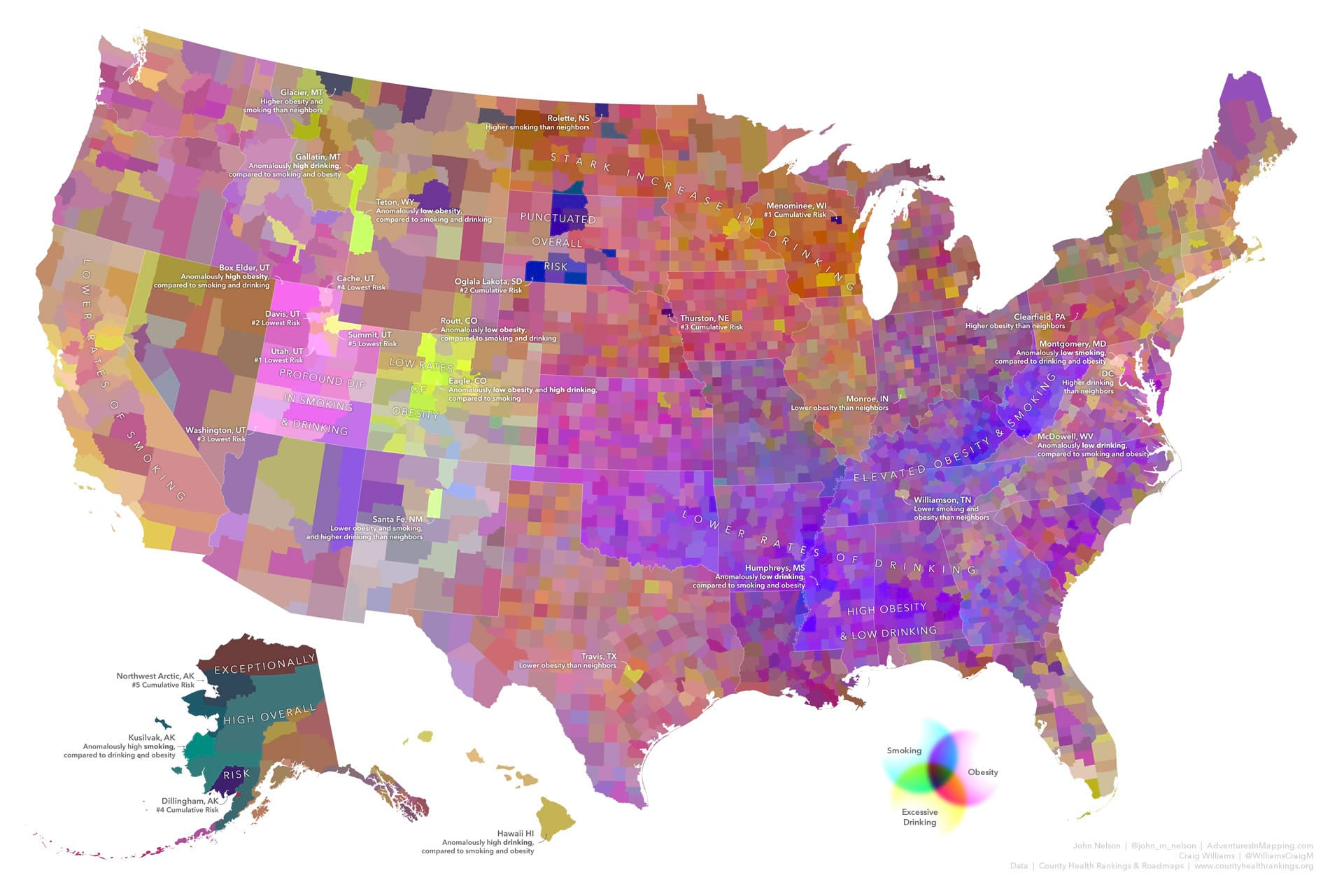
I wanted to make a trivariate (like a bivariate map, but 50% crazier) choropleth map of three health risk factors in the CMYK color model. If we could tie rates of smoking, obesity, and excessive drinking to rates of cyan, magenta, and yellow hues, would their mixing reveal some interesting insights?
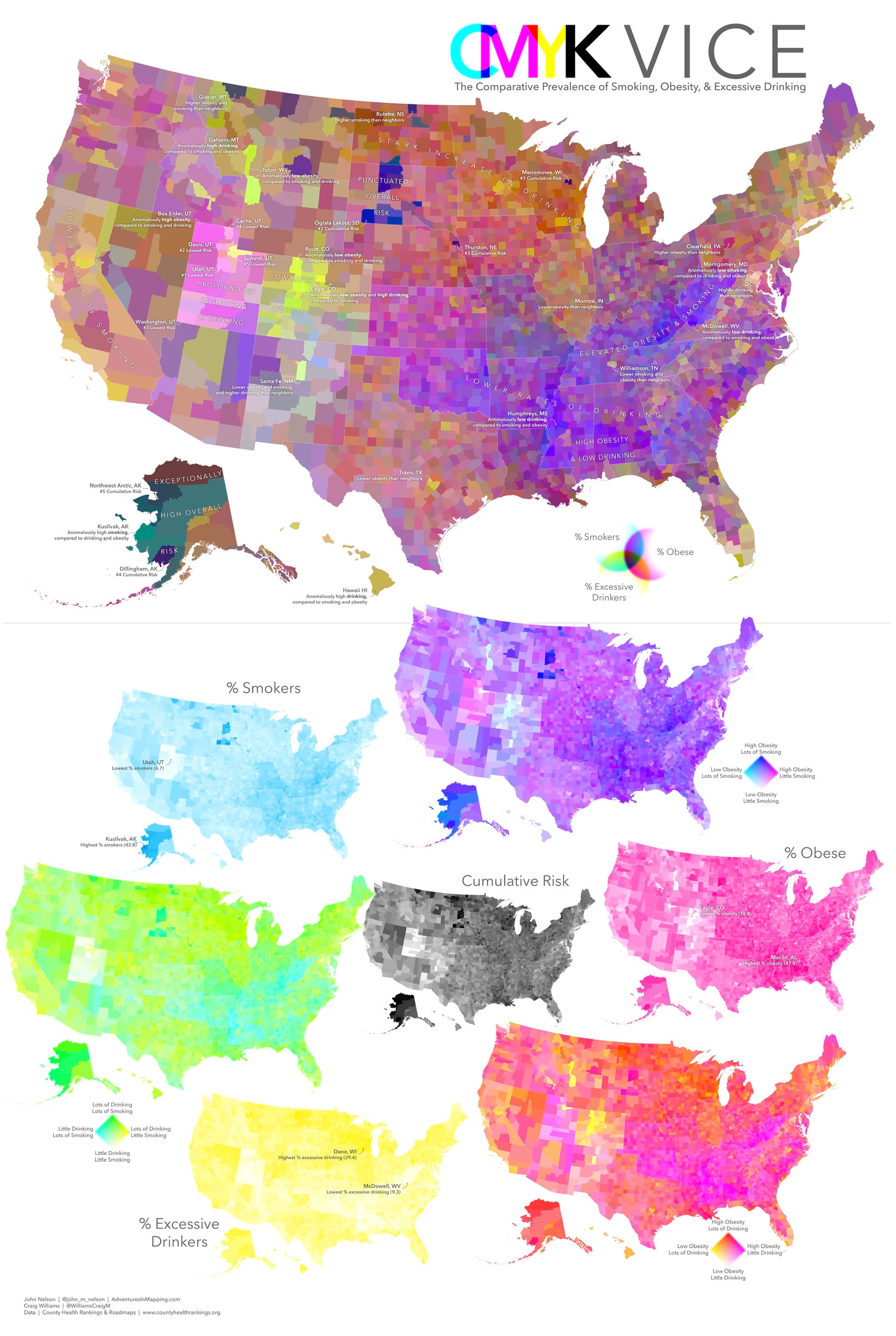
Yes, yes, I know. There’s a lot there. Consult the story for a thorough and rapturous analysis of the pros and cons of this map.
In the meantime, maybe you’ll have some far more practical applications for writing expressions to make complex symbology possible. Let’s dive in!
Expression Symbology in ArcGIS Pro
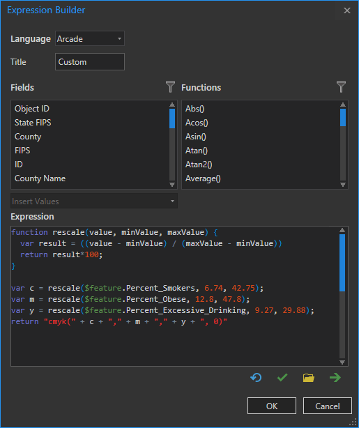
Craig Williams wrote this expression for me. It uses the Arcade language to re-scale the lowest and highest rates of each of the three health risk factors (Percent_Smokers, Percent_Obese, and Percent_Excessive_Drinking) and ties them to 0% – 100% rates of cyan, magenta, and yellow.
Here’s how you can apply this in Pro…
This is the county layer, with all the amazing health attributes, in a layout (with Alaska and Hawaii present in insets—I’m not a monster).
In the symbology panel’s hamburger menu, activate the option to allow symbol property connections (a cornucopia of symbology power awaits).
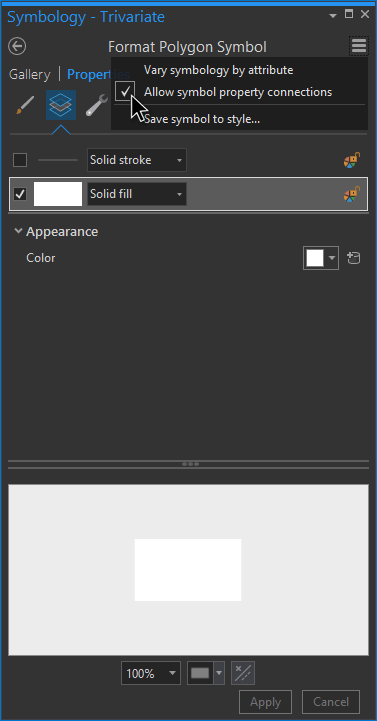
Then a little database icon will appear next to the symbol options there in the Appearance section. Click that guy.
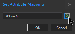
This is where you can point to the layer’s attributes, but we are going FULL EXPRESSION so click that expression editor button. This is where you can write some logic into your symbology (or paste a generously written snippet from Craig).
And POW!
That escalated quickly.
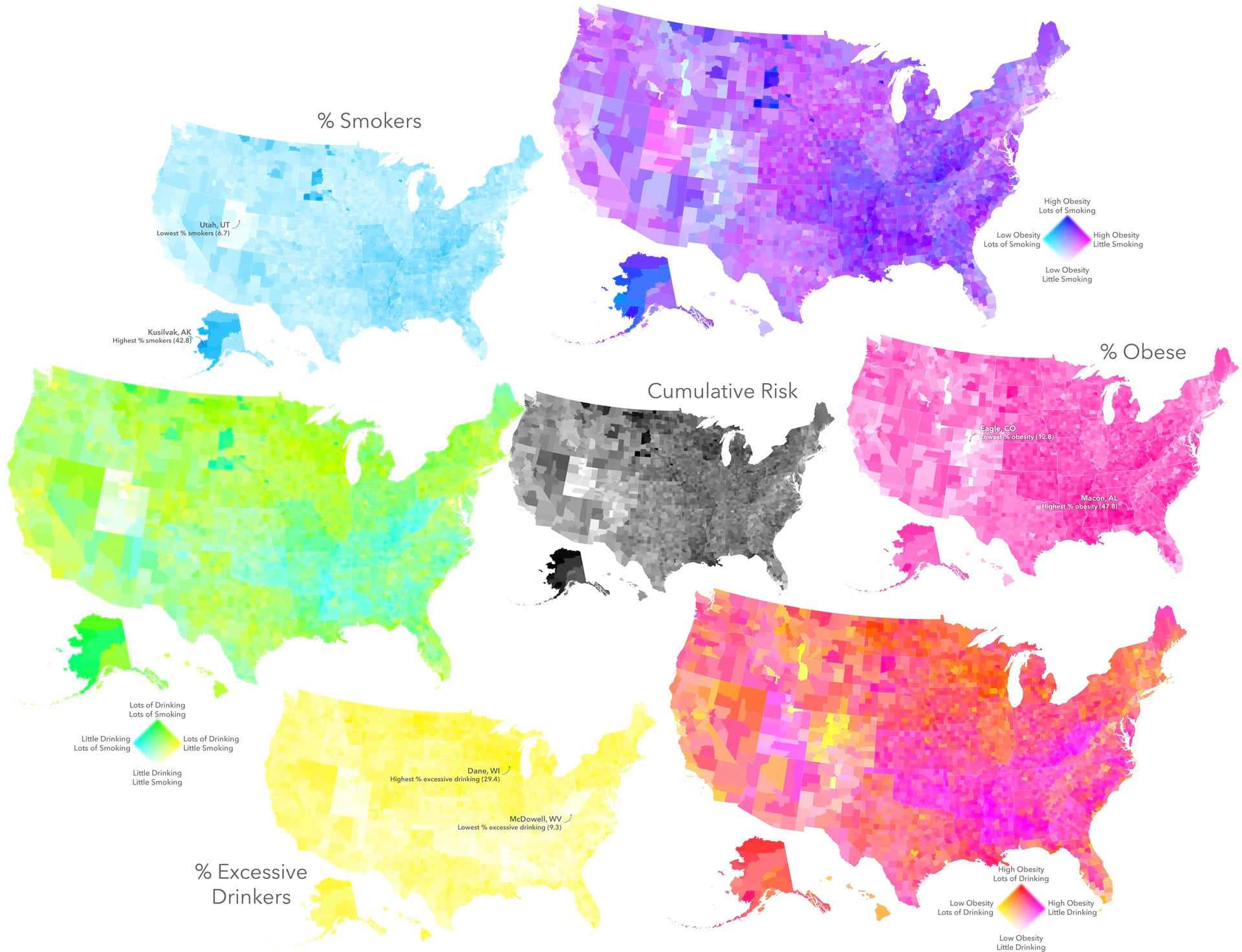
I also played with the arcade snippet, setting some of the color variables to 0, to create the three univariate and three bivariate maps used in the layout.
So have at it! If you have symbology plans that you just can’t get to via the symbology panel’s interface then consider diving into the world of expressions. Of course your work will be much more practical than mine and for that I thank you.
Happy Expressioning! John

Commenting is not enabled for this article.