As of version 4.9 of the ArcGIS API for JavaScript (JS API), you can now generate renderers for the following visualizations in a web app:
- Age (using color and size variables)
- Predominance
- Relationship
-
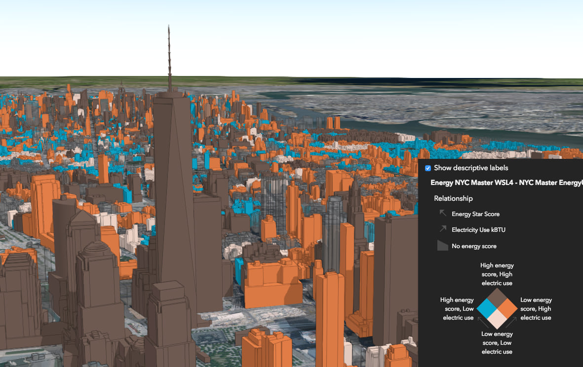
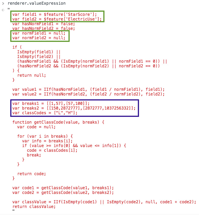
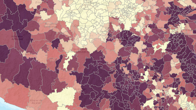
A relationship visualization exploring the relationship between energy usage and an energy score for buildings in Manhattan, New York.
Under the hood, these renderers are driven by data values returned from Arcade expressions, which execute in the browser, using one or more attributes from the layer.
Background
Previously, I’ve written about how you can write Arcade expressions for visualization purposes in web apps. Because the logic of many Arcade expressions can be reused across layers, we created the Esri/arcade-expressions GitHub repo, providing you with a platform to reuse others’ expressions and even to share your own. Read more about how to use this repo.
While expressions are reusable in concept, they still require some revising when used in different layers since field names will certainly differ across datasets. To account for those differences, rather than copying, pasting, and editing Arcade expressions specifically for different apps, you can write JavaScript functions for generating templated Arcade expressions on behalf of your users. As outlined in this blog post, you can then pass the generated Arcade expression as a parameter in a Smart Mapping renderer creator function to explore the new values returned from the expression(s).
This requires the developer to write expressions and pass them to Smart Mapping renderer creator methods. The 4.9 release of the ArcGIS API for JavaScript took that concept a step further by generating the Arcade for you in the three cases already mentioned above: age, predominance, and relationship.
These three use cases require Arcade expressions, but you no longer have to worry about generating the expressions on behalf of the user; the renderer creators do this for you in the API.
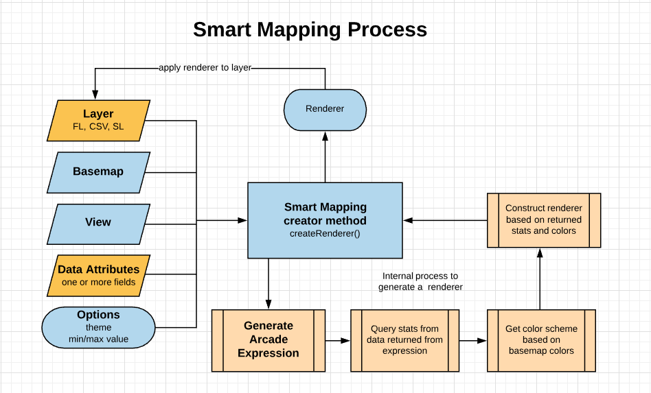
Notice that generating Arcade expressions is now handled as part of the Smart Mapping workflow for these cases. The following apps will illustrate what the final Arcade expressions and renderers look like once generated by the appropriate renderer creator function. I’ll cover each of these use cases in more detail in upcoming blog posts.
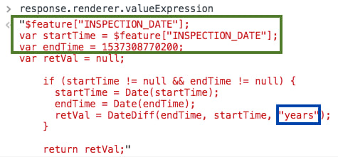
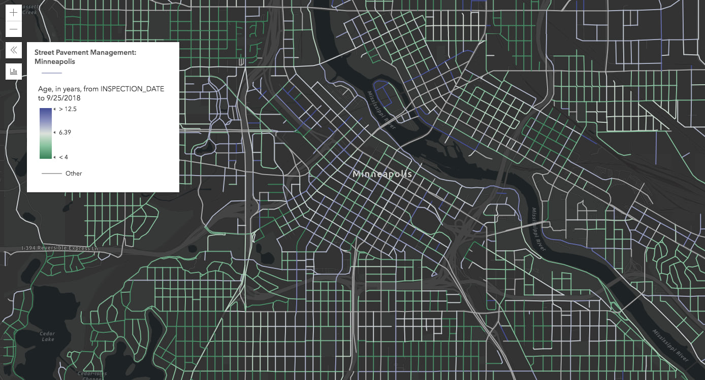
Age
The createAgeRenderer method exists on both the color and size creator modules. This method visualizes features by their age based on one or two date fields in the layer. To do this, it generates the following Arcade expression prior to querying statistics and getting a color scheme. You can see this by logging the renderer in the developer tools console.
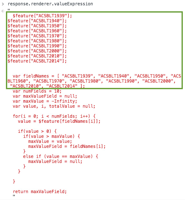
Predominance
Predominance involves creating a unique values (or type-based) visualization that indicates the winner among a set of one or more competing numeric fields. A common application of this is election mapping. A while ago, I wrote about how to write your own Arcade expression for predominance visualizations using Arcade. You can also do this by creating a new field in your service layer. Rather, you can specify the name of each numeric field in the createRenderer method parameters, and it will generate the following Arcade expression based on the field inputs and produce the correct visual for you.

Relationship
Relationship visualizations were introduced to ArcGIS Online in June 2018. Commonly known as bivariate choropleth mapping, it involves exploring the spatial relationship between two numeric fields (e.g. % population diagnosed with diabetes versus the % population classified as obese). In the JS API, this is implemented with a UniqueValueRenderer driven by the following generated Arcade expression.
Keep a look out for additional posts exploring each of these renderer creators new to the JS API version 4.9.


Commenting is not enabled for this article.