In part one of this two-part blog I explored how dots of different colours mix on a dot density thematic map, and how transparency and blend modes can be used to improve the final map. If you haven’t read part one then please head on over there first to get the background to what follows. I can wait.
OK, you’re back, and you want more?. Let’s get into this second part then.
A standard dot density thematic map randomly positions dots inside an area which has usually been defined to collect and report the results of activities such as the census or elections. Different areas will have similar, or very different densities based on the data values, and the map should support the ability for a reader to see patterns among areas. But on many maps the random positioning of dots throughout the whole area belies the fact that the underlying population will almost never be distributed evenly throughout the area.
Again using San Bernardino county in California, and the 2020 Presidential election results as an example, a standard dot density map would position blue, (Democrat), red (Republican) and orange (Others) dots like this:
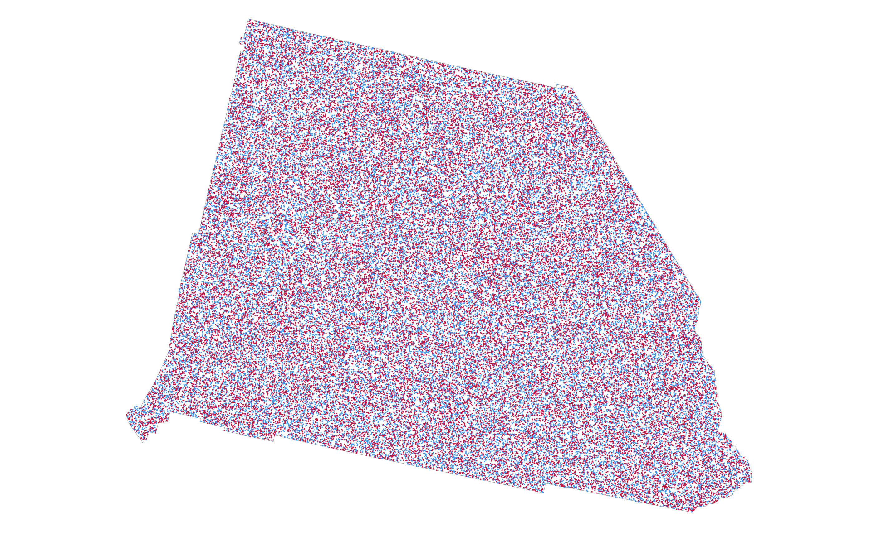
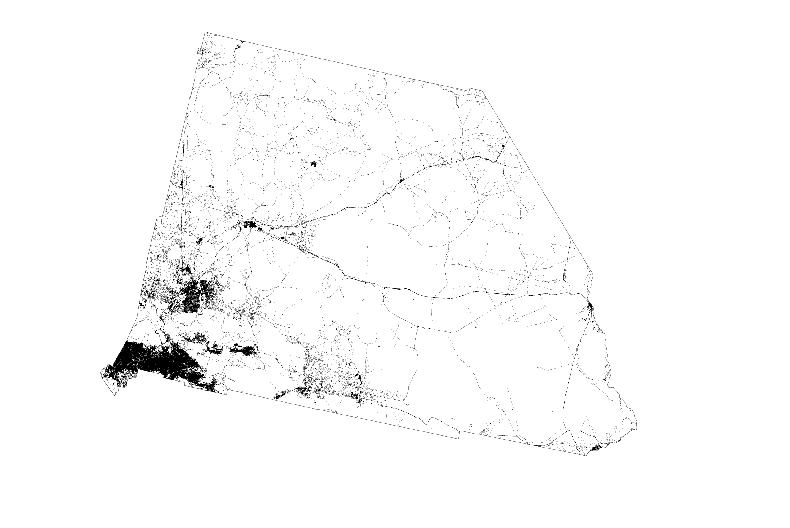
The impression is that the state is equally, and homogeneously populated everywhere. But it isn’t. In fact, the vast majority of the county is classed as scrub or barren according to the US National Land Cover Database. Only the dark areas on the following map derived from the National Land Cover database are urbanised. It shows cities and towns as well as the network of highways that interconnect them. And that’s where the vast majority of people live, work (and spend time at the wheel!). So it might make sense to show the dots in those areas that people inhabit rather than spread them across areas where people simply do not inhabit.
An easy way to do this would be to mask non-urban areas and we get a sense of dots filling just the urban areas. This is sometimes referred to as the binary method.
Except that’s cheating. Masking simply removes a load of your dots (and data) from the map and still leaves the impression of internal homogeneity in the distribution of the dots that remain. What’s needed is a way to break free from data being spread evenly across areal units, and instead refines the distribution of the dots to better reflect their real distribution. In this case, where are the populous parts of counties exist and which forces dots to be more concentrated in those areas.
Fortunately methods exist that help redistribute the data to make a more truthful looking map. They’re broadly termed ‘dasymetric’ which means taking data collected and usually shown using one spatial unit, and re-allocating it to another, usually smaller, set of spatial units. It’s a spatial manipulation of data into a different geography, a disaggregation of data into more natural geography and one that reflects a truer distribution of the phenomena being mapped. Dasymetric techniques were first developed nearly 200 years ago by George Scrope on his 1833 map of world population density. The term ‘dasymetric’ was coined by Benjamin (Veniamin) Petrovich Semenov-Tyan-Shansky in 1911 who defined them as maps “on which population density, irrespective of any administrative boundaries, is shown as it is distributed in reality.” Waldo Tobler was one of the first to create an automated dasymetric technique called pycnophylactic interpolation.
So this is going to become a dasymetric dot density map. In summary, I need to move data values held at one spatial unit (in this case counties or county equivalents), and reapportion it to different areas. In so doing I need to adhere to the pycnophylactic principle that ensures the quantities of data I’m transferring from one set of areal units is the same in its new configuration. For example, in San Bernardino county, Democrats gained 455,859 votes, Republicans gained 366,257 votes, and the other candidates gained 18,815 votes. The total number of votes is 840,931. I need to ensure that these are distributed to the new areas such that when you sum all the new areas that exist within the area that defines San Bernardino county, the total is 840,931, and the distribution between the three counts is the same.
There’s a few steps involved so let’s get going.
1. Source and process ancillary data that defines populated areas.
To reallocate data held at a county level into areas that define populated places I need a dataset that represents populated places. I used the aforementioned National Land Cover Database to identify urbanized areas which I’ll use as a proxy for populated areas. It’s a raster dataset at 30m resolution. I used the impervious surface categories and extracted those to a new raster dataset. Since 30m resolution was way too detailed for my needs, I resampled the dataset to 500m and, then, converted the raster dataset to a feature class where polygons were attributed as one of three classes based on the NLCD impervious surface categories: rural (1), urban (2), and dense urban (3).
A more generalized workflow wouldn’t necessarily disaggregate the ancillary data into three different classes but I want to be able to reapportion the election data so that more densely populated areas receive a disproportionate value of the data compared to the other two classes rather than simply treat all urban areas as equally populated. This adds effort but it’s a level of detail in the method that will improve the final map.
2. Calculate area geometry
For the derived NLCD urban area feature class I created a new field and calculated area geometry for each feature, named NLCD Area. This is an important step which will be used later to establish the correct proportion of data reapportionment amongst the urban area polygons.
3. Intersect the feature classes
I then intersected the NLCD urban area feature class with the US county election feature class to create a single combined feature class. Each of the resulting polygons has a land cover class (1, 2, or 3), a county ID field, the calculated area geometry data (NLCDArea), and the election results for the county in which it is situated (DEMVotes, REPVotes, OTHVotes). Each polygon within a county at this point simply has the attributes of the total number of votes for that county.
4. Calculate urban area totals
In order to correctly reapportion data to each of the smaller urban area polygons it’s necessary to determine what proportion of the total area for the urban area class it forms part of covers the county in which it sits. To do this, use Select by Attribute to select all polygons where the urban area class = 1. Then right-click on the county identifier field (in this case I used the FIPS code), and select Summarize. Specify the NLCDArea field and ‘Sum’ as the required statistic and an output table is created. Repeat for the other two urban area classes (2, and 3).
5. Join the urban area totals to the intersected feature class
I joined the three tables created in step 5 back to the intersected feature class, and then copied the data values into a single unified new field called NLCDTotalArea. So, for each polygon in the feature class I now have a value for the area of that individual polygon (NLCDArea) and a value for the total area of that urban class which it forms part of, by county (NLCDTotalArea).
6. Data reapportionment
At this point I now have all of the necessary data to be able to calculate the data reapportionment. I added three new fields called DEMDasy, REPDasy, and OTHDasy to contain the reapportioned data.
Now to reapportion the total votes at county level for the three outcomes (Democratic, Republican, and Other) into the NLCD urban area polygons, and this is where the urban area classification becomes important because it is used to weight the reapportionment. The dense urban areas get (in total) 50% of the data from the county total in which they are situated. The urban areas get 35% of the data and the rural areas get 15% of the data (remember, the weighting must sum to 100% so you don’t lose any data values during the reallocation). These weights are a guesstimate on the density of population across different land cover types.
There’s a little bit of maths involved in this step…lets work it through using the example below which I’ve repurposed from a rather wonderful book called Cartography. available at all online purveyors of books.
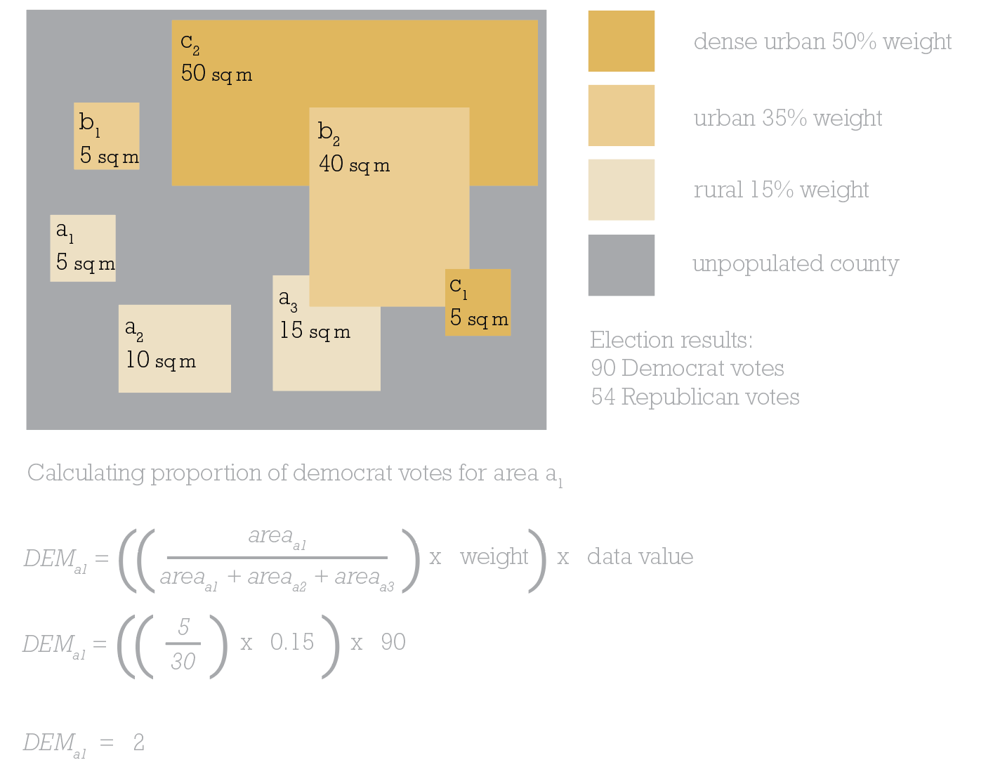
In this simplified example for a single county, there’s 2 areas of dense urban area totaling 55 sq miles. There’s 2 areas of urban totaling 45 sq miles. There’s 3 areas of rural totaling 30 sq miles. There’s a lot of the county that is unpopulated. Let’s concentrate on rural area a1, which is 5sq miles.
To calculate the number of Democrat votes area a1 should be allocated, divide its area by the total area of rural polygons (30 sq miles,) then multiply by the weighting value (15%, therefore 0.15), and, finally, multiply by the data value we want to find a proportion of. In this example it’s 90 as we’re wanting to find out what proportion of Democrat votes from the county level need to be reallocated to area a1. And the answer is 2. So if I’m creating a 1 dot to 1 vote dasymetric dot density map then 2 of the Democrat dots need to be randomly positioned in area a1.
Back to the map at hand.
In the attribute table I used Select by Attributes to select all polygons that are in urban class 1 (rural), then right-clicked DEMDasy and calculated the reapportionment of the Democratic votes as:
((NLCDArea/NLCDTotalArea)*0.15)*DEMVotes
Repeat this to reapportion the Republican votes into the REPDasy field:
((NLCDArea/NLCDTotalArea)*0.15)*REPVotes
And repeat once more to reapportion the Other votes into the OTHDasy field:
((NLCDArea/NLCDTotalArea)*0.15)*OTHVotes
That’s all the rural polygons calculated. Now use Select by attributes to select all urban class 2 polygons (urban) and calculate the three fields using a variation of the same formula but with a different weighting:
DEMDasy=((NLCDArea/NLCDTotalArea)*0.35)*DEMVotes
REPDasy=((NLCDArea/NLCDTotalArea)*0.35)*REPVotes
OTHDasy=((NLCDArea/NLCDTotalArea)*0.15)*OTHVotes
Finally, use Select by Attributes to select all urban class 3 polygons (dense urban) and calculate the final reapportionment:
DEMDasy=((NLCDArea/NLCDTotalArea)*0.5)*DEMVotes
REPDasy=((NLCDArea/NLCDTotalArea)*0.5)*REPVotes
OTHDasy=((NLCDArea/NLCDTotalArea)*0.5)*OTHVotes
And that’s the maths done. Phew! Maybe a quick coffee is in order before continuing.
7. Working out if it worked
This is an optional step but it’s always nice to work out if all that effort and maths has actually worked right? How do you know? Well remember, this entire process has been to move data values around the map but in a way that maintains the pycnophylactic principle that the data values in the reapportioned polygons should sum to the original total for the source data. In this case, all reapportioned data should sum to county totals for all polygons in that county.
In the attribute table, right-click on a county ID such as FIPS and select Summarize. Then select the statistic Sum for the fields DEMDasy, REPDasy and OTHDasy. This generates an output table with a row for each county which can be compared to the original county data. Does the summed dasymetric data match the original data? If yes, then it’s worked! Remember, give yourself a small margin of error because during all of the steps some rounding may occur.
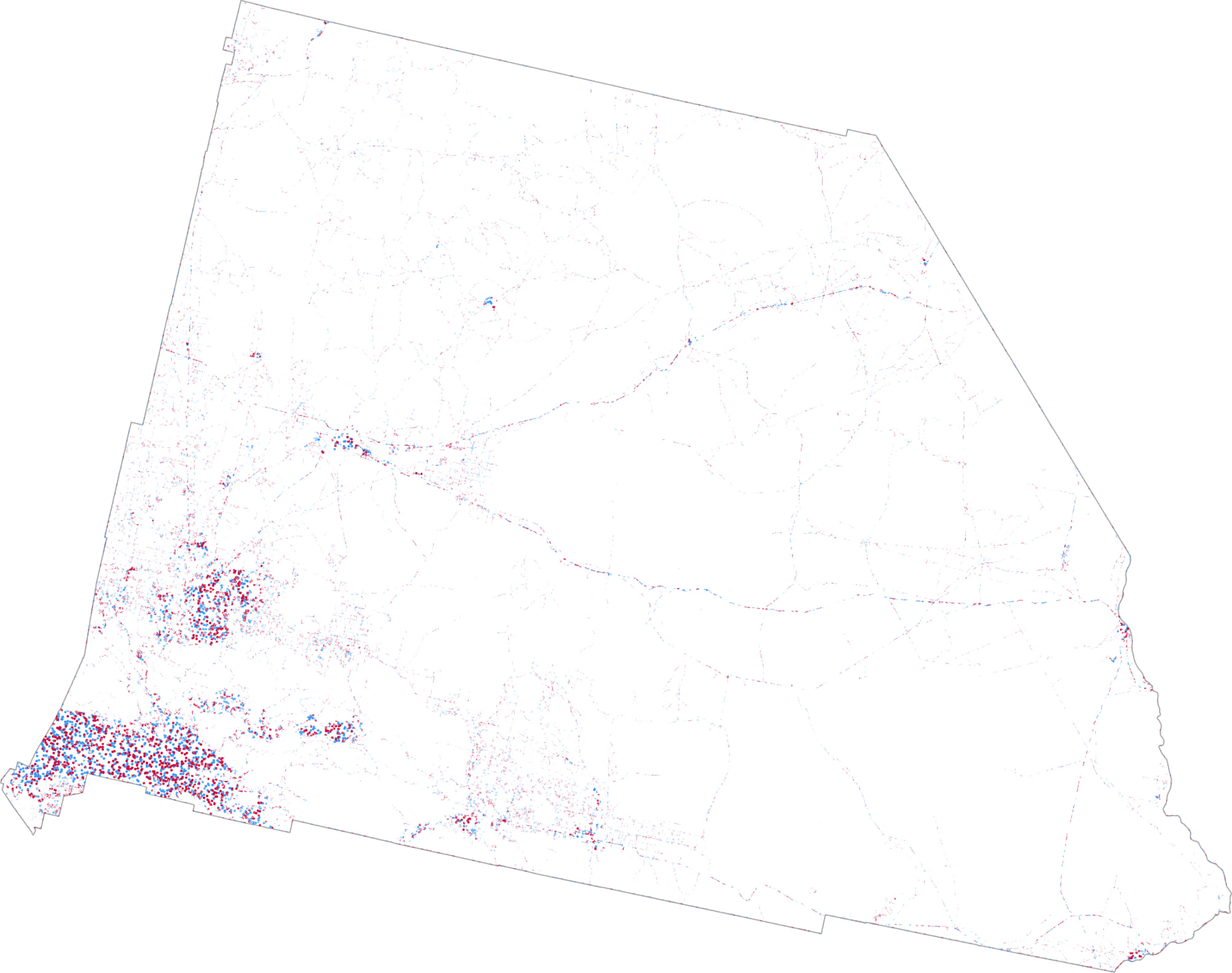
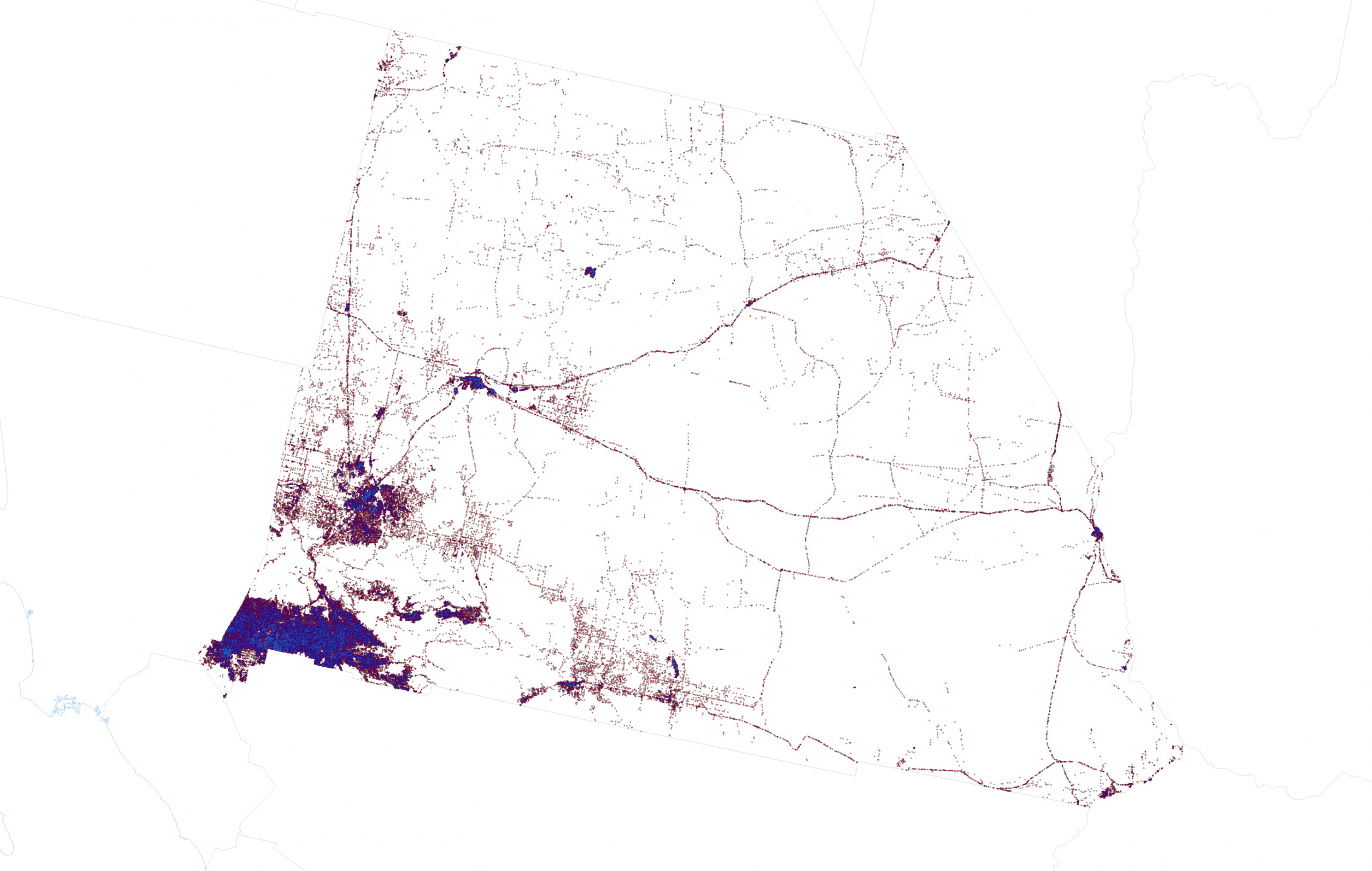
And now it’s time to get back to the mapping. Part one of this blog went through the details of using transparency and blend modes to create a great looking dot density map. There’s no need to repeat the experiments here so I simply used the same technique of creating three layers, rendering each with 70% transparency and applying a Multiply blend mode to the Democrat layer so its blue dots blend with the red dots of the Republican layer below it in the Contents pane. Here’s San Bernardino as a dasymetric dot density map with extremely small dots:
And here’s the US, though admittedly this is a bit of a small format for this particular map:
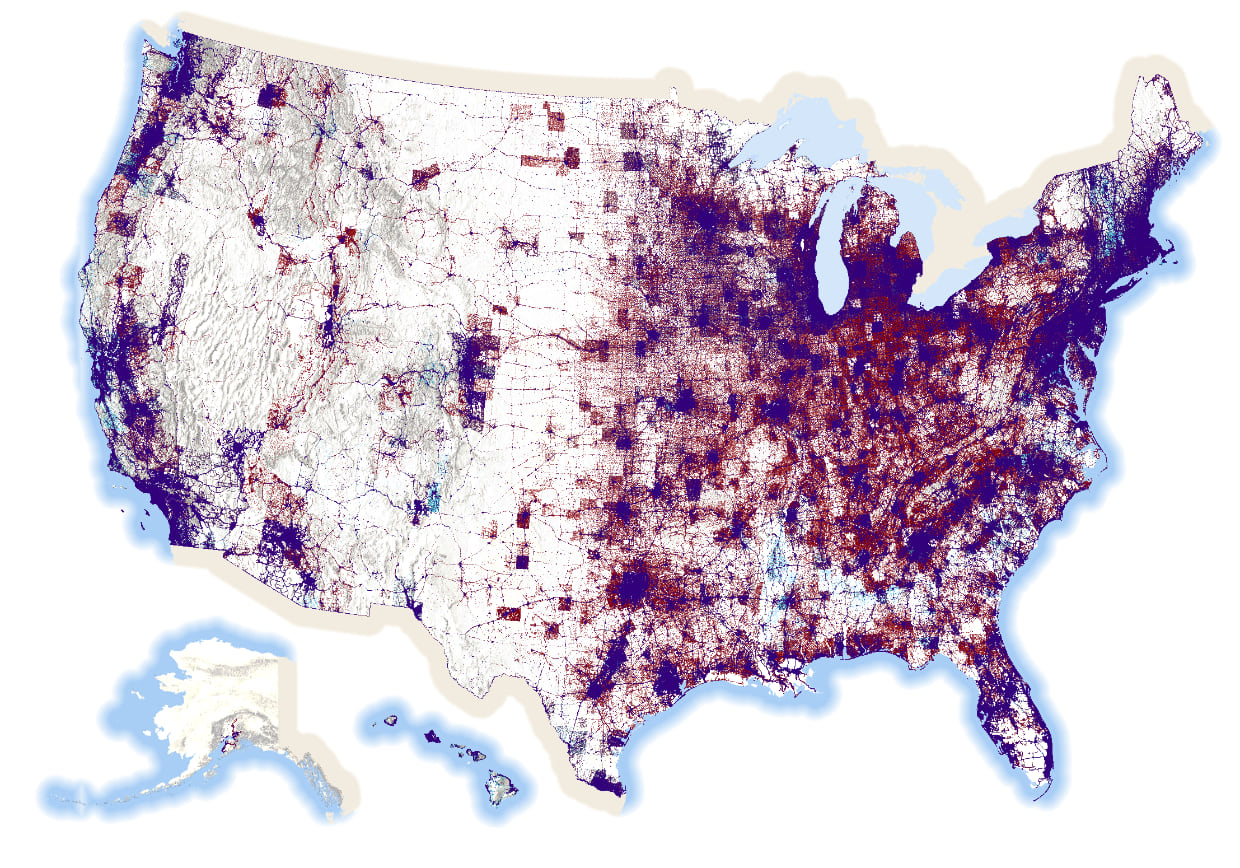
There’s 81,268,924 blue dots, 74,216,154 red dots, and 2,898,325 orange dots on this map. In total, there are 158,383,403 dots on this map. One dot for every single person who voted. That’s a lot of dots on a map.
The map pushes the data into areas where people actually live. It leaves areas where no-one lives devoid of data. It reveals the structure of the US population surface as evidenced through the voting patterns of the 2020 electorate. Most maps that take a dasymetric approach will all end up looking similar in structure if they’re based on population distribution but I think there’s value in the approach. To me it presents a better visual comparison of the amount of red and blue that the standard county level map that maps geography, not people, and over-emphasizes relatively sparsely populated large geographical areas. A standard dot density map improves the view of the data as we saw in part one of this blog, but a dasymetric approach dials it up to 11.
There’s a few things to keep in mind though. With any dot density map, there’s always the potential for someone to read the dot’s location as a real location. When mapping 1 vote per dot that danger is even more real. Remember, though, that the data comes from county totals. Each dot is positioned randomly according to the choices made in how to reapportion the data and what weighting is employed. Crucially, keep these sort of maps at relatively small scales and you avoid people looking at an individual dot and wondering how the heck did some cartographer manage to map every vote to a particular household.
No map is perfect though and if you look closely you can still see the structure of many county boundaries where it appears that the voting population suddenly stops at an invisible edge. Look at this closeup of Amarillo.
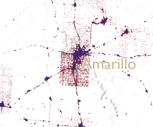
This artifact occurs because a highly populated county, by virtue of a relatively large metropolitan area, is surrounded by very sparsely populated counties. The reapportionment of the data from the densely populated county uses urban areas right up to the edge of that county. There simply aren’t the same amount of dots that get reapportioned in the surrounding counties so a ghostly border is formed. I could likely finesse this a little more to get a smoother gradient between urban and rural but frankly I have dots before my eyes.
So, finally, if you’ve read this far then you deserve a treat so here’s the above map as a zoomable (but not too zoomable; the largest scale is around 1:500,000) web map. You can see the zoomable map in its full glory here.
And here’s a large format (i.e. BIG) print map of the same data:
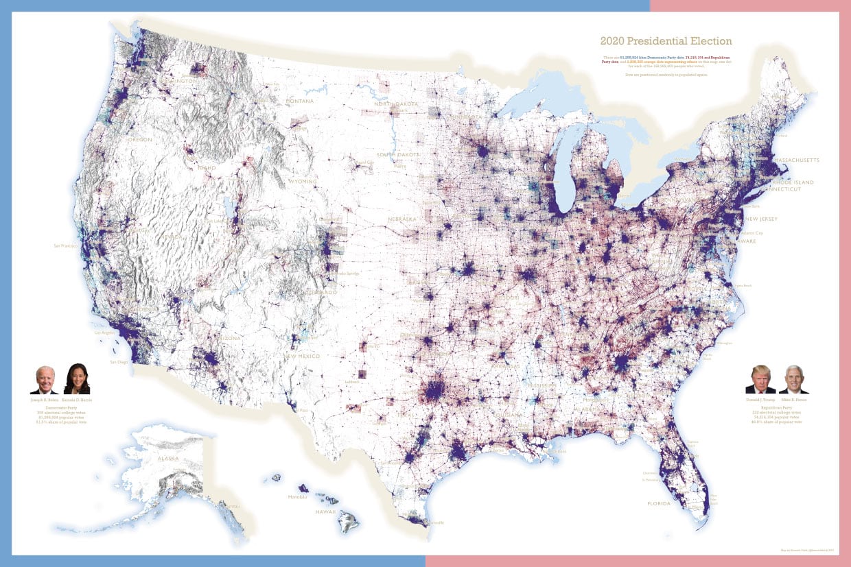
If your preference is a large poster for putting on a wall, you can download it from here.
I hope you enjoyed the experimentation with dot density, and the ways in which you can use transparency, blend modes and the dasymetric technique to improve and extend the power of this rather terrific thematic mapping technique.
Happy mapping!
Ken

Commenting is not enabled for this article.