In this two-part blog I’m going to take you down a few rabbit holes experimenting with the (rather excellent) dot density thematic mapping technique. In part one I’ll explore some of the functionality in ArcGIS Pro to make dot density maps, discuss how dots of different colours can be accommodated, and introduce blend modes (what? YES – blend modes!) as a way to improve the final appearance of a dot density map. In part two I’ll extend the discussion to show how to make a dasymetric dot density map, a variant that cajoles data from one set of areas into another set. This is usually to move data from large, arbitrary areas used to collect and report data into areas that better reflect the distribution of the population being mapped. I’ll be using the 2020 Presidential election results at a county (and county equivalent) level of measurement. Join me as we head down a mazy rabbit warren.
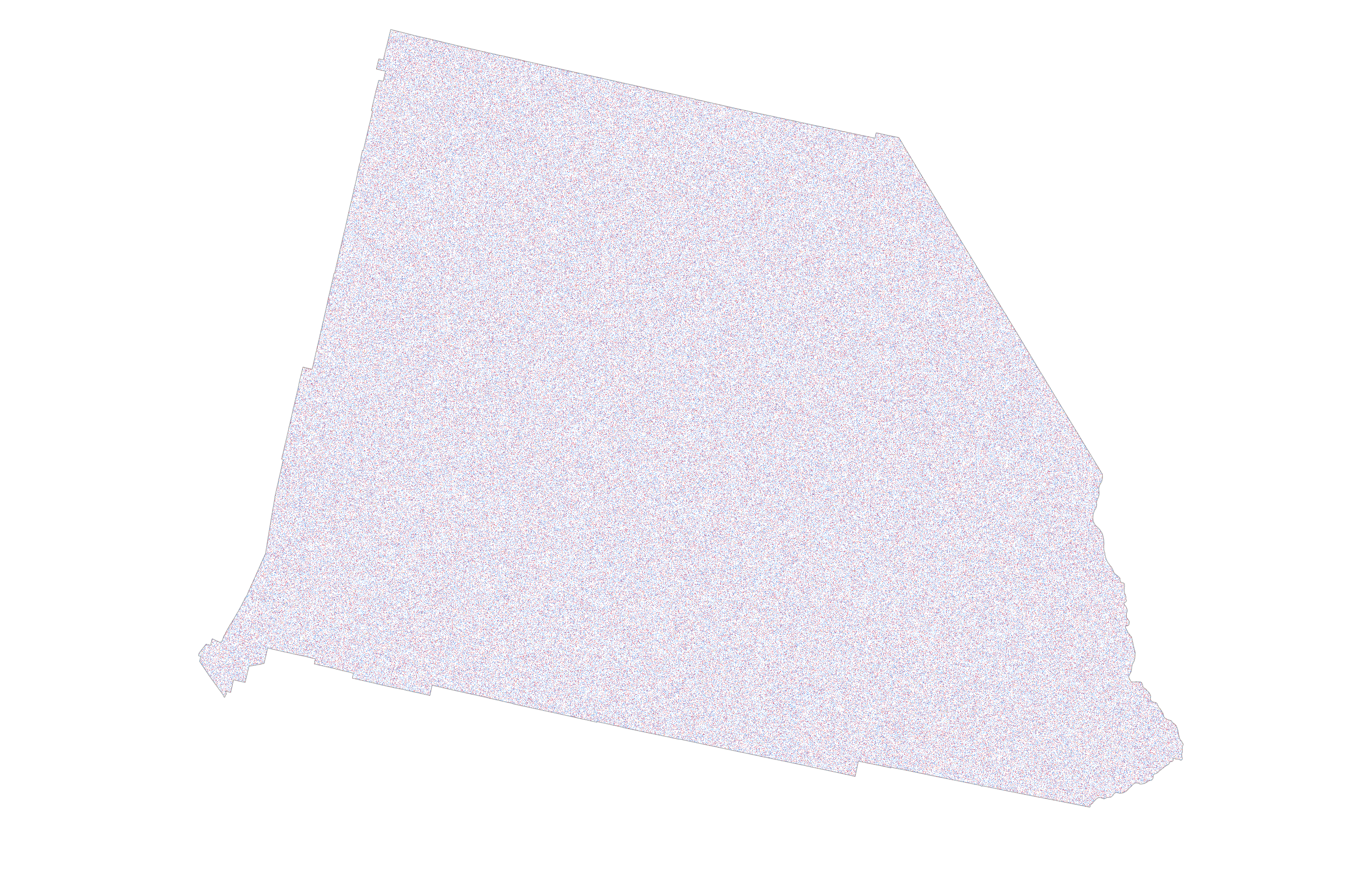
When you have a single variable symbolized by a dot of the same size, value and colour it’s a fairly easy task to create a dot density map using the dot density renderer in ArcGIS Pro. Here, each dot is 10pt in size and each represents a value of 100 votes. The data is the 2020 US Presidential election and this is the county of San Bernardino in California. It’s both the largest county in the contiguous US, and one of the most populous.
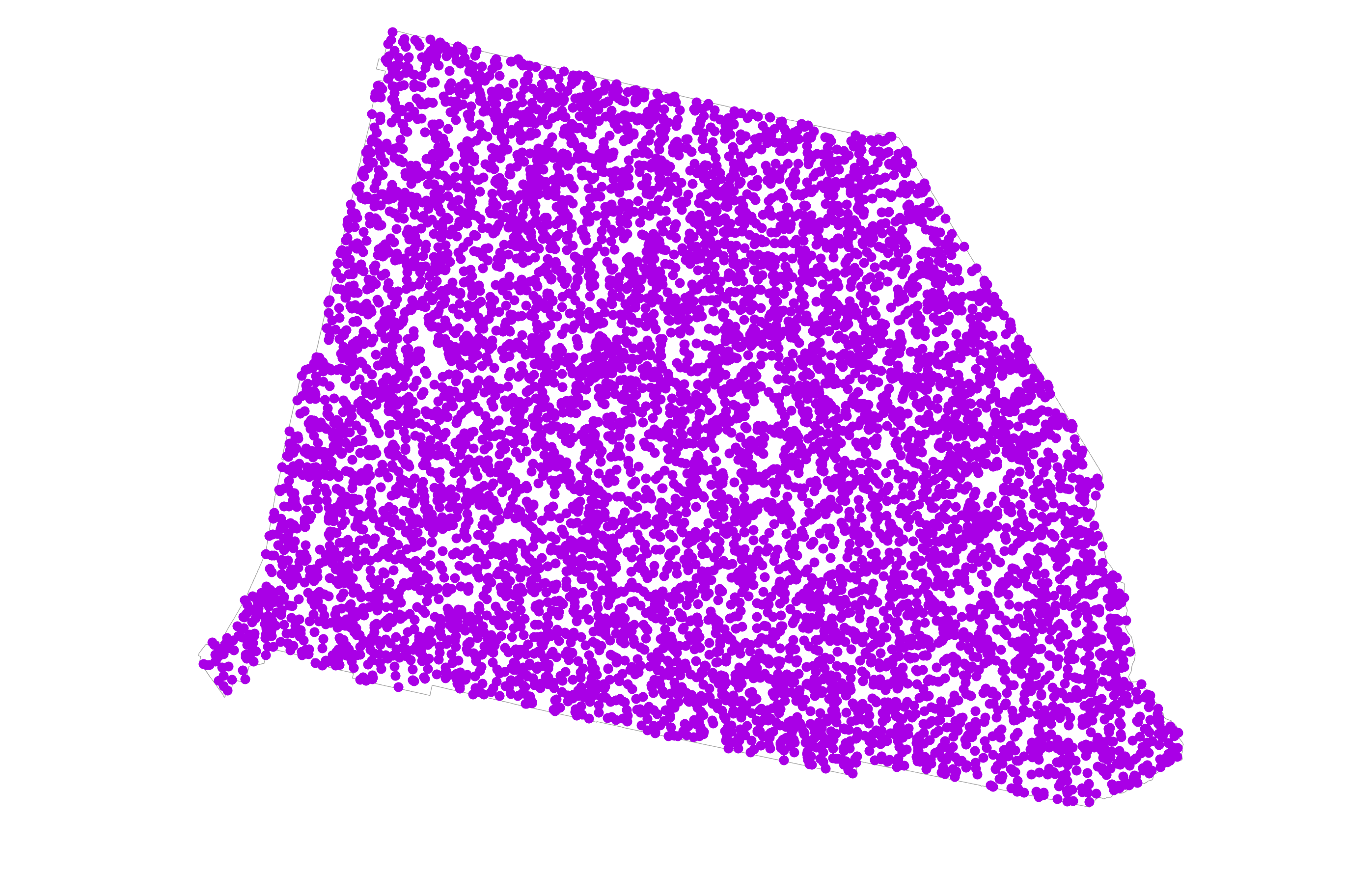
This example is probably at the farthest end of being useful because there’s perhaps a little too much coalescence of dots. It makes it hard to establish just how much overlapping is taking place but I’ve deliberately made the dots large to explore some options. I could introduce a little feature level transparency into the mix to see this impact. Actually, the following introduces a lot of transparency with each dot being 90% transparent.
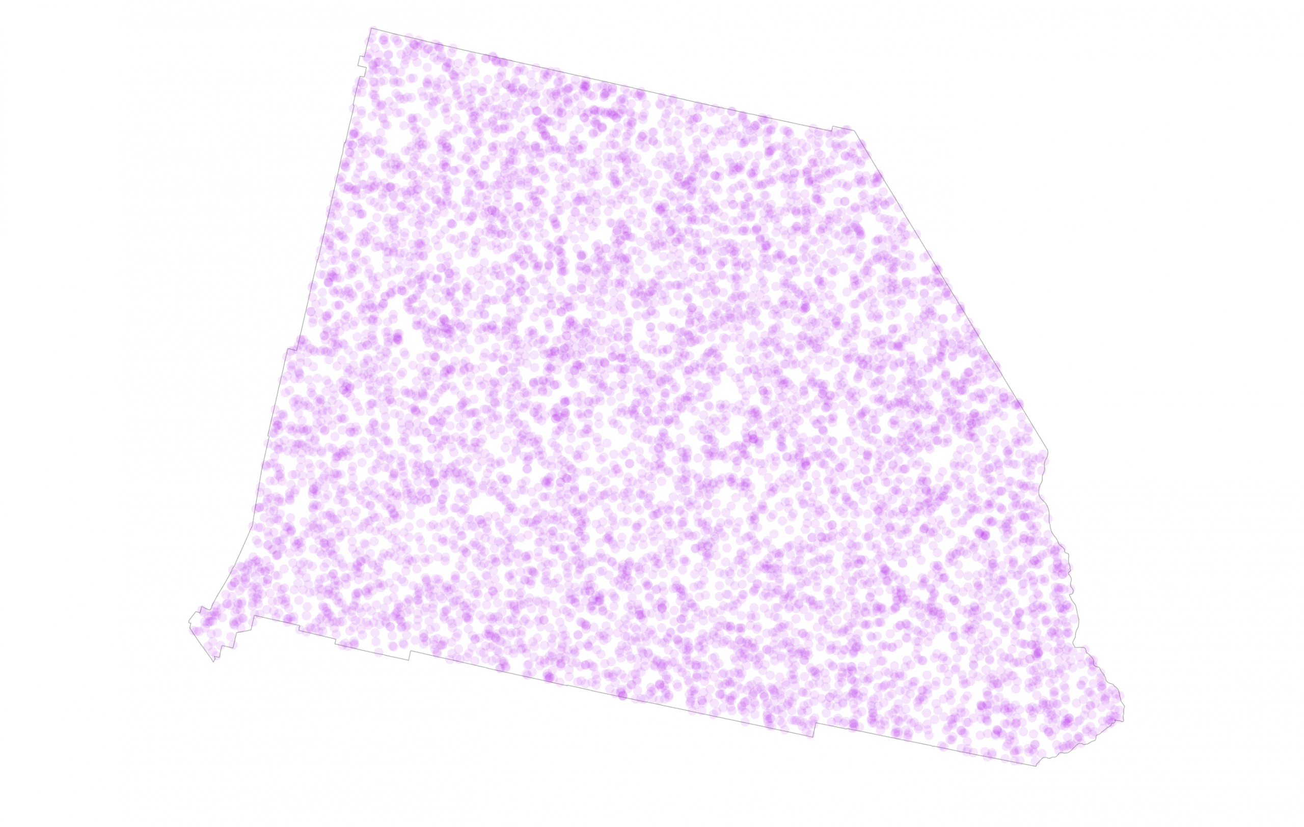
The result has a little more texture because areas with more overlaps appear darker. That’s not necessarily what I want to show though, because darker is normally seen as ‘more’ of something against a light background but here it’s just an artifact of randomly positioned dots and not any meaningful intra-area variation. Maybe I don’t want to introduce that visual impression to the map reader.
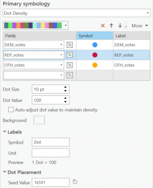
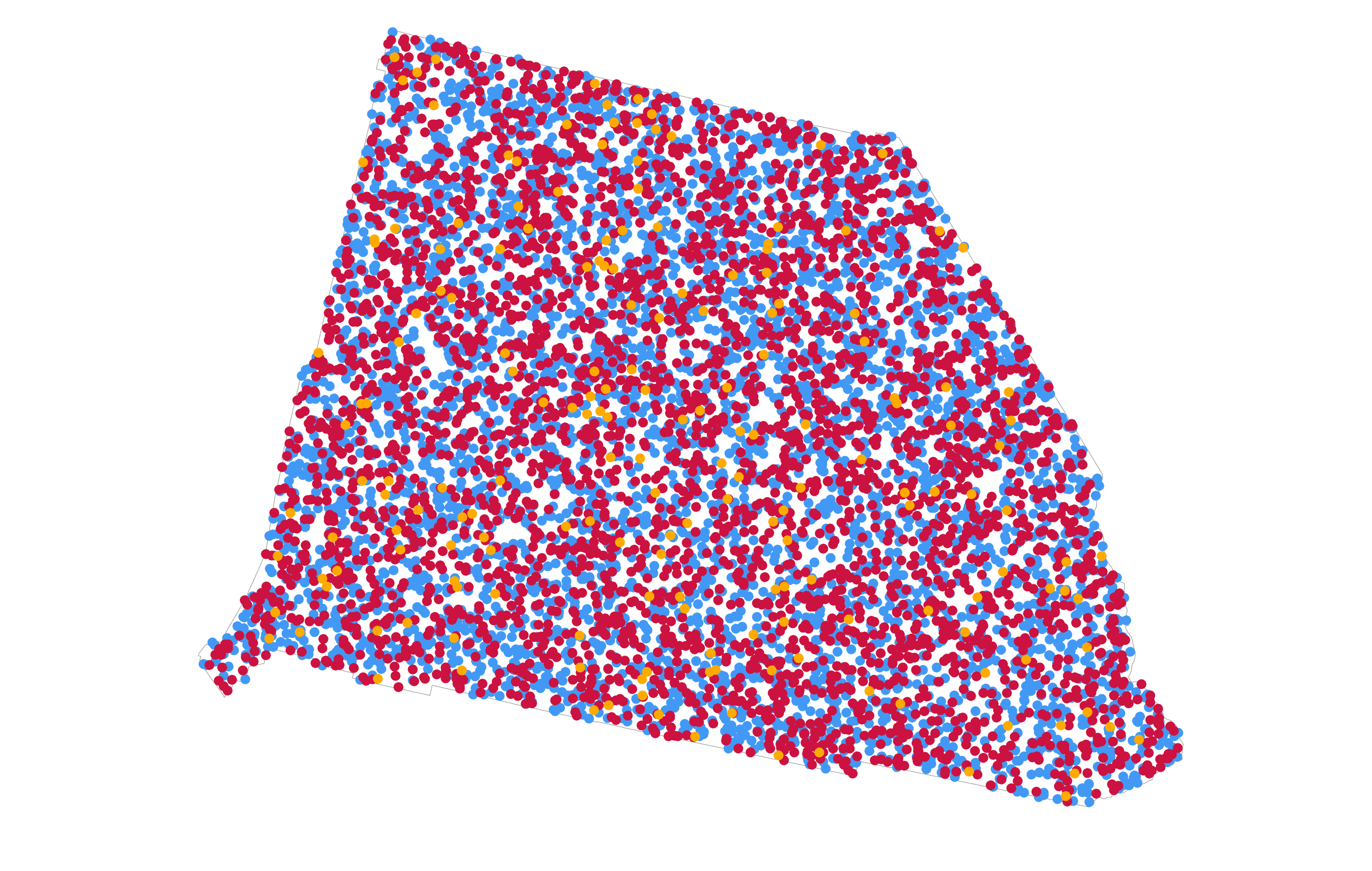
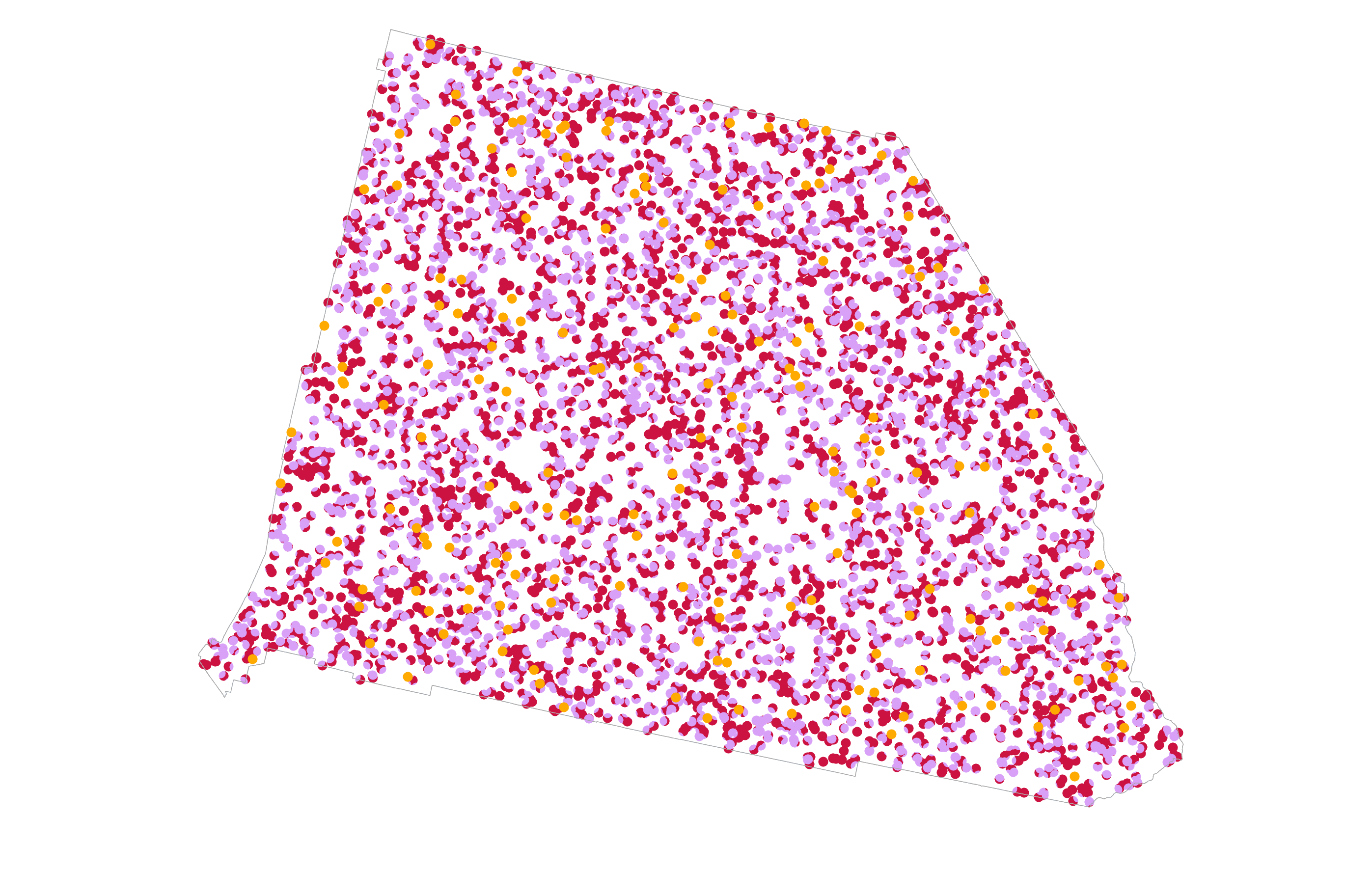
But what happens when you have more than a single variable, and you want to show them all on the same dot density map? Total votes is an interesting metric in an election, but votes per candidate is way more interesting. Again, the dot density renderer supports this. Here, I’ve added three fields from my data, one for the total number of Democratic votes, one for the total Republican votes, and one that totals all votes for other candidates. I’ve maintained the 1 dot = 100 votes and a 10pt dot, but changed the colour of the dots to align with well-understood party colours. The seed value for each field is different to ensure dots are not positioned coincidentally.
And here’s the map:
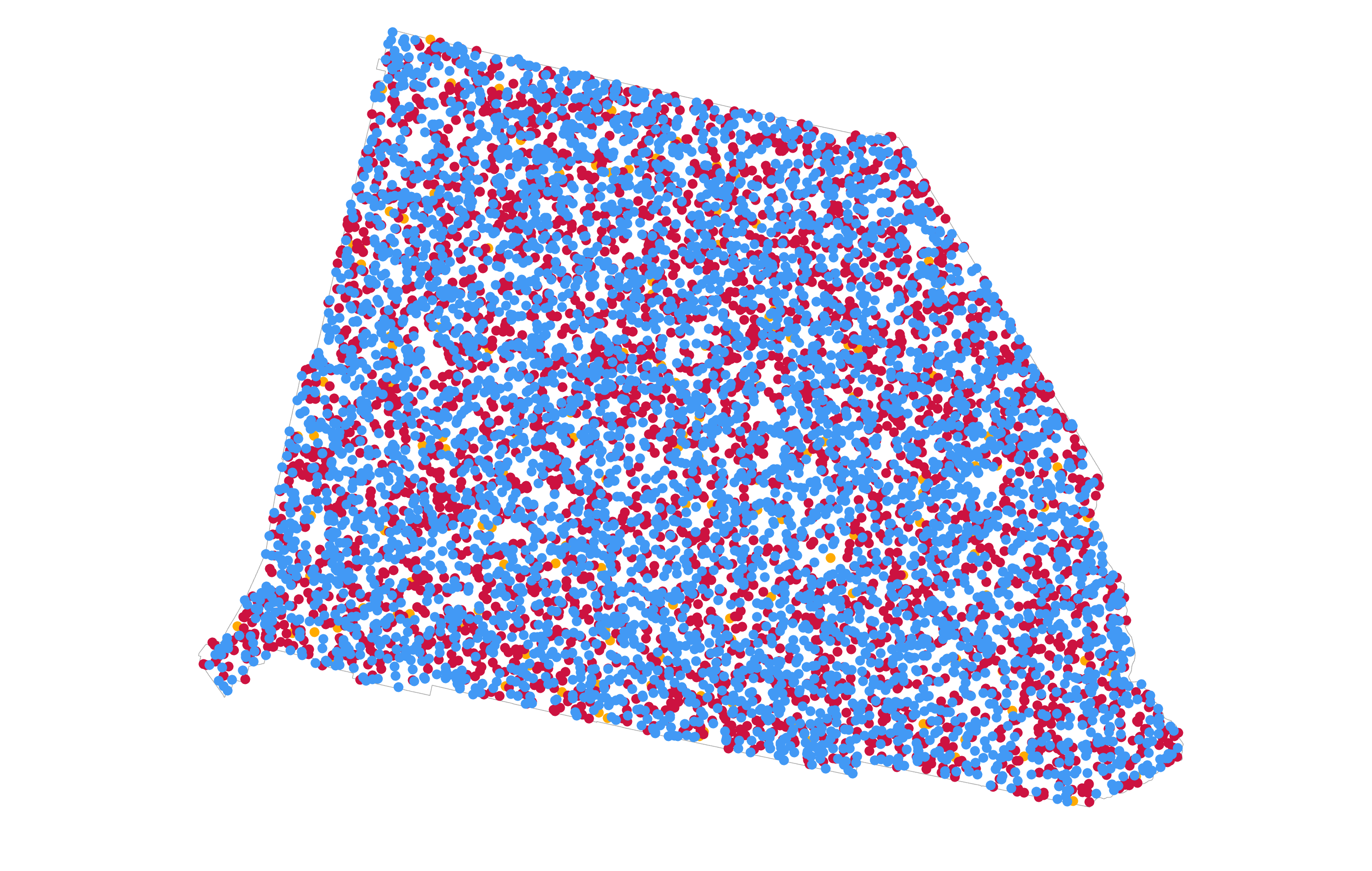
My deliberate use of dots that are too large emphasizes a drawback of the approach because draw order impacts the appearance. The Democratic dots draw on top of the Republican dots, which in turn draw on top of the almost unseen other candidate dots. Reversing the draw order gives a completely different appearance:
So one takeaway is simply to understand that the order in which you position your fields in the symbology pane for the dot density renderer can go a long way to how the mix of dots appears on the final map. It’s always worth checking the end result makes sense to you, and is an expected visual outcome that will convey the right message to the map reader.
Maybe transparency helps us in this situation. Leaving the draw order, what happens when I apply 70% feature level transparency?
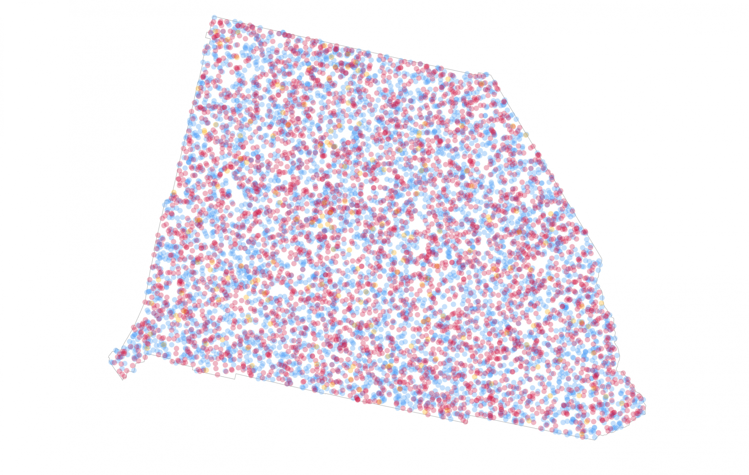
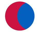
Now I’m getting somewhat closer to seeing a mix of dots rather than a predominance of one colour by virtue of draw order. In reality, the overlap of a 70% transparent red dot with a 70% transparent blue dot gives a purple hue. And that works for an election where the visual metaphor of blue and red mixing to purple makes some sort of sense.
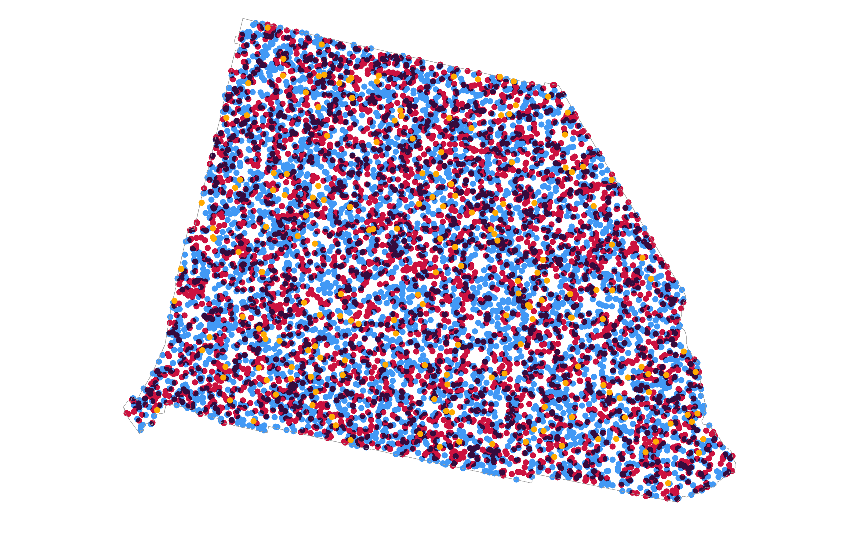
So what should that mix look like? San Bernardino went to Democrats with 455,859 votes (54.2%). Republicans polled 366,257 votes (43.5%) with other candidates polling 18,815 votes (2.3%). A dot density map of this result should reflect that share of the vote through a visual mix that people are able to see – a win for the Democrats but not without a substantial part of the share of the vote won by the Republicans. Does the map above suggest that Democrats won with slightly more than a 10% margin of victory? It looks a little more red than blue to me. How about if I reverse the draw order again to have the Democratic dots sit atop the Republican dots.
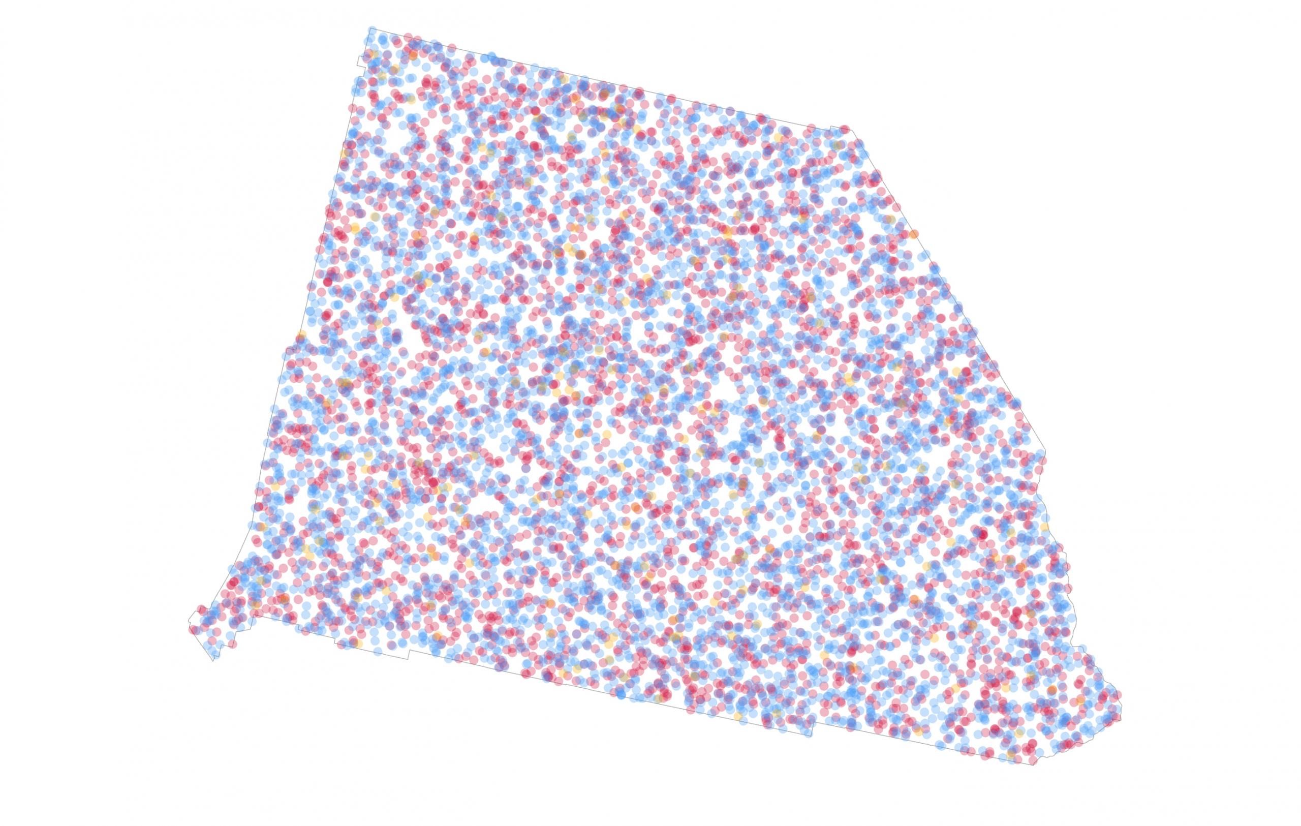
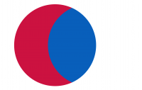
To my eyes at least, this version shows a slightly bluer mix of dots [side-note, get plenty of other eyes on your map to see if your sense is backed up, and be aware that dealing with different colour deficiencies in sight may be critical to how your map is seen]. Now let’s reduce the size of the dots, and change their value. Every single vote cast in San Bernardino is on this map, randomly positioned with a 0.5pt dot, and coloured red, blue, or orange. It sits just on the blue side of a spectrum of blue-purple-red indicative of about a 10% margin of victory for Democrats. A larger margin and you’d see it bluer. A large margin for Republicans would see more red.
With some modification to dot size, value, and transparency I can extrapolate this general approach across the whole US to end up with a small scale dot density map. Dot value is 100 votes, size is 0.5pt, and transparency is 98%
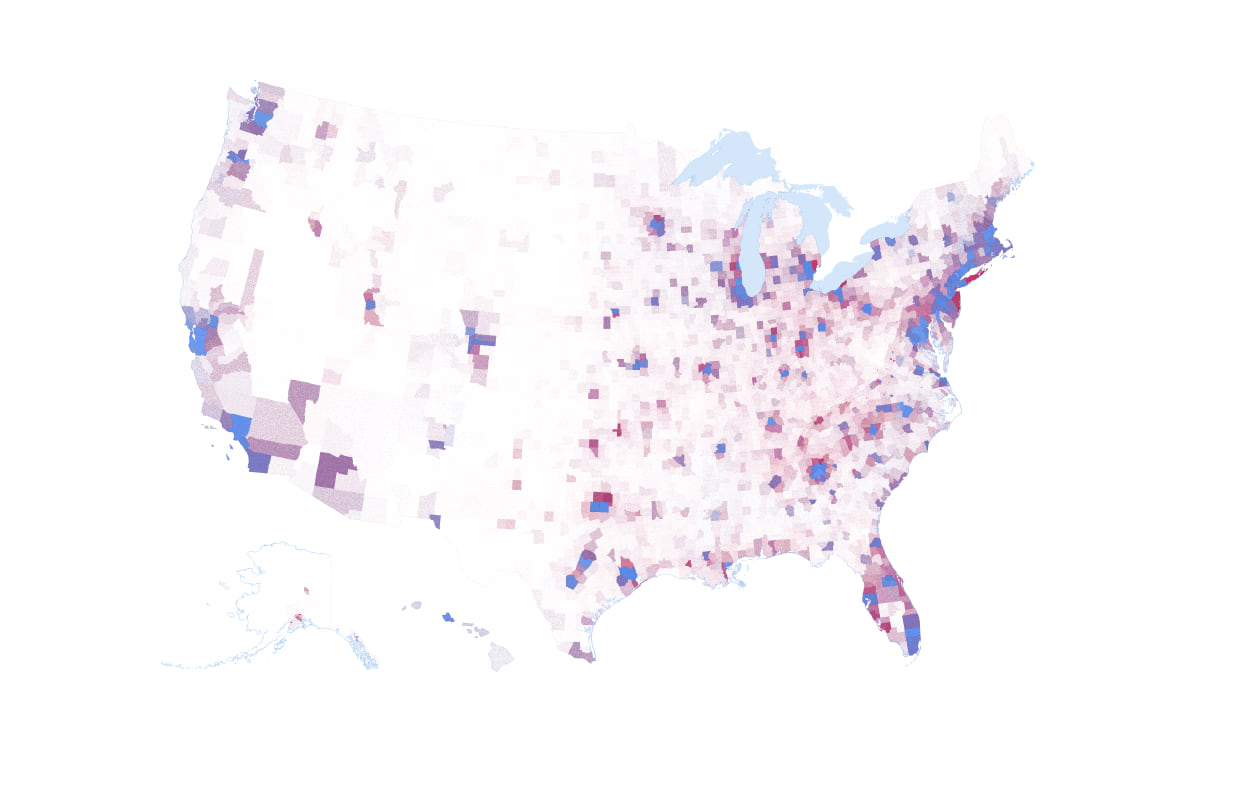
That’s a pretty decent looking map. Counties which the Democratic Party won are in the blue range of the blue-purple-red continuum. Counties which the Republican Party won tend toward the red end. The map is still a compromise though. If I make the dot value any higher to overcome saturation in the most populous areas I lose fidelity in the less populous areas because fewer dots would be placed on the map. What the dot density technique does a good job of while reporting the mix of results is also showing the broad population distribution across the US. It is a markedly different picture of the results than the winner-take-all red/blue maps that exhaust space on the map and take no account of population density.
To this point, the manipulation of dot size, dot value, colour, and transparency helps establish a good appearance when designing a map at different scales. But I can experiment a little further, and for that let’s go back to San Bernardino county. Here’s the exact same data, with a dot size of 10pt and a value of 100, coloured blue, red, or orange with no transparency. Except this time, rather than using the dot density renderer to show all three variables in one layer I’ve split them into three separate layers. It suffers from the same earlier problem of draw order establishing the predominance of the dots higher in the draw order (in the Contents pane).
But now I can explore the use of blend modes (instead of transparency) to see what sort of colour mixing I might be able to obtain, and to what extent it might give me a more pleasing final appearance than the use of transparency. Blend modes are accessed on the Appearance tab once you have a layer selected in the Contents pane. They can be used to apply visual effects to the selected layer to change how it blends with layers lower in the draw order.
So with the Democratic dot density layer in the middle of the draw order let’s experiment. Here goes…
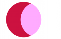
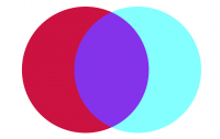
Hmm, disappointing. This is the result of applying the Screen layer blend. It’s a lightening mode and unfortunately the effect loses all the blue, and replaces the overlap of the blue dots on the red dots with magenta. Not ideal. But the point is that blend modes are visual effects. Not every one is going to be suitable for the data to hand. So it’s a case of trial and error (as in, a few clicks on the Layer blend drop-down, a quick look, and either a grimace or a pleasant emerging grin). Let’s see how blend modes work with the venn diagram of two dots with the blue one atop the red.
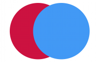
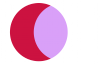

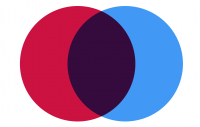
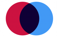
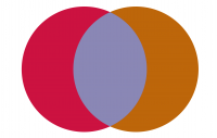
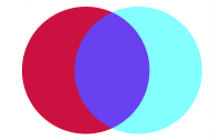
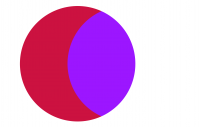

It’s immediately obvious that the vast majority of these blend modes are not going to help in making this specific map any better because I either lose the blue part of the dot that sits atop white space, or the overlapping part renders a colour that just doesn’t make sense for this dataset. But the darkening modes show some promise so let’s try the multiply blend mode.
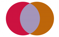
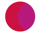
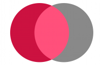
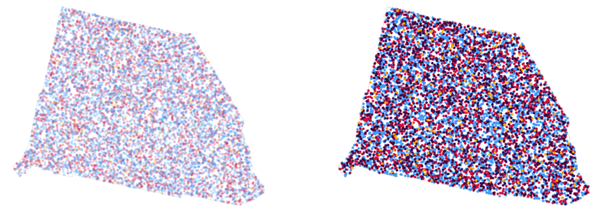
Remember, there’s no transparency used on these symbols as the blend mode handles the colour mixing. As the blend mode suggest, it’s darkened the overlaps of the red and blue dots. So I see the original blue, red, and a deep purple. There’s only four colours on this map (including the orange for other votes) compared to the earlier version where I applied 70% transparency to each dot in a single layer which created a multitude of different hues as dots overlayed one another. Here they are side by side for comparison with the use of transparency on the left and the multiply blend mode on the right.
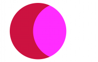
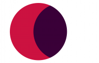
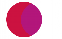
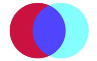
But the beauty of blend modes is they work independently of transparency so while I’m down this rabbit hole of experimentation what if I apply 70% transparency to the dots AND use a Multiply blend mode.
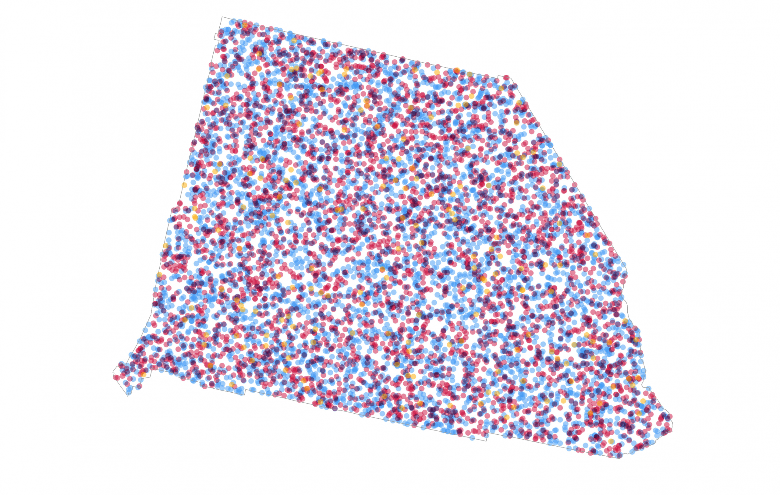
Stop me right there! The best of both worlds. I’ve regained some of the depth of colour rather than overly washed out the map. At the same time I haven’t overly darkened the map. I’m happy with this. And here’s the impact on the US map of 1 dot = 100 votes.
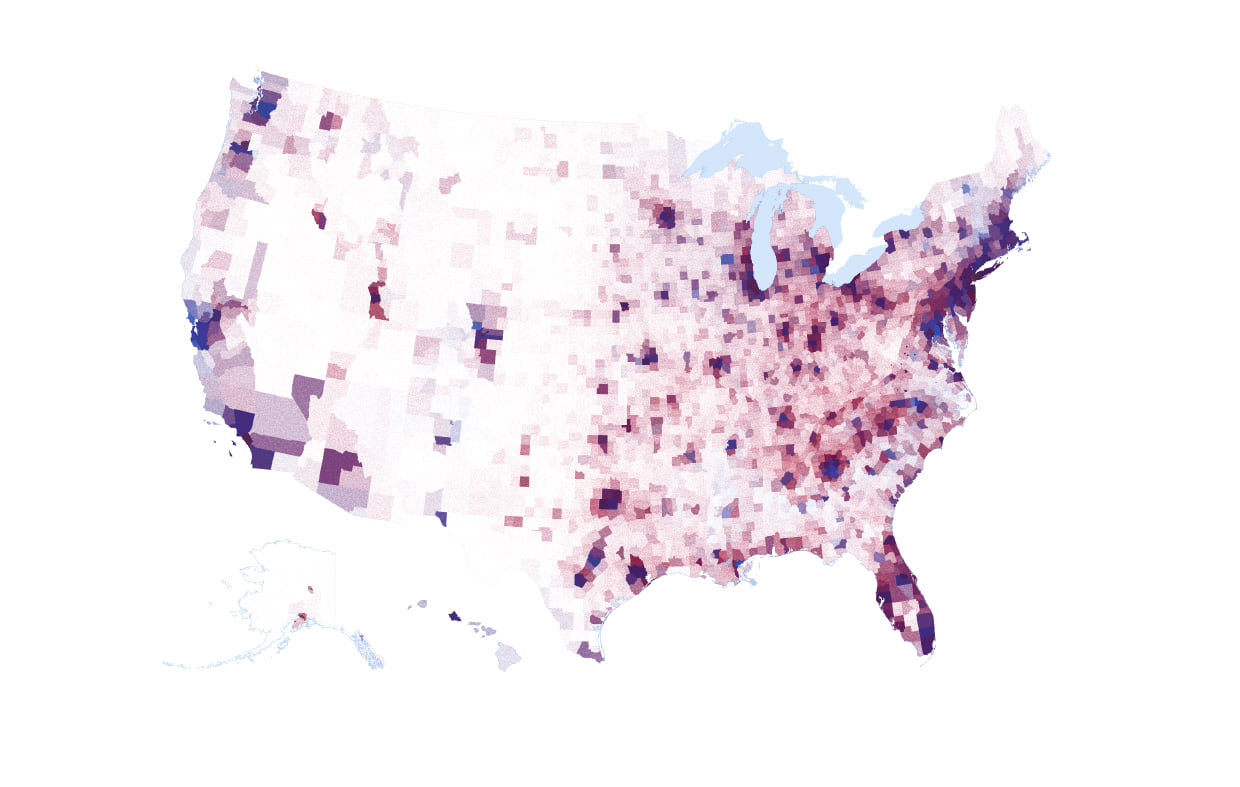
Modesty prevents me from exclaiming this as a great looking map (it is). As you would expect, you can see pockets of increasingly blue, or increasingly red but there’s an awful lot of mixing going on and the application of the multiply blend mode has helped alleviate some of the problems of using transparency alone where even careful selection of dot size, value and transparency wasn’t enough to stop some counties being seen as more blue or more red simply by virtue of draw order. Blending solves it.
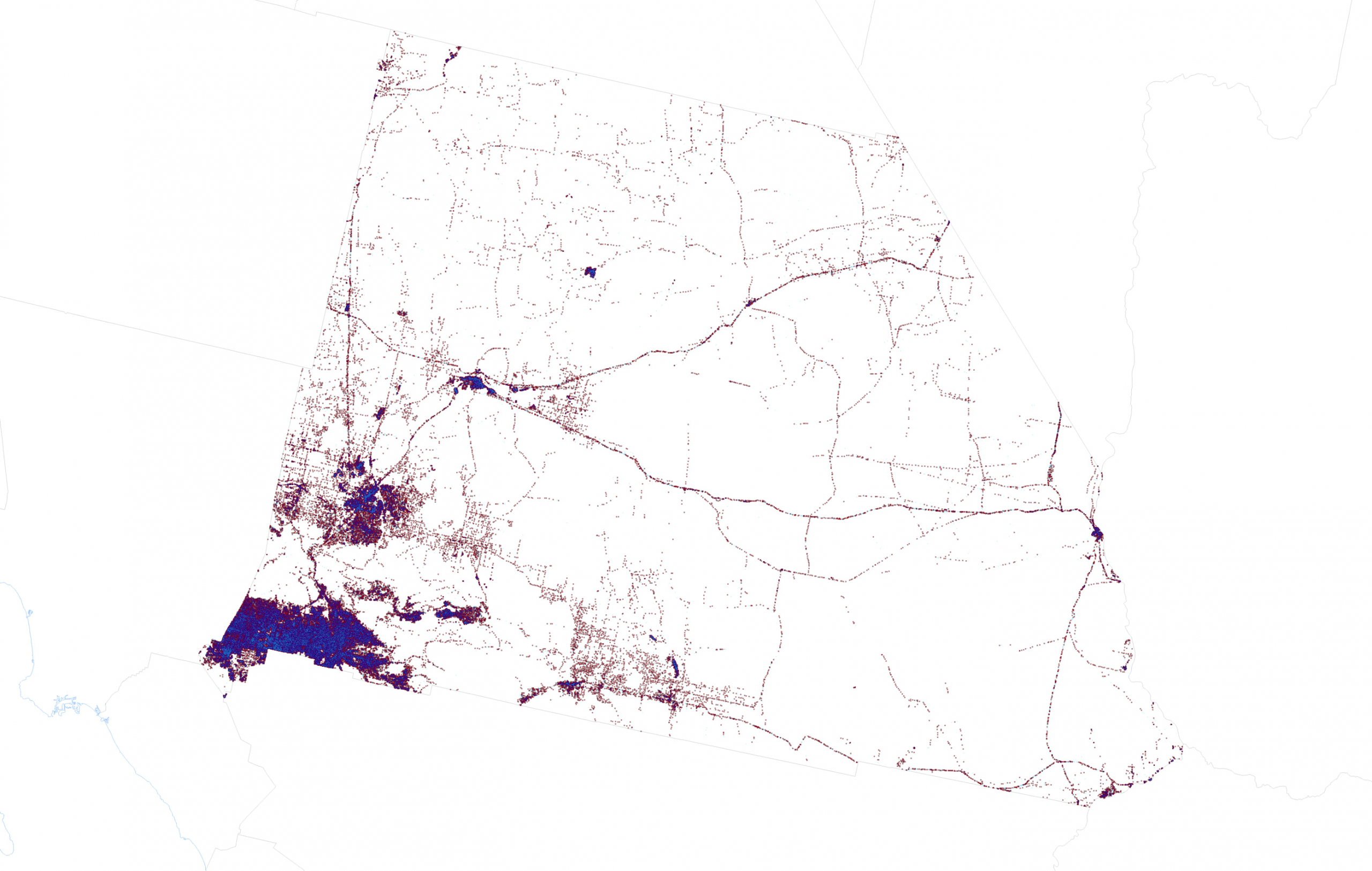
But we’re not finished experimenting. Here’s a teaser for where I can take this experimentation which I’ll be exploring in part two of this blog. San Bernardino, like every county or county equivalent in the US does not have a population that is distributed evenly over space. But with some dasymetric data reapportionment I can move votes around so they are represented in areas that are populated. San Bernardino is mostly desert, but I want to show votes in the parts where people actually live and work.
This is what a dasymetric dot density map of the 2020 Presidential election looks like for San Bernardino County with 1 dot = 1 vote represented by lots of tiny dots. Part two explores how it’s created and reveals a 1 dot = 1 vote version for the entire US.
OK, we’re done here. Time to head over to part two of this blog Until then, happy mapping!
Ken

Commenting is not enabled for this article.