If I’ve said it once I’ve said it a thousand times. Why make sterile digital looking maps when you can make them look like the they are made from tediously arranged and stitched sheets of dyed matted ruminant mammal fibers? I’m sure I’m not alone.
One fine day, a year or so ago, my daughter Willow asked if she and I could make a map together from the colorful felt swatches that she was cutting and assembling. Being the why make it analog once when you can make it digital a million times sort of person I am, I suggested we collaborate on a map we make together on the computer, using a photograph of a bit of felt and unbridled craft energy. So we teamed up (she did the thinking and designing and I did the clicking) to make this map in ArcGIS Pro…
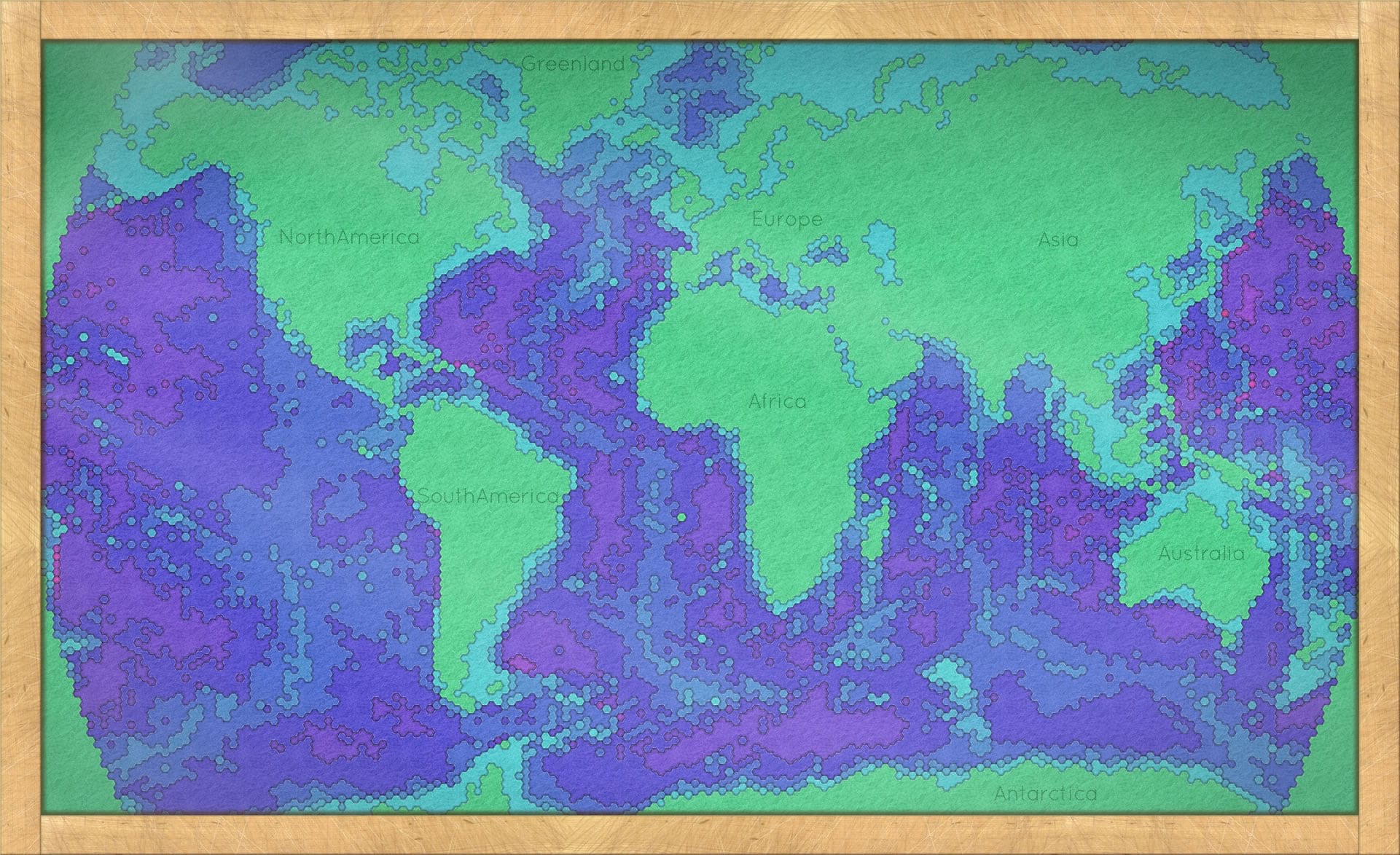
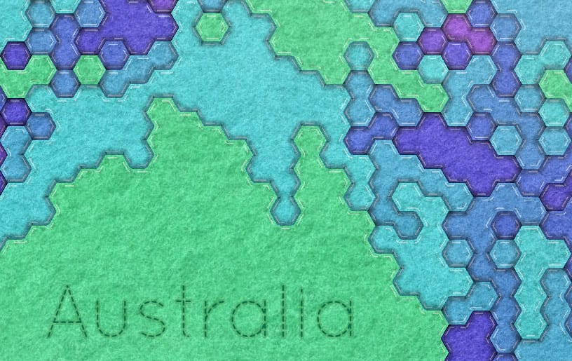
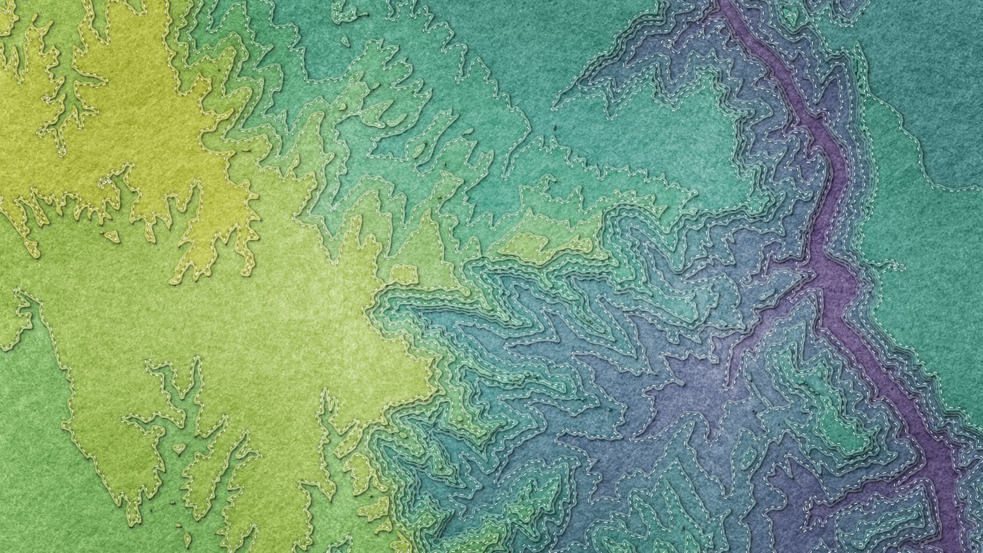
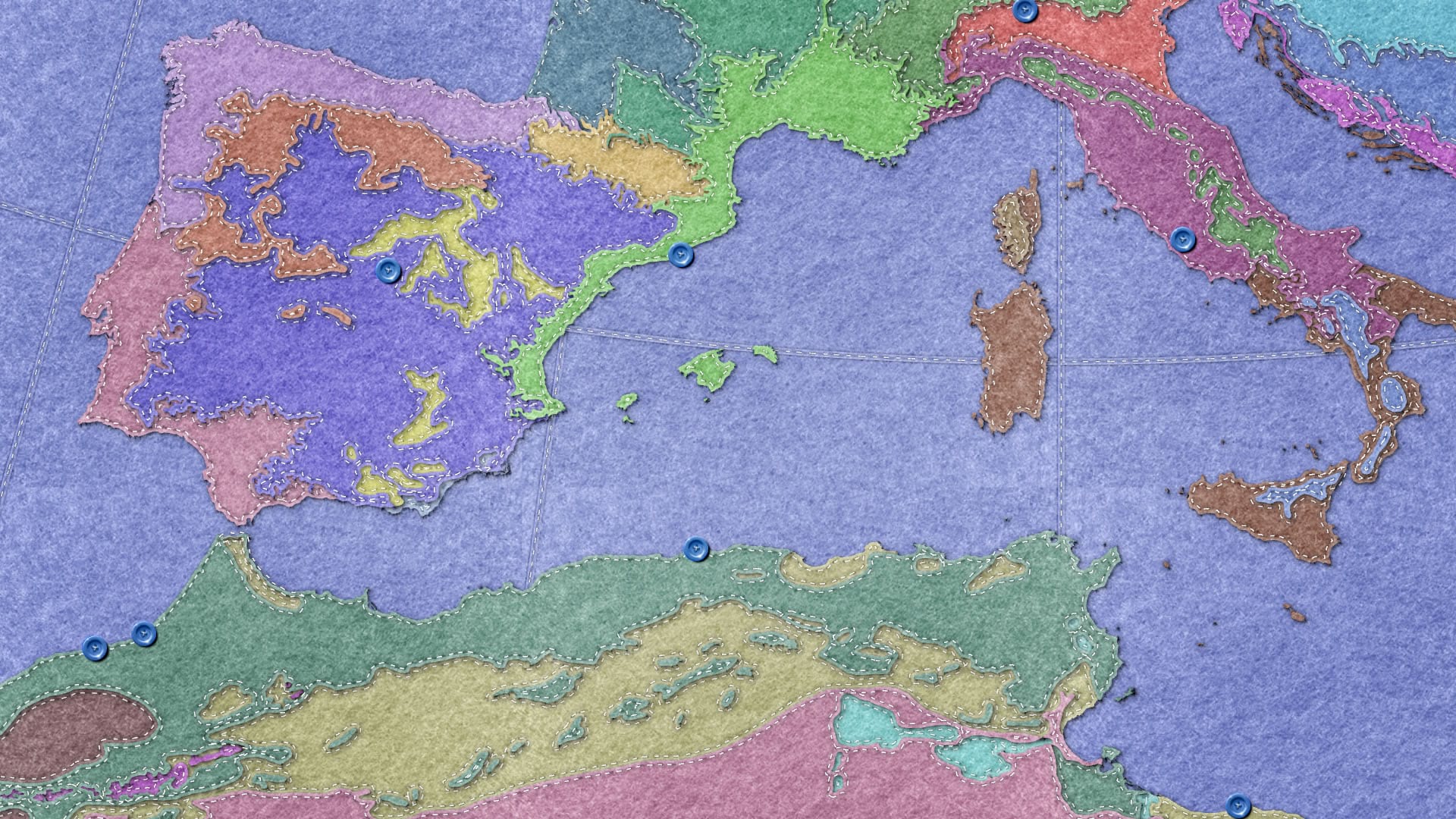
Here’s a closer look…
People liked it. It even showed up as some set dressing for the cartography mooc.
But Willow and I have been terrible selfish people for not making a reusable ArcGIS Pro style so that everyone else can make felt maps. Monsters, really.
Here is a style you can use to turn your maps into captivating colorful tactile fiber works of cartographic joy.
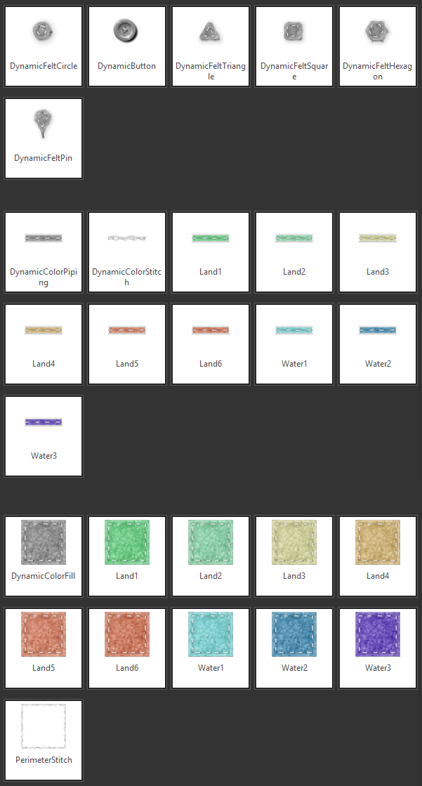
It’s got point, line, and polygon symbols. And I endeavored to make them all look like they were plausibly fashioned from wool, by golly (I’ll follow-up with a post describing how the symbols were made). I seeded the style with some colors, but each and every symbol can all be changed to whatever color you want. Dyed in the wool.
Here’s a quick reference if you want to learn how to add a style to an ArcGIS Pro project.
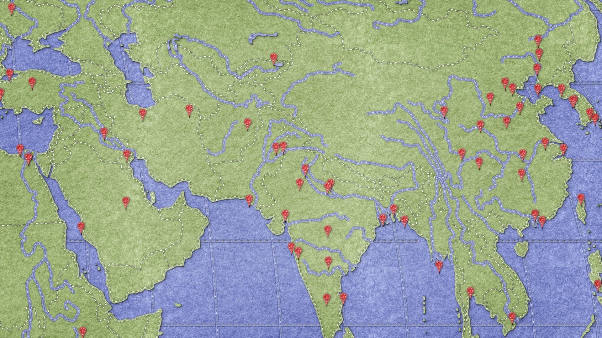
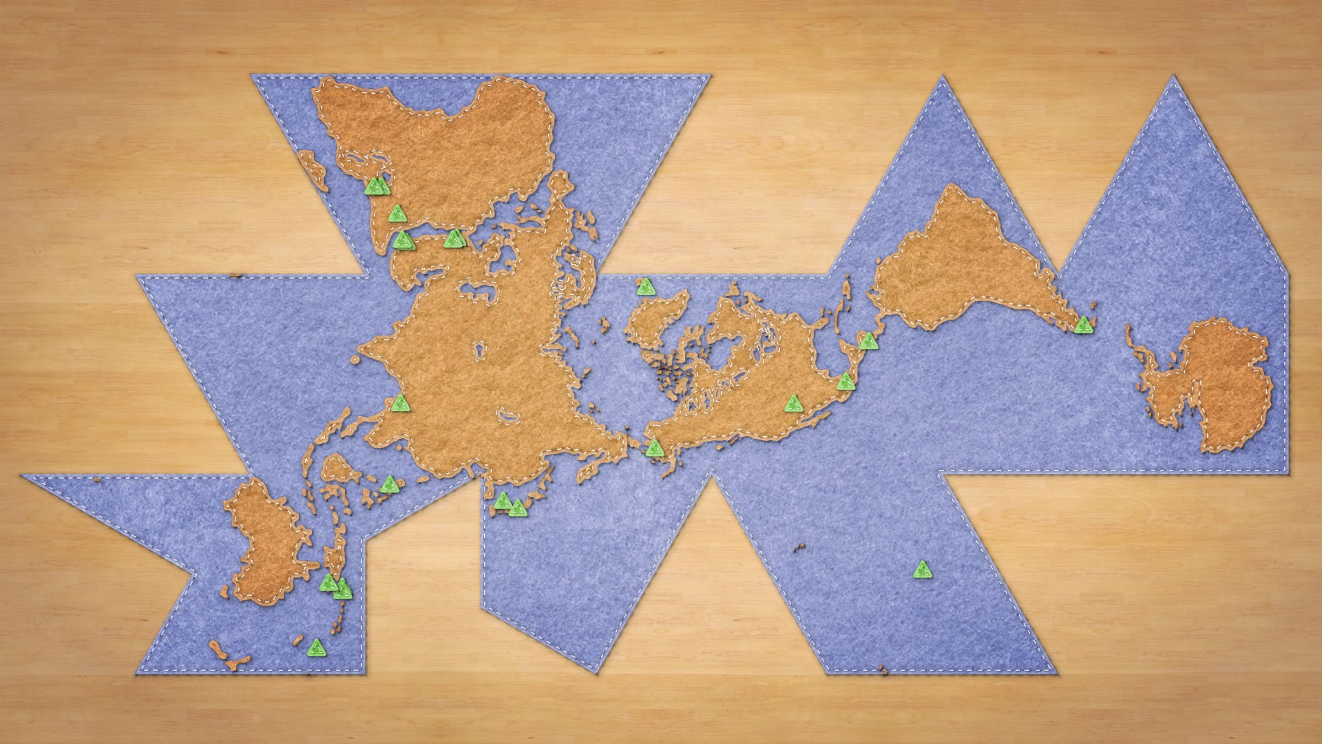
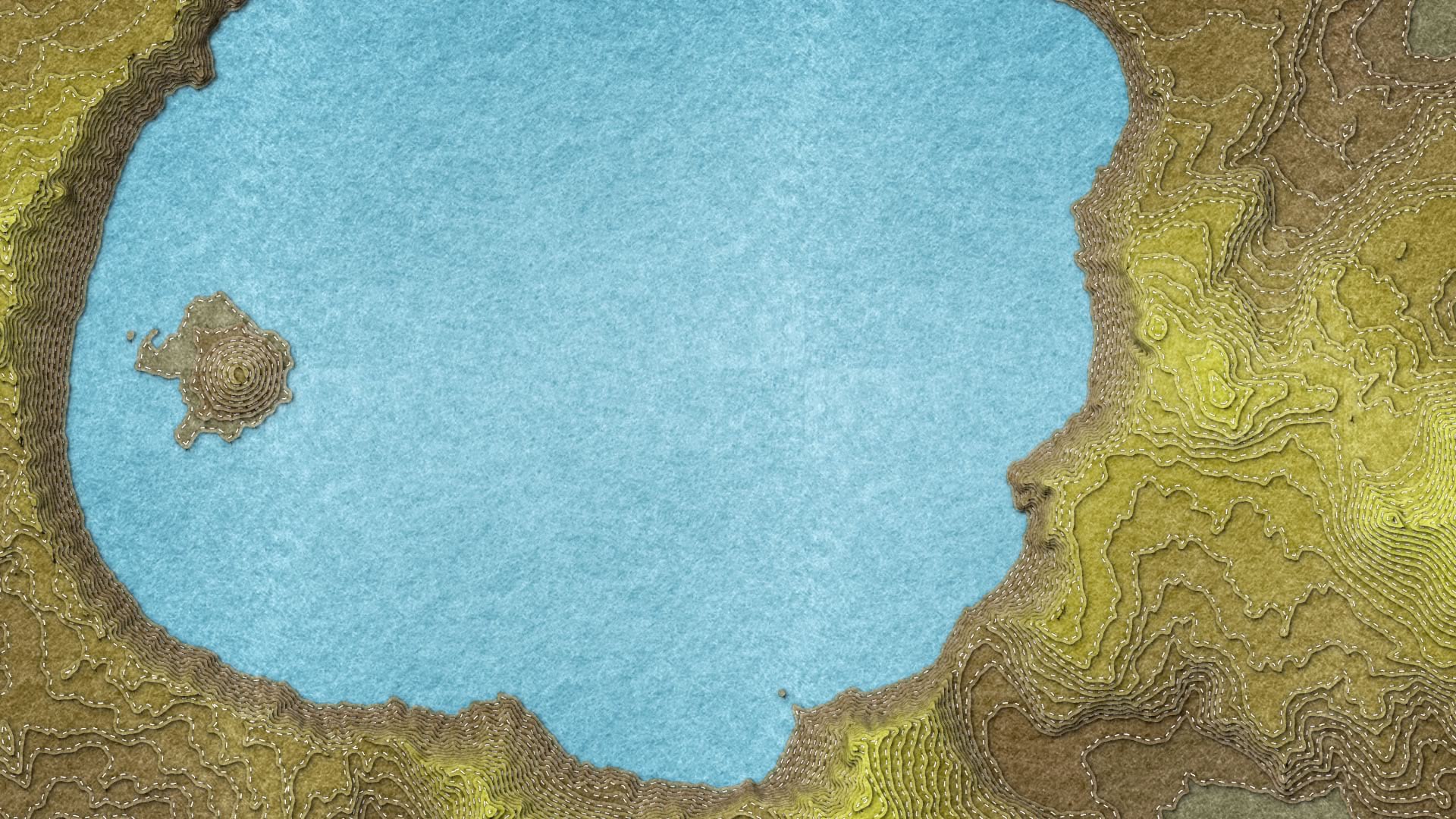
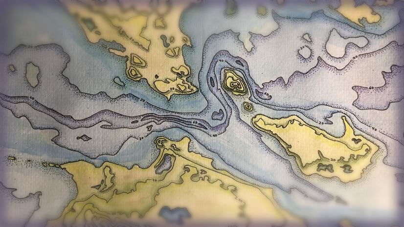
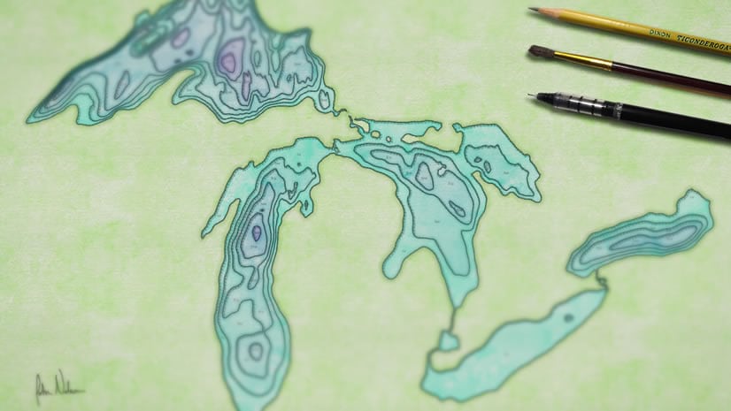
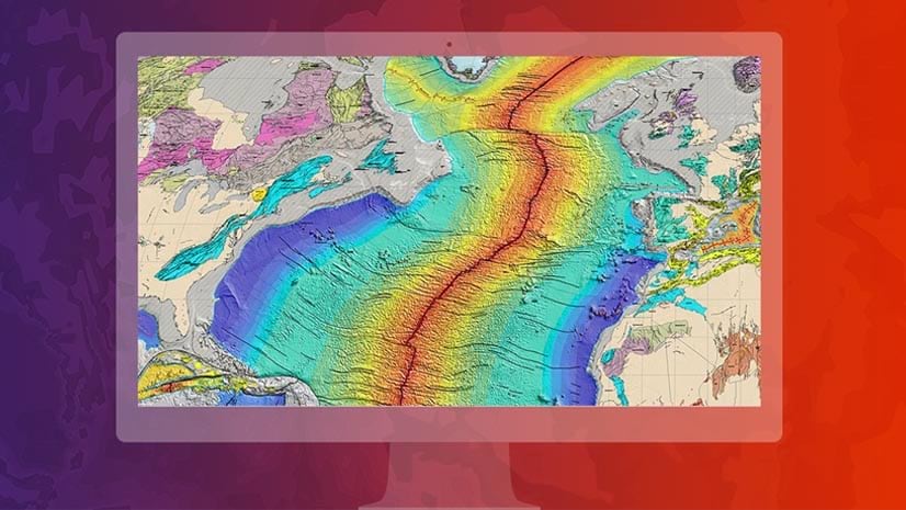
So what sorts of cozy maps can you make with this style? Here is an assortment of maps that I used while building/testing the style. You can grab all sorts of fresh data from the Living Atlas and stitch together all sorts of amazing things.
HOW
Here is a step-by-step if you are interested in how the felt is made (here’s the whole map-making-madness channel, if you are feeling brave). It covers the creation of a texture in Adobe Illustrator, using that texture image in Pro symbology, then saving and using a saved style. Also, you get to hear my nasally Midwestern accent, which you can take for whatever it’s worth.
Wait Wait, Why?
Seriously? Felt maps? Is this really a worthwhile endeavor?
Yes, and I’ll tell you why. Maps are wonderful instruments of geographic communication. They elegantly encode and reveal spatial relationships and insights. But they are also an aesthetically endowed tool. We humans are drawn to maps for their inherent beauty and utility. The world is swimming in visualizations and data products but it isn’t swimming in effective and charming communication. If your map can take the form of something that gives pause to a set of eyes, especially young eyes or the eyes of those not already predisposed to give a map a close look, then you are miles ahead. Maps that invite a wide eyed lean-in have the potential energy to connect with an audience that an otherwise uninteresting-looking map couldn’t. When a map is crafted with joy, or in an unexpected medium, they earn a greater audience.
When Willow asked me if we could make a map together it was an opportunity. Not an opportunity for me to impart some cartographic lesson to Willow, but to learn what a ten year old finds interesting and engaging. As the years that separate me from my own childhood accumulate, that sort of perspective is achingly ephemeral and wholly precious.
I don’t think you have to be ten to enjoy a vibrant and touchable map. I do think, though, that enjoying a vibrant and touchable map brings us back a bit closer to ten.
Happy Mapping,
John
P.S. If you feel like it, you can use this frame image I made in your layout. Just add it as a picture over your map (uncheck the “preserve aspect ratio” option in the properties dialog).
P.P.S. If you are interested in textile maps then you will probably revel in the beauty of the work of textile artist Bettina Matzkuhn.


Commenting is not enabled for this article.