Part 1 of a 4-part series on creating this set of posters for the Esri Germany and Esri Switzerland joint user conference.
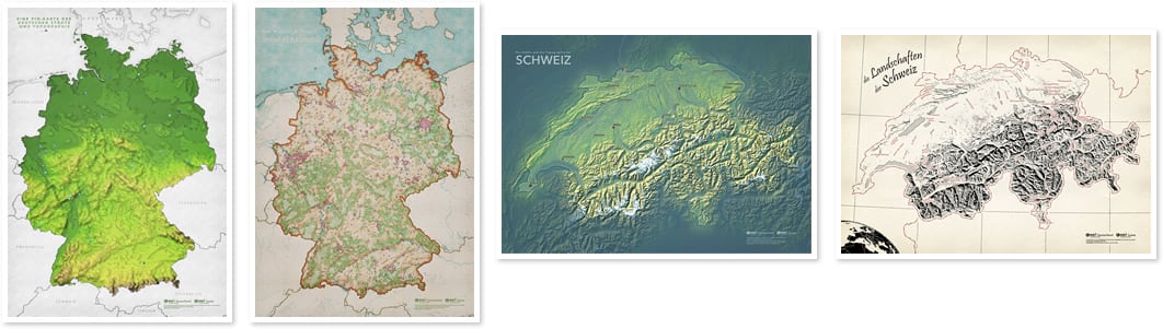
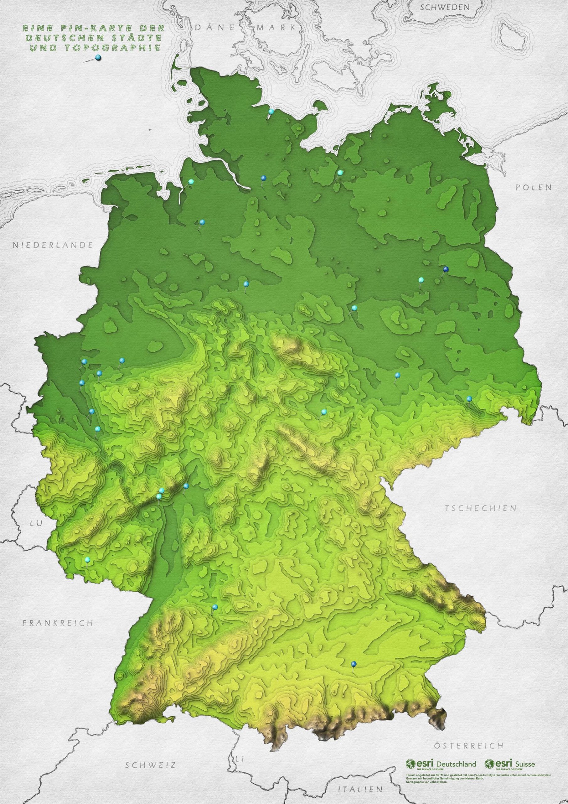
Here is a poster of the remarkable topography of Germany represented as meticulously cut and stacked layers of verdant colored craft paper.
It was made in Pro with publicly available data. The process I used (Focal Statistics and Contours) requires a Spatial Analyst license.
Digital Elevation Model
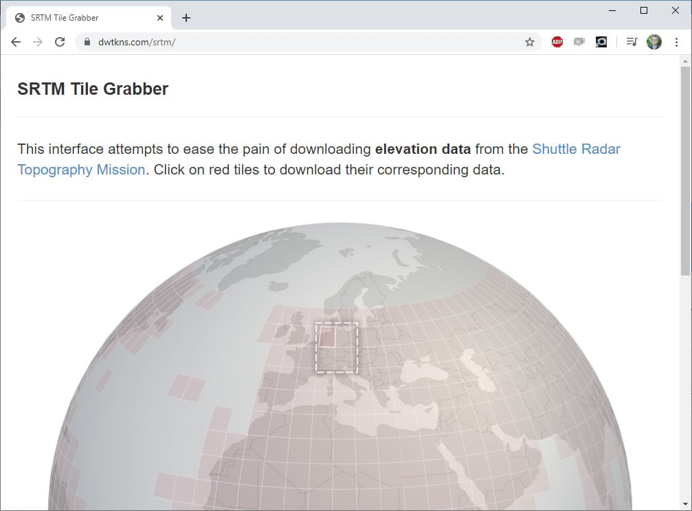
This whole effect pivots on a DEM source that we can blur and then slice up into contours. I have found that NASA’s Shuttle Radar Topography Mission (NASA: “hey, we keep flinging these crafts into space, what if we slap a sensor on there that collects elevation data and give it away to the whole world because we’re awesome?”) DEM data is so useful for all manner of small to moderate scale topo mapping (if you need mega-resolution, check out the excellent assemblage of fantastic topo sources brokered and merged into the impossibly convenient Terrain image service available in the ArcGIS Living Atlas). So while NASA’s technical acumen, creative brilliance, and data openness is just wonderful, it might feel a bit like a gauntlet run actually obtaining that sweet sweet data. Derek Watkins, however, ran the gauntlet for us and has created an intuitive application that lets you choose and download SRTM elevation model images (older 90 meter and newer 30 meter resolution). The coarser stuff is perfect for my map.
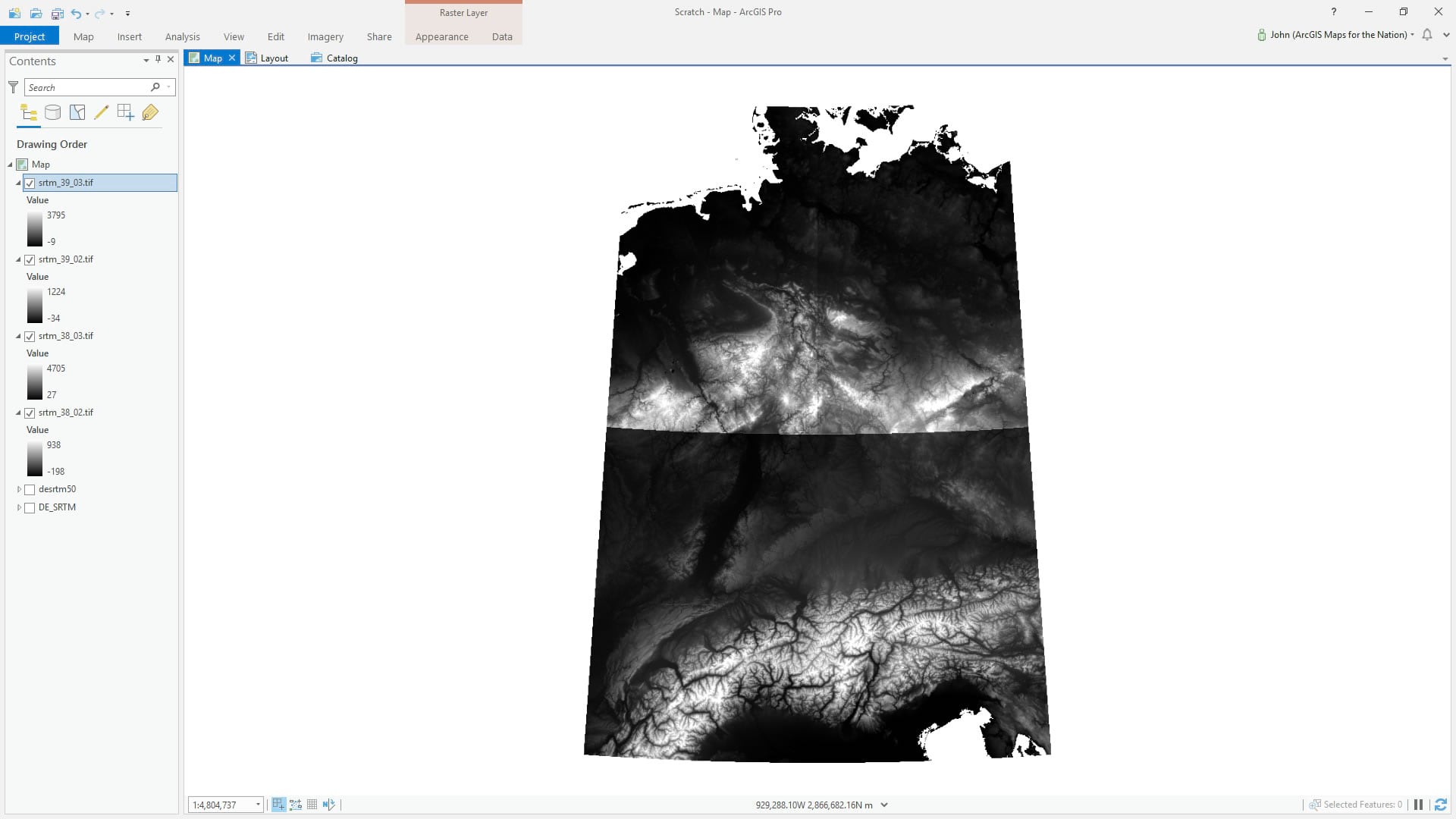
Conveniently, Germany (and Switzerland, for that matter) are nestled perfectly within four images.
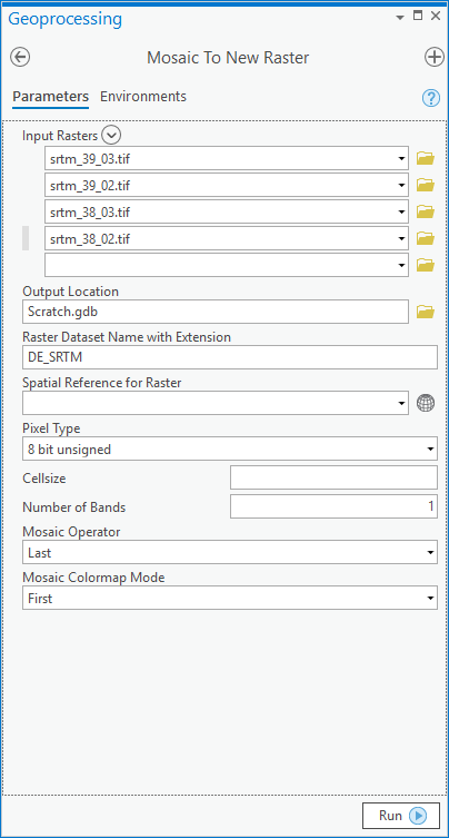
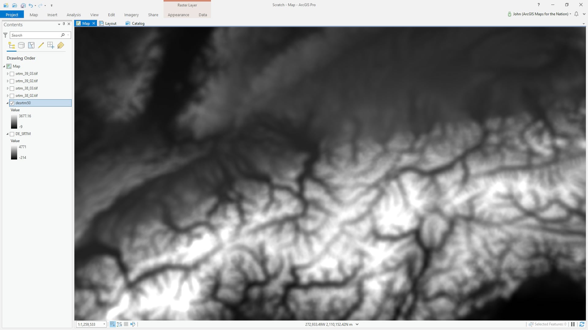
Here they are in ArcGIS Pro. You can definitely tell they are from four separate DEMs though, so we’ll need to stitch them together with the Mosaic to New Raster tool.
No problem.
Looks great! Thanks Mosaic to New Raster tool!
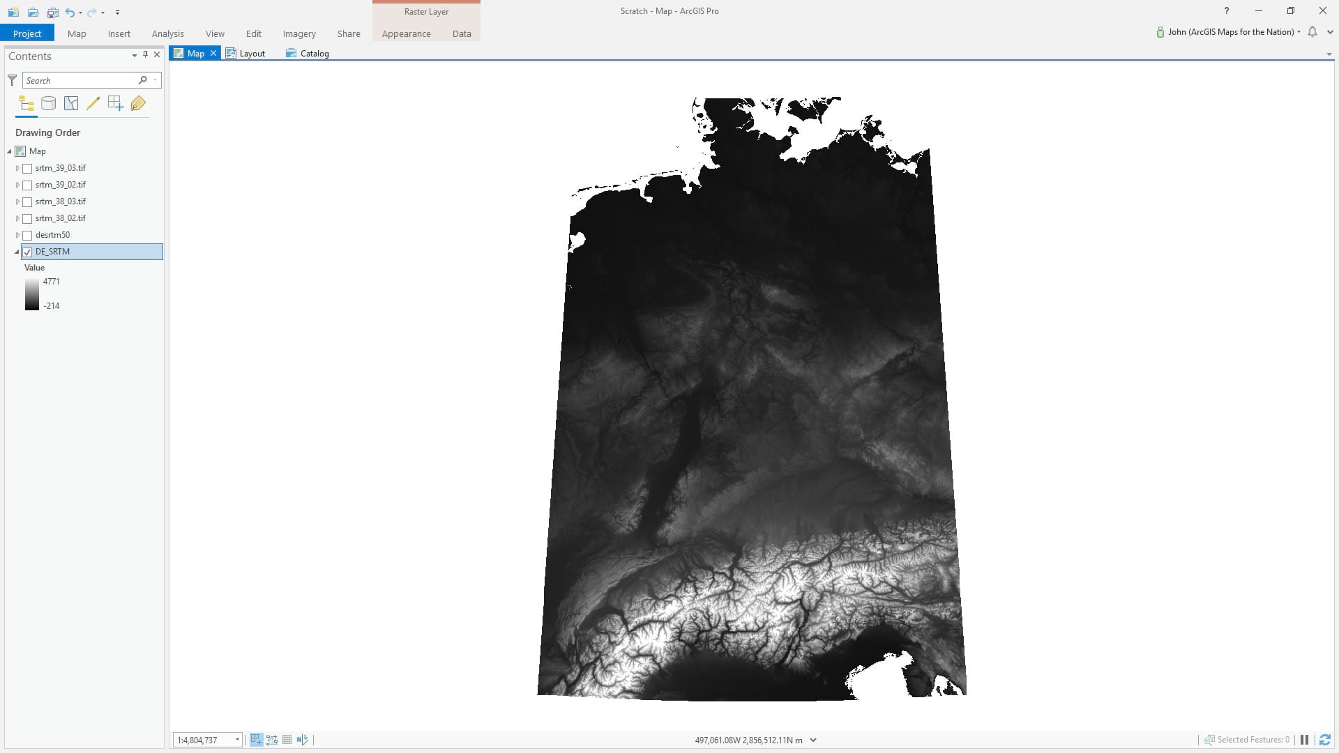
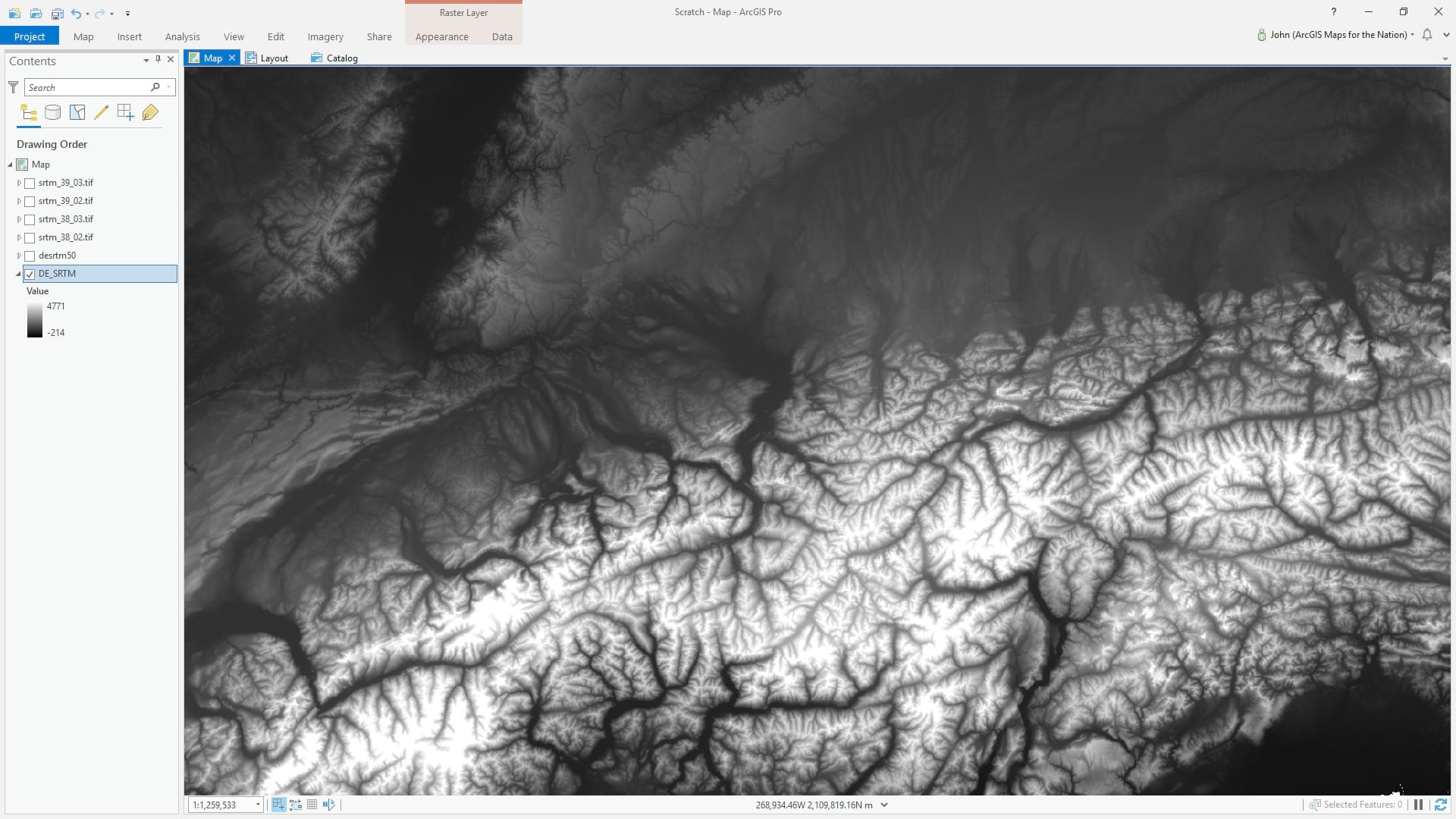
But, ironically, it’s too great. This amount of resolution would result in a paper cut map that is far too detailed and jagged to look believably analog. To sell the look of a real paper cut map, we’ll have to blur this DEM before we trace the contours.
GIS best practice note: when possible, generalize source data and not derivative data.
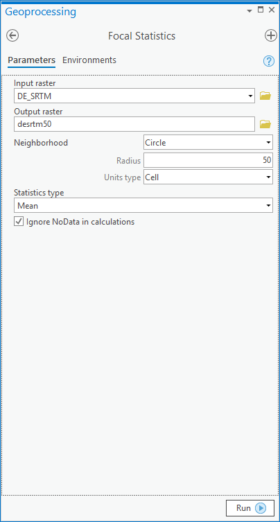
The curiously-named Focal Statistics tool will blur this DEM for us. I chose a blur radius of 50 pixels. Why 50? Because 200 turned out to be too much and 20 wasn’t enough.
GIS pragmatism note: your eyes and brain are the best algorithm to determine the cartographic goldilocks zone of scale and generalization (“Nope. Nope. Yup, there it is!”).
Ah, ok there we go! Nice blurry elevation that will give is smooth, rounded, plausibly proto-paperish, contours.
Contours
Ok, we’ve got a blurry DEM! Time to party! If I had a dollar for every time I’ve said that…
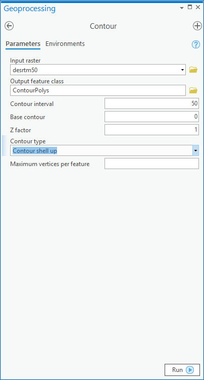
With the Contour tool (spatial analyst or 3D analyst) you can feed it a DEM and it will hand back a lovely vector contour layer. But we have options. The one I’ll use to make a stack of overlapping slices of equal-elevation polygons is called, obviously, “contour shell up.”
And pow! Just like that we have a nice tidy stack of elevation polygons.
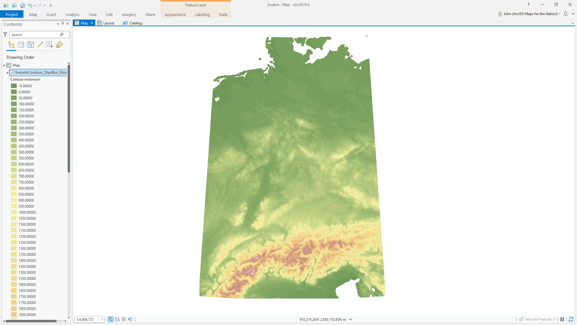
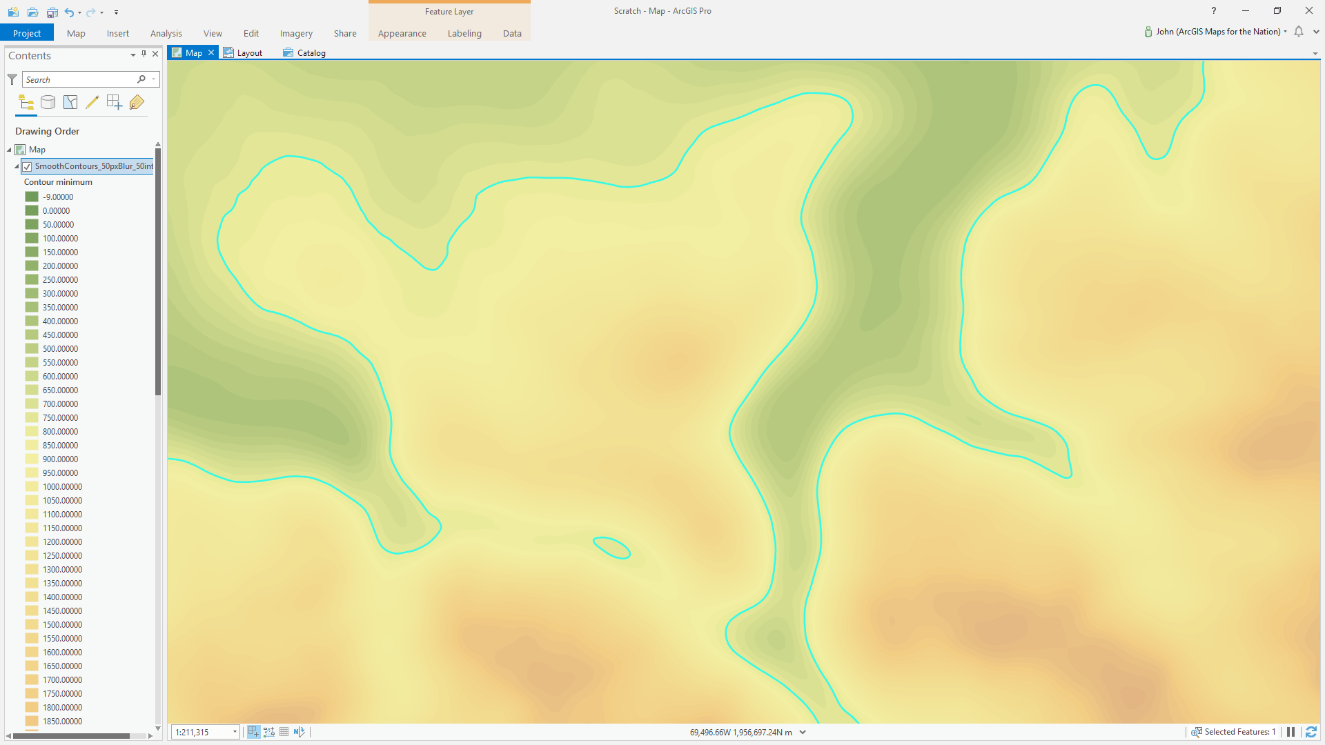
But at this scale it almost looks like I just applied a color gradient to my DEM. Here’s a closer look, with one of the polygons selected…
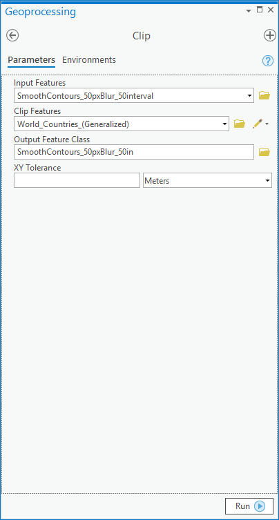
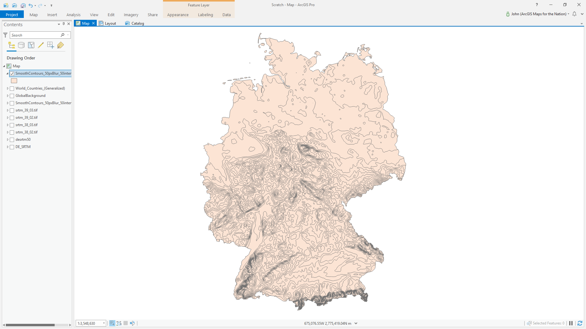
Clipping Out Germany
At this point we’ve got a contour polygon layer that covers the somewhat arbitrary extent of our four merged DEM images. I’ll be honest, this clipping step is optional, since I did it before later deciding to use an overlay polygon which sort of negates the benefit. But we are irrational creatures so just hear me out.
In the Add dialog, I clicked the Living Atlas tab, which has a lot of boundary layer options. What a treasure trove. I added the generalized countries layer. If you prefer, you can also use the “Admin 0” shapefile from Natural Earth (lots of other great stuff there, too).
GIS data advice: use what works.
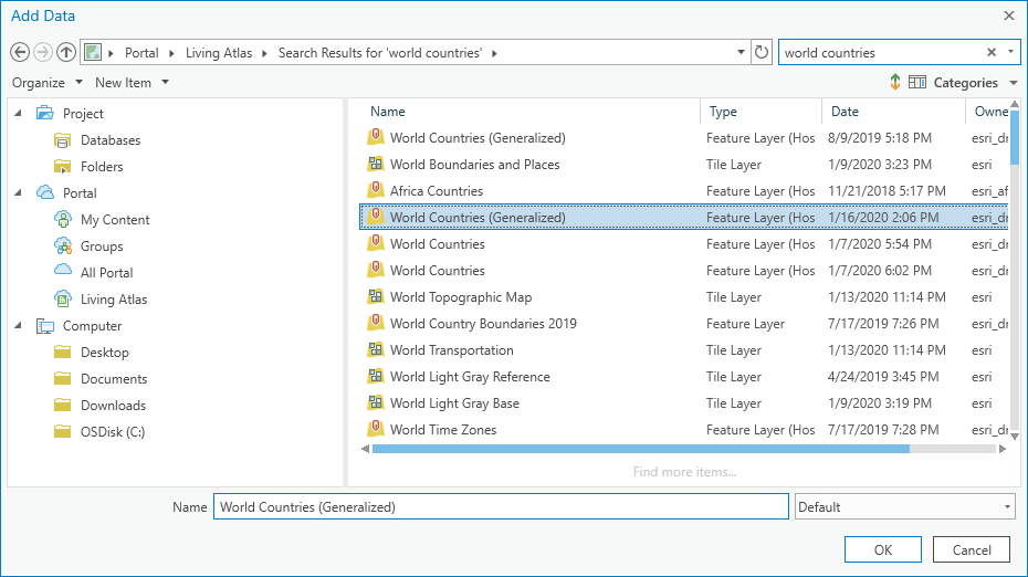
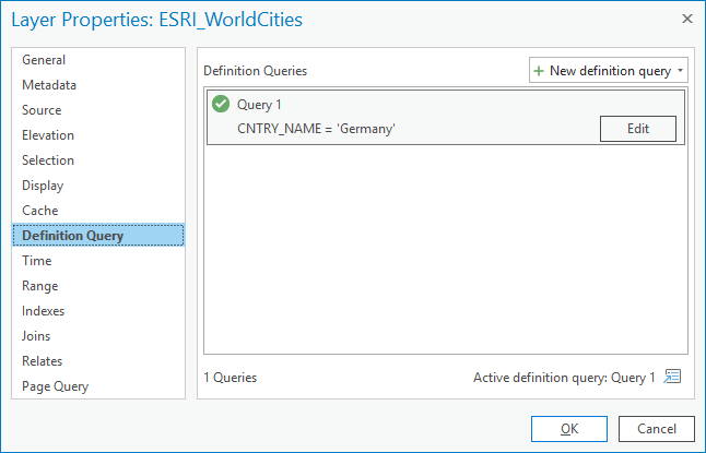
Then it’s just a matter of doing a Definition Query to isolate Germany and running the Clip tool.
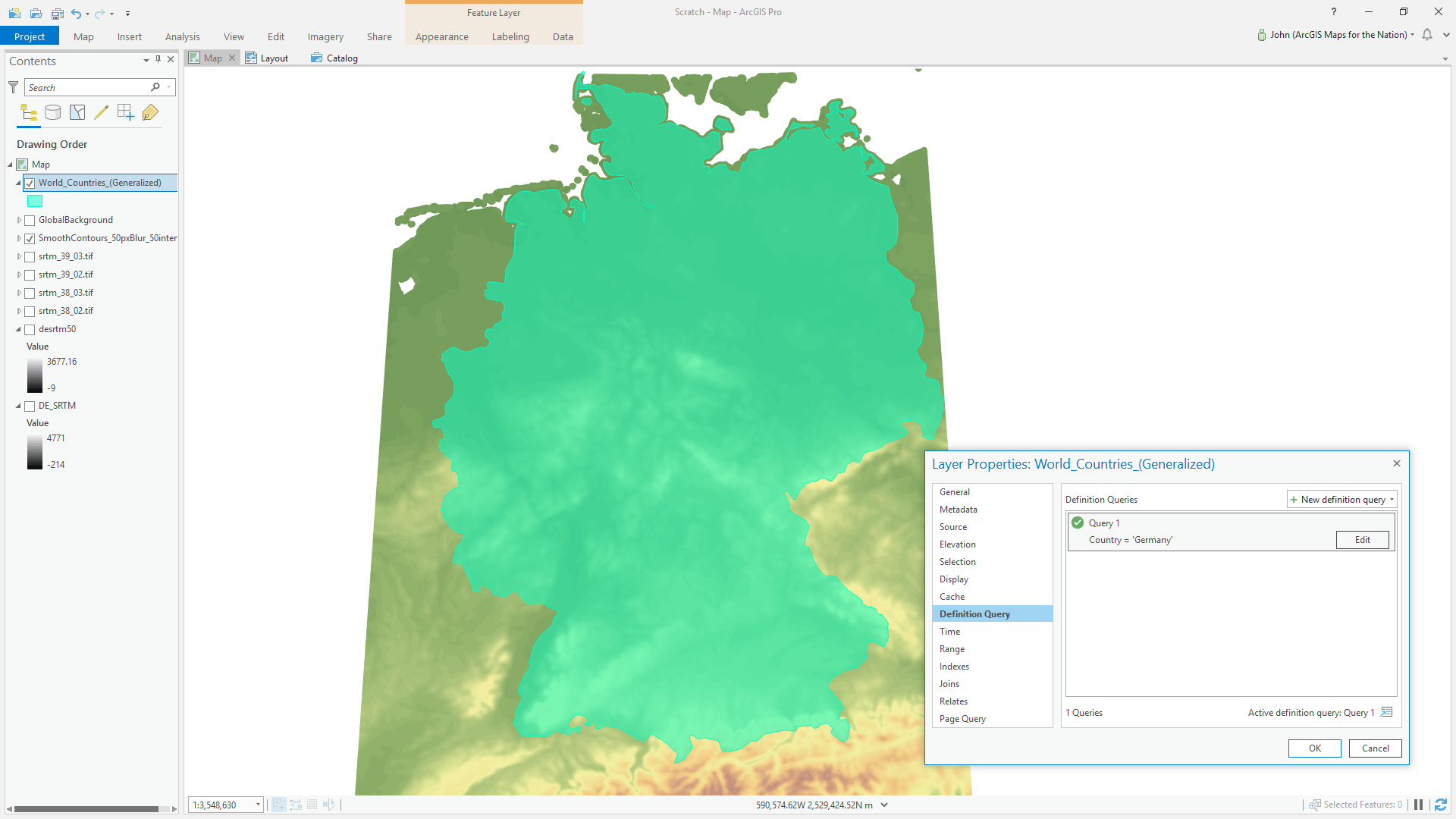
Ich präsentiere Ihnen die Konturen Deutschlands!
Paper Cut Style
Oh my gosh! I’m so excited for you to share this moment with me. There’s just something magical and charming about transforming crisp vectors, the stuff of precision and theory, and turning them into something real! Something you want to lean in and touch!
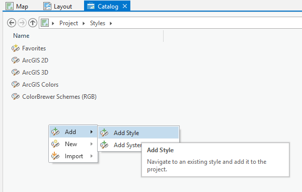
The Paper Cut style is available here. You will download it. It is your destiny.
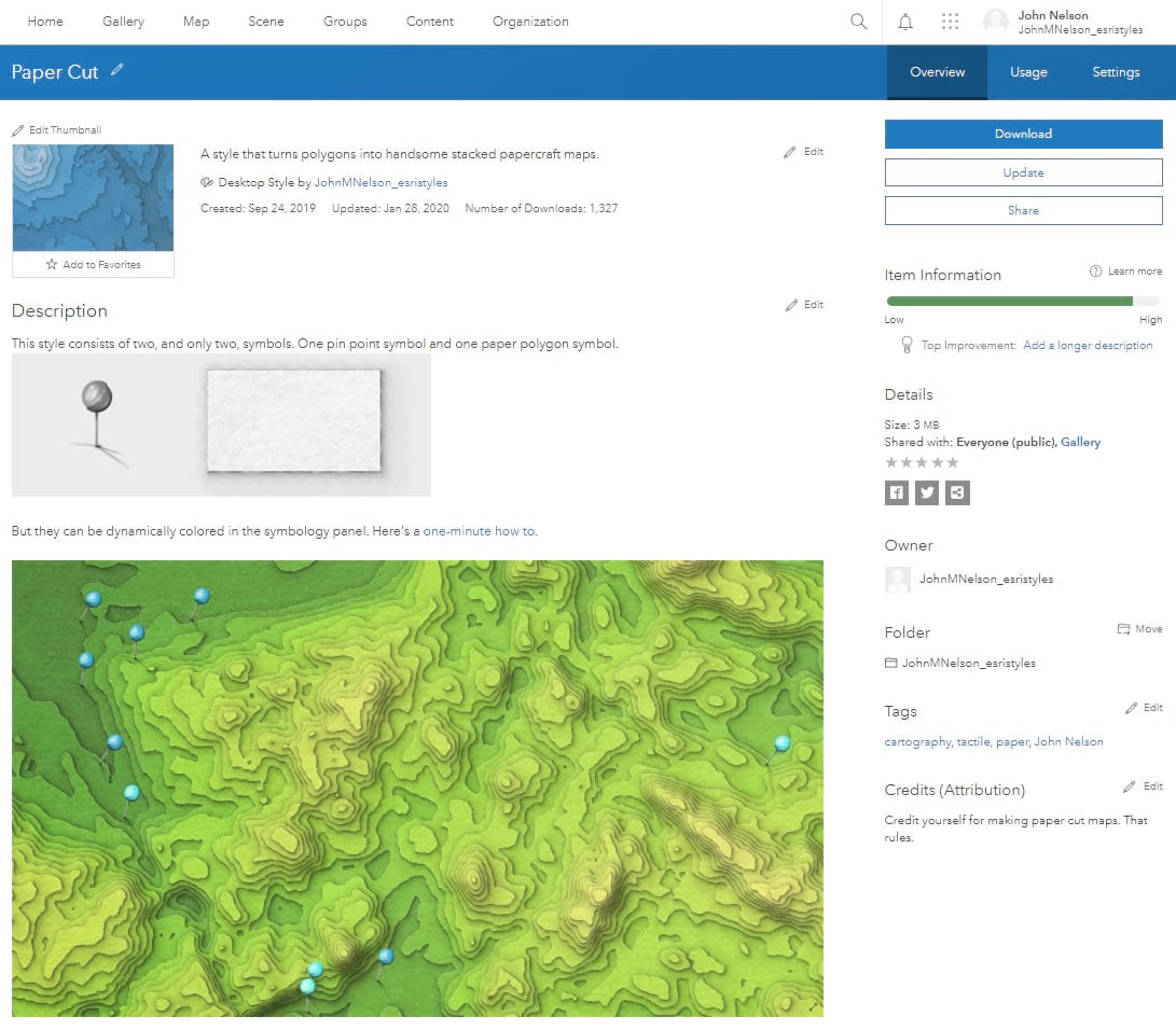
And just add it to your project, as I have done, via the Catalog.
GIS how-to-ism: If you ever accidentally close one of your Pro tabs, they aren’t gone. Just go into the Catalog and open them back up.
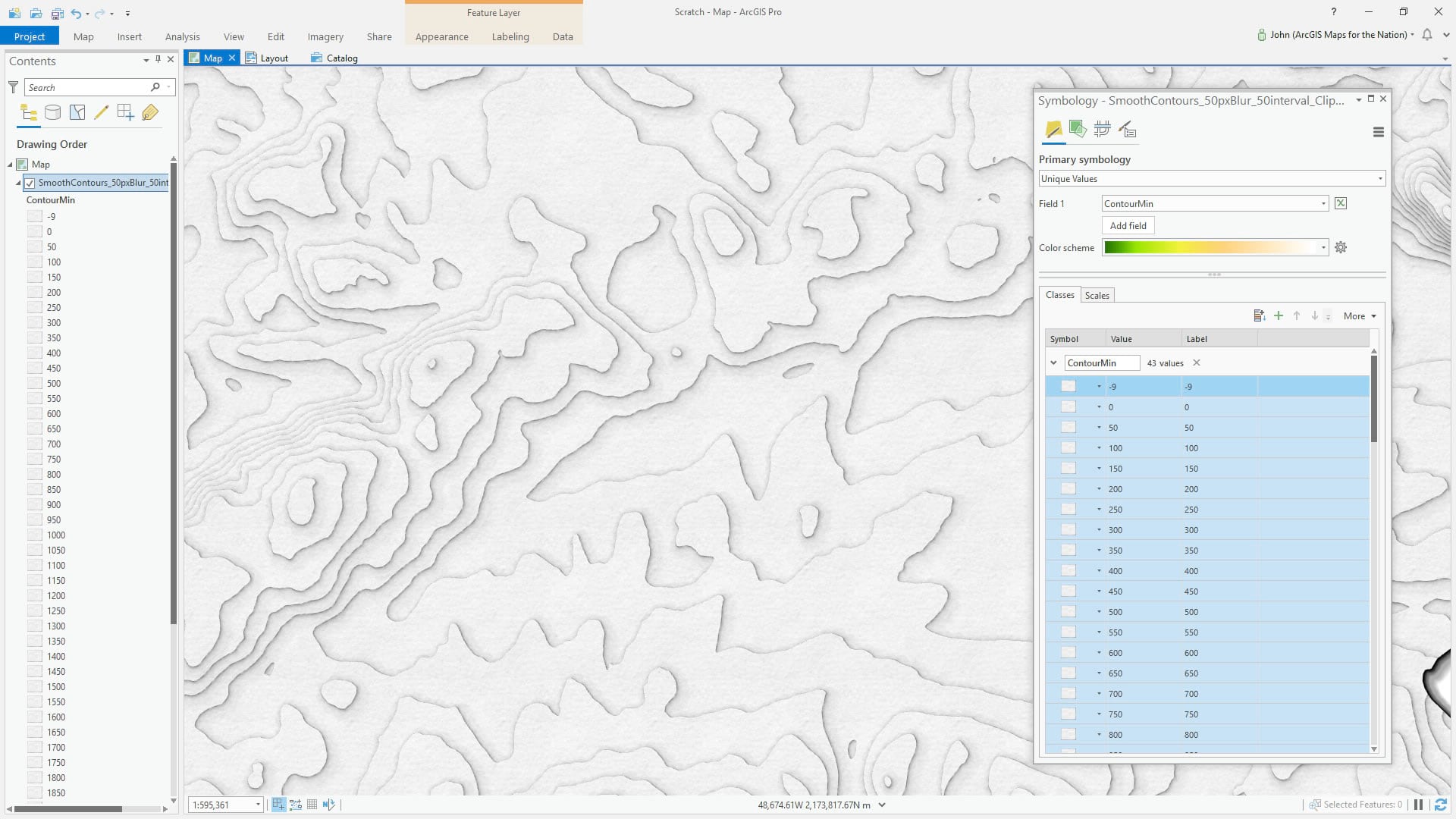
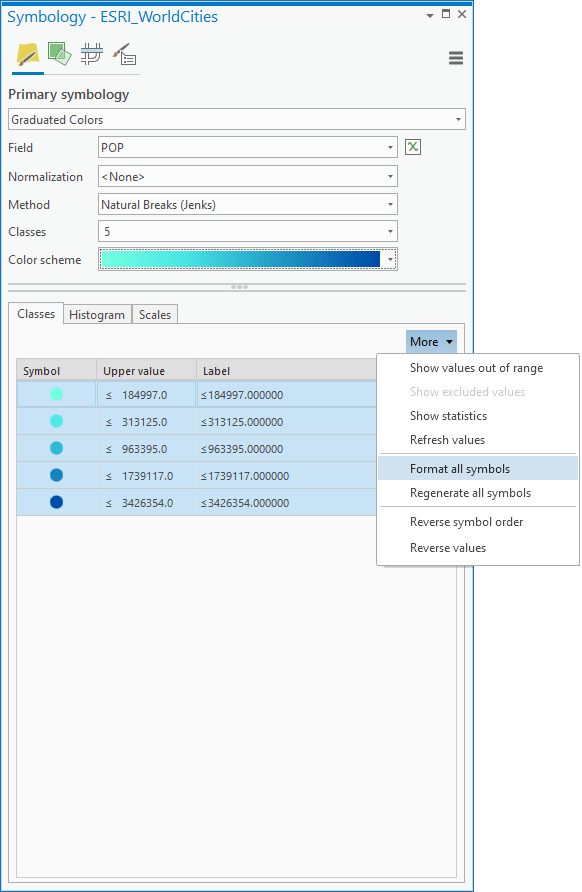
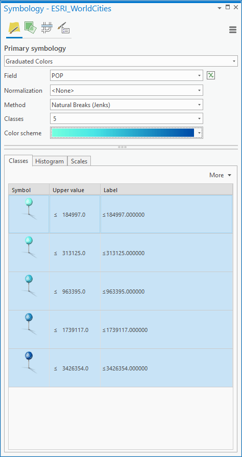
Ok, before we apply our style (I know, can’t wait, right?!), we’ll get the symbol type and range stuff set. For these contour polygons, I’ve found it’s best to use “Unique Values” by elevation. This is a very rare use of unique values for me, I almost never use that. Then I give it a nice little color gradient. GIS cartography prompt: you aren’t stuck with the default droplist of color schemes; choose the “format color scheme” button at the bottom of the color scheme droplist and let the glories of full chromatic control wash over your stunned façade, breathing new creative energies and empowerment into your cartography. Defaults aren’t the boss of you.
But no paper yet. Well, my friend, simply choose the “format all symbols” option in the “more” droplist. When they say more, they are not kidding.
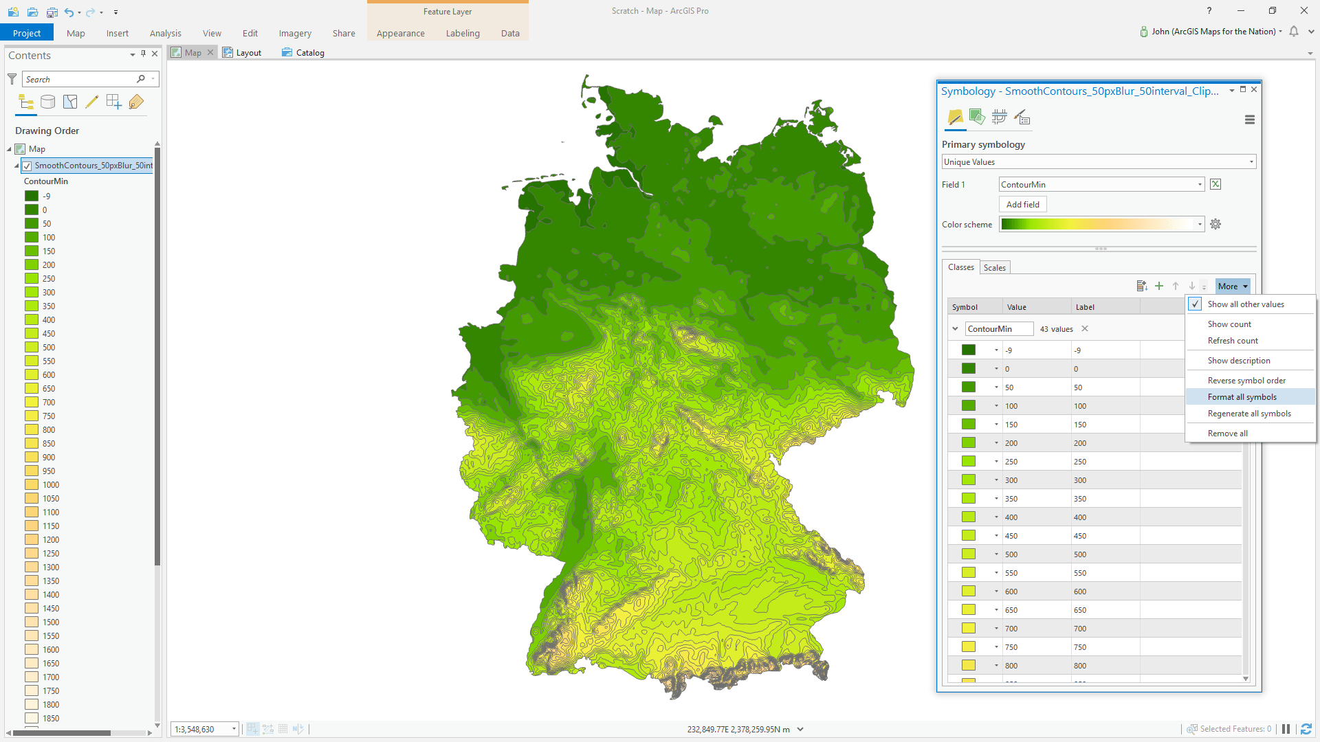
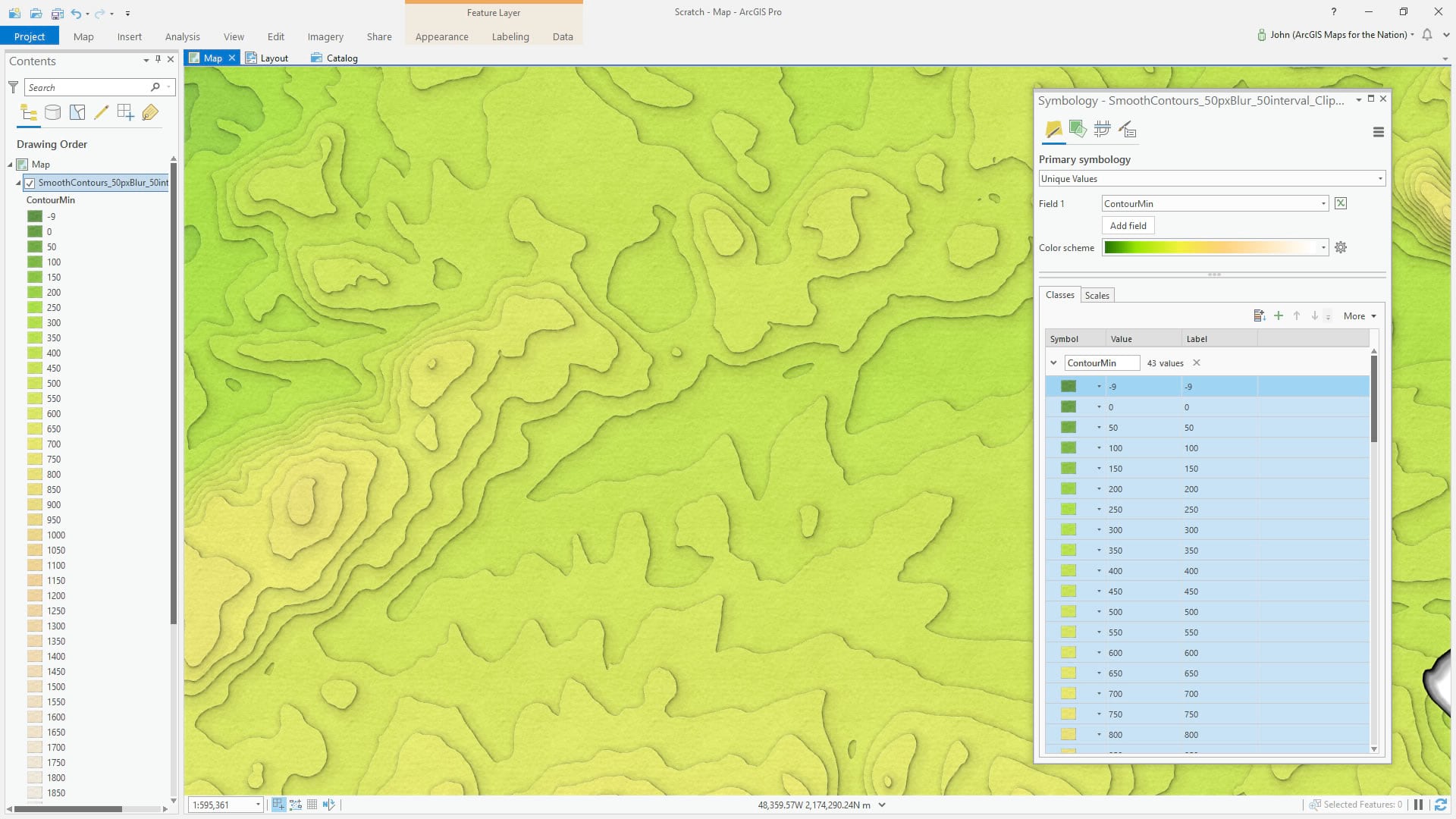
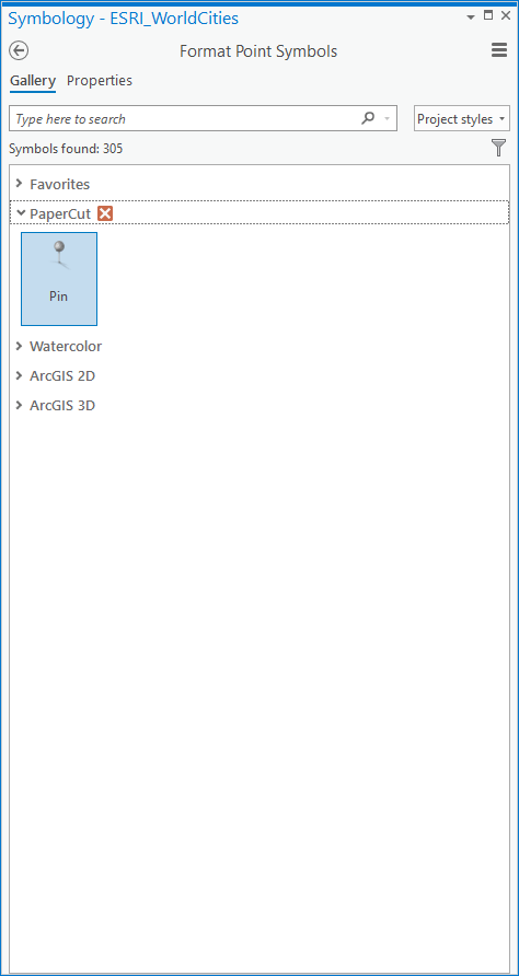
Ok, this slides the symbology panel over to reveal the “Gallery” tab. This is where all your styles live…including the luscious Paper Cut style you just installed (right?). Oh my, just one option though?
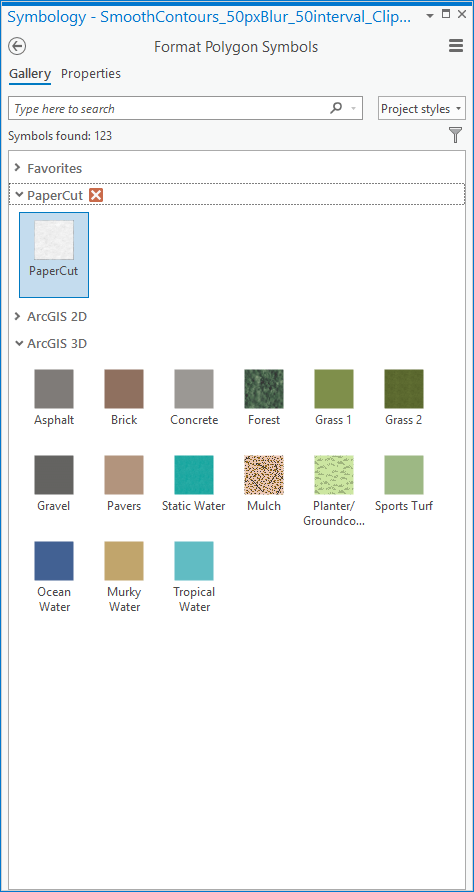
Yes. One deceptively simple glorious little option. Choose this papery symbol…then give it a minute to render. It’s doing some heavy lifting.
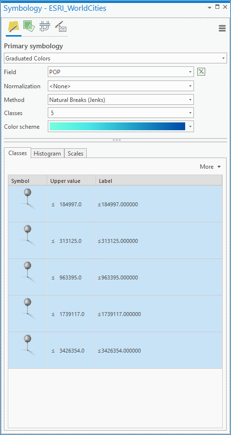
Ok, but they’re all the same white paper color! Not to worry, this symbol can be re-colored dynamically. Just re-select your color scheme from the droplist to remind it of its chromatic destiny.
If you’d prefer to watch a one-minute map hack video where I walk through this, you can find that here. It was actually nominated for an Oscar for best digital short, if you can believe it. Fingers crossed; wish me luck.
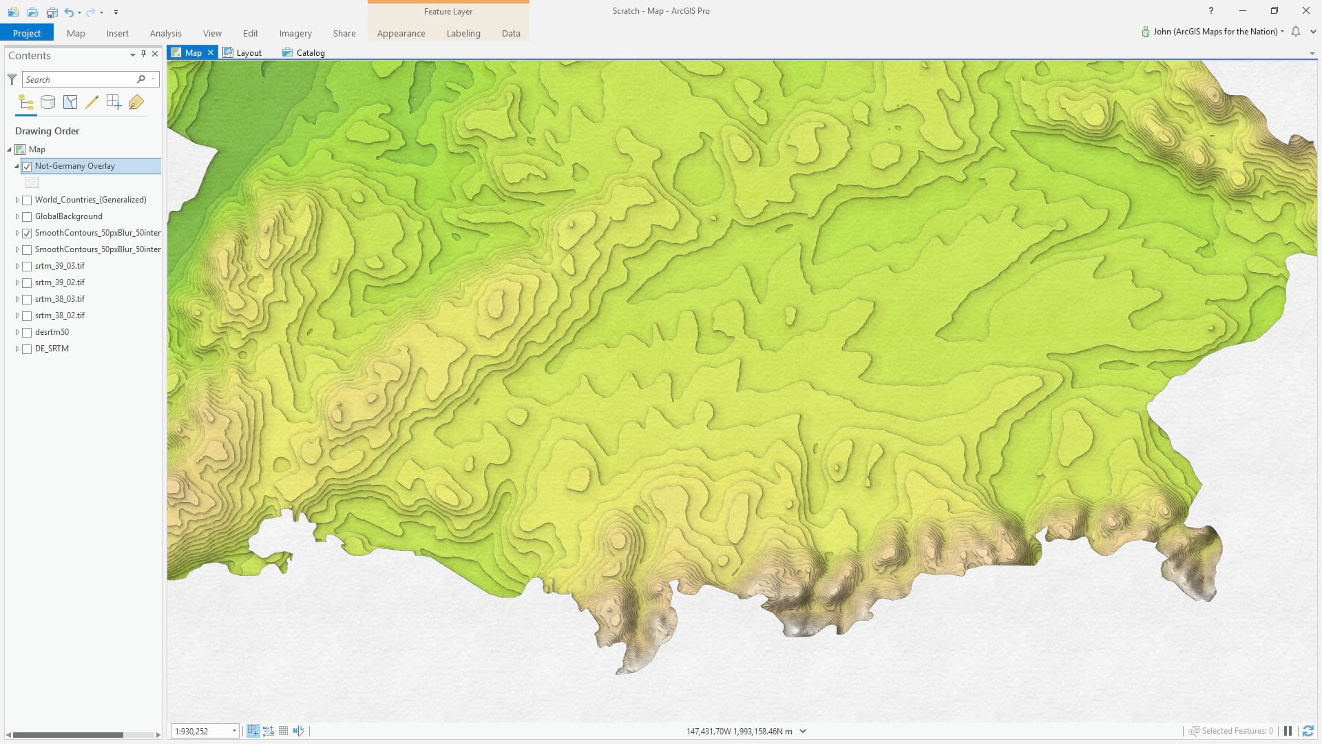
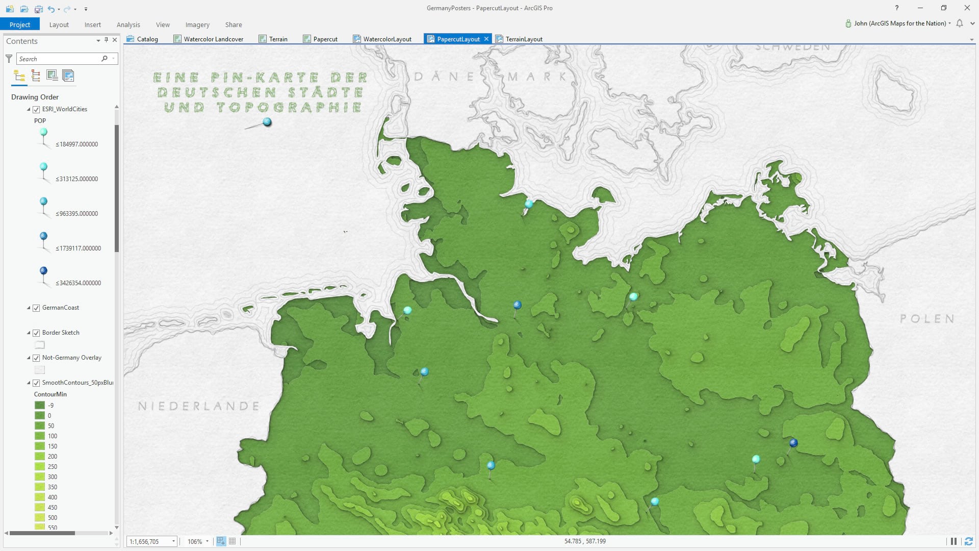
Overlay
Looks cool and all but gosh, all those Alpine paper stacks casting their shadows at the bottom of Germany bugs me.
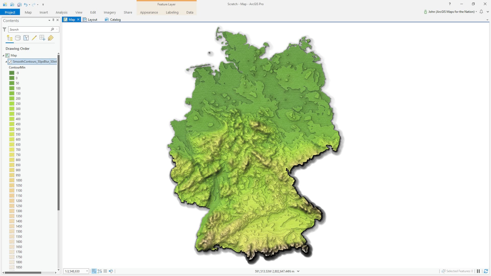
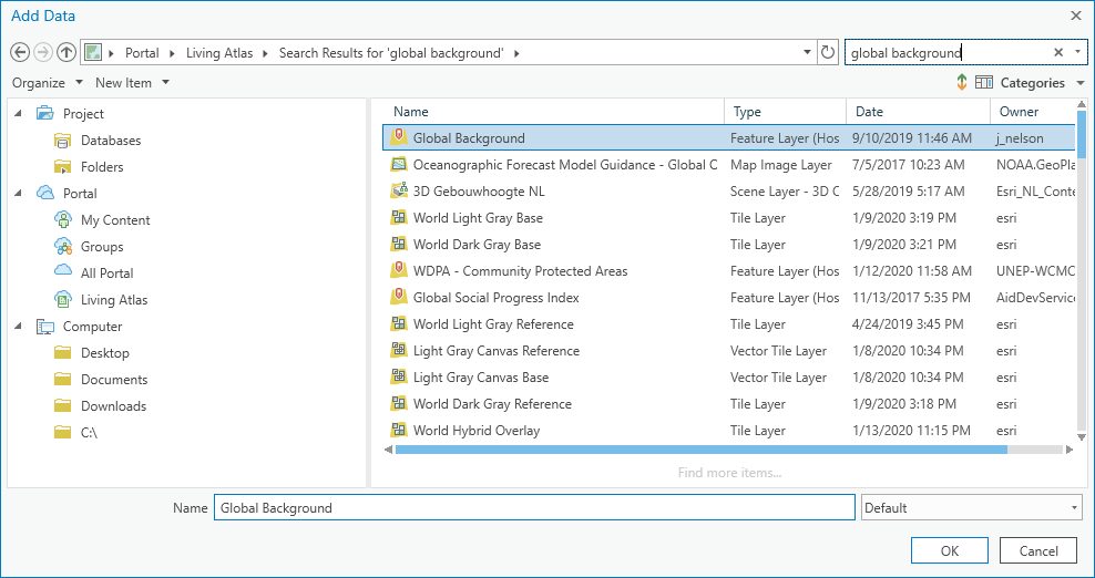
I had planned on using a paper texture for the background but I think it might be cooler to apply a paper texture to an overlay! Let’s add the trusty old Global Background layer from the Living Atlas. It’s just a single polygon that covers the whole world. I use it frequently and with great relish.
If you skipped the Clipping step above, you’ll have to add a countries polygon layer at this point, and use a definition query to show only Germany.
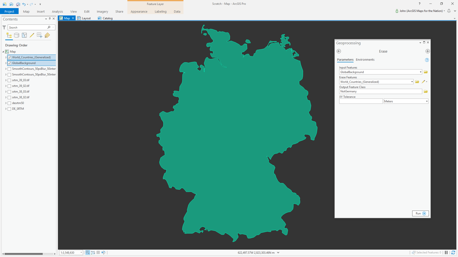
The Erase tool (if you don’t have this license, just use the Union tool and delete what you don’t need—I got your back). Then just apply an un-colored paper cut symbol to the resulting not-Germany polygon! Much better. Also, if you’d like to see a one-minute video of me doing this, check it.
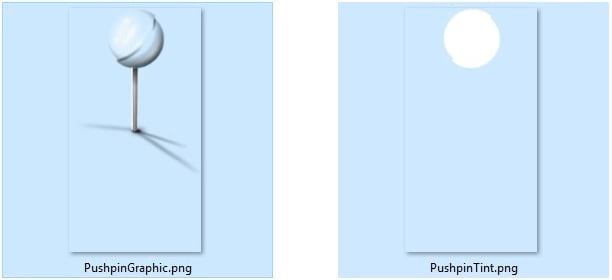
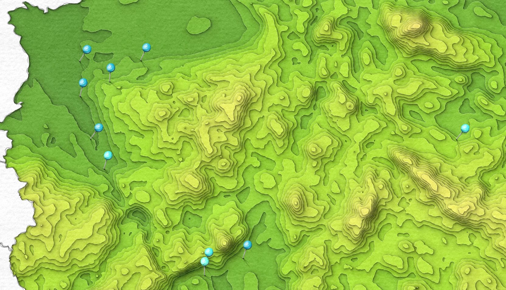
Push Pins
After looking at the paper cut map of Germany, I like it and all, but I felt like it could use a bit more…something. In the past I’d toyed with the idea of adding a pin symbol to the Paper Cut style but never had a solid motivator. This was the requisite motivation. I shared the progress on Twitter, for Photoshopping up a dynamically colorable symbol, something I quite like to do (both sharing inane stuff on Twitter and also creating graphical resources for symbology).
GIS community advice: share your process, sharing secrets makes everybody more adventurous and demystifies the most bonkers maps.
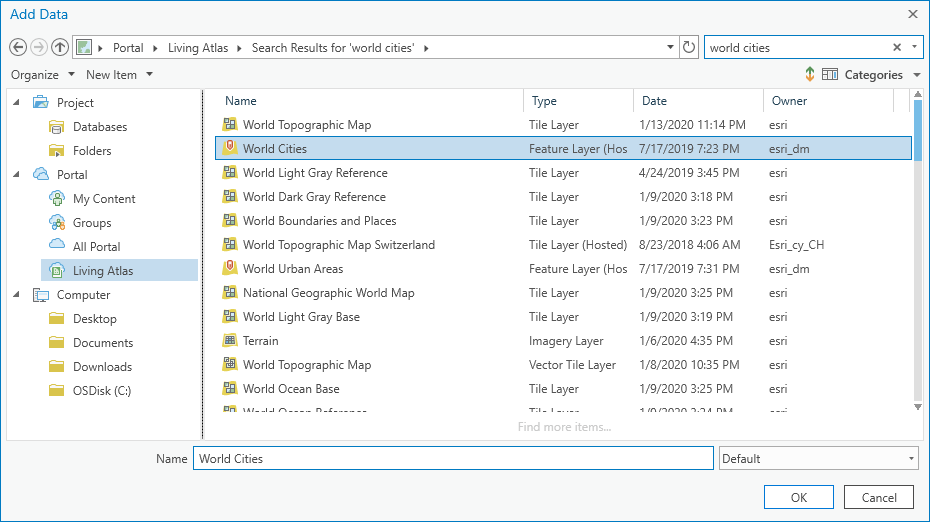
I added a world cities layer to the map, from the Living Atlas.
Then isolated only German cities.
I ranged and colored them up, and headed straight for the Pin symbol in the Paper Cut style.
And re-applied the color scheme to the pin symbols (for realz, these one-minute maps hack videos are handy for making transparent all sorts of tradecraft).
When all the pins are on the map at exactly the same angle it looks artificial. When I put pins in things it’s all willy-nilly. How can we add in some humanity to these things? By giving them just a bit of randomized rotation.
GIS user experience postulation: skeuomorphism isn’t dead, it just has less competition now!
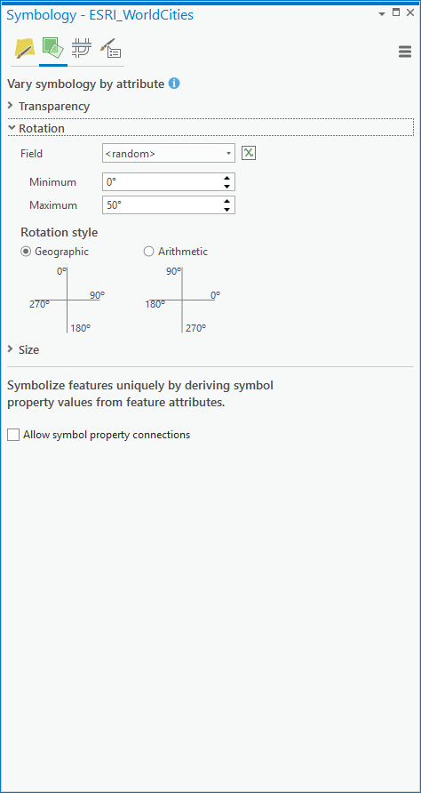
There we go. A bit of wabi sabi. Jinnan Zhang, a friend and colleague, lent me a book about this once to read on a plane trip. It’s had a pretty big influence on my work.
GIS academic prompt: don’t stay in your own lane; everything in your experience makes your imagination and work richer.
Extra Credit
Notice how the map title and country labels have a sketched/painted appearance? I applied the Watercolor style to them (and unchecked the paper symbol layer). Yes, you can apply polygon styles to text, and you should.
See those charming little vintage waterlines that ripple into the North Sea? Learn how to do that here.
Viel Spaß beim Mapping! John
GIS statement of gratitude: thanks so much for reading (skimming) this through. I’m honored to get to make maps and share them with you, but especially honored to be in the position of sharing my process. I love hearing from you and if you ever have a question please shoot me an email.

Commenting is not enabled for this article.