Part 2 of a 4-part series on creating this set of posters for the Esri Germany and Esri Switzerland joint user conference.
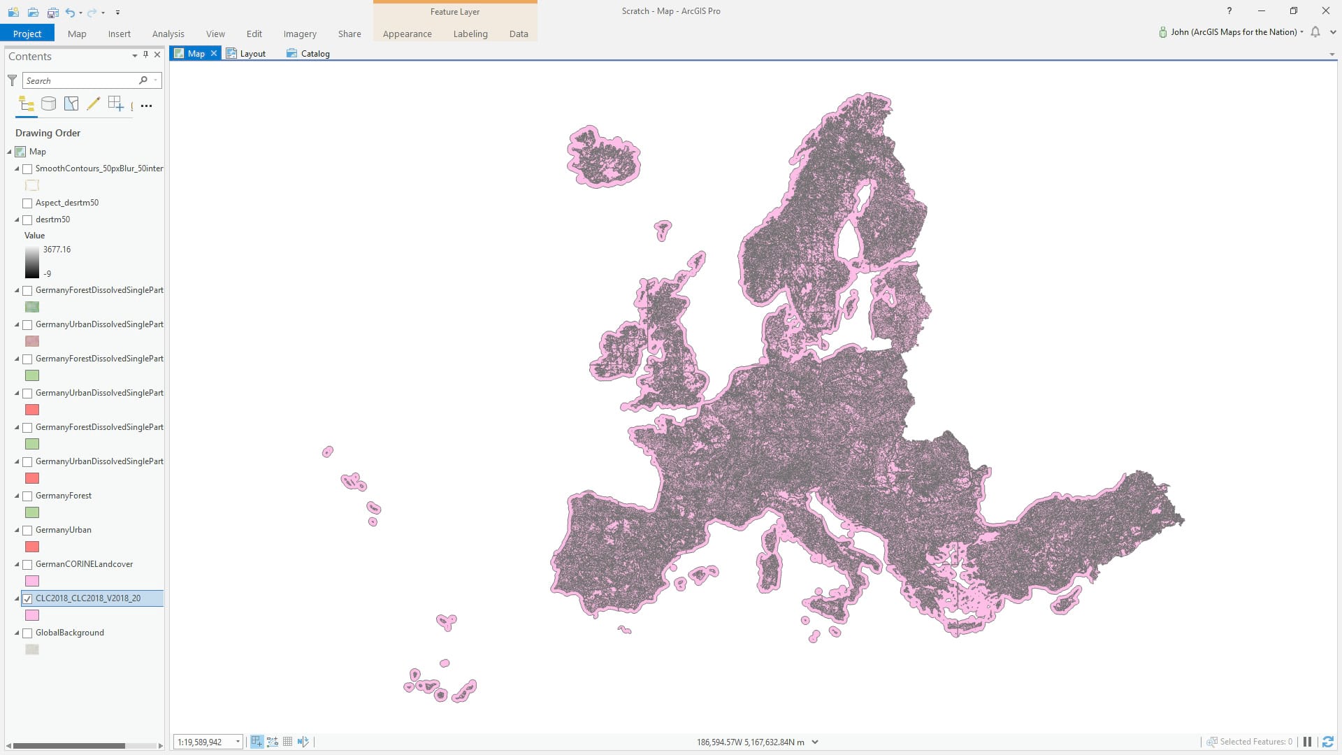
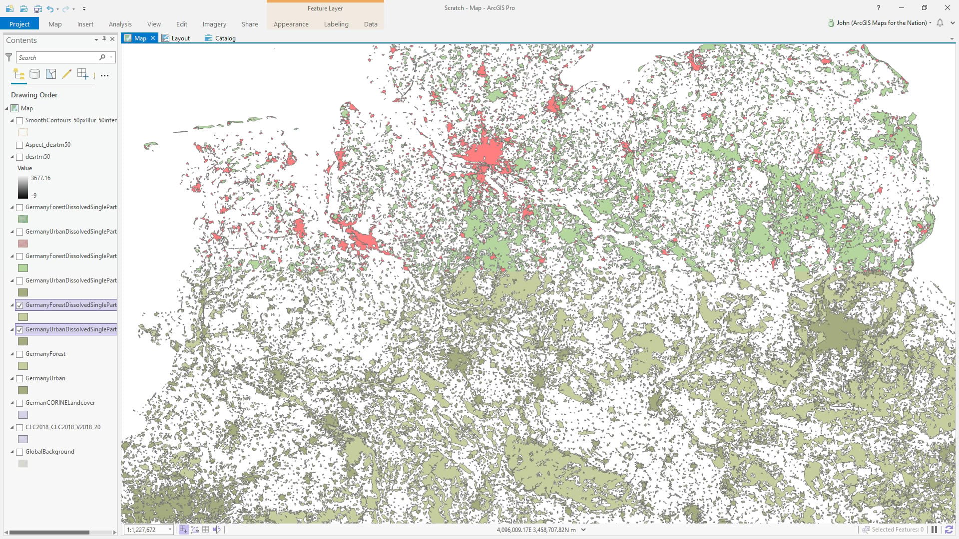
The Corine Land Cover program is a fantastically resolved satellite-fed en-slicing of Europe into land cover categories. You can download (first create an account, no biggie) a geodatabase stuffed with vector land cover polygons, but better put on a pot of coffee first —it weighs in at 2.6GB. Golly is it ever amazing though.
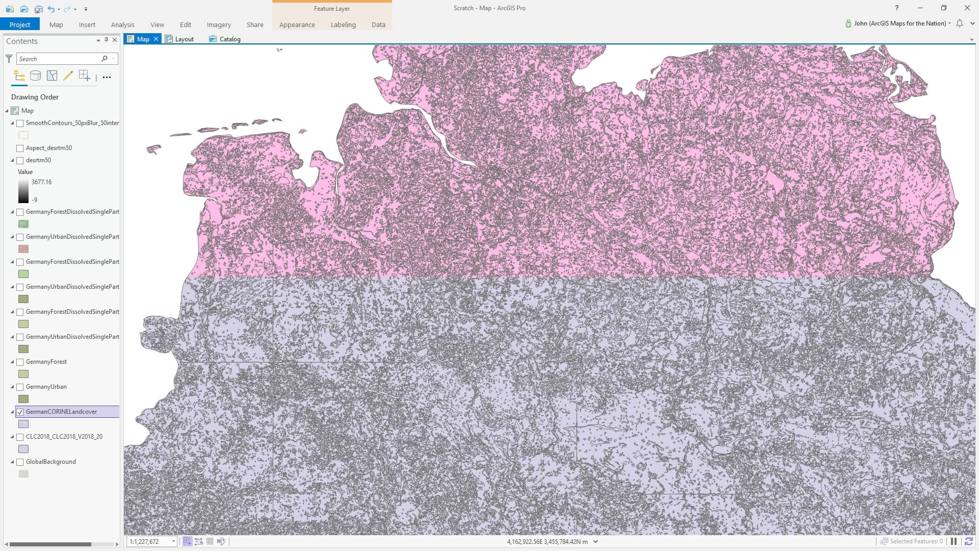
Here’s a closer look.
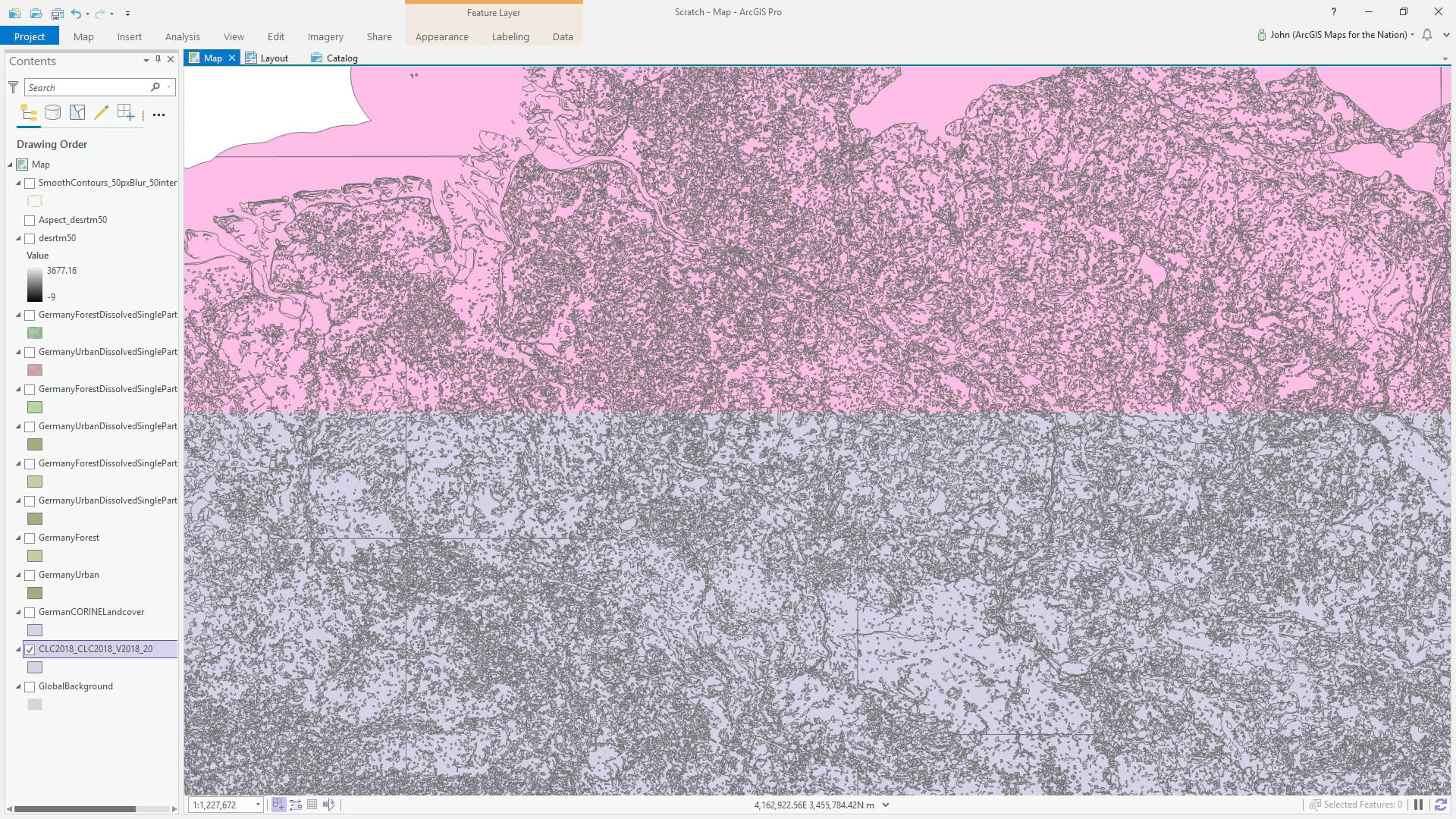
I want to make a watercolor style map of Germany, though, and this stuff is just way too detailed to work for a national-scale look-at-me sort of map that is supposed to look hand painted. Generalization is one of the most important, but most overlooked, aspects of smaller-scale cartography. Precision in source data is a rare and beautiful treasure. Often, though, there is far too much stacked up bunched up piled up content that, at the output scale, creates visual distraction.
Not to worry, we have the power of geoprocessing at our mouse tips. Ready?
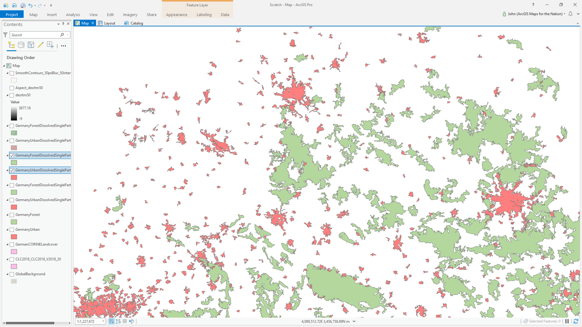
First of all I added a layer of world countries, and used a definition query to isolate Germany. Then I ran the Clip tool to cookie-cut out only German land cover. Wow, did that ever lighten the load.
I isolated Forest and Urban via a definition query, and saved each as a separate layer for some reason (right-click > data).
Then I ran the Dissolve tool to turn contiguous areas into whole polygons, getting rid of much of the inter-zonal boundary noise and erasing the regional square cells that the source data is divided up into. I did not choose to make the areas multipart —I need them to be singlepart for when I calculate area in a bit.
The forests have a fair bit of voids within their perimeters, which will cause some visual erratics at small scale, so I filled them with the dauntingly named Eliminate Polygon Part tool (advanced license).
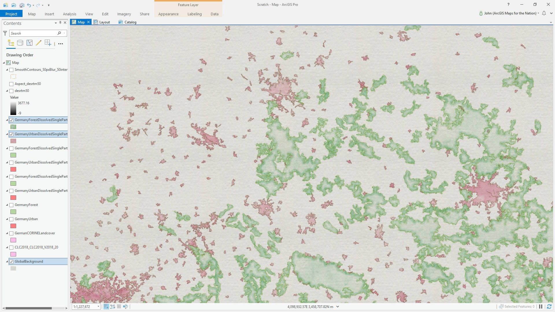
Right, area! Ok, time to ask these polygons how big they are. The Calculate Geometry Attributes tool will coax that out of them. Then, based on that, I can zoom out to my full layout extent and run some queries to get a visual sense for where to draw the line on what areas to keep and which areas are so small they just look like noise on a chunky watercolor map. Here’s what I decided on…
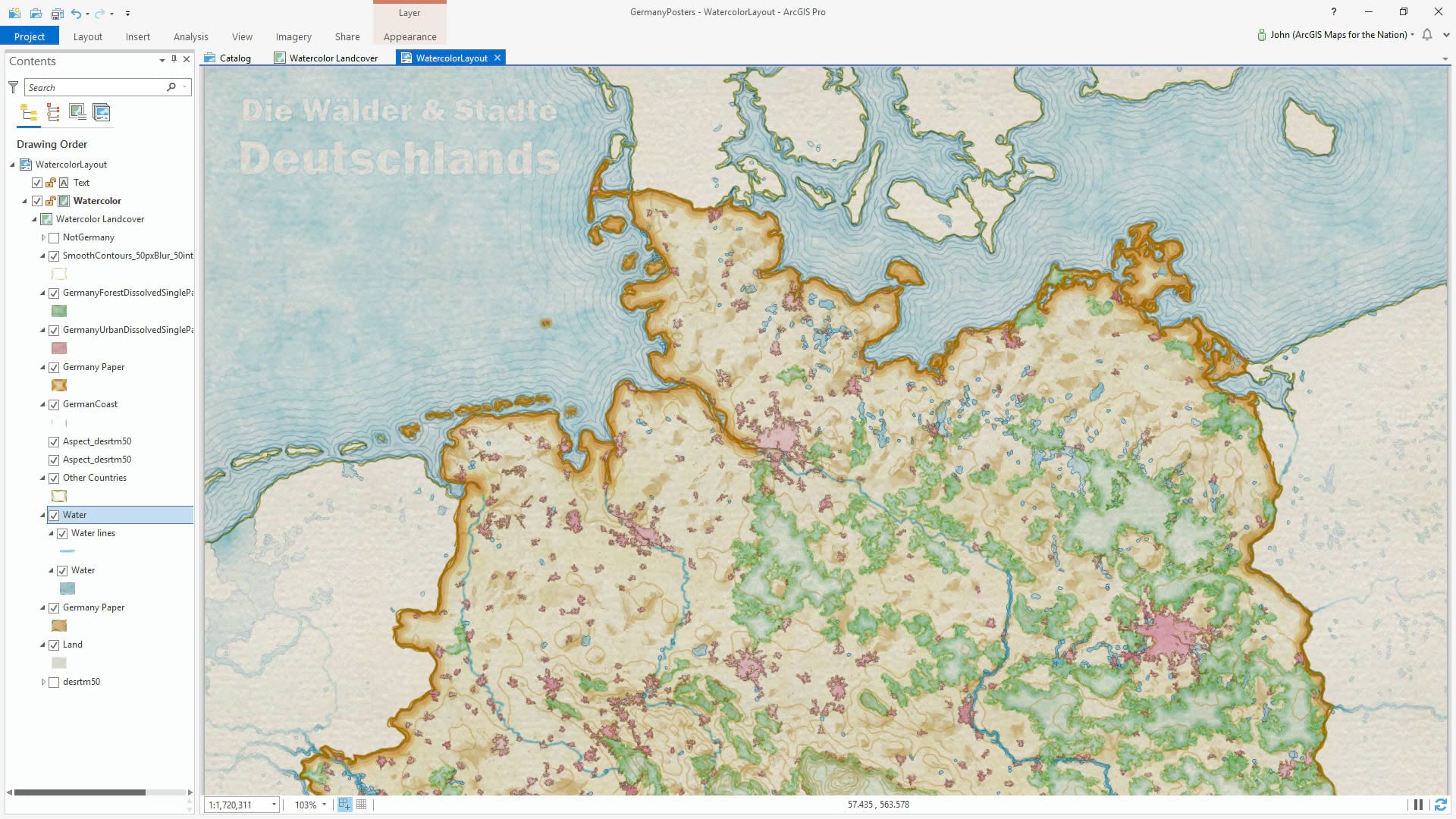
Next it’s just a matter of downloading and installing (catalog > styles > right-click > add) the Watercolor style for ArcGIS Pro and applying that to our newly dissolved and filled and culled polygons. See how I applied the style to the background? You can do that by adding a global background layer, or just applying the style to the map frame’s background in a layout (in a layout, right-click the map frame > properties > paint brush tab).
At this point it still seemed pretty flat. If I were really painting this I might try my hand at dabbing in some hillshade. I can’t help myself, let’s give something a quick try. I added a blurred Digital Elevation Model, based on SRTM images (jump over to this post to see the source and steps for getting this DEM into shape).
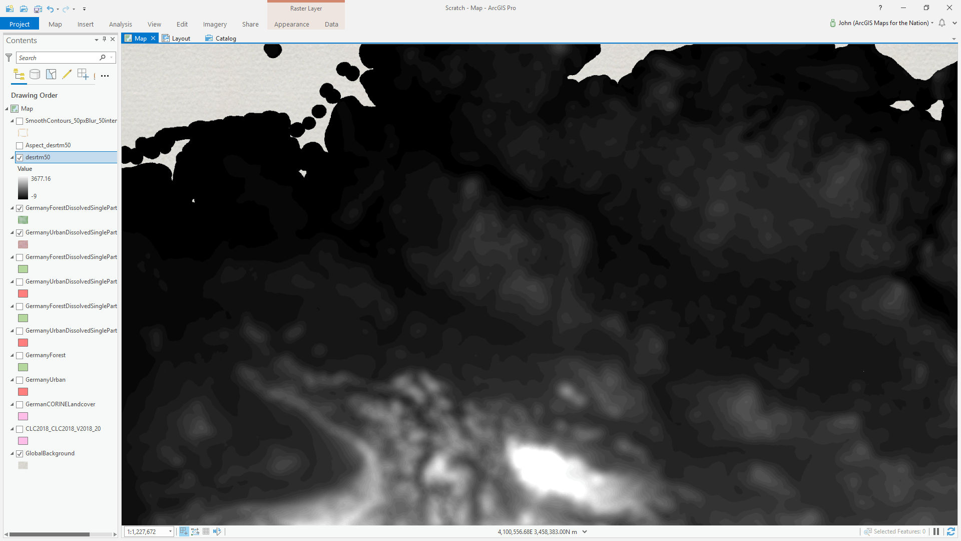
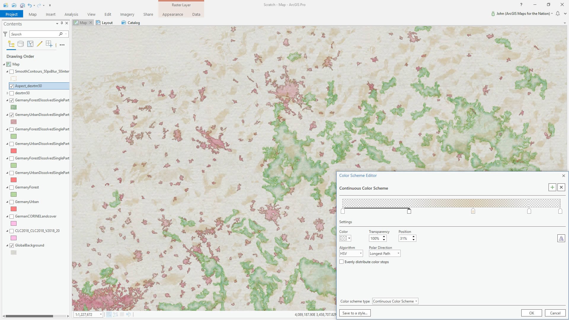
Then I ran a Raster Function on it, to render it as an Aspect map (color-coded by what direction a slope is facing). Then I gave it a sneaky color gradient so only south-east angles get a semi-transparent dab of paint.
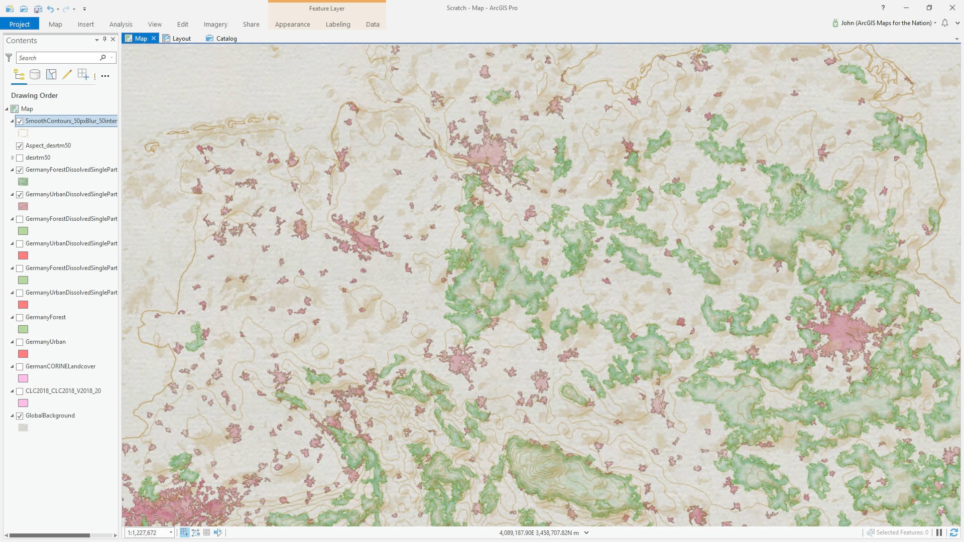
Then, with that same gorgeously blurred DEM, I ran the Contour tool (3D analyst or spatial analyst license) to get some topo lines and applied a sketchy stroke to them, courtesy the Watercolor style (what? You haven’t downloaded this yet?).
Then it’s just a matter of goofing around with water features, waterlines, bordering countries, and titles!
There is a glowing hot core at the heart of GIS, enabling all manner of spatial feats. And it’s powered by a team of engineers who think and breathe and swim in algorithms. I sure am glad they do what they do. Thanks team!
Happy Geoprocessing! John


Commenting is not enabled for this article.