Part 4 of a 4-part series on creating this set of posters for the Esri Germany and Esri Switzerland joint user conference.
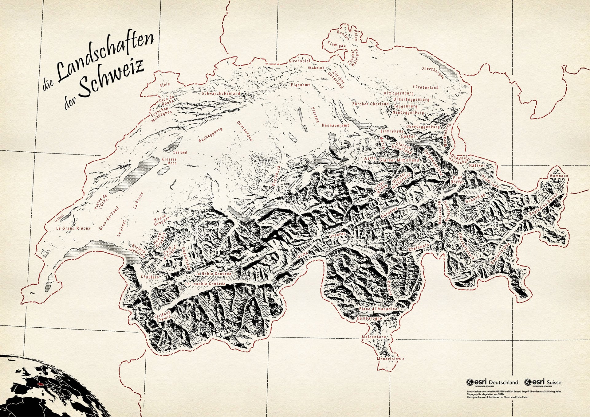
Here is a map of the landscapes of Switzerland, created in a manner meant to honor Erwin Raisz.
After making this map, and prior to writing this, I was fortunate to chat a bit with Kate Raisz, the granddaughter of Erwin Raisz. Kate is also a media producer—isn’t that wonderful? She has this to share about Erwin…
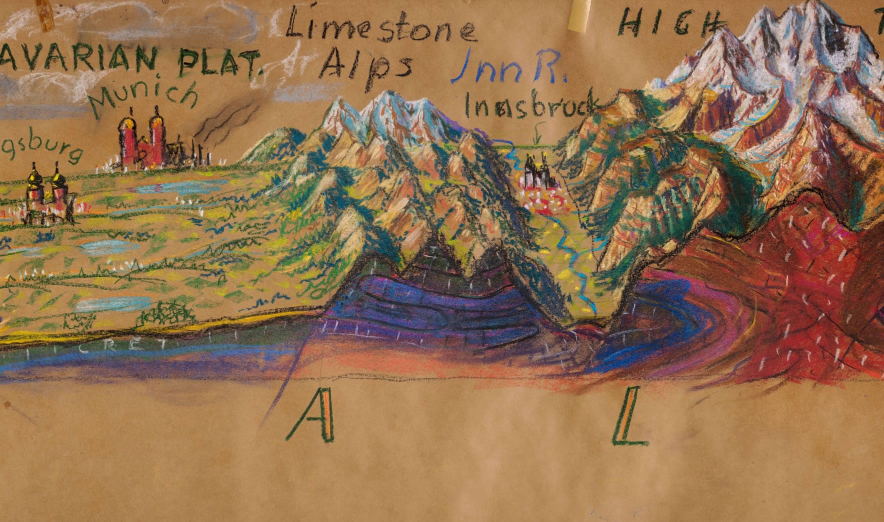
My grandfather’s maps set a high bar for the marriage of art and science which I aspire to in my work making media for museums. I still remember being a young child and watching over my grandfather’s shoulder as he peered through a massive magnifying glass while he drew the landforms of the Earth with a fine-tipped pen dipped in a black ink well.
Magnificent.
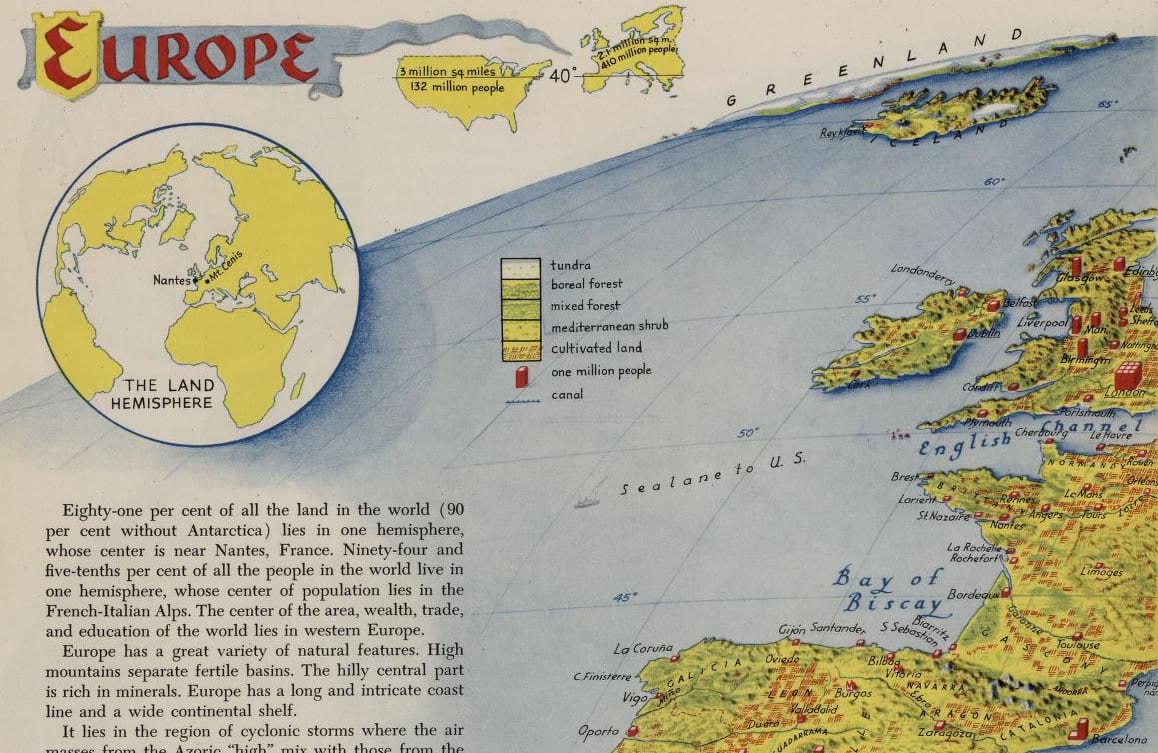
I have spent (invested) a fair amount of time peering closely myself at the exquisite hand-drawn cartography of Erwin Raisz. From his vibrant pastel cross-sections of continental landforms to his impossibly intricate physical landforms maps. I’ve even stumbled on his work in a collection of the Journals of Lewis and Clark. In all instances, the maps bear the gravity of a mastery of scientific representation and an artist’s sense of representation and charm.
Let me just get something out of the way straight off.
I would be an arrogant fool to think I could approach creating anything like this short of an apprenticeship with Raisz himself and years of practice in actual pens and inks. And a heap of talent. But I still want to pay homage to Raisz and dip a toe into this sea of cartographic wonder, with the tools I have. The result was something fun, and, I believe, a repeatable method that can pull cartographers of today a bit closer to appreciating the work of our colleagues of the past, echoing the spirit of their work within our own. A process that brings an appreciation of the talent and efforts of Raisz, invites a closer look at the techniques of a past age, and invigorates our own creative energy, is all I hope for.
There.
Regarding some of Erwin Raisz’s pen and ink work, when I peer closely through my magnifying glass I notice these qualities:
- Southeast illumination with solid black hillshade
- Slope and aspect hachuring on sunlit slopes
- Hand lettered labeling nestled within landscapes
- Heavy horizontal hatched water fill
- Stippled indications of low-rise flowing landforms
- Illustrative mountain representation at large scale that coalesces to an overall topographic flow at small scales
Let’s take a crack at this.
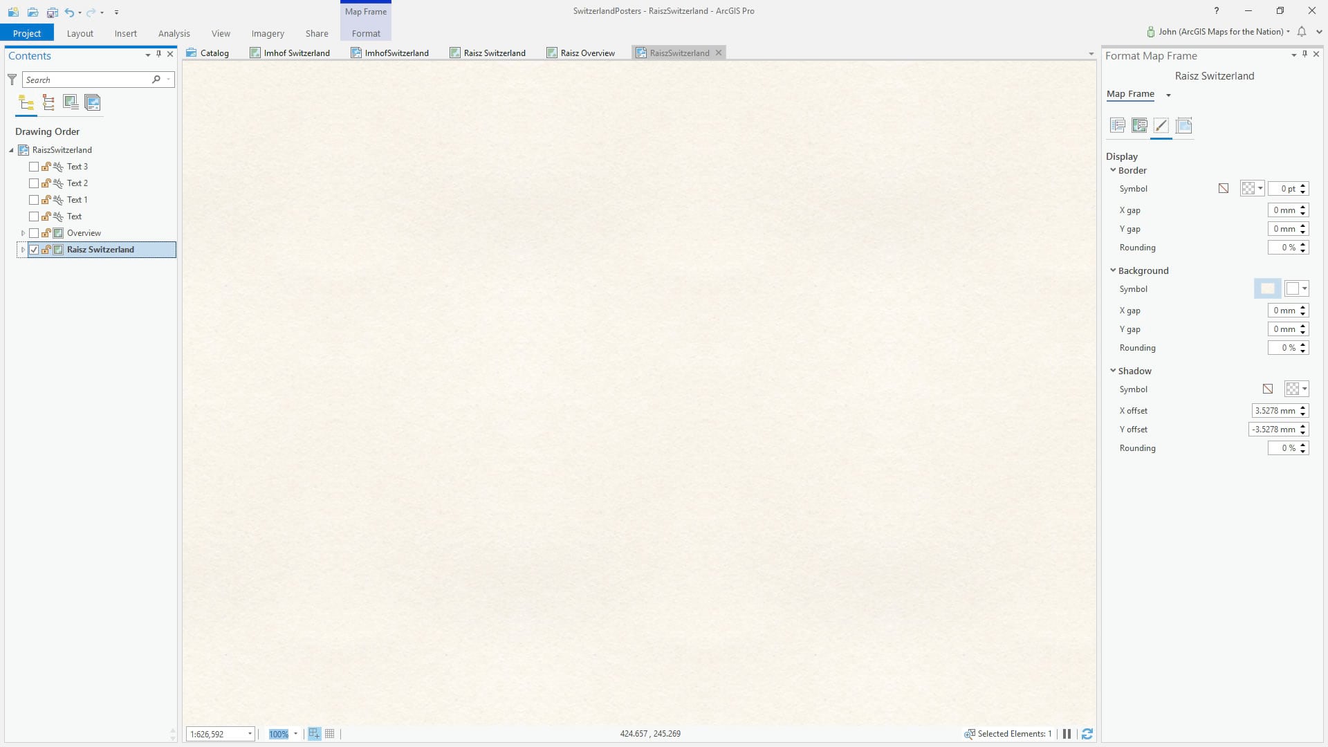
Poster Paper Background
I’ve got a swatch of poster paper I’ve created that repeats well without repeating edge effects. Here it is; you can save it and use it yourself:

You can add this Global Background layer, available in the imminently convenient Living Atlas, to your map and give that image as a picture fill (set to 400pt size), or you can apply it to the background of the map frame in your Layout. As is the case in anything in GIS, there are a ton of ways of getting to the same thing. It’s a beautiful cornucopia of options.
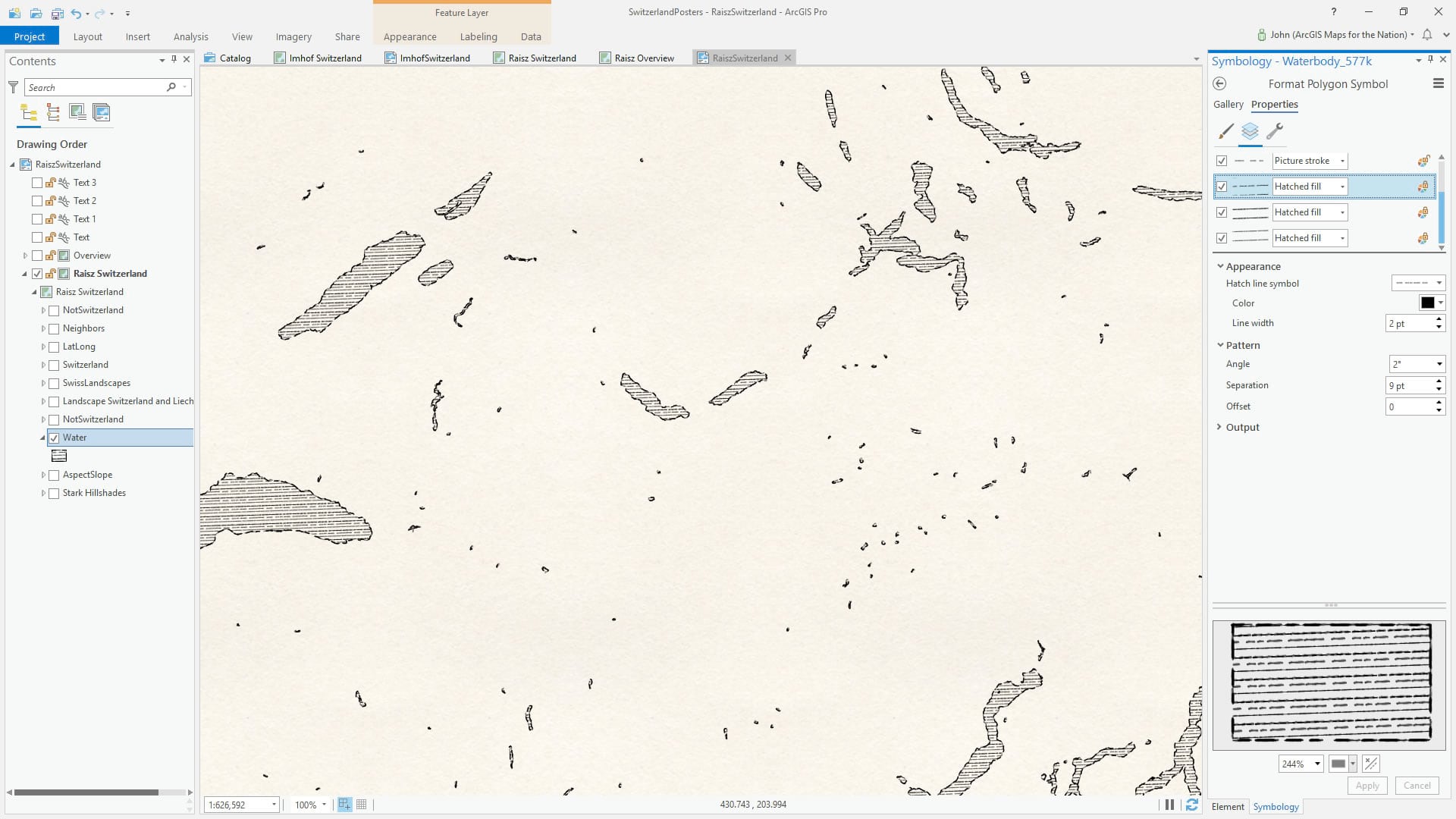
Hatch-filled Water
Raisz’s water fills are commonly constructed of dense horizontal (not quite horizontal -I notice he often aligned his hatch strokes to the graticule. What a magnificent detail). I started with a picture stroke line symbol, which I then pull into a hatched fill line pattern. I made three versions of the line stroke, and applied each as a hatched fill pattern to add some variability, offset so they don’t overlap each other.
DEM and Hillshade
I added a Digital Elevation Model to the layout (the Living Atlas has a great Terrain DEM image service, or you can download a discrete SRTM image) and applied a hillshade Raster Function with a low sun-angle and a south-east light source origin. Then I applied a stark color scheme so only northeast edges of mountains were painted with full black.
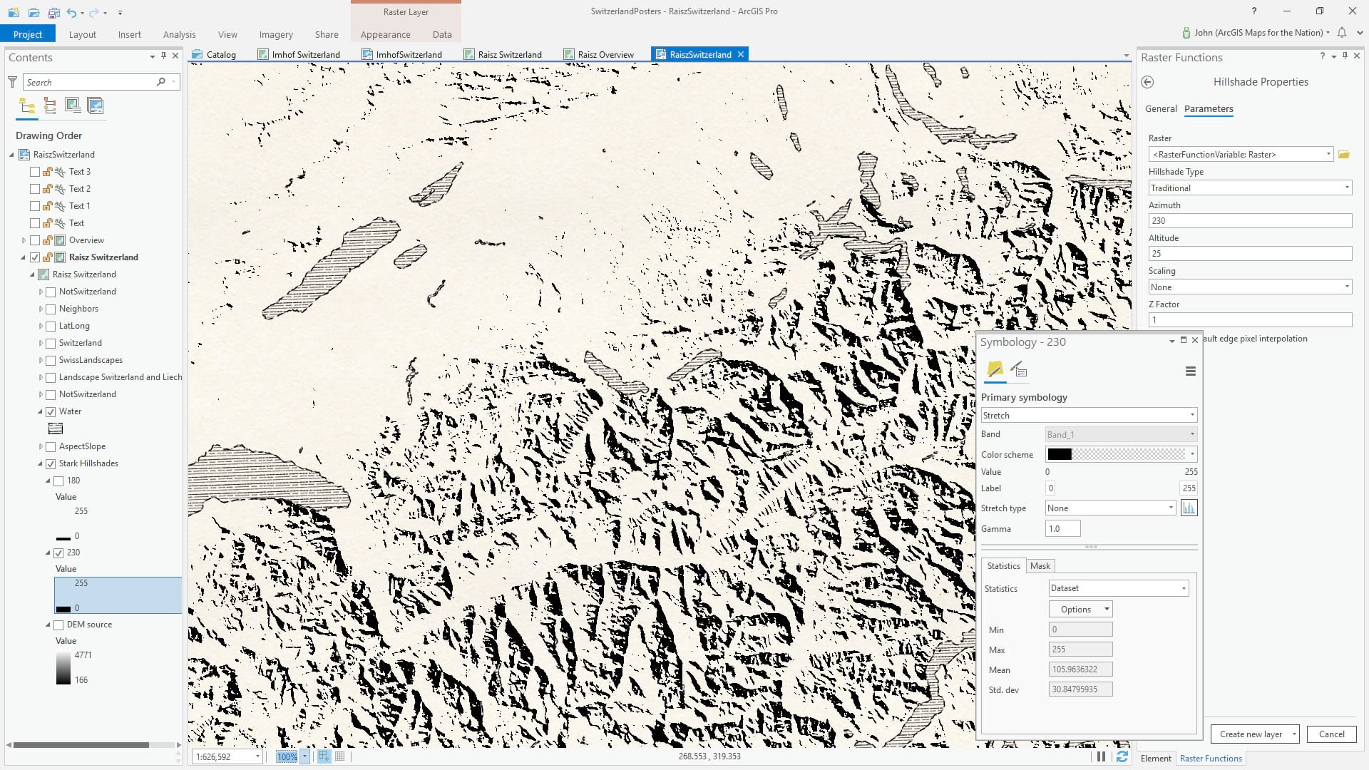
To round out the shadows a bit, and add some more black ink in the manner of Raisz, I added a second hillshade with the sun positioned due south shooting light straight north. This I painted in with an even starker color scheme.
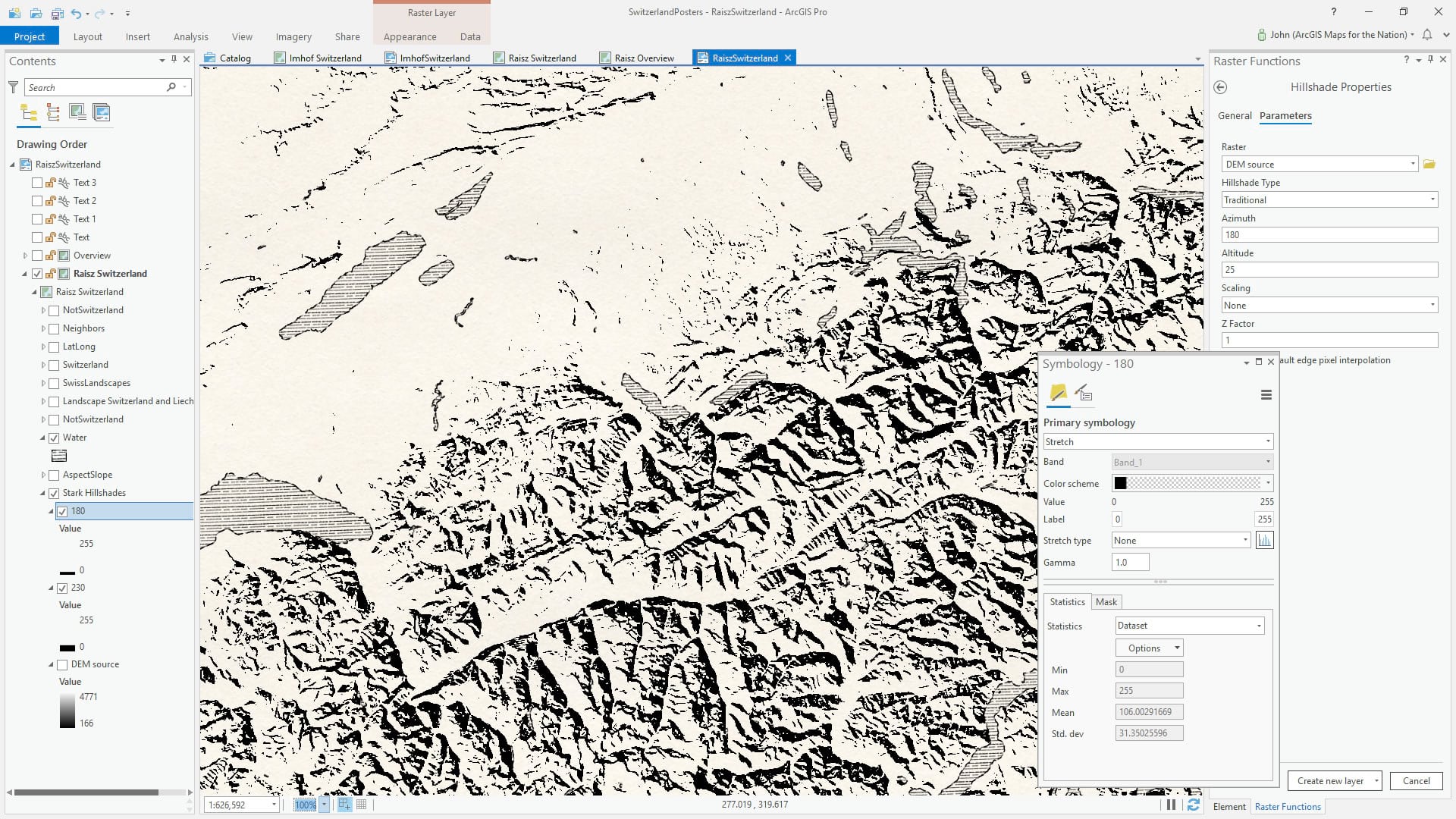
I was getting somewhere, and the three minutes of Hillshading I’d invested were promising. But without mountain hachures it just wasn’t Raisz-like. Warren Davison suggested I try my hand at creating discrete polygons of slope and aspect, and applying hachure fills to those. I had hoped it wouldn’t come to that…but Warren was right. Thanks Warren!
Hachures
Here’s a look at my white-boarded geoprocessing plan for this bit. The angles for six discrete aspect ranges and three levels of steepness. Oh, oops, did some pottery, patches, and a left-handed mitt get in there?
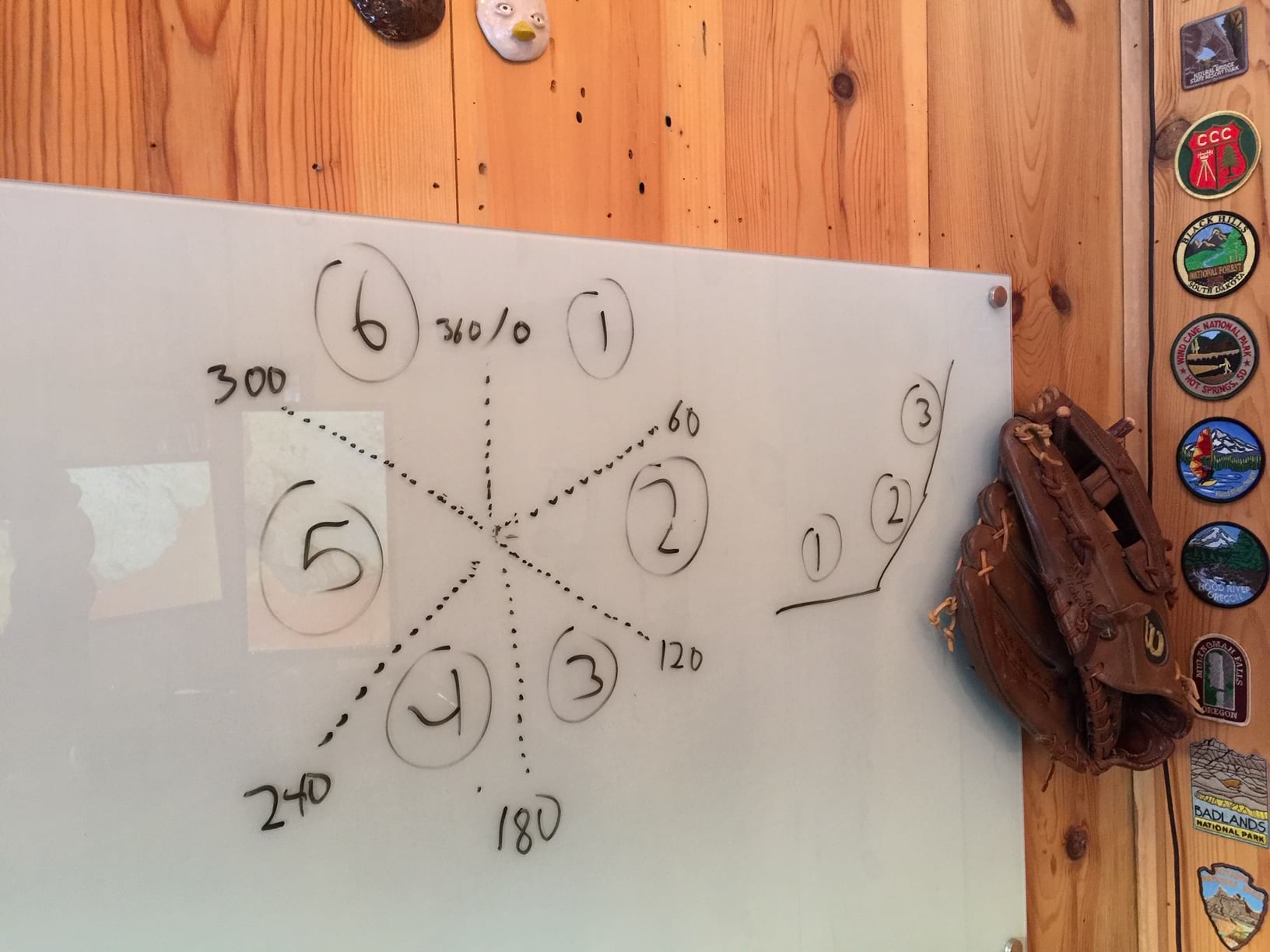
Here’s where it gets a bit complex. Since I’ve covered these steps in other posts I won’t draw it out, but here’s a summary. With the DEM as a source, I created an Aspect layer (pixels are colored according to what direction a hillside is facing), re-classed it into 6 discrete bands, then converted it to vector. Here’s a how-to for that (or a nasally video full of “um”s and “uh”s and “right”s and “like”s).
Next, and this is the bit of Warren Davison cleverness that really sells it, I did the same for a Slope layer I derived from the DEM. I created three discrete classes of steepness and converted those to vectors.
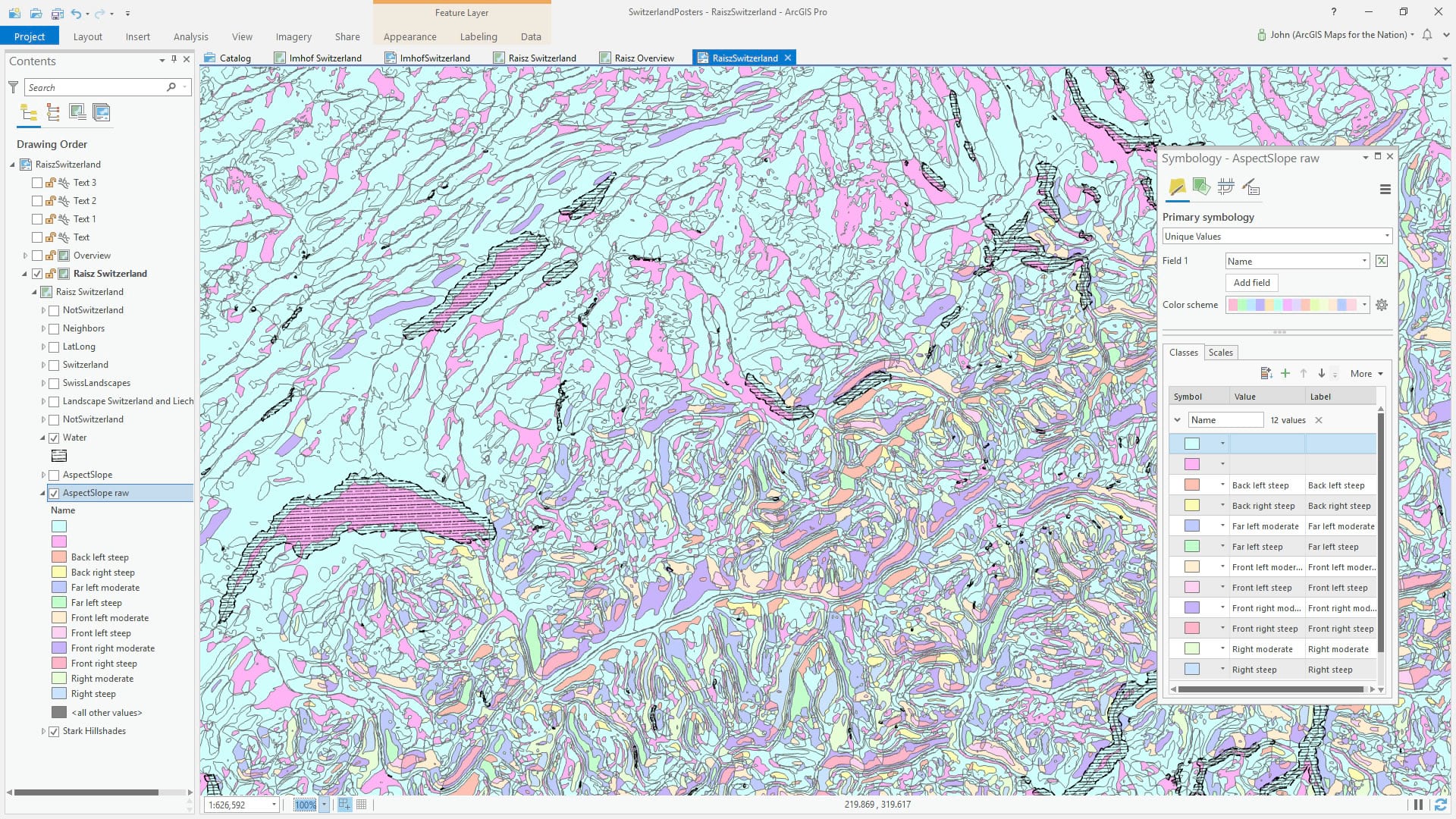
Then I ran a union of the two vector layers so that I had 18 discrete polygon types corresponding to their direction and steepness. I created a new field and named the 10 polygon types that I’d make use of (I didn’t bother symbolizing the flat stuff and a couple others).
I applied hatched fills that gave a hachure-like scrapes down the sunlit slopes, at the right densities and orientations.

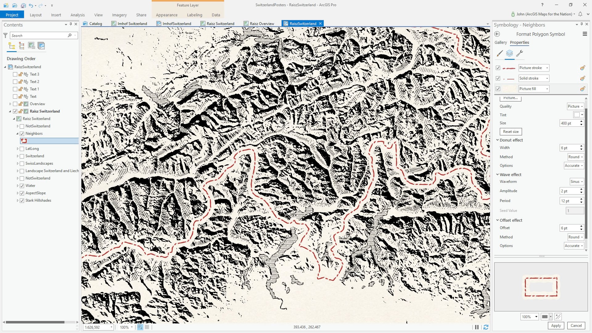
Borders
Now that I had the mountain topography looking ok, I jumped over to adding country borders. The data source for this is the Generalized World Countries layer, available in the Living Atlas. I noticed many of Raisz’s maps use a dot/dash pattern for boundary lines. Done. And I gave them a deep mid-century red to offset the black. While I was predominantly inspired by Raisz’s black ink maps, I borrowed a bit from his other work that used a pop color and there is nothing more mid-century than black and crimson over yellowed poster paper.
To give these borders some breathing room I hacked a masking effect by giving the polygon fill (the same poster paper picture fill as the background) a “donut” effect (check out the wrench icon in they symbol panel to see a ton of sweet symbol layer effects). This just punches out the fill so it only renders along the edge of the polygon. I also added a “wave” effect to reduce its digital sterility. I balanced that with an offset effect, so the result was a somewhat centered thick line of paper that was, effectively, a pseudo-masking layer that covered up all that mountain busyness around the borders.
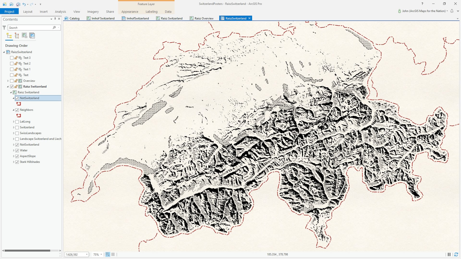
Then I copied the countries layer, give it the paper fill, and wrote a definition query to hide Switzerland, to get a not-Switzerland area of disinterest overlay. This was a tough call, but in the end I think it helped clarify the composition.
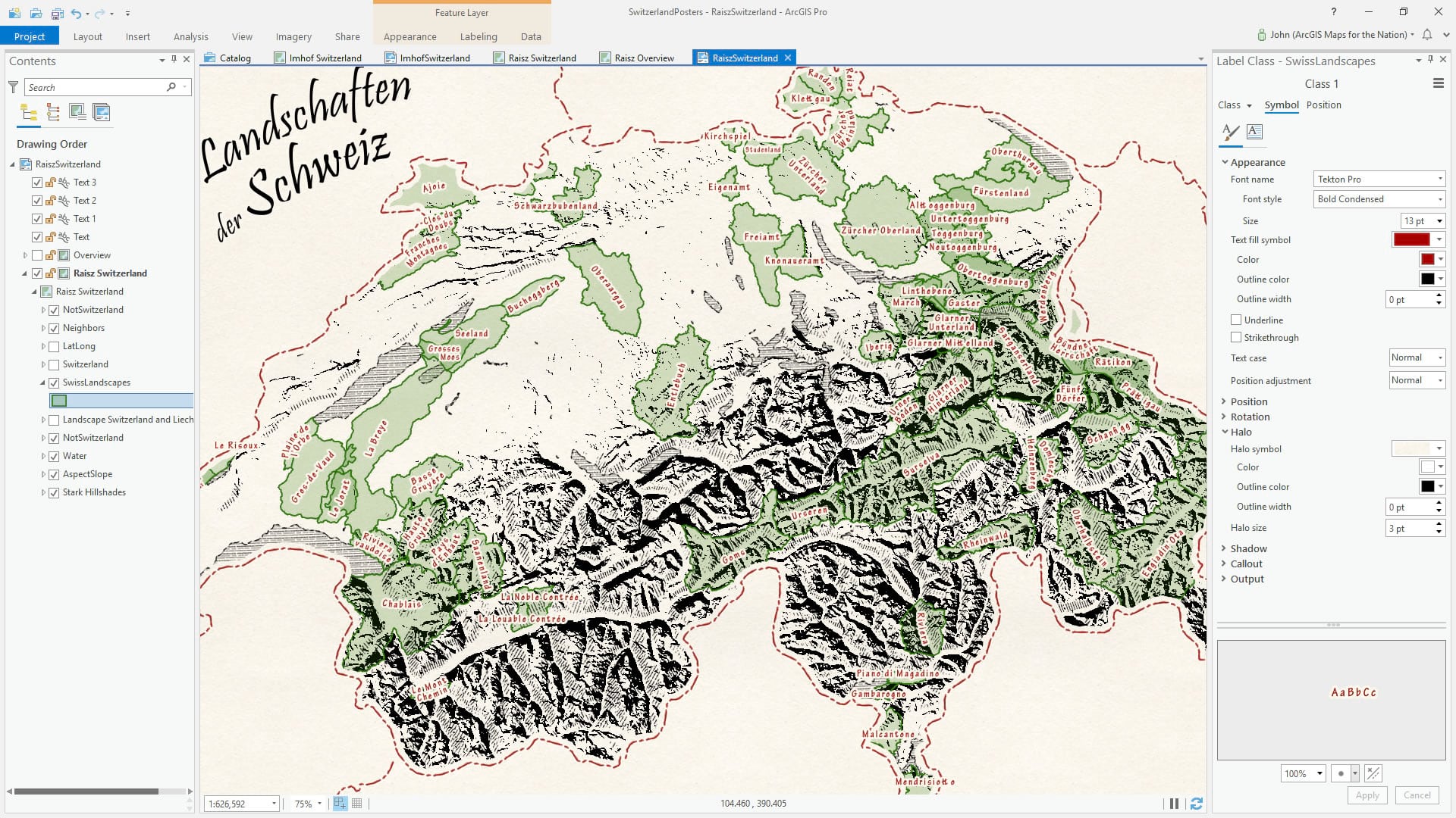
Text
For the landscape labels I added a Switzerland Landscapes layer from the Living Atlas, provided by Esri Switzerland. You can see them here in green as a reference. For the map, I un-checked all symbol layers but left the layer checked on so that labels would be visible.
The title was added manually to the layout, via “curved text” using the Pristina font, which is surprisingly similar to what Raisz used in his larger lettering.
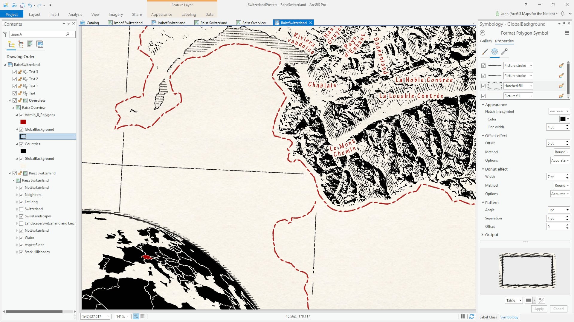
Overview
In many of Raisz’s atlas and magazine spreads he used a wonderful offset oblique view of the earth to mark the subject location in a global context. As a nod to that method, I added a second map to the layout with a simple black fill applied to the country layer (and a negative offset so that the fill snugged in to create negative-space borders). The hatching around the globe was borrowed from the hatched water fill, with an offset (so it renders outside the global background polygon) and donut effect (so it doesn’t render inside the globe).
And that’s that. I’ll likely follow-up with a style for ArcGIS Pro with all these symbols wrapped up for convenient sharing and re-use. But you’ll be on your own when it comes to creating the slope/aspect polygons!
My own grandfather was a quiet man, slight of frame and painfully shy. He always wanted to be a farmer but instead worked in a paper mill and later ran a small service station. He taught my three-year-old father to point out each and every country on their family globe when he would whisper the name. My father turns 79 today. This is that globe.
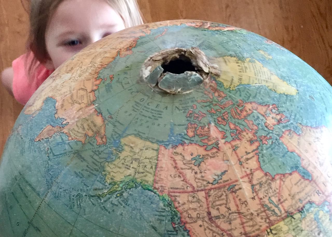
Family, of course, gifts the indelible trace of one generation to the next. Dad grew up to be a professor of geography and I make maps. We don’t choose our grandparents or parents, but we occasionally get very very lucky. I am fortunate to be the grandson of Charles Nelson, but in addition to that I am fortunate to be part of a livelihood with a rich tradition that, if we are very lucky, we get to look back at with wonder and take chances at emulating. And in a sense when we adopt the work of masters that went before as inspirations of our own, borrowed for a bit, for encouragement and satisfaction, we trace a fine line of craft and gratitude through a few generations. Thank you Erwin Raisz!

Commenting is not enabled for this article.