Previous posts on this subject have intended to encourage you to map coronavirus responsibly by sharing some best practices. Subsequently I shared a coxcomb technique for illustrating the confirmed Covid-19 cases using time-series data. In this post I’ll return to illustrating a single time slice of the confirmed cases, but one which allows you to illustrate a number of variables at the same time. It uses waffle grids as a multivariate symbol.
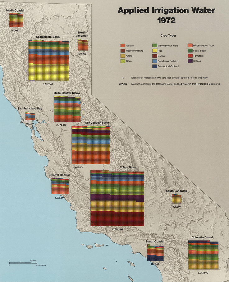
Let’s start with an example. Below is a page on Irrigation Water from the California Water Atlas by William Bowen, 1979. I used it as the example in my recent book Cartography (still available from all good online retailers!)because it’s a beautiful example of the map type, showing the amount of water used to irrigate different crop types. Each cell is 5,000 acre-feet of water, so you can see the relative proportion of water used to irrigate the different crop types. And the different water basins have their own symbol that become proportional to one another simply through having more cells in the waffle grid.
So waffle grids aren’t new then. But let’s make them new again by showing how they can be used to map the current coronavirus pandemic.
A waffle grid shows quantities of categories that form a whole. It is similar to a pie chart but takes a square or gridded appearance. Each of the constituent categories is then displayed as a recurring symbol in the waffle grid. This symbolization is usually through using different hues to represent different categories. Unlike a pie chart which relies on the reader being able to decipher the relationship between non-stated angles and proportions, a waffle grid is easier to interpret to gauge relative proportions. It’s also possible to recover data by counting (though that’s an unlikely reading task!). Small parts of the whole are much easier to see on a waffle grid than other charts. By using a hue that contrasts or is more saturated, it is much easier to denote a single cell as a category that attempting to reconcile a very thin slice in a pie chart.
Part of the success of the waffle grid is its basis on repetition. Perceptually, humans are good at recognising repetition among objects, and this familiarity helps in recovering meaning. These grids are therefore easy to read, are discoverable, and do not distort the data in ways that our cognitive system has difficulty disentangling.
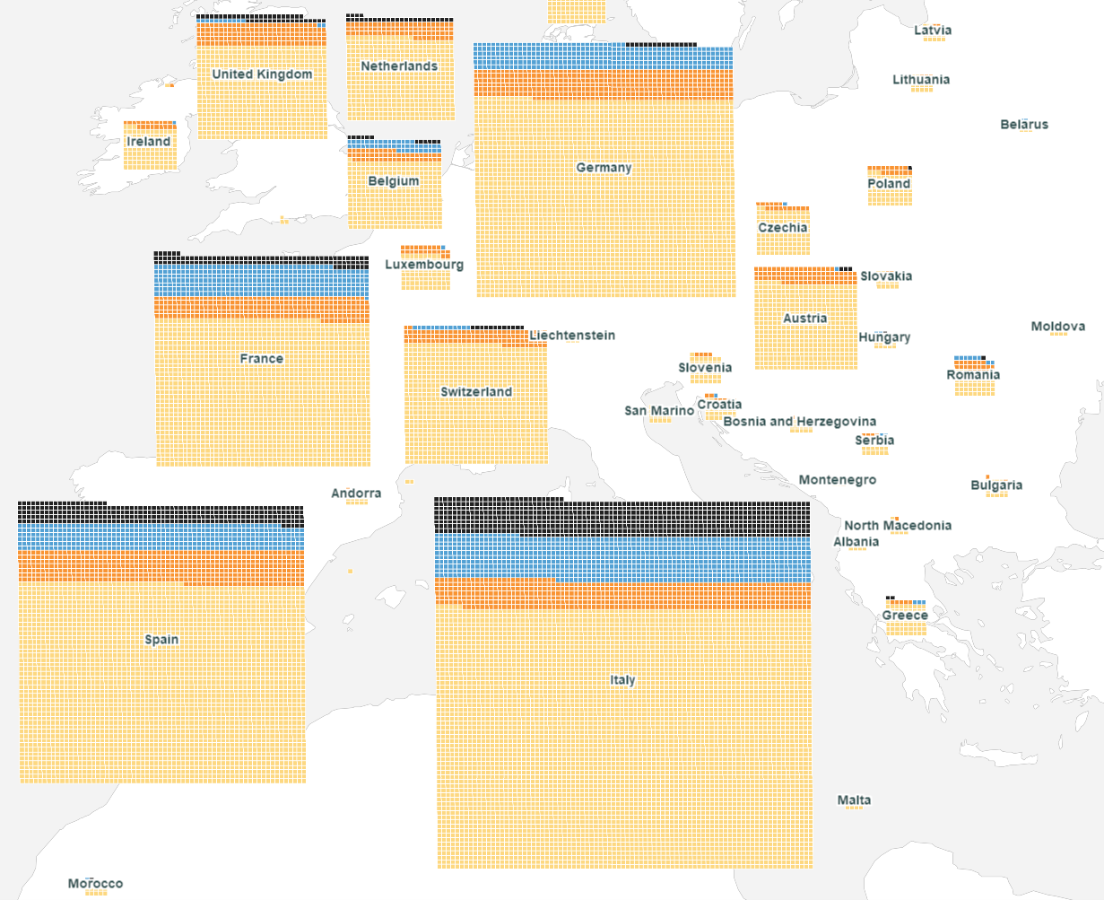
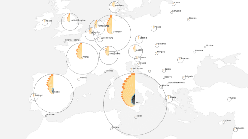
Here’s a portion of the map we’re going to make showing the Covid-19 data up to and including March 25th 2020 (downloaded from the Johns Hopkins University dashboard):
Many maps that have been published on the coronavirus pandemic have defaulted to the choropleth or proportional symbol. And those techniques largely limit the ability to show more than one variable, or one component of the data. They usually show simply the total number of confirmed cases (or rates on a choropleth).
Some proportional symbol maps attempt to illustrate the number of active versus new cases, and the number of recovered versus deceased cases at the same time. They do so by simply adding different layers on top of one another on the map. Except this always leads to occlusion of information on those layers that are lower in the visual stack. The problem of trying to interpret relative quantities can also be complicated if different geometric shapes are used. While this approach is usually done to try to distinguish between different data, it ends up making things harder to understand.
The waffle grid, then, shows different variables in the same visual plane. For each country we can easily see the relative proportions of active, new, recovered and deceased at the same time. There are no occlusions, and no overlaps. It’s almost the perfect multivariate mapping technique! And you can make them too.
A number of us are working on a side-project at Esri to develop a toolbox containing a range of cartogram tools. We intend Waffle grids to be part of that toolbox. But rather than wait for all the tools to be ready for release we thought this would be an opportunity to share the Waffle grid tool (click the link to go to the tool download). It’s designed to work in ArcGIS Pro. Just unzip, and add the Waffles toolbox to your map, set the map projection to whatever you intend the final map to be displayed in (Equal Earth for this thematic map), and run the Waffle Grids tool. Complete the parameters as follows:
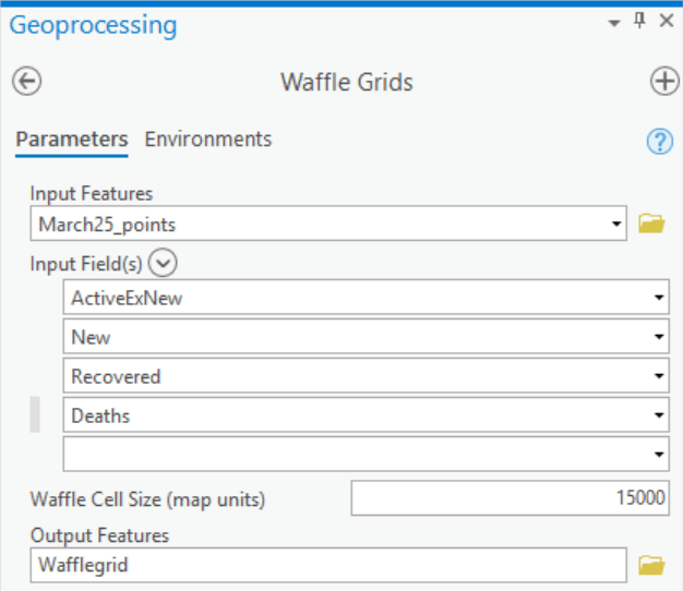
Input Features are the input feature data which can be either point or polygon.
Input Field(s) present you a list of the fields in the attribute table of the Input Features. Select all those that you want to include in the waffle grid. Here, data for active, new, recovered and dead counts of confirmed cases. The grid will be built on the order you specify here with the first selection being created at the base of the waffle and so on.
Waffle Cell Size is the length of a side of each cell in map units. Here, 15,000 metres.
Output Features is the polygon feature class to be built
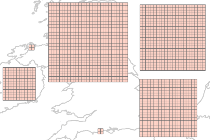
The output will be a grid of cells, each one a polygon, built into a waffle where each row in your data becomes one waffle. So, for the countries in the coronavirus data the output is this:
The attribute table has a WAFFLE field where cells belonging to the same waffle grid have the same value (based on the OBJECTID of the Input Features). The VALUE field carries over the label of the Fields used as Input Fields.
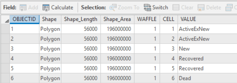
It’s then a simple case of symbolizing the VALUE field using unique values, in this example we’re using non-alarmist colours with a white outline and the four values.
What’s going on with the top row and the missing cells? They’re not missing. They have a VALUE of ‘None’ in the output because the algorithm that creates the waffle grid creates a square grid based on a rounded-up square root of the sum of the values per row. Clearly this doesn’t result in a perfect n x n grid of cells. Either use a definition query to exclude them or set the symbology fill and line colour to no colour.
There’s a few things to bear in mind. A few ‘tricks’, if you will.
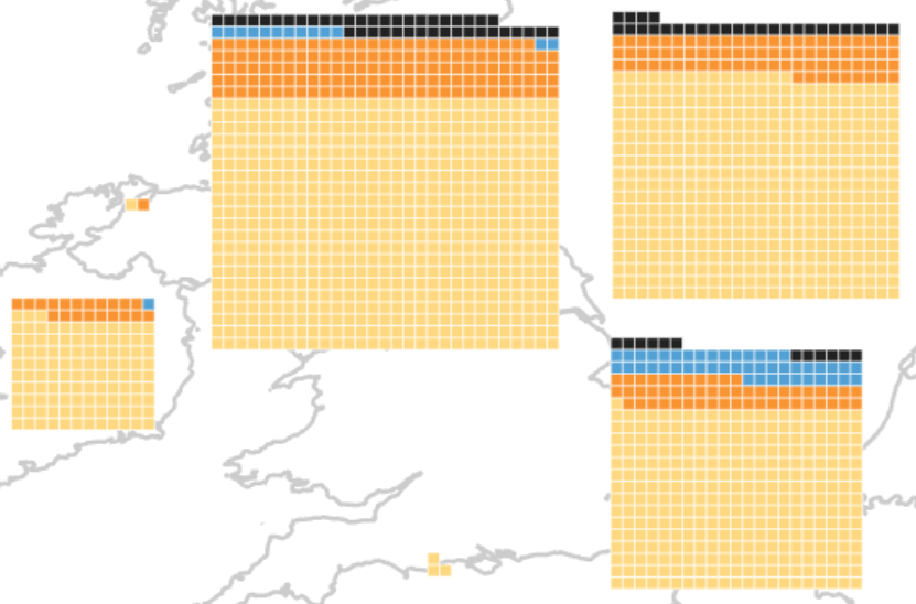
Firstly, if you count the cells above you’ll see there are 12 cells representing ‘dead’ for Belgium in the bottom right waffle grid. Yet the data says there’s 122 deceased as of March 25th. There’s some scaling going on. In fact, I didn’t want 81,000 separate cells on the map for China. They would have been ridiculously small and the grid ridiculously large. I created four new fields in my data, each scaling the original data by * 0.1 (a factor of 10). This gave me a good compromise of waffle size and cell size. So 12 squares = 120. Where’s the other 2? The data is rounded up or down by a factor of 10 in this case since cells are equivalent to 10 cases.
Secondly, you’ll see that the waffle grids are a little offset. You will likely need to do some manual editing to shift waffle grids to overcome overlaps in heavily congested areas. This is simple by selecting each wafflegrid and moving it. You end up with a pseudo DeMers cartogram of waffle grids in some parts of the map.
Finally, you don’t have to just fill each cell with a colour. You could use any type of symbol. Experiment with marker layers, or even convert the layer to a point feature class (using the Feature to Point tool) and develop some isotype symbology!
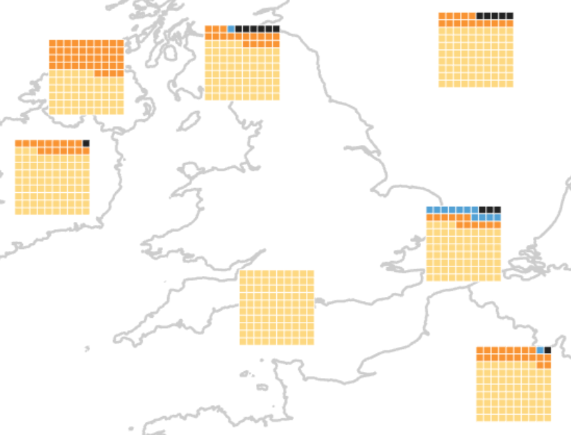
Other than that the map is built and all that is left to do is publish it. Here’s the final map:
I shared the waffle grids as vector tiles to ArcGIS Online, then added it to a map that already had an Equal Earth Vector Global basemap (again, I’m using John Nelson’s extremely useful pre-built vector tiles in a useful (non-Web Mercator) projection. Finish the map off with some popups (features with transparent symbology built by running the Dissolve tool on the waffle grids and using the WAFFLE field as the dissolve feature) and share as an app built with Web Appbuilder and that’s it.
As an aside, the tool can also be used to create waffle grids of equal sizes if the input variables are percentages. This will create a waffle grid of 10 × 10, containing 100 data cells. Here’s how it would look for this data.
Except it makes no sense for this data because each waffle grid is the same in visual weight. The Channel Islands might be seen to have the same overall quantity of confirmed cases as the UK, or Belgium. That’s not the case. But it’s worth pointing out this use case.
Remember, you can get the Waffles toolbox here and give it a go on your own data. Happy waffling!
Thanks to Linda Beale and Bojan Savric who helped massively in building the Waffles toolbox. Stay tuned for the full cartogram toolbox.

Commenting is not enabled for this article.