There is no one right way to make a map. Especially data-heavy thematic maps. In that spirit my friend and colleague Ken Field recently challenged Sarah Bell and I to each re-imagine a few wonderful classic maps. This is a tall order, but I found some comfort and encouragement with the knowledge that the language of maps is infinitely varied, and because we all bring our unique perspective and energy to the making process we can offer a fresh take on even the coolest of old maps.
Nihil sacrum est?
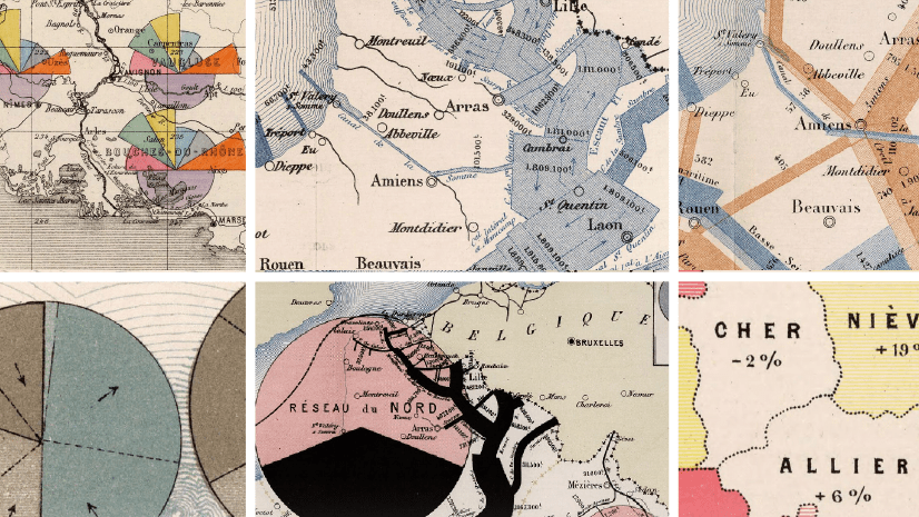
Here is the original map, a lovely multivariate treatment made in 1878/1880 by statistician, engineer, cartographer, and all-around polymath Émile Cheysson. It shows seven variables of road maintenance, at once. You can behold it in glorious high resolution here, in the eternally inspiring David Rumsey Historical Map Collection.

It uses coxcomb charts (polar area charts) to show seven variables at once. If it seems like Cheysson was taking data viz right to the edge with this map, well you should have a look at the whole collection. One bold multivariate visualization after another.
Now, I’d never say that I could improve on this map, but since there is no one right way to make a map it was an opportunity to bring a different perspective. And the beauty of a subjective/objective domain like thematic mapping is that everyone has something to share.
In this video I’ll make two different maps. The first is done in an aesthetic somewhat like Cheysson’s but with a twist on the thematic symbol (and a sneaky lesson on how to make plausibly old-style maps with yellowed paper and charming old coastal rakes). The second map is a big departure but uses a “small multiple” layout to visually communicate lots of data.
I’ll blab on and on about why I’m doing these things, but here’s the gis:
1. When making a thematic map, always ask your self, “why not just…” as a prompt to continually rethink and simplify.
2. The biggest mistake we make in thematic mapping is asking too much of one single map.
…
…
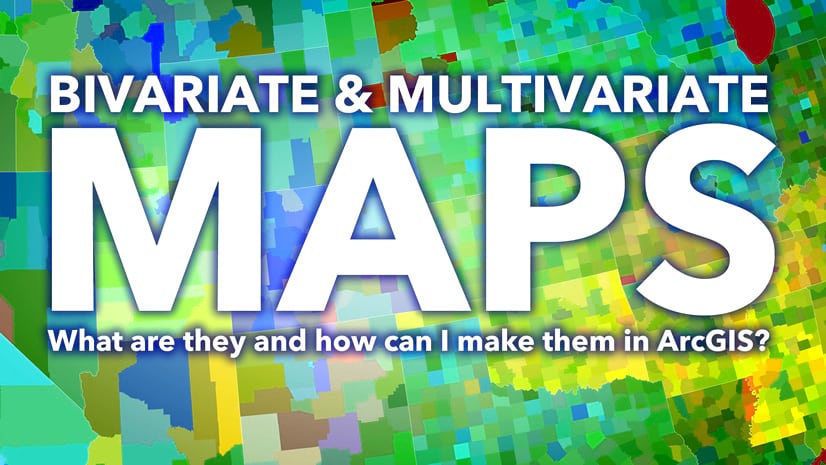
To delve deeply into the style of Emile Cheysson, check out this blog post from Ken Field and Edie Punt. Also, Ken provided me with all the tediously transcribed source data from the original map, which you can find at the same link. If you’d like to see the beautiful result of Sarah Bell’s reimagining, and of course you do, find that here. And if you are curious about multivariate thematic maps then feel free to revel in this video jam-packed with descriptions, examples, and alternatives.
Happy Re-Mapping! John
P.S. Here are my draft maps of the re-working, made in ArcGIS Pro. The first is an adaptation using a bar chart rather than the polar area chart, and the second (preferred) is a small multiple layout.


Article Discussion: