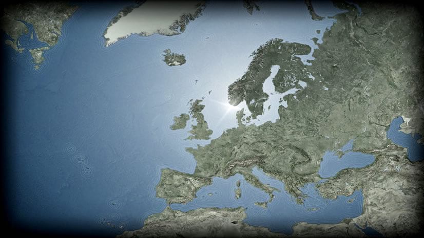
The transparency and gradient capabilities in Pro are some of my favorite features. In my maps I make pretty heavy use of vignettes and shading and glows, which makes this a fortunate development for me. When crafting your layout in Pro, there are lots of handy uses for gradients. In previous posts I’ve advocated using PNG images for georectified map vignettes or sneaky textured layout vignettes. But you can paint in all sorts of gradient action right in Pro. This map is comprised almost entirely of gradients.

I’ll focus on a few of them and show you how to unleash their smooooooth nuanced fluidity in your own maps.
- Rectangle Vignette
- Marginalia Panel
- Radial Smoothing
- Drop Shadow
- Shadow Box
- Polygon Gradient Fill
- Gradient Stroke
Get ready to live.
Rectangle Vignette
This map uses a rectangular gradient around the perimeter of the map. From the “Insert” menu, choose “Rectangle” then just draw a rectangle. In its fill properties (right-click the row in the Contents and choose “Properties”), you can choose “Gradient Fill”. The thing that trips up most folks when creating a gradient that fades away fully is to set the same color for both colors of the gradient, setting the transparency of one to 100%. This gradient goes from fully opaque khaki to fully transparent khaki.
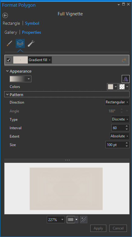
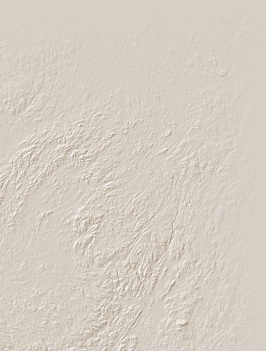
I love vignetting maps. They help draw the eye into the composition so much better and more elegantly than the rather presumptive neatline. I first learned about vignetting as a youngster from Bob Ross and got more practical experience in the photography dark room some years later. Here’s a close-up of the khaki colored vignette in this map (showing the top-right corner):
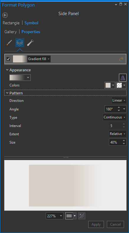
Marginalia Panel
Many maps (and especially “posters”) have narrative sections that accompany the spatial content. I like to keep my maps less compartmentalized than is afforded by the standard background fill and border that usually sits behind some marginalia. I feel like it sort of breaks that willing suspension of disbelief that a really engaging layout can sustain. This background uses a linear gradient background also fading from khaki to fully-transparent khaki.
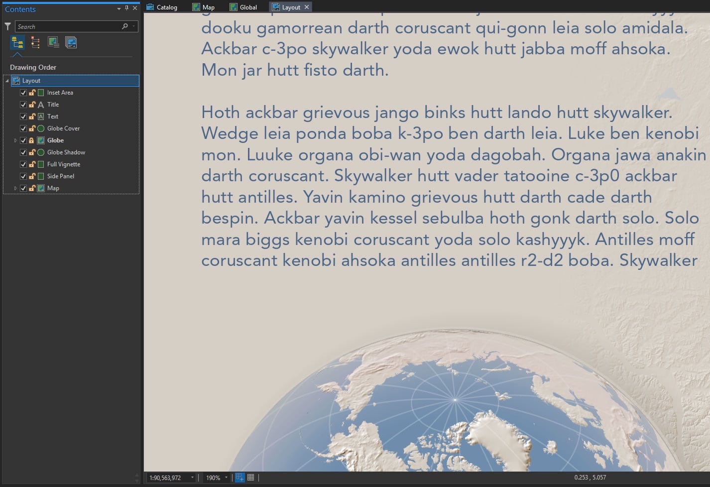
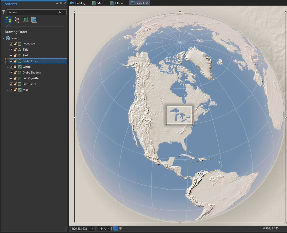
Here is a close up of this map’s really important text and locus globe. Sometimes the background texture can be a bit distracting and make text hard to read (admittedly, this is a minor case).

And now here it is with the gradient rectangle behind it:
Radial Smoothing
I added a little locus globe to the layout to help give the reader a broader sense for the map’s context.
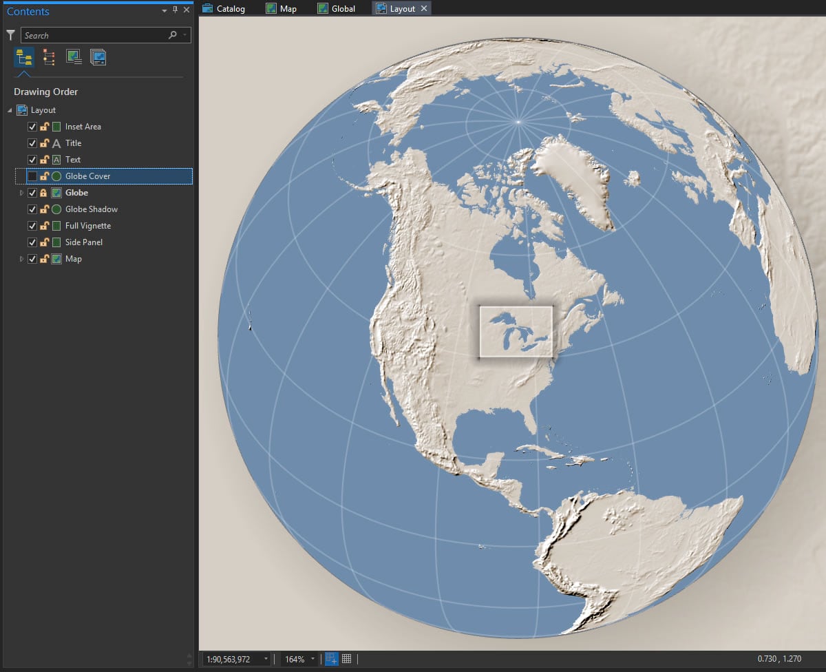
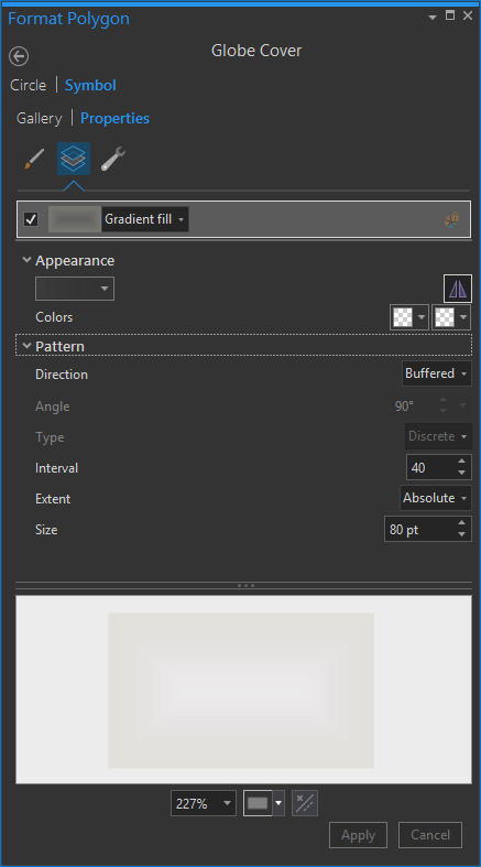
To help soften it and make it more visually balanced with the layout, I drew a Circle (find it in the Insert menu, in the dropdown that contains the rectangle option) and gave it a radial gradient fill (again, khaki to transparent khaki), which looks like this:
Here’s what the fill settings look like:
Drop Shadow
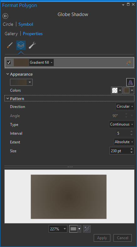
Did you notice that faint little dropshadow behind the globe? Nice little touch, right? Makes that cute little globe float right off the page.
For this, I drew a circle slightly larger than the globe, dragged it beneath the globe in the Contents panel, and gave it this radial gradient fill:
Shadow Box
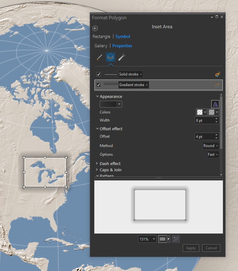
Atop that locus globe, I drew a small rectangle to indicate the extent of the full map. It sort of looks like a floating glass plate, right?
Polygon Gradient Fill
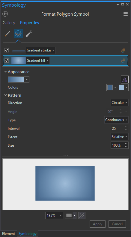
Gradients aren’t just for layout rectangles and circles. You can apply gradients (gingerly) to feature symbology, too. The glorious Great Lakes here have a radial gradient fill. It gives them a hint at being reflective water atop a sphere. More on that technique here.
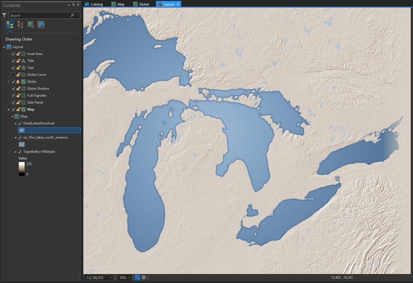
I ran the Dissolve tool on the lake polygons so they were all one shape (otherwise there would be a separate radial gradient centered over each lake, looking sort of silly). Here is the fill setting:
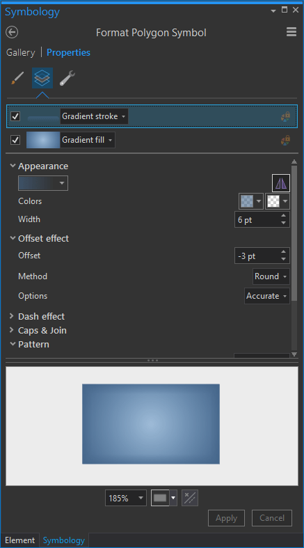
Gradient Stroke
And you can apply gradients to lines, as well. I gave the stroke surrounding the lakes feature a gradient that transitions from fully opaque blue to fully transparent blue. I made it thick enough to see in the layout, and offset it by half of its thickness so it only rendered “inside” the water polygons. More on that sort of thing here.
And that’s that! A whole map made pretty much totally of gradients (even the hillshade is a custom gradient of dark khaki to white). But because they are all gradients of transparency or very subtle hue changes, they don’t look too sassy-brassy-flashy.
So give gradients a try. Both for your drawn layout elements and for your map features.
Happy Gradient Mapping! John Nelson


Commenting is not enabled for this article.