This past GIS Day I was invited to chat with some map friends in Sweden about using styles for rapid and consistent cartography. I pondered a bit about what I could demonstrate that might be a fun smashing-together of our homelands and settled on a WPA national parks poster style of the 30s and 40s applied to Corine Land Cover data of Europe. This was a nice opportunity to mix the quaint charm of that aesthetic with the Scandinavian hygge that my hosts bring to their gathering (which they call a fika, and involves coffee and cinnamon rolls and oh my goodness I just discovered someone has written a StoryMap about the Swedish Fika! Map people are just wonderful).
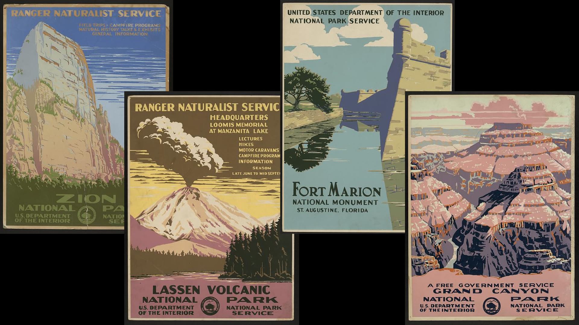
First, here’s a look at some examples of actual WPA posters. Positively dripping with charm…
Actually, you’ll be hard pressed to find a current-day national park art poster that isn’t designed to this aesthetic (there’s also a joyous cottage industry of parody posters that cite negative yelp reviews). Not wanting to feel left out, here is a map I made in ArcGIS Pro during the presentation (and the style, also partially made during the presentation), echoing that design sensibility:

Pretty fun!
Ever since Emily Meriam shared her process for making a WPA Poster styled map I was eager to try it as well; definitely check out Emily’s post for a beautiful map and a helpful history of the Works Progress Administration’s national park posters.
There are actually very few surviving WPA national park posters. They were printed so inexpensively and accepted with such passing regard that they have not well-survived the ravages of time and attention. Many examples only survive as black-and-white photos so we don’t know their original color palette. Some designers and enthusiasts, Doug Leen chief among them, have imagined palettes for these references (or re-imagined the old palettes). Don’t tell anyone, but I actually like these new palettes much better. I sampled this style’s colors from the Devils Tower poster.
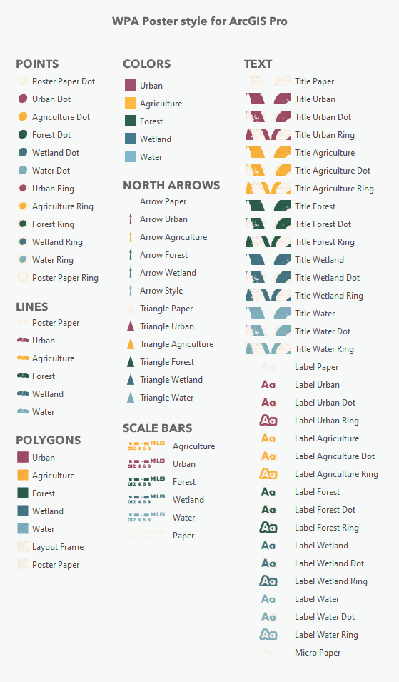
So here is the ArcGIS Pro style so you can start making your own WPA-style maps. It’s stuffed with these colors, symbols, north arrows, and scalebars…
Here is a little run-down of the sorts of things I notice about this overall look:
- A vectory paint-by-numbers approach with a handful of colors, belying inexpensive print production (I’ll be using Corine land cover vectors).
- That charming yellowed poster paper texture (check this one-minute map hack to see how).
- Occasional ink-loss or print imperfection (got some help from Warren Davison for this).
- Wonky bold type with a centered alignment. I found a really nice art deco font called “Fascinate” here.
- A seal or logo arranged within the title. You can use a north arrow for this (or use the seal as a north arrow; I’ll do a video for that some other day).
Anyway, because I have the European data all styled up, it was a snap to crank out a few layouts, for different places in Europe.
Here’s lovely Edinburgh…

And Dobova…

And here’s one of Rotterdam…

In fact, I re-purposed my presentation for some friends at Esri Netherlands, so here’s a short video describing the poster aesthetic and the creation of part of the style, if you like.
Happy Retro Mapping! John

Really enjoyed the examples and style you have shared here.
It also allows one to consider the interesting fonts in addition to the stodgy but functional tired and overused typefaces.
Loving the attention to the pallettes and the inks of that era.
Thanks Joseph! Yes, fonts are tricky since they’re not packaged in a style or a project package. Licensing gets weird. But there are so many great free fonts out there to try, I’m glad you pointed that out.