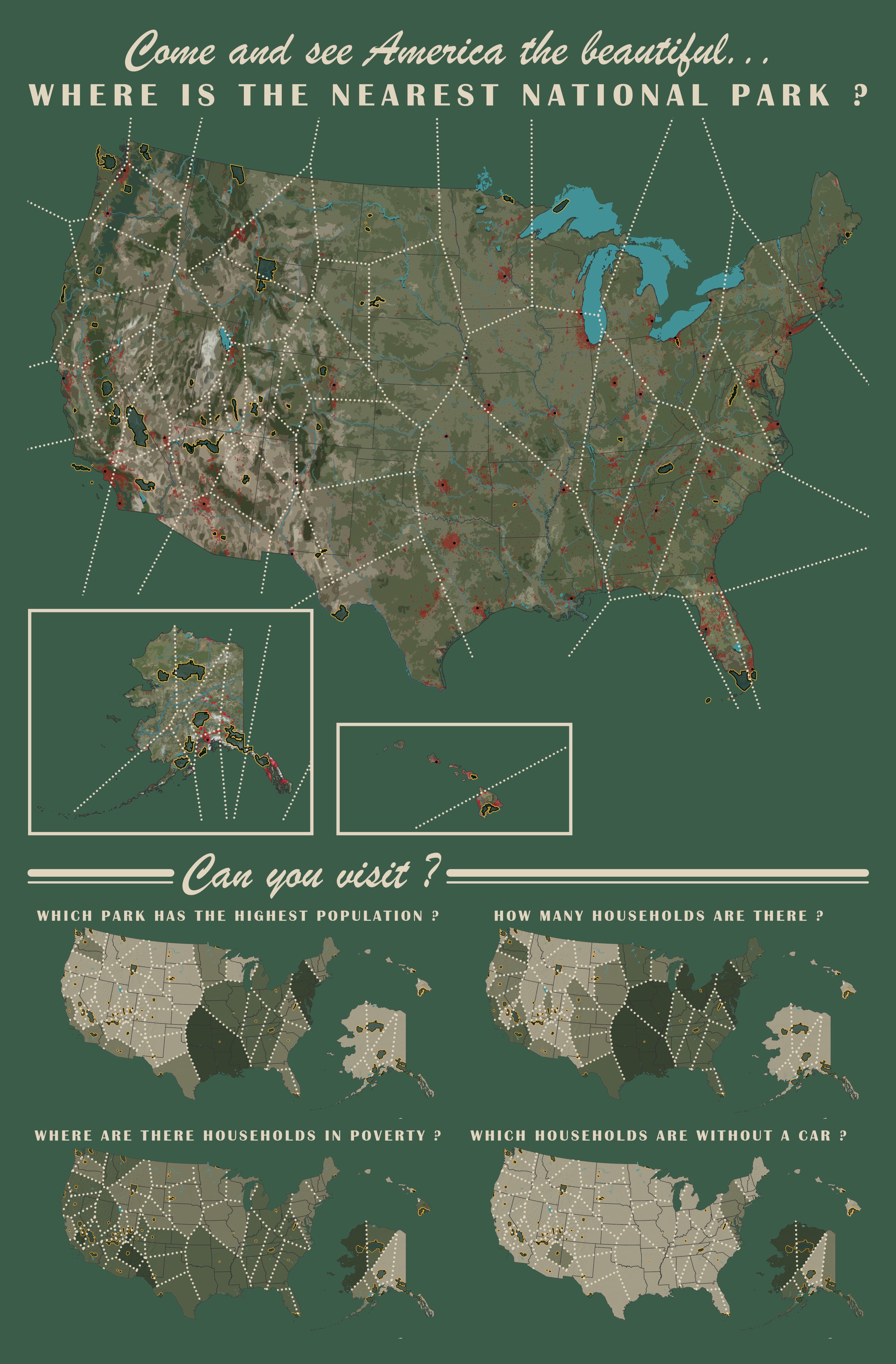
UPDATE: New 2021 map at the end of the blog adding in two new National Parks.
Have you ever wondered where is the nearest National Park?
That would be a good map on its own wouldn’t it?
But then the geographer’s mind starts to wander around. What would make this map more interesting? Why not take it a step further and show some of the demographic relationships for people living around each park?
Processes & tools
Use ArcGIS Pro to run the Thiessen (Voronoi) polygon tool (this requires an Advanced License) on information from the National Park Service. Then give the map more purpose by enriching it to help understand the circumstances for people living around each park.
We will be using Pro for the Thiessen polygon tool; information enrichment (this requires an ArcGIS Online organizational account); and final layout of the map.
There will a quick sidestep using a graphic design software to enhance the basemap (to obtain a cutout effect); but then it’s back to Pro to Georeference that layer and finish the final design.
Map muse
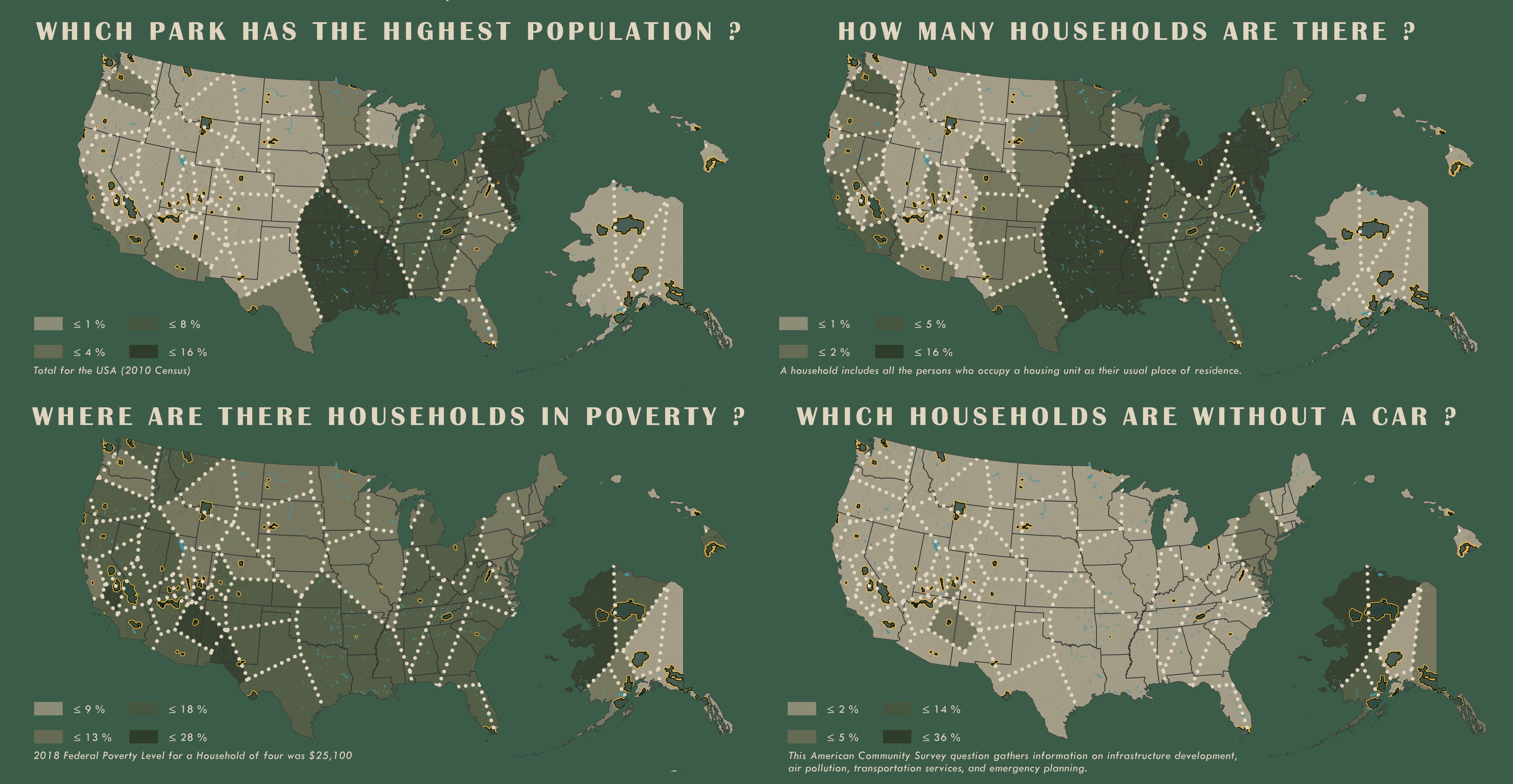
Since this map is about National Parks, why not take those beautiful vintage posters made in the 1930’s and 40’s by the WPA (more on that below) and give this map a nod to their past?
Don’t you love these posters? Here are a few I’ve collected through my travels:
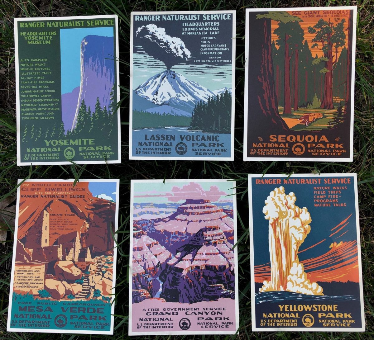
TIP: These posters can be good sources for color palettes and are wonderful for choropleth maps and displaying hierarchy. Each one has five to eight colors, only, and are beautiful color combinations that have withstood the test of time. Use this tool to sample colors on the computer (you will LOVE this tool).
Who made these?
President Franklin D. Roosevelt created the Works Progress Administration (WPA) in 1935 (renamed the Work Projects Administration in 1939) during some of bleakest years of the Great Depression.
It was one the most ambitious programs of the New Deal and it employed millions of Americans in public works projects building new roads, bridges, and buildings.
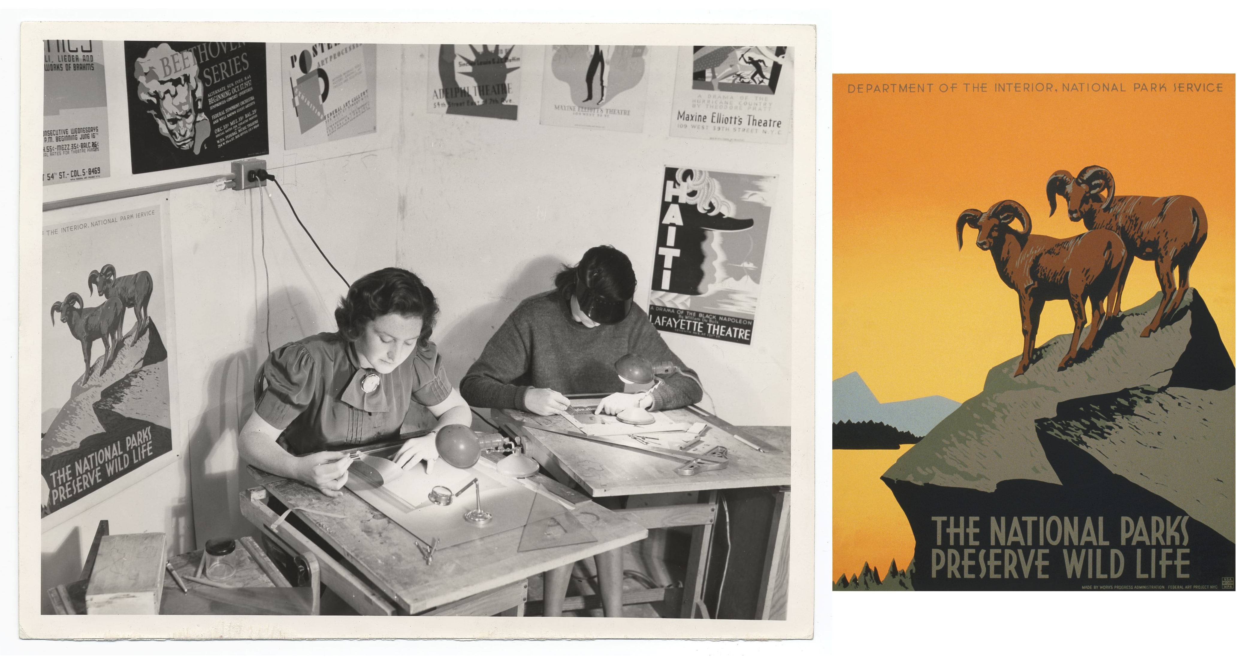
The WPA also had a Federal Art Program that employed out-of-work artists to provide art for buildings and public spaces. From August 29, 1935 until June 30, 1943 thousands of writers, painters, actors, and musicians were hired and they created numerous sculptures, easel paintings, murals, graphic art, posters, photography, museum and theater design, and arts & crafts within cities and communities creating some of the most meaningful pieces of public art in the United States.
From 1938 to 1941 the WPA created a series of posters for the National Parks and these are now classic graphics of some of America’s most beloved geographies. These artists made over 35,000 different types posters to promote safety, health, education, theater, and travel.
Click on the picture below and step back in time, for just a moment, and see how these artists are working. I was even able to find the poster hanging on the wall. See it in color!
Get the layers ready
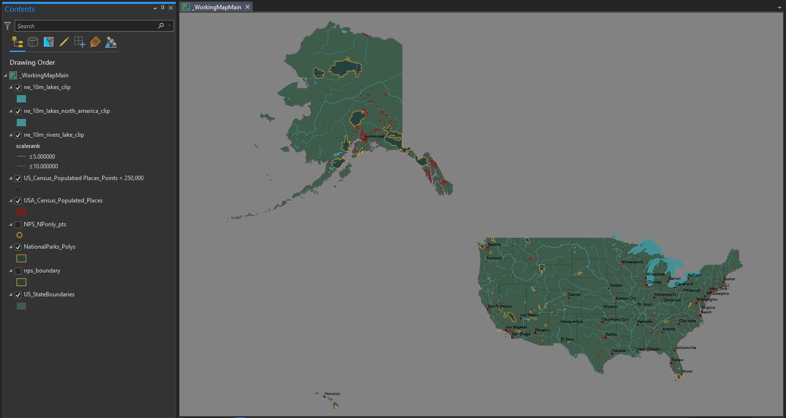
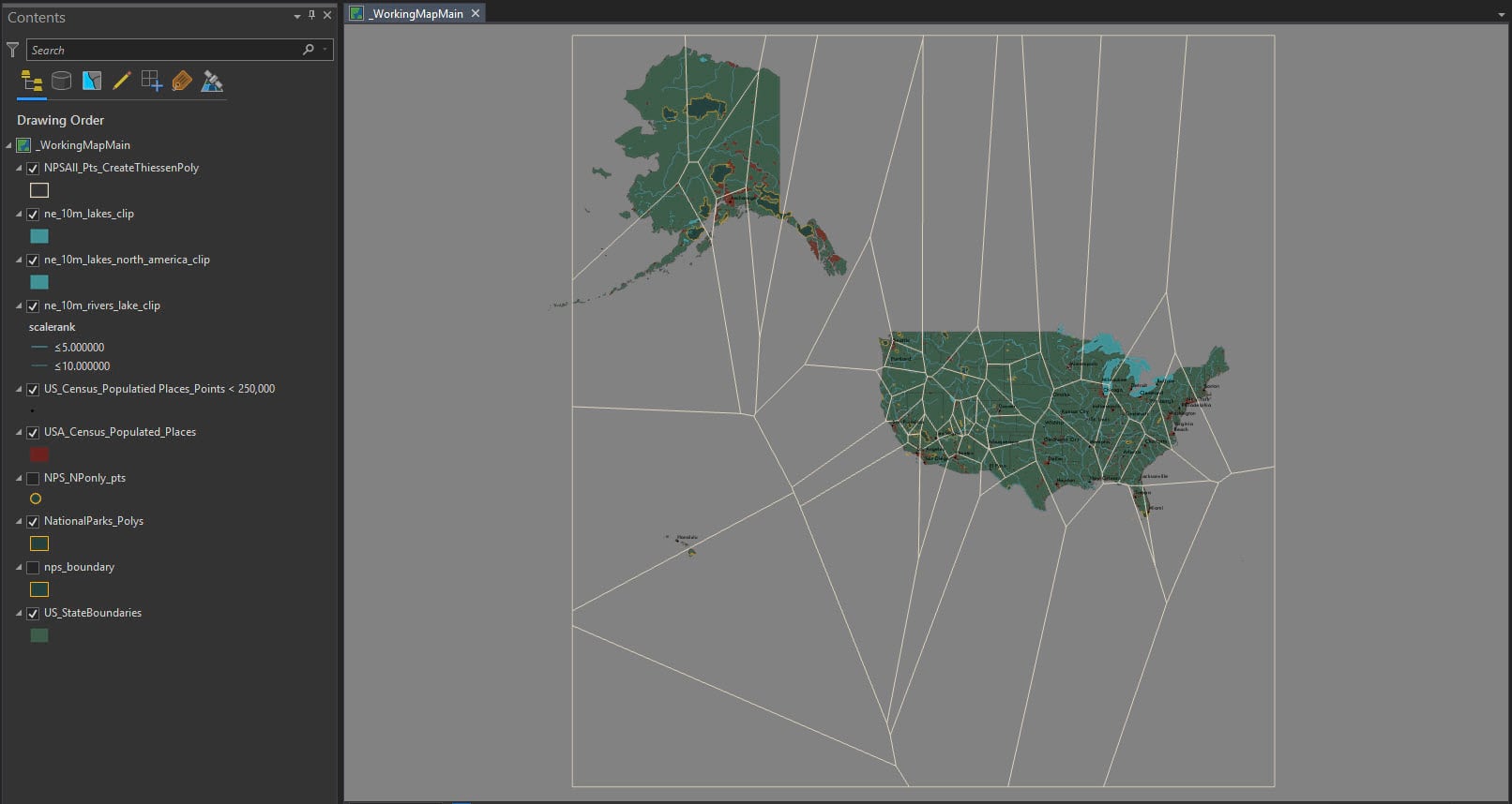
Download the project package for ArcGIS Pro here. Shown below is:
WorkingMapMain
The following layers and tools were used to prepare it:
US State Boundaries (Add Data from Path; select the States and use the Copy Features tool; Export the features to the geodatabase.)
Administrative Boundaries of National Park System Units (Download zip file; select and export only National Parks (NPS); use Feature to Point* tool and covert all of the NPS polygons to points). *Please note that this project was run using the data’s native GCS North America 1983 Coordinate System and the preferred output Coordinate System would be 102010 North American Equidistant Conic.
US Census Populated Places (Add Data from Path; select the States and use the Copy Features tool; then use the Feature to Point* tool and select 75 cities that are < 250,000)
Natural Earth Hydrography 1:10,000,000 (Clip all layers to US State Boundaries)
A) Rivers and lake centerlines
B) Lakes + Reservoirs
C) North America supplement (Lakes + Reservoirs)
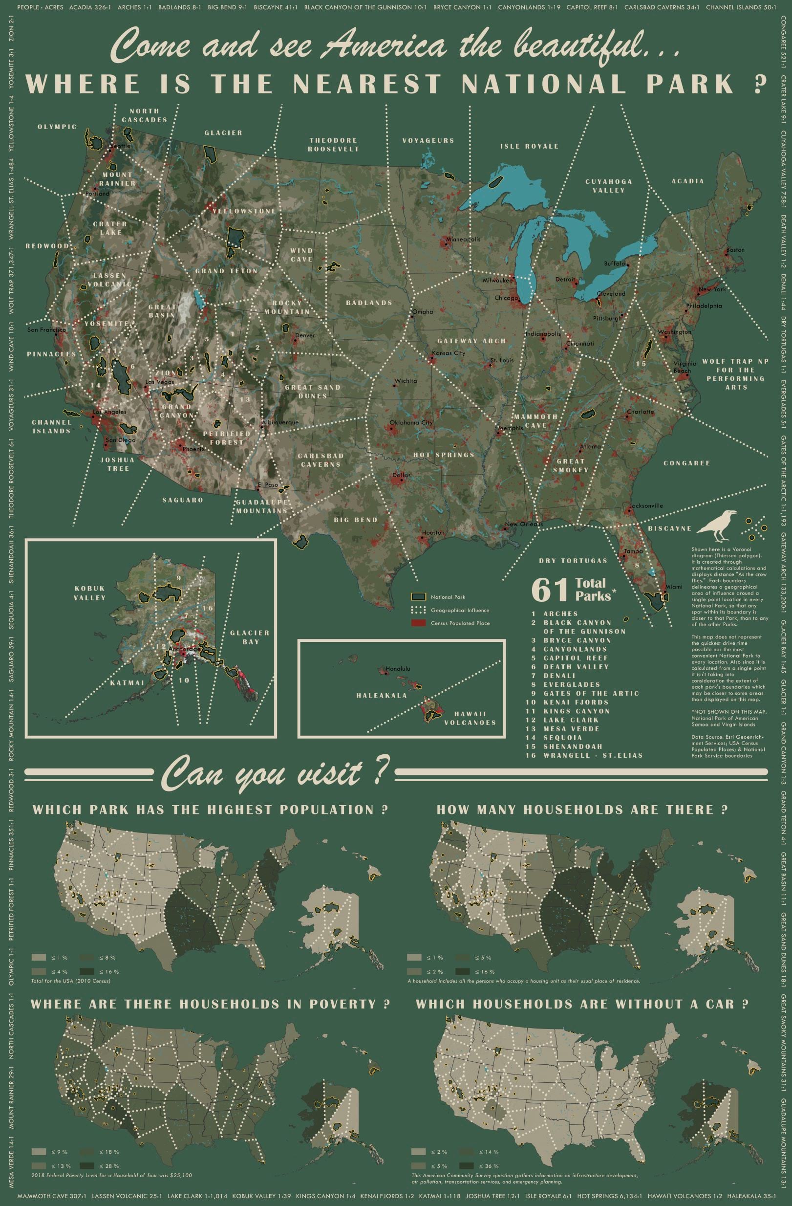
When all is said and done it will look like this.
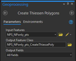
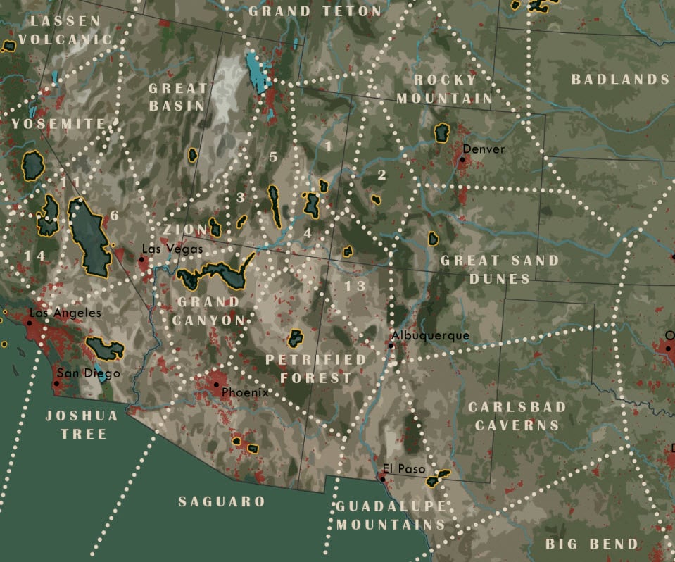
Create Thiessen polygons (Voronoi)
This tool will calculate the area of influence around each National Park.
The way it works is it divides the area covered by the input point layer into Thiessen or proximal zones.
These zones represent areas where any location within that zone is closer to its own input point than to any other point.
These are mathematically accurate, but also beautiful like the geometry of a spider’s web.
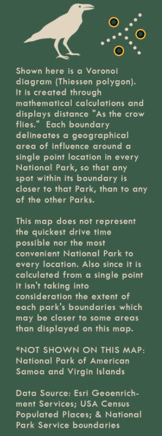
There is a caveat about Thiessen polygons that must be mentioned and be a disclaimer on the map.
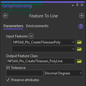
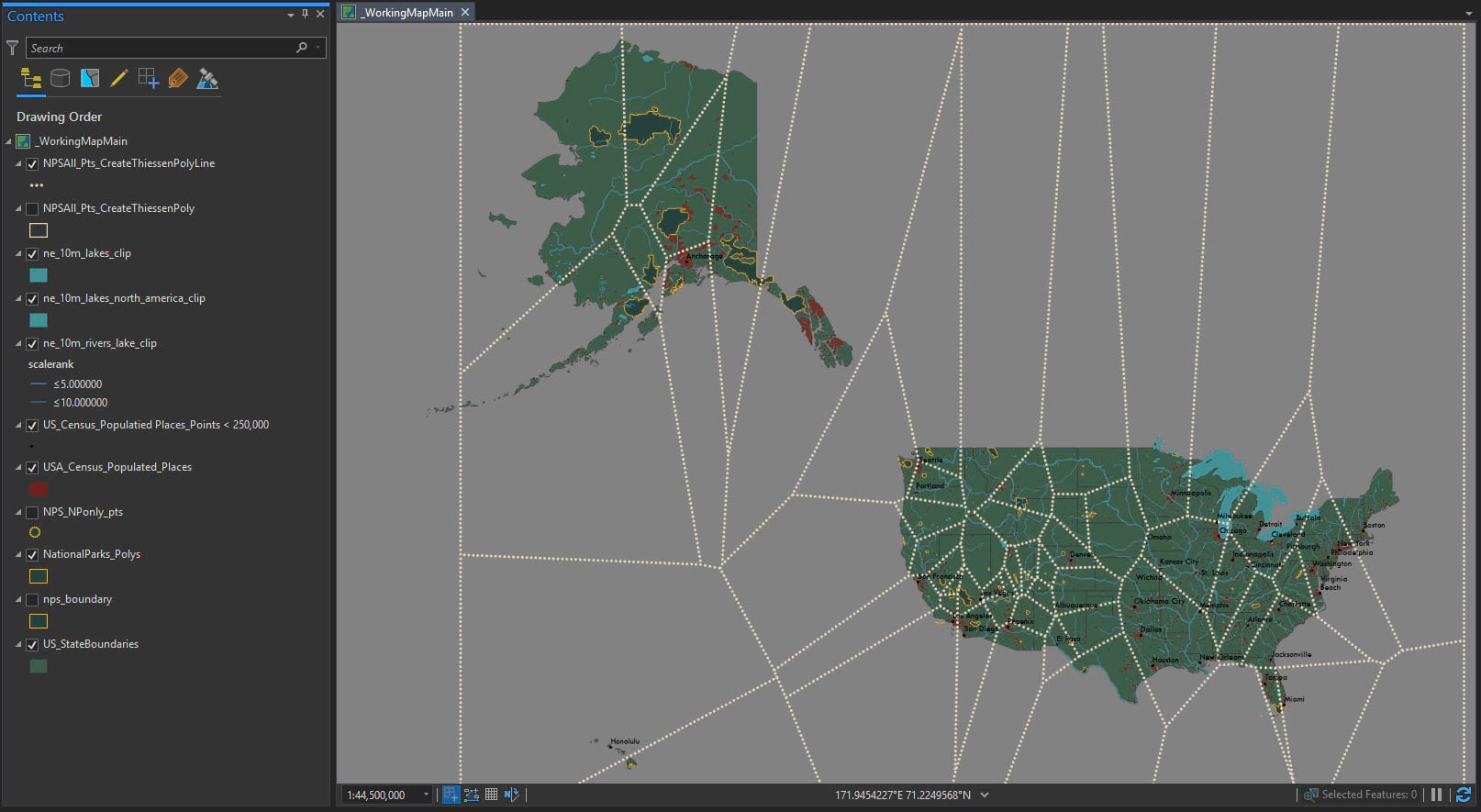
TIP: Convert your Thiessen polygon to a polyline using the Feature to Line tool so you can symbolize with a dotted line. This tool allows each line to become its own unique entity avoiding the mess when two contiguous polygons try and render a dot or hash mark together.
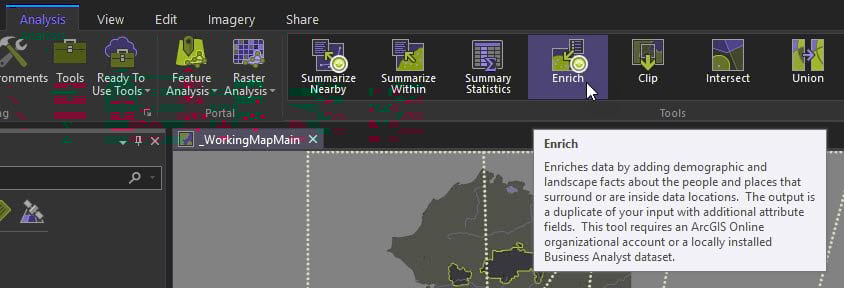
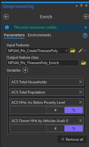
Run layer enrichment
The enrich tool will calculate demographic and landscape facts about the people and places that surround or are inside your layer locations. The output is a duplicate of your input file with additional attribute fields.
Running the Enrich tool will consume credits. Click here for more information.
In Pro under Analysis open the Enrich tool.
Use the Thiessen polygon layer we created and give the new output feature class a name. Then click on Variables.
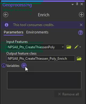
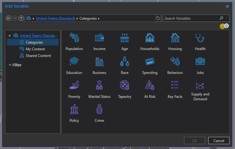
There are many categories available to choose from.
Give purpose to the map
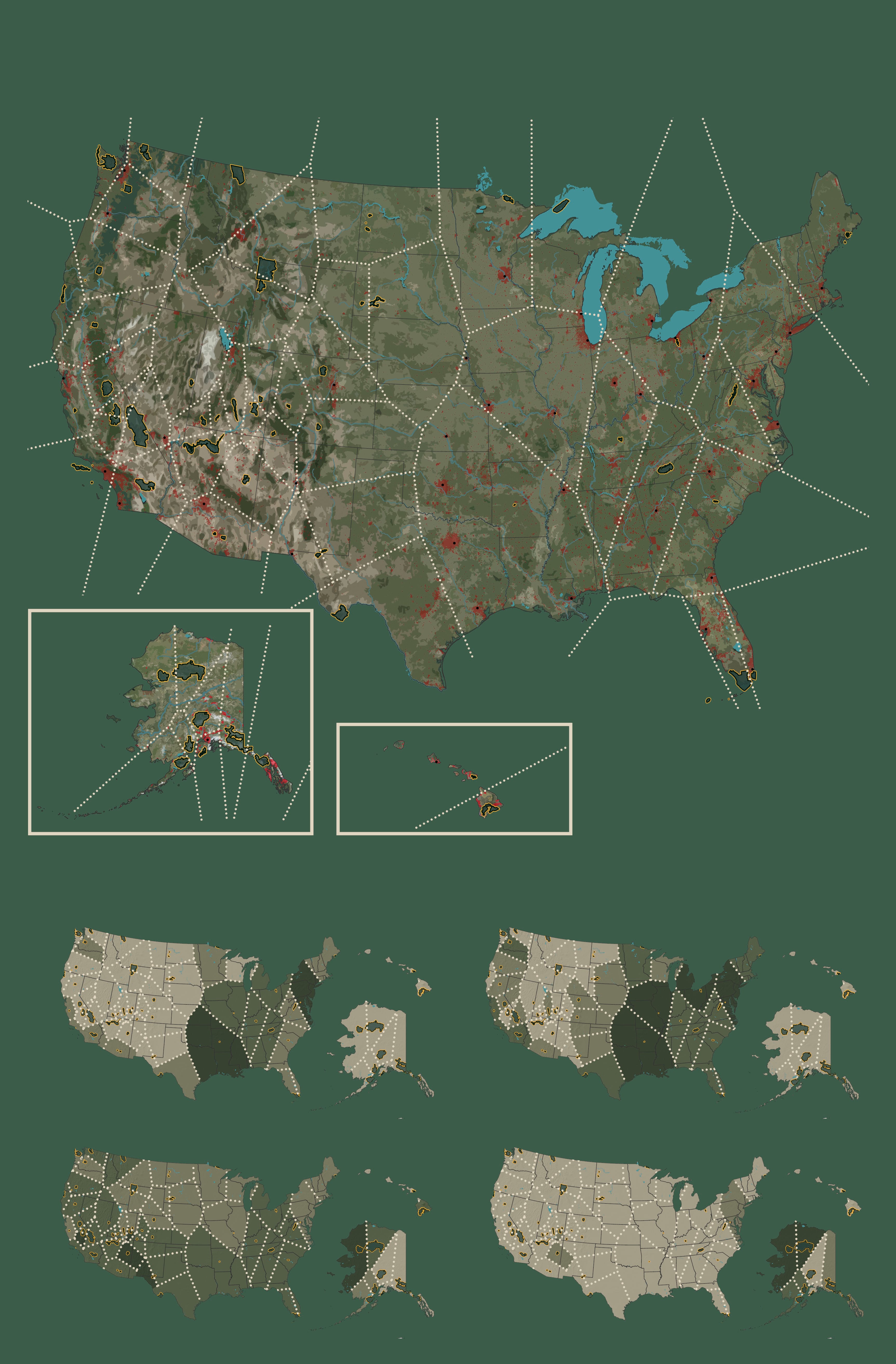
For this map let’s try to highlight the people who live around each park and the potential barriers for them in visiting:
How many people live around their closest National Park?
How many households are there?
How many households are in poverty?
How many households are without a car?
The quickest way to find what you need is to use the Search box (top right) to quickly find the appropriate layer vintage. Next uncheck the boxes for the dates you do not need. This example shows how to search for population from 2013-2017.
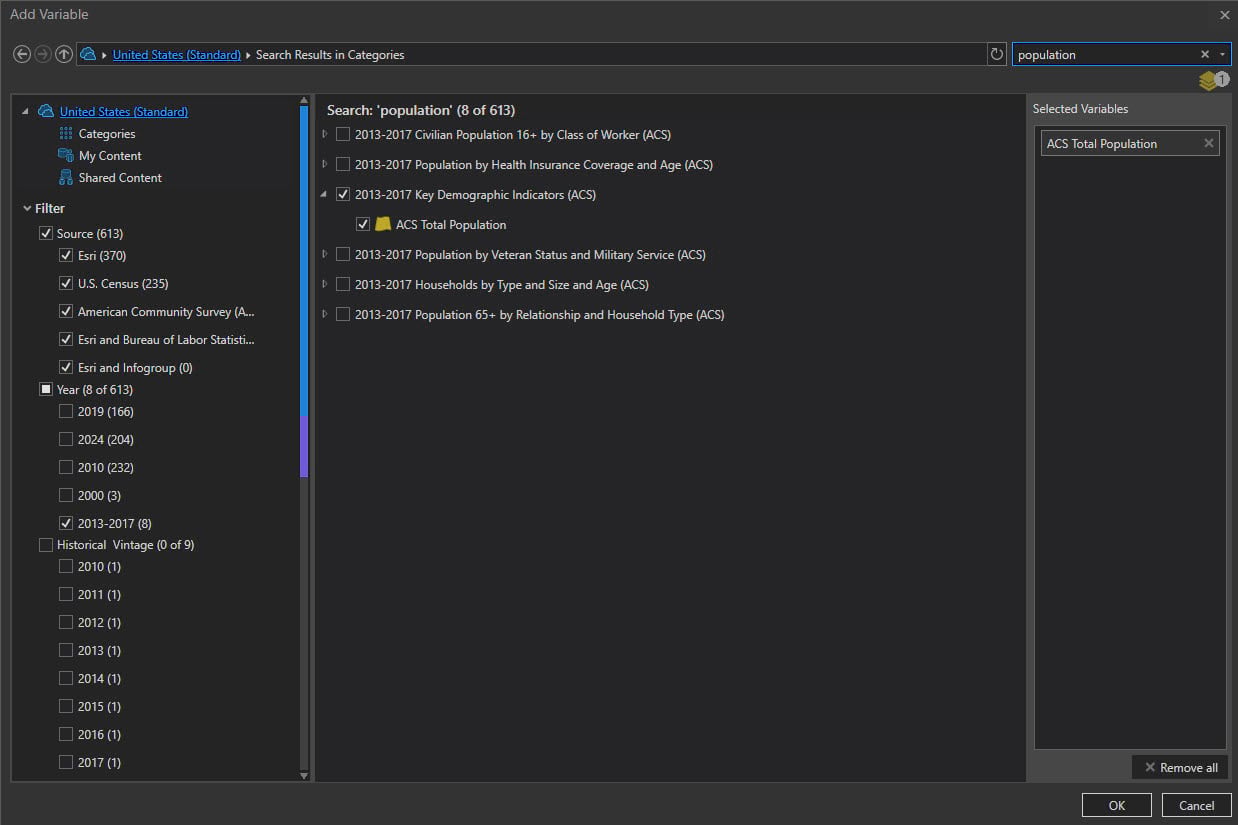
Select the following four enrichment layers:
2013-2017 Key Demographic Indicators (ACS) Total Population
2013-2017 Total Households
2013-2017 ACS Households Income Below Poverty Level
2013-2017 ACS Owner Households by Vehicle Available: 0
Run the tool and open the attribute table to see the new fields that have been added:
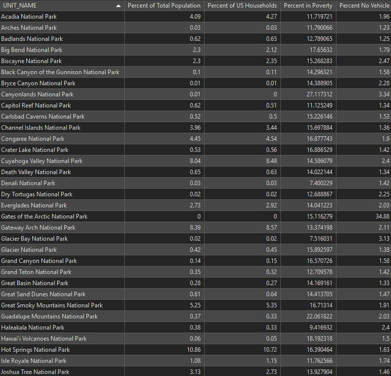
The results from the enrichment show interesting patterns and trends – too many to mention them all – but a few jumped out:
The communities and reservations around Petrified Forest National Park in the Southwest have a high rate of poverty and are without cars.
The area around my neck of the woods (pun intended) near Sequoia National Park also have a high rate of poverty, but most households have cars.
Kobuk Valley and Gates of the Arctic, both National Parks in Alaska, have low amounts of households but those households also have a high rates of poverty.
Also look at the large geographic area and population that Hot Springs National Park serves!
Bring in the vintage National Park style
These posters all share a “cutout effect” and we need the map to emulate that.
To achieve this effect we will use the World Imagery (Clarity) basemap; next sidestep to a graphic design software for the cutout effect; and lastly re-import the image and georeference it.
In Pro open the map called:
WorkingAerialCutout
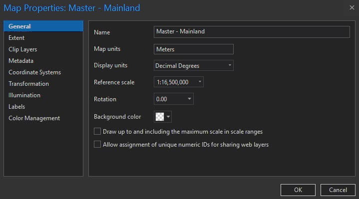
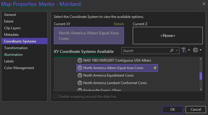
The Map Properties have been adjusted to:
Reference scale of 1:16,500,000
Projection is North America Albers Equal Area Conic
Add in the World Imagery (Clarity) from the ArcGIS Living Atlas.
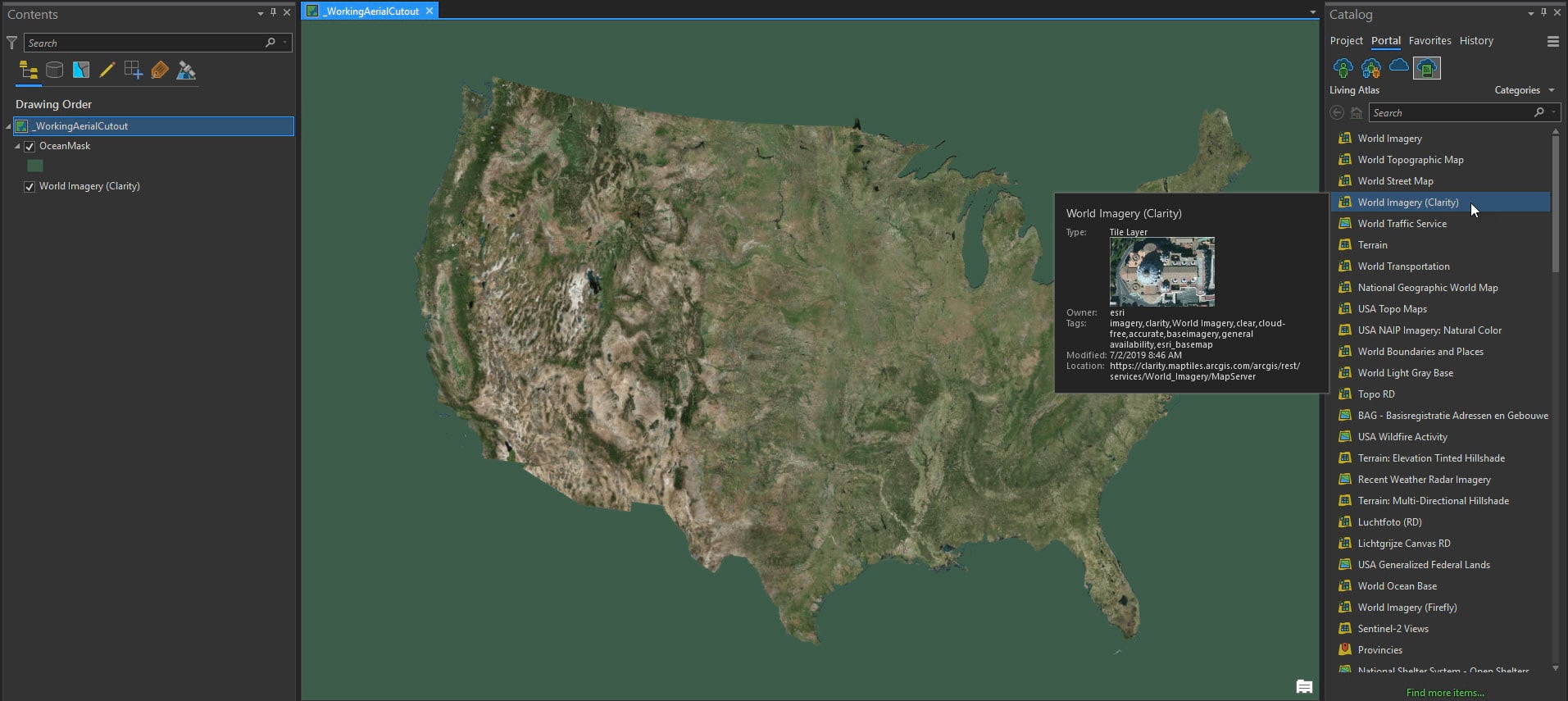
Note the ocean ‘mask’ feature class (green polygon area) that I want for the background of my map (we need this for georeferencing later).
TIP: To make a ‘mask’ of an area – create a new feature class that is a shape that completely covers your layout extent (I use a box generally); Then use the Erase tool to subtract the area that you want to highlight (in this case it was state boundaries).
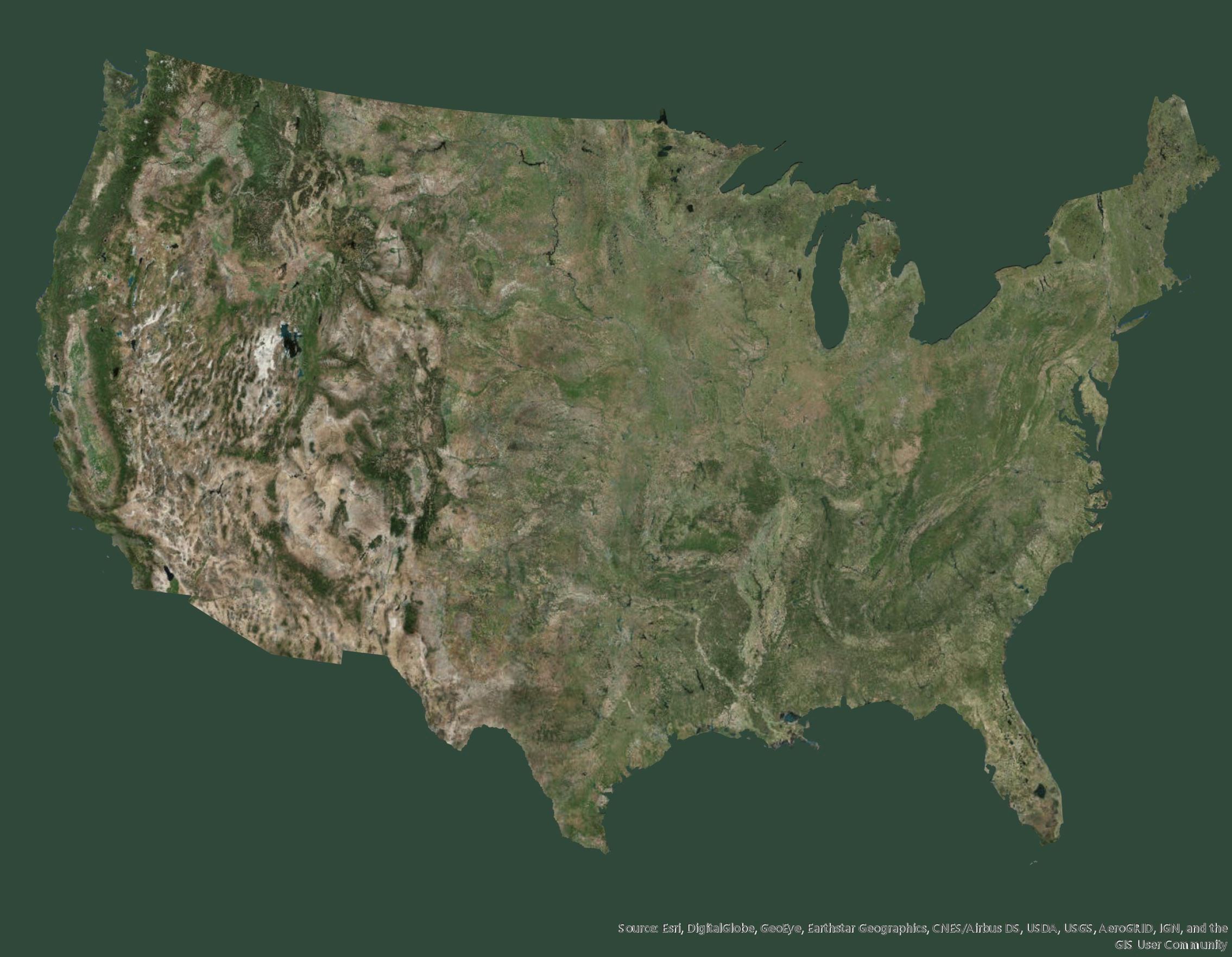
Export the Clarity map with the ocean ‘mask’ as a PDF with a Resolution (DPI) of 175.

Exported PDF:
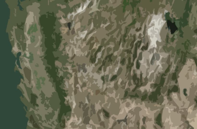
Import the PDF to a graphic design software (I use Adobe Photoshop here).
Use the Cutout Effect from the Filter Gallery:
Number of Levels: 8
Edge Simplicity: 5
Edge Fidelity: 3
Export this as a .gif image file.
Yes a .gif and you might think that’s strange, but neither the .jpg or .png behaved and performed as nicely as the .gif. The .gif resolution stayed intact (for printing at 11×17) and was easy to georeference.
The basemap now has the following effect.
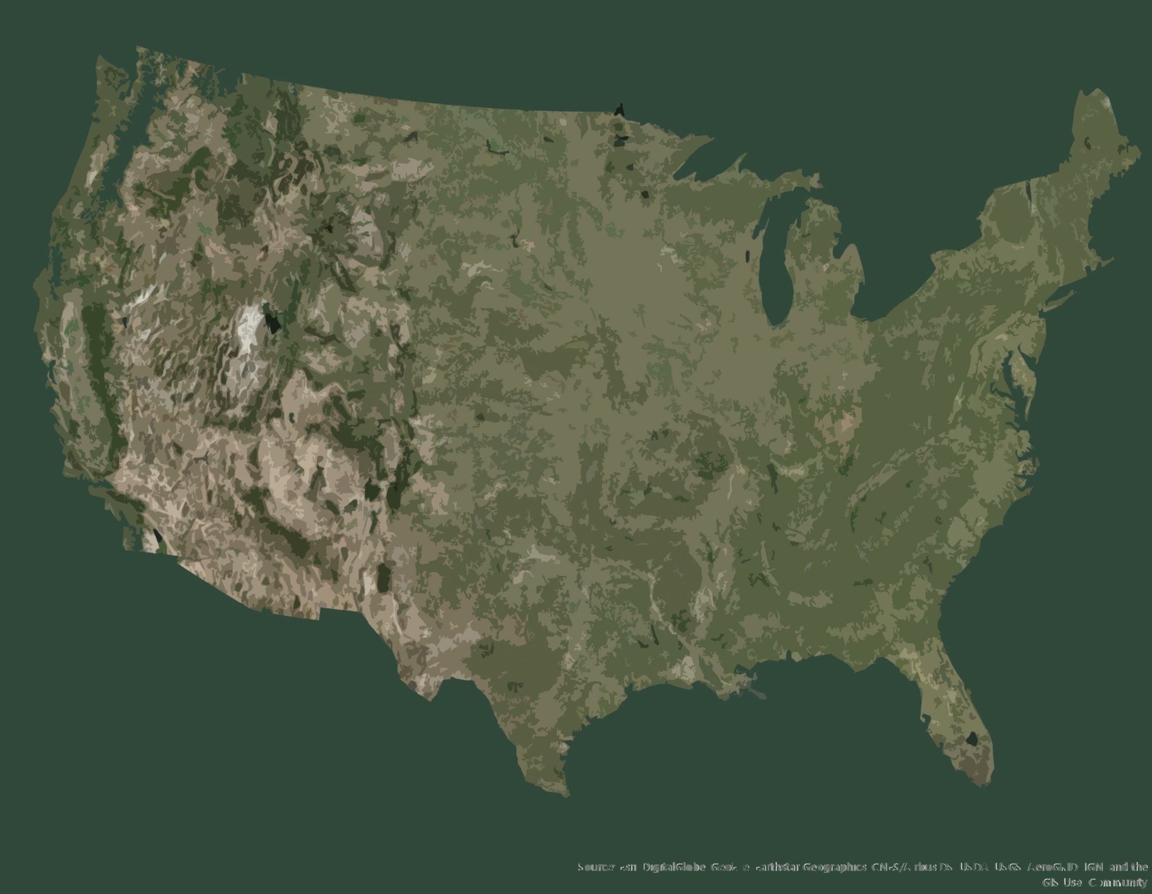
It looks just like the poster!
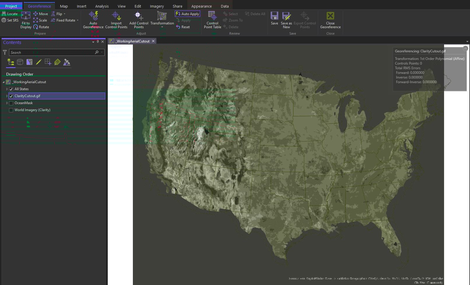
Back to Pro…add in the US States boundary because we will need it for georeferencing.
Import the .gif and when it asks to ‘Build Pyramids’ say yes. It will not appear though.
Open the Georeferencing toolbar.

The tool is intuitive and the ribbon changes to reflect georeferencing options. Select Fit to Display.

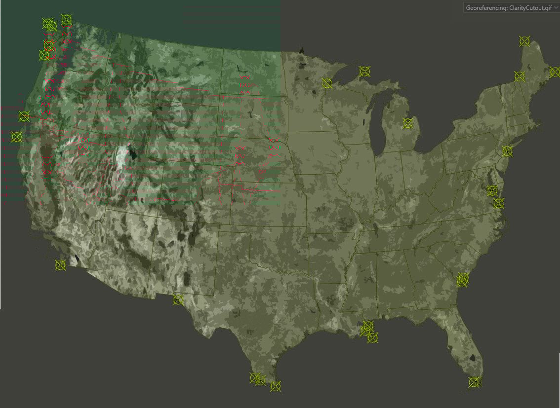
All together in one place!
The .gif actually came in pretty close and isn’t going to be too difficult to align.
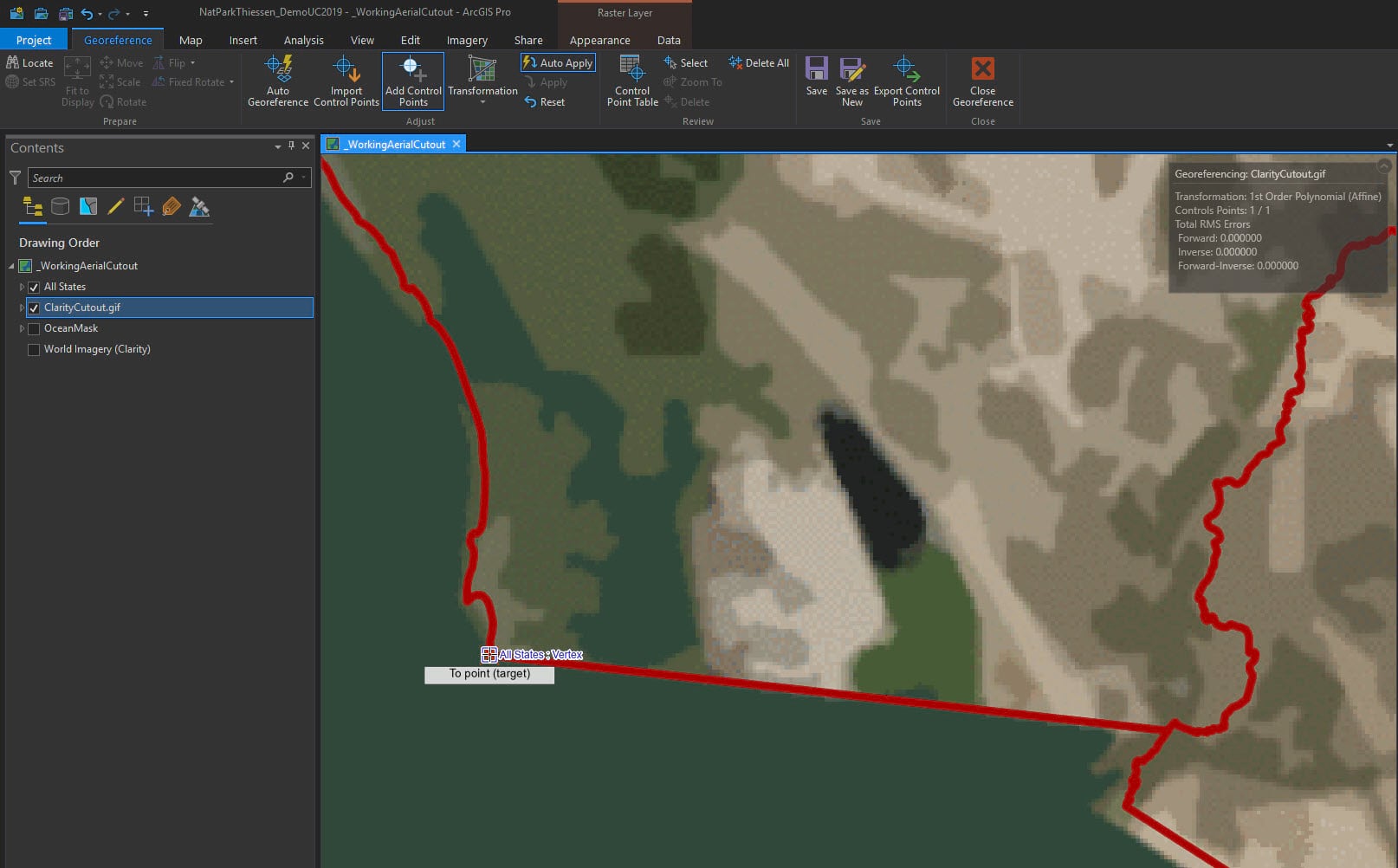
The next step is to add the control points to assign the geographic position to the .gif.
Click on the Add Control Points tool.

Ideally these first initial control points should be placed as far apart as possible. I usually start with the four corners when georeferencing.
Zoom to the southern most westerly tip of California and add the first control point.
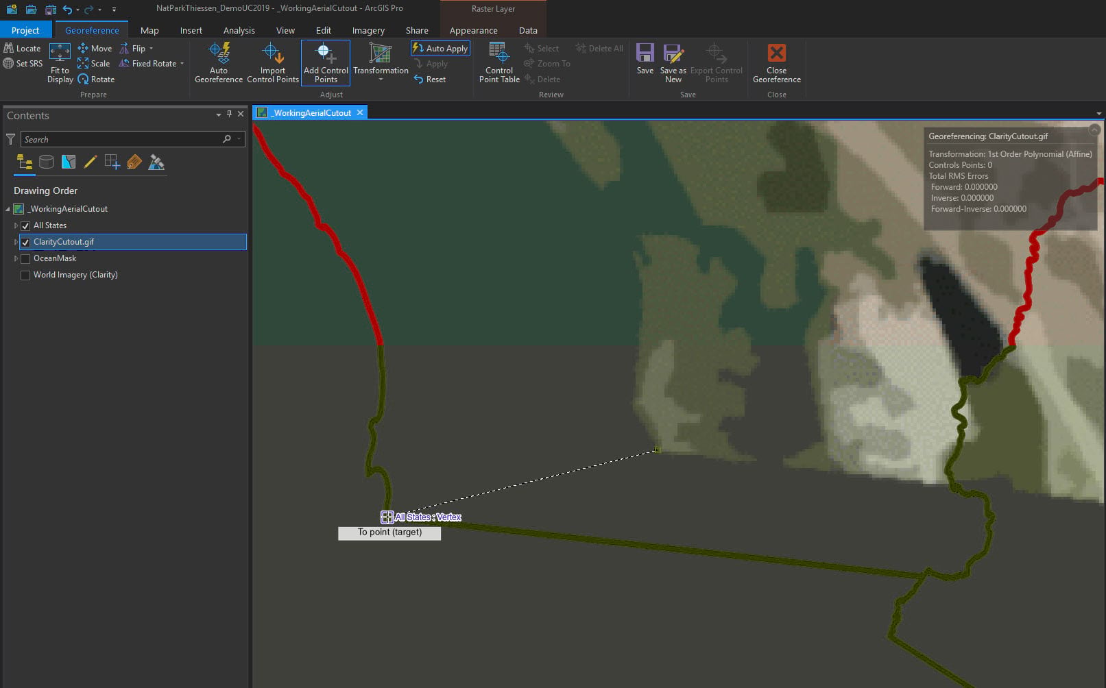
Release the mouse and with the second click of the first control point, the .gif shifts over to its new location.
Let’s do another one. This time zoom to northern part of Maine. I see a nice square feature to add a point.
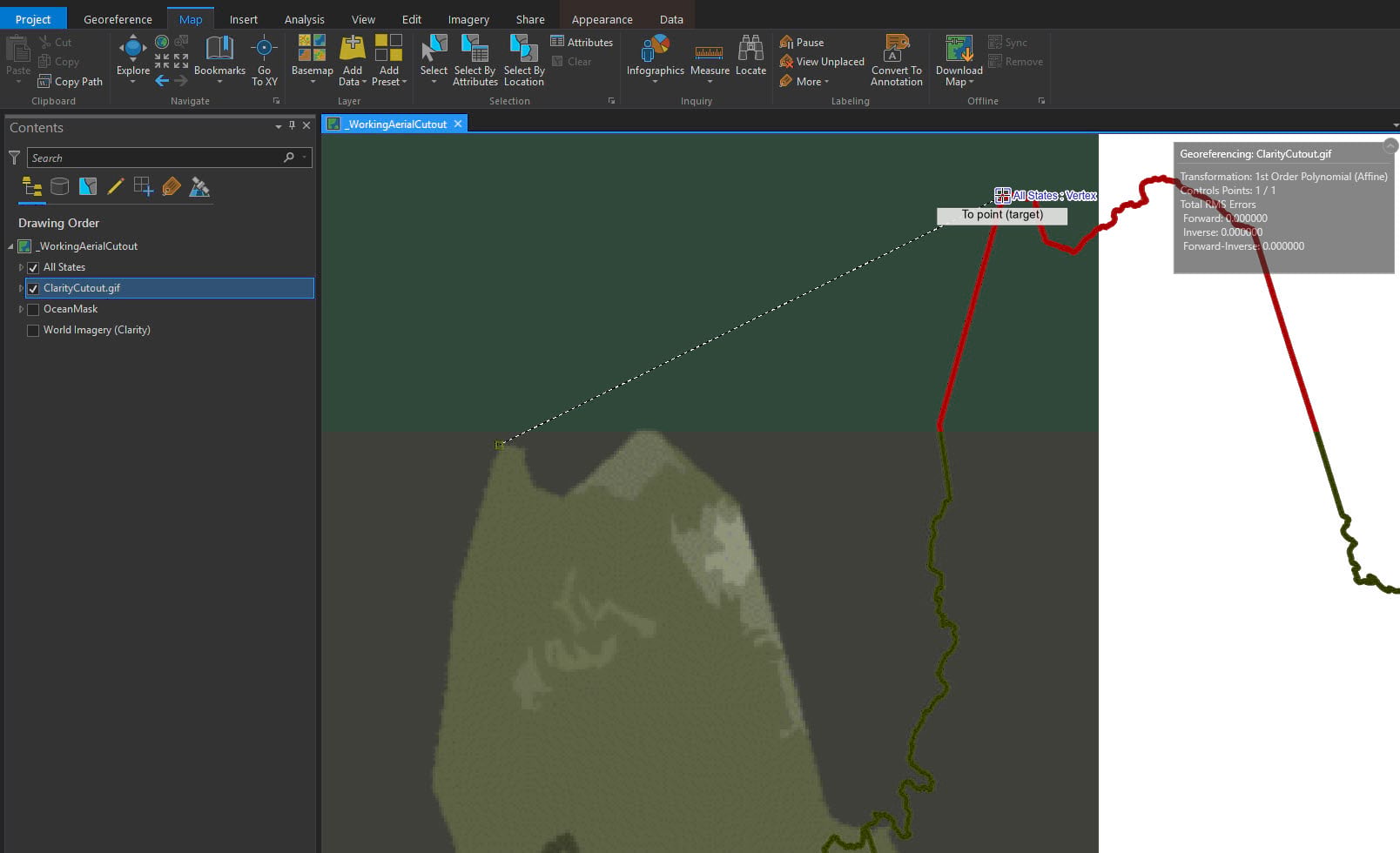
The next control point shifts the .gif again.
Every control point assigned will give the .gif a more accurate location.
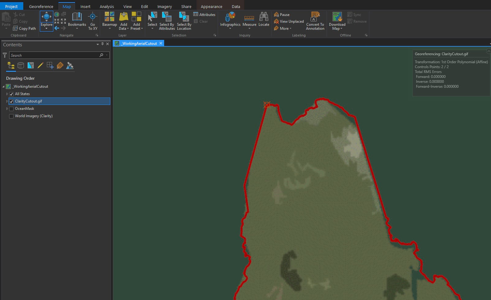
This looks about right.
Keep in mind the image will not be 100% perfect because it does have an artistic cutout filter applied to it. The green ocean mask (same as the layout background) will be forgiving for those spots that are not in perfect alignment.
Click save and close georeferencing.
Put it all together
The layer elements are ready to go! To layout view…
Let’s get this started with the page setting as portrait to mimic the orientation of the posters.
This map will have an incredible 15 individual maps! The main focus map will have have the US mainland (1:16,500,000), Alaska (1:77,000,000) and Hawaii (1:15,500,000).
The four demographic sections each have three maps: US mainland (1:50,500,000), Alaska (1:133,000,000), and Hawaii (1:25,000,000).
For the typography there are three fonts in Pro that have the vintage look that is perfect for this map:
Britannic Bold
Brush Script MT
Tw Cen MT.
Now what is needed is a good title to draw people in and then a logical segue into the demographic section.
Here are the specs:
Come and See America the Beautiful – Brush Script MT 48 pt #E0D5BF
Where is the Nearest National Park & Can you visit? – Britannic Bold 29 pt #E0D5BF; Letter spacing at 50%
Four sub map titles – Britannic Bold 14 pt #E0D5BF; Letter spacing at 35%:
Now let’s make the map labels and turn them into annotation for the National Parks and cities.
Use the original Thiessen polygon but symbolize it without a fill or stroke, though, because we don’t want to see it. We just need it for annotation creation.
Specs:
National Parks – Britannic Bold 9 pt #E0D5BF; Letter spacing at 50%
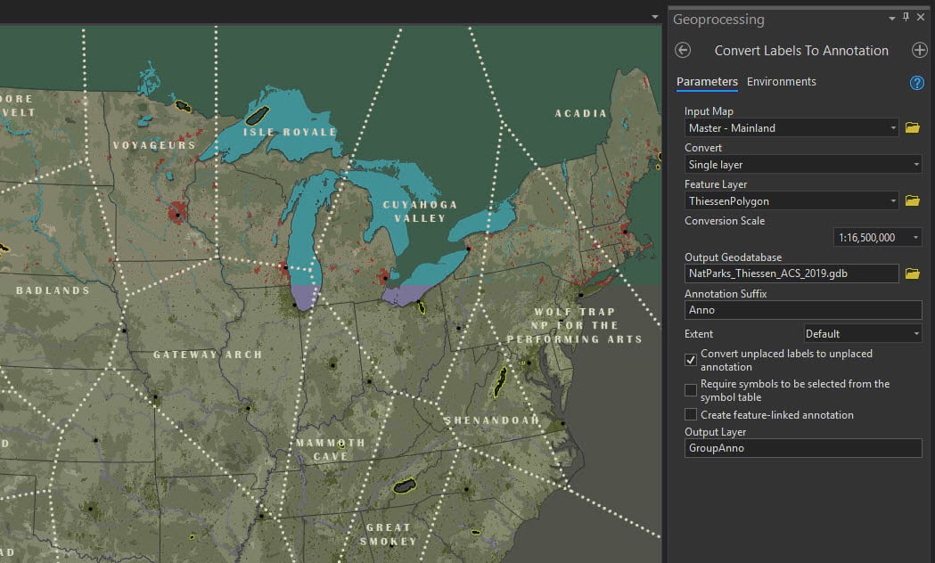
Cities: Tw Cen MT 7 pt #000000; Letter spacing at 10%
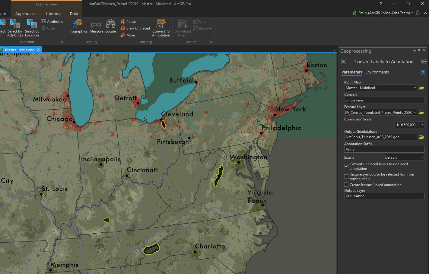
I like to edit the annotation placement in Layout view myself. I find it easier to do it there.
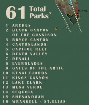
Take note that not all of all of the park names will fit. Create a alphabetical number classification system for those that will not fit inside their polygon.
All that’s left is to add the legends, disclaimer as mentioned above, and one last element to make this map really bring it. Let’s calculate the ratio of People:Acres for every National Park!
TIP: Use a text element as a neat line.

So where is the nearest National Park?
I would like to tip my hat to the hard-working artists of the WPA.
This map will hopefully engage the viewer and honor the style of those posters.
The final high resolution ORIGINAL August 16, 2019 map is here.
Download the ORIGINAL August 16, 2019 project package for ArcGIS Pro here.
2021 UPDATE
Since publishing there have been two new National Parks – Indiana Dunes and New River Gorge.
Here is the updated April 12, 2021 map and for the high resolution version please download from here.
The changes made were adding in the two new National Parks, as well as U.S. Virgin Islands and American Samoa (now a complete map of ALL National Parks), running the Thiessen polygons tool, removing the demographic analysis, neat line, and lightening the green a bit.

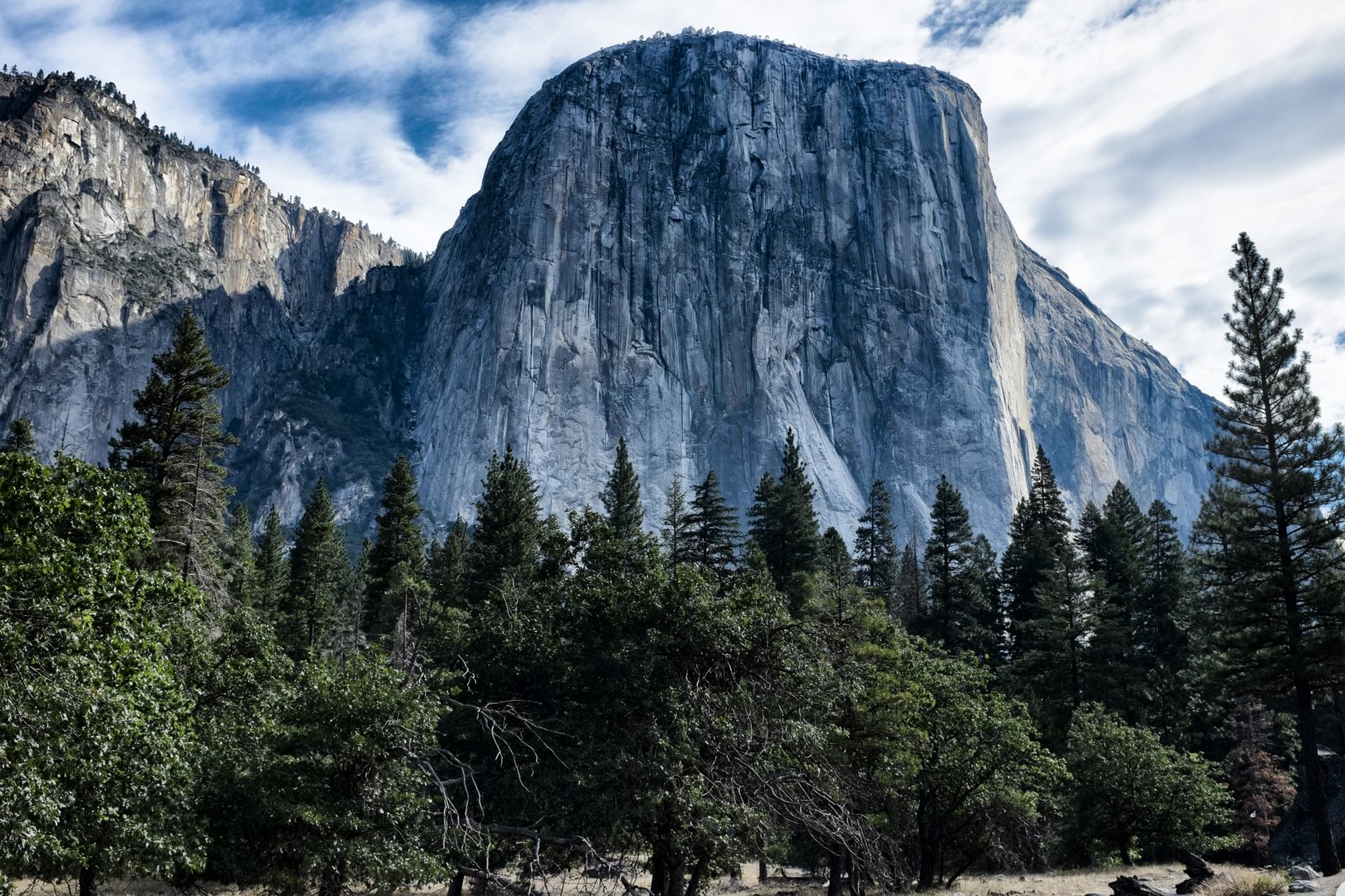
Thank you for reading. I’ll leave you with an image from Yosemite National Park and one of my favorite spots to marvel and stare at while watching the shadows dazzle across it throughout the day…such treasures these places are!


Commenting is not enabled for this article.