This blog post was written by guest blogger, Spyridon Staridas.
Find additional contributions written by Spyridon here and here.
…
This blog post is about styling and labelling data from the OpenStreetMap database in ArcGIS Pro, to produce impressive maps. The key is to understand the structure of OpenStreetMap data, the different data types and their correspondent attribute schemes.
For the purpose of this blog, I selected the country of Luxembourg in Europe, because it is a small country and I believe it is a good example. Of course, this process can be applied to any other place in the World, provided that OpenStreetMap data is available for that place.
All OpenStreetMap data have been downloaded from the Overpass Turbo with appropriate queries in GeoJSON format and further converted to feature classes with the JSON To Features Geoprocessing Tool.
In the following paragraphs I attempt to style and label all data with Arcade, whenever possible. I believe Arcade can really help ArcGIS users to save time and make better and more efficient workflows.
Map and Layout Preparation
In ArcGIS Pro I open a new map, which I rename to “Luxembourg” and I select the OpenStreetMap from the basemap gallery (on the Map tab, in the Layer group).
I navigate to Luxembourg with the help of the Locate pane and I open the Map Properties dialog box. At the Coordinate Systems tab I search for the “Luxembourg 1930 Gauss” (EPSG:2169) projected coordinate system and I select it.
I create a new Layout, with height 100cm and width 70cm, which I rename to Luxembourg and I add a new Map Frame with the Luxembourg map. I zoom and center to the boundaries of Luxembourg and I set the map scale to 1:100,000.
This is going to be the scale of the final map and since I will produce a single-scale map, it is a good idea to set it as the Reference Scale for the map.
I am all set-up to start adding layers on the map. The layers I am about to add can be categorized in three major groups and they include:
- Cultural Features
- Countries Boundaries (polyline)
- Countries Areas (polygon)
- City of Luxembourg Area (polygon)
- Urban Areas (polygon)
- Populated Places (point)
- Physical Features
- Forests (polygon)
- Water bodies (polygon)
- Rivers (polyline)
- Transportation Layers
- Roads Back (polyline)
- Roads Front (polyline)
Before delving in styling and labeling each individual layer, it is also necessary to install the fonts I will use. I need one sans-serif font for the cultural features and other elements of the map, as well as one serif font for the physical features.
For this I select to work with the Source Sans Pro and the Source Serif Pro, two of my most favourite Google Fonts.
NOTE: If I haven’t already installed these two fonts, I will have to shut Pro down, install the fonts in my system and then start Pro again.
In the following paragraphs I will narrate how I add, style and label each layer separately and successively until I end up with a final street map for Luxembourg!
Cultural Features
Countries Boundaries
The first layer to style is the administrative boundaries of Luxembourg and its neighbour Countries, which are Belgium, France and Germany. OpenStreetMap features all levels of administrative boundaries. For our case we need the number 2 admin level in polyline geometry.
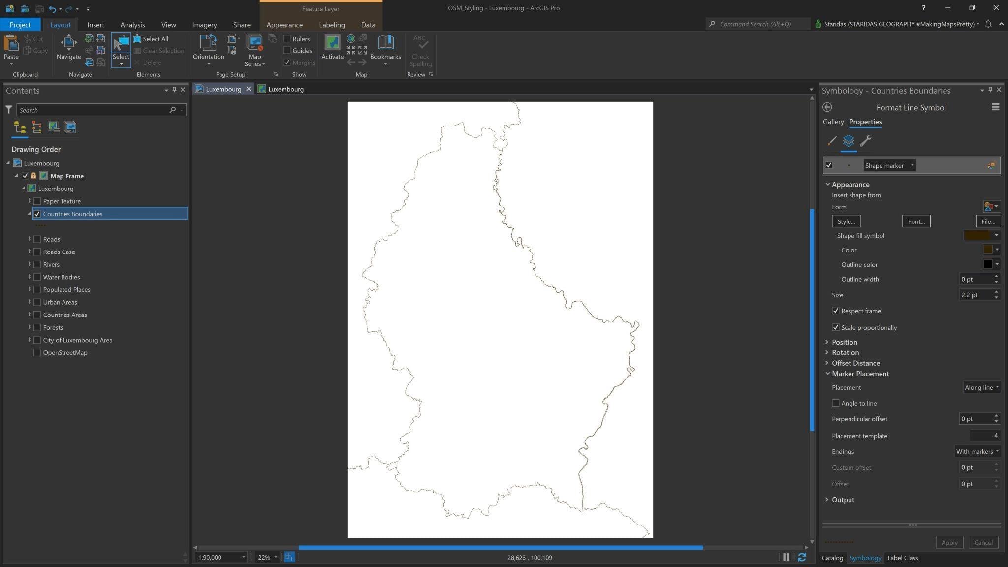
So, I add the admin polylines in ArcGIS Pro and I style them with a Shape marker. I give the marker a Size of 2.2pt and for Color I choose the #332200. At the Marker Placement properties I select Along line for Placement, 4 for the Placement template and I choose With markers for the Endings (Picture 1).
I rename this layer to Countries Boundaries at the Contents Pane.
You may always skip all the process, I narrate here, and go directly to my ArcGIS Online account where I have uploaded the ArcGIS Pro project, presented here, in one compact Map Package. You may get it from here and freely use it under a CC BY-NC-SA 4.0 license.
Countries Areas
The Countries Areas layer is the same administrative layer in OpenStreetMap but in polygon geometry. I will use it firstly to highlight the boundaries of the Countries and then to label them.
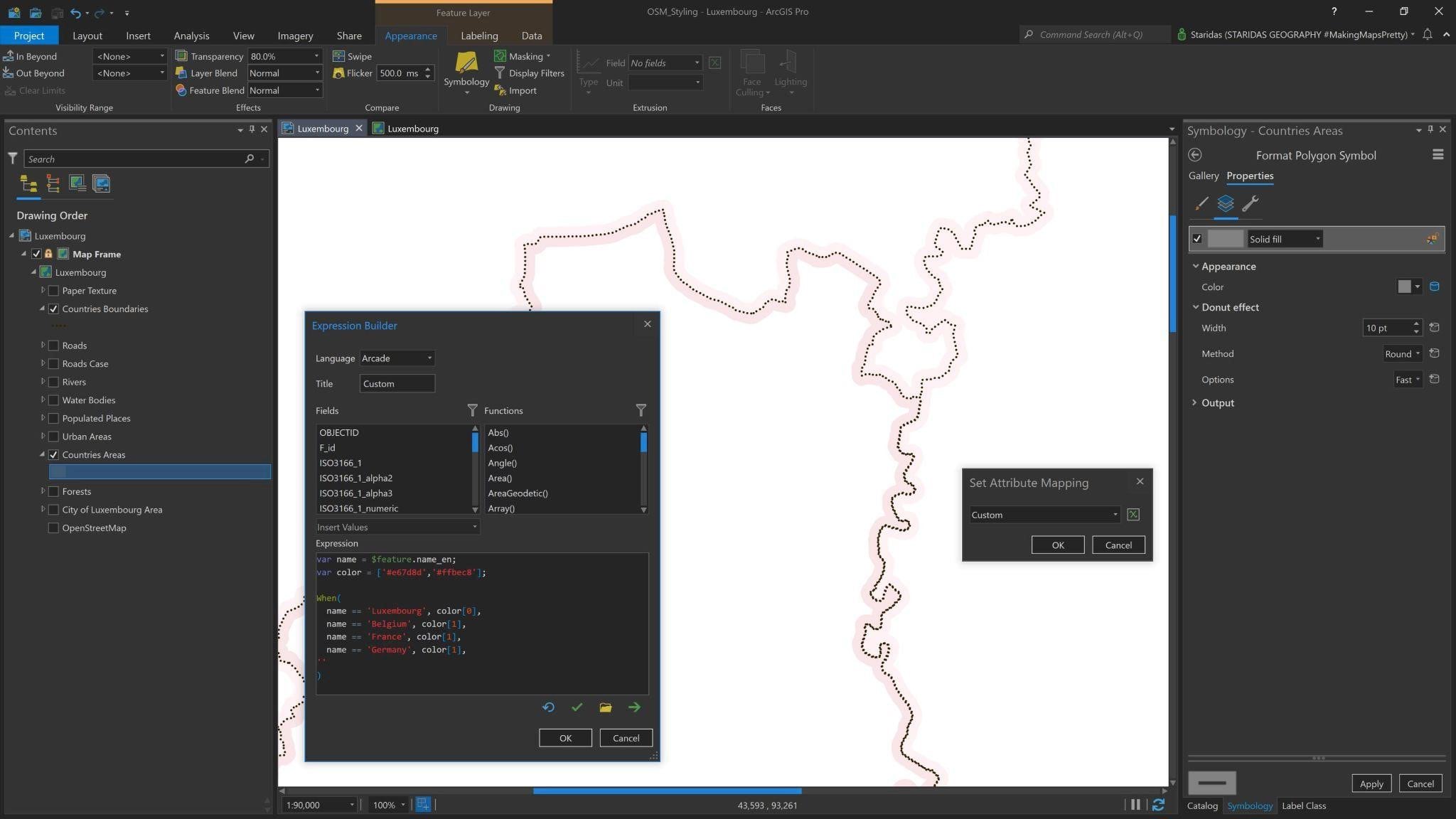
I add the polygon Countries Areas on the Contents Pane and I open its Symbology properties. I select a Solid fill with a Donut effect. For the Donut effect I pick 10pt for Width and Round for Method.
Now, I want a different Color for Luxembourg and for its neighbour countries. I will do this with an Arcade Expression.
To do this, I go to the Symbology pane and at the Vary symbology by attribute tab I check at the checkbox next to the phrase Allow symbol property connections. Then, at the Symbol layers tab at the Symbol properties, I click on the database icon which has appeared next to the Color selection (see Picture 2). The Set Attribute Mapping dialog appears, where I write the following expression:
var name = $feature.name_en;
var color = [‘#e67d8d’,’#ffbec8′];
When(
name == ‘Luxembourg’, color[0],
name == ‘Belgium’, color[1],
name == ‘France’, color[1],
name == ‘Germany’, color[1],
” )
In this expression I declare the variable name which represents the attribute name_en of the feature layer. I then declare the variable color to which I assign an array of HEX colors. For this case the array has only two colors #E67D8D and #FFBEC8.
I then open a When() function where I state a conditional expression. I actually say: when the name of the Country is Luxembourg, then give the polygon the first color of the array, when the name of the Country is Belgium, then then give the polygon the second color of the array etc.
After I finish with my expression the Countries Areas layer looks like the one in Picture 2.
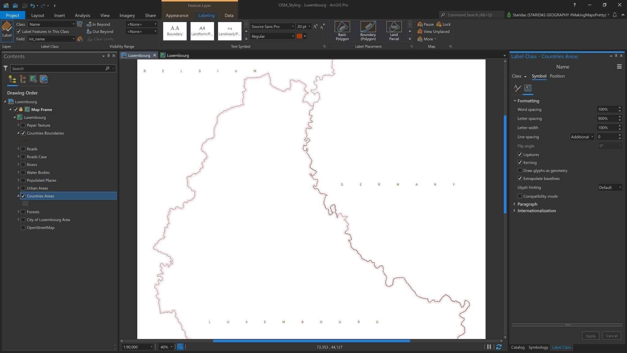
I also have to label that layer. I will label it with the values of the field int_name (stands for International Name) and for Font I select the Source Sans Pro Regular with a size of 20pt and a Font Color of #A83800.
I also select Upper case for the Text case, 900% for Letter spacing and a Regular placement. My map looks like Picture 3.
City of Luxembourg & Urban Areas
The Urban Areas are the areas where people actually live, where they mainly have their residences and related urban activities. OpenStreetMap has a specific Land Use type for this, which they call it Residential and it comes in polygon geometry.
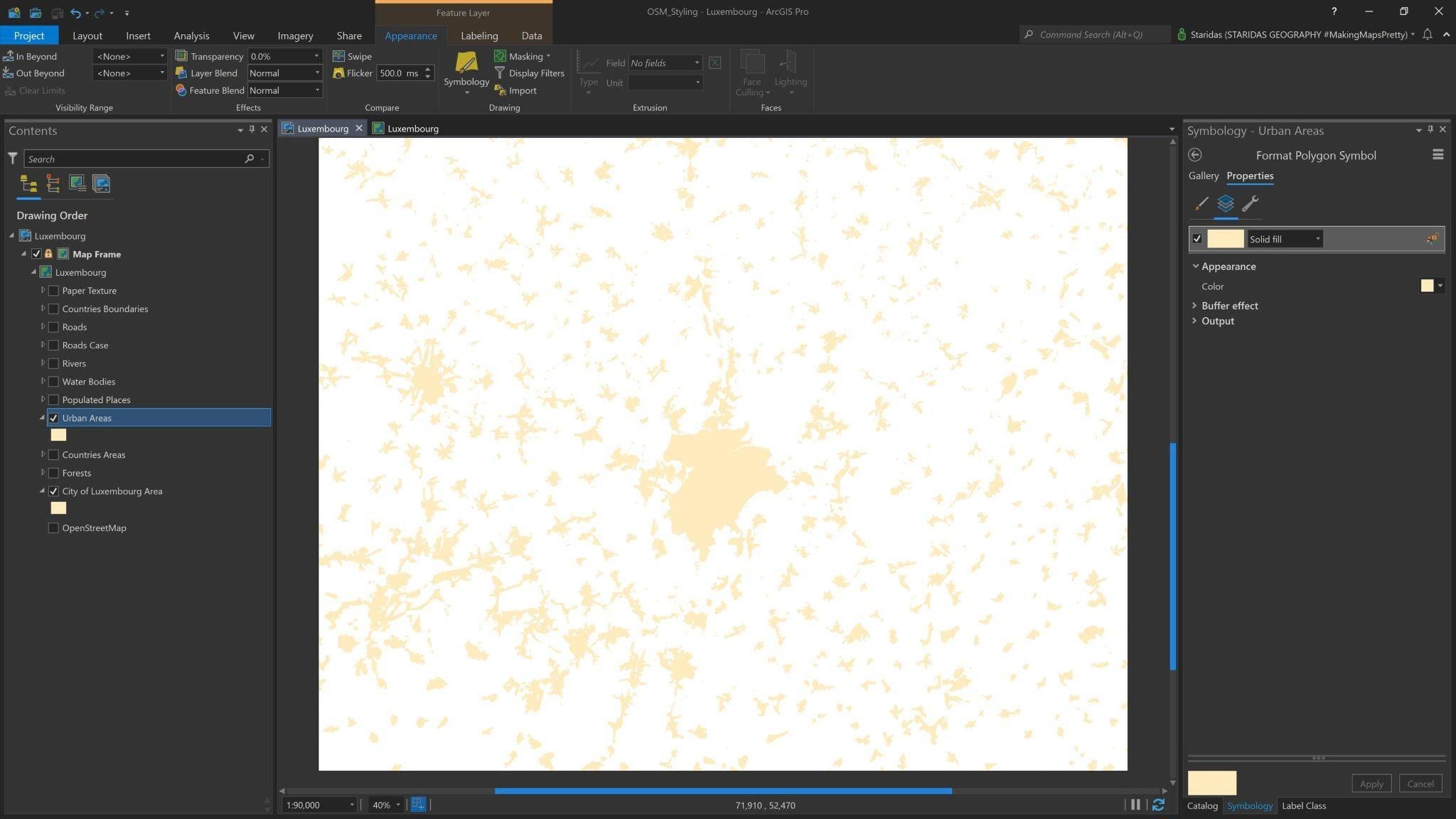
So, I add on the map the Urban Areas polygon layer. I open its Symbology properties and I style the polygons with a Solid fill with a Color of #FFEBBE and a Buffer effect with 1pt (Picture 4). The reason I give a buffer effect is to emphasize a little the boundaries of these areas.
For the actual City of Luxembourg I observe that the residential land use polygons do not shape a solid large urban fabric. So it would be better to add the area of the administrative boundaries of the city to emphasize even more its prominence. For this, OpenStreetMap has the Admin Level 8 polygons.
So, I also add the polygon of the City of Luxembourg and I style it with the same parameters as the Urban Areas. My map looks like Picture 4.
Populated Places
The Urban Areas as well as the City of Luxembourg Area do not come with name values in their attribute tables. They are pretty useful to illustrate the urban fabric but they are not able to label the populated places that correspond to the urban fabric.
For this, I need another layer with the names of the populated places. Thankfully, OpenStreetMap has the Place category where I can find such layers. In point geometry, they have categorized the populated places in several classes from which I choose the City, Town, Village, Hamlet and Isolated Dwelling.
Once I get them in one point layer, I add it to the map and I rename it to Populated Places. I need this layer to mainly label the populated places, but there are certain circumstances where OpenStreetMap does not have the corresponding urban area polygon. To avoid having a label without an associated feature, I will style the point layer with a Shape marker with a Color of #FFEBBE.
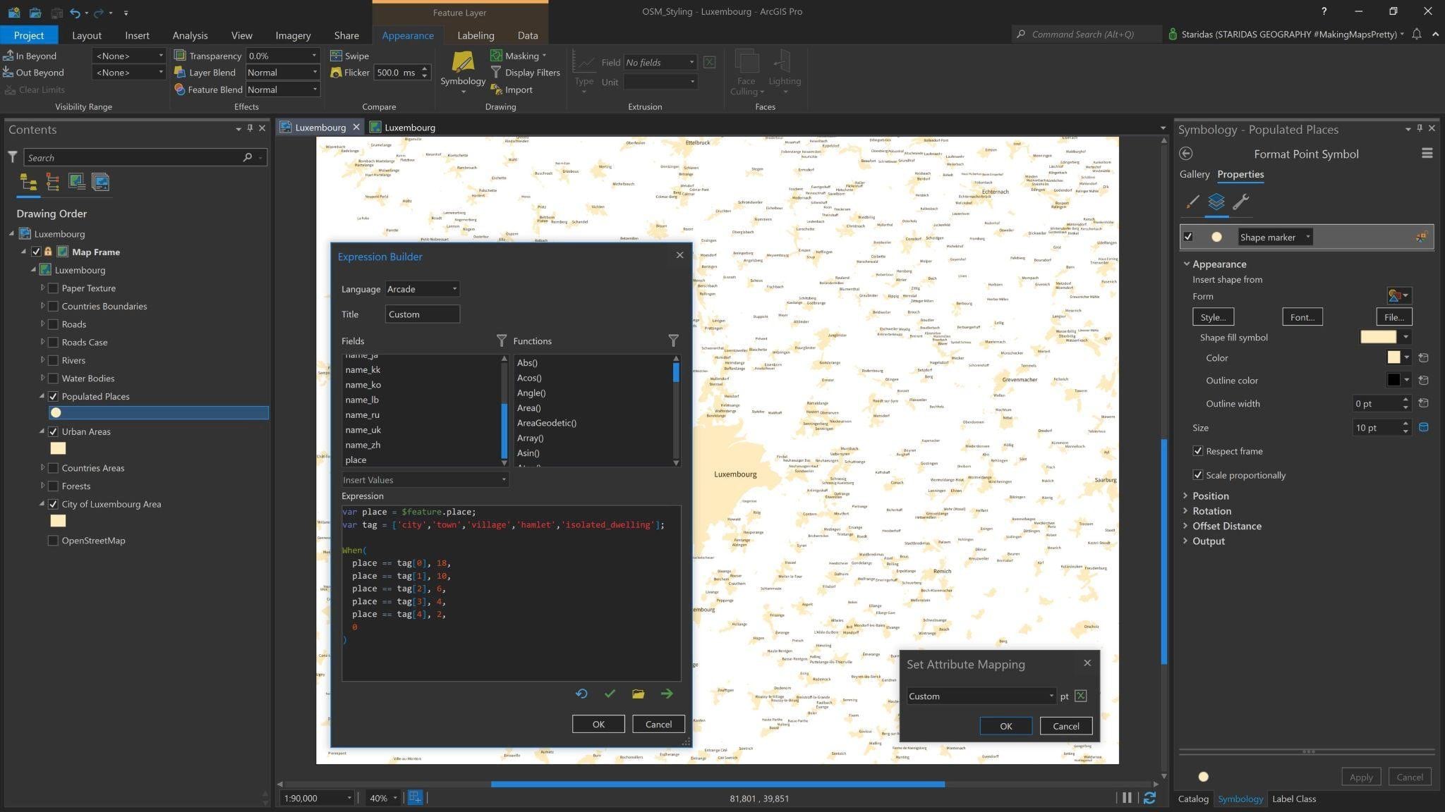
I will control the marker’s Size with an Arcade Expression, based on the type of the place. The expression is:
var place = $feature.place;
var tag = [‘city’,’town’,’village’,’hamlet’,’isolated_dwelling’];
When(
place == tag[0], 18,
place == tag[1], 10,
place == tag[2], 6,
place == tag[3], 4,
place == tag[4], 2,
0
)
In this expression I declare the variable place which represents the attribute place of the feature layer.
I then declare the variable tag to which I assign an array of values, which are the related OpenStreetMap tags for the Place category. These tags are values in the field with the name place in the attribute table of the feature layer Populated Places.
I then open a When() function where I state a conditional expression. I actually say: when the place has the tag ‘city’, then give the marker a size of 18, when the place has the tag ‘town’, then give the marker a size of 10, when the place has the tag ‘village’, then give the marker a size of 6 etc.
After I finish with my expression the map looks like the one in Picture 5.
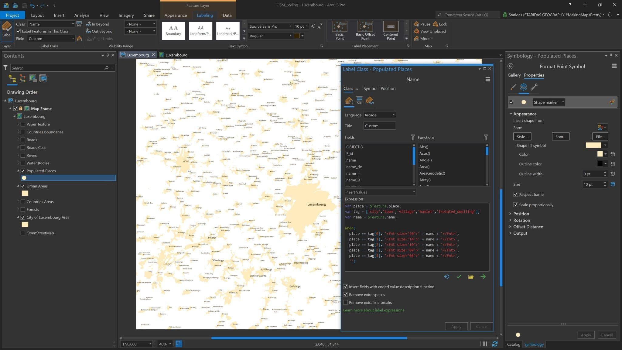
Now it’s time to label the Populated Places and I will do this with an Arcade Expression! I open the Label properties and for the Label Expression I write:
var place = $feature.place;
var tag = [‘city’,’town’,’village’,’hamlet’,’isolated_dwelling’];
var name = $feature.name;
When(
place == tag[0], ‘<fnt size=”20″>’ + name + ‘</fnt>’,
place == tag[1], ‘<fnt size=”14″>’ + name + ‘</fnt>’,
place == tag[2], ‘<fnt size=”10″>’ + name + ‘</fnt>’,
place == tag[3], ‘<fnt size=”09″>’ + name + ‘</fnt>’,
place == tag[4], ‘<fnt size=”08″>’ + name + ‘</fnt>’,
”)
In this expression I declare the variable place which represents the attribute place of the feature layer.
I then declare the variable tag to which I assign an array of values, which are the related OpenStreetMap tags for the Place category. These tags are values in the field with the name place in the attribute table of the feature layer Populated Places.
Finally, I declare the variable name which represents the attribute name of the feature layer. This is the attribute with which I will label the layer.
I then open a When() function where I state a conditional expression to control the Font Size of the labels. I actually say: when the place has the tag ‘city’, then label it with the value of the field name and give it a Font Size of 20pt. The Font Size is defined with the <FNT> text formatting tag.
In a similar manner, the When() function continues to when the place has the tag ‘town’, then label it with the value of the field name and give it a Font Size of 14pt, when the place has the tag ‘village’, then label it with the value of the field name and give it a Font Size of 10pt etc.
After I finish with my expression the map looks like the one in Picture 6.
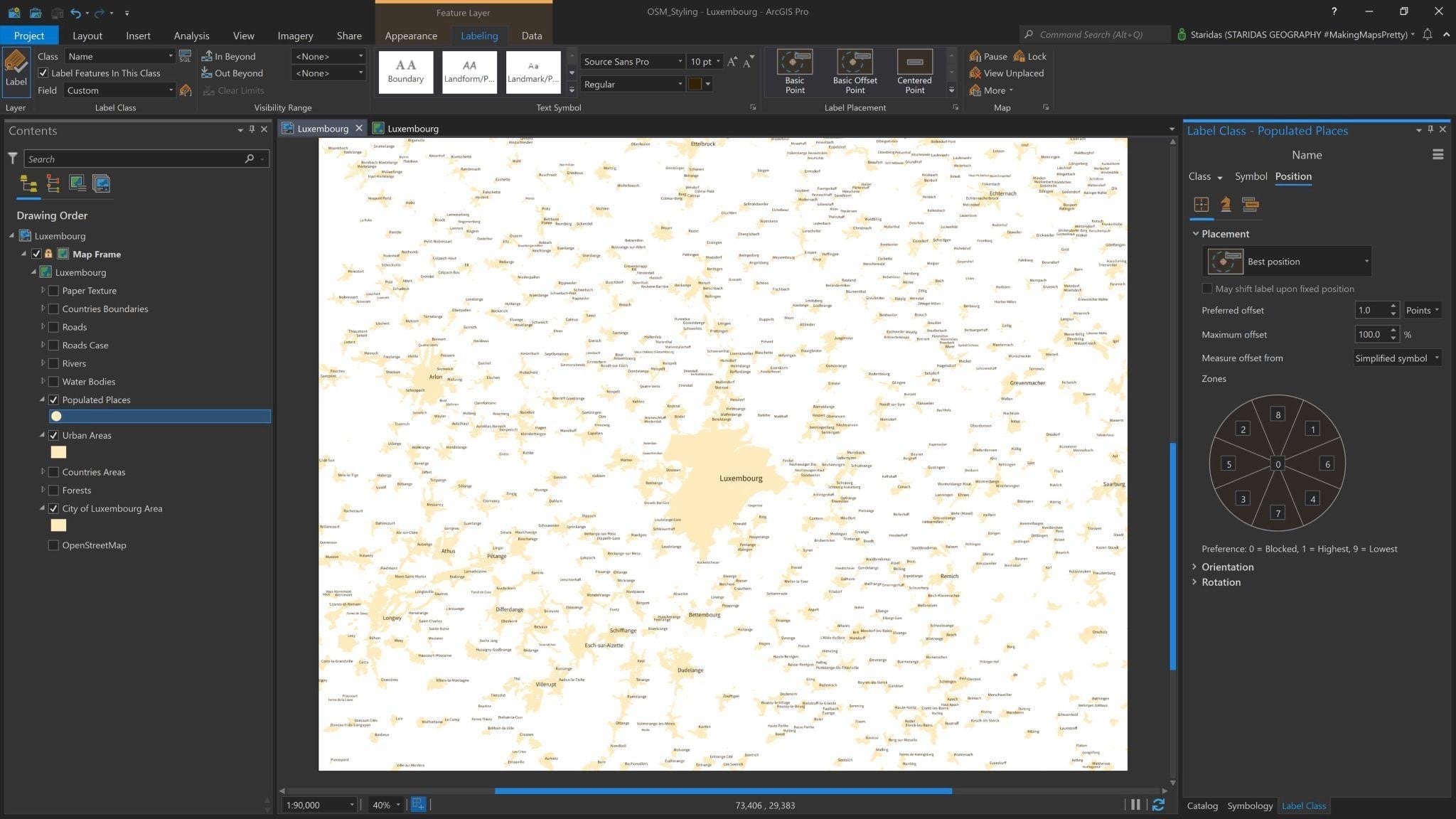
The Arcade expression is used to control the Label Expression, which for this case is only the name field, as well as to control the Font Size of every label.
Then, for all labels I select the Font Source Sans Pro Regular with a Color of #332200 and at the Placement properties I select Best position for Placement, I uncheck the checkbox near the Stack label option and I check the Hard constraint at the Label buffer option (Picture 7).
Physical Features
Forests
Thankfully, Europe has a good balance between built and physical environment. OpenStreetMap has a specific Land Use tag for Forest in polygon geometry. I will use this feature to highlight the green areas on my map.
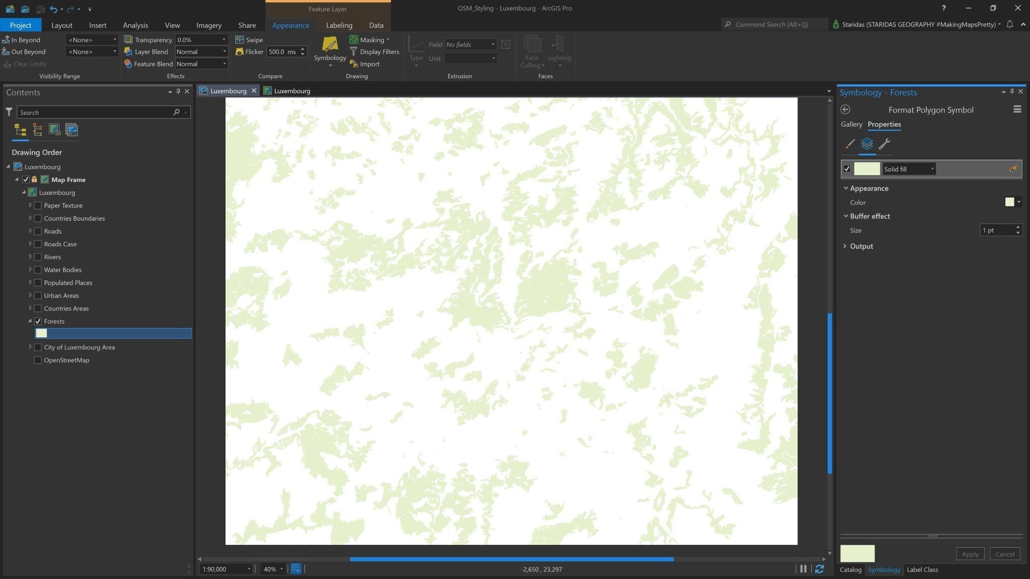
So, in ArcGIS Pro I add the Forests layer at the Contents pane. I symbolize it with a Solid fill with a Color of #E6F0CD and I give a Buffer effect of 1pt.
The reason I give this slight Buffer effect is to emphasize a bit the boundaries of the Forests polygons. The map looks like the one in Picture 8.
Water Bodies
The Water Bodies layer includes lakes, either physical or artificial, as well as rivers with a remarkable surface. OpenStreetMap has the category Natural, which is used to describe all natural and physical land features, including those with the tag Water in polygon geometry. I will use these features for the Water Bodies on the map.
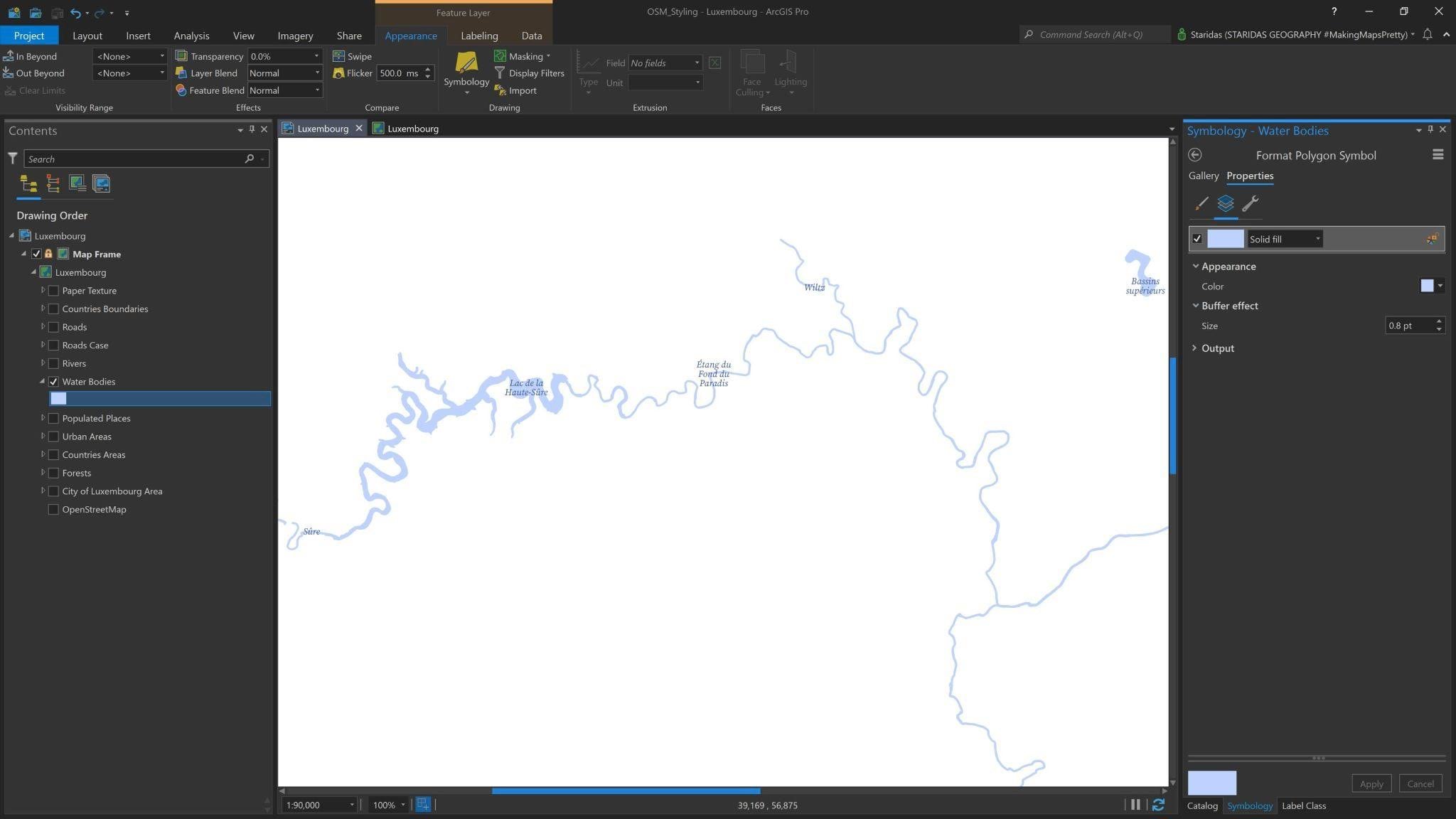
So, at the Contents pane I add the Water Bodies and I symbolize them with a Solid fill with a Color of #BED2FF and a Buffer effect of 0.8pt. The map looks like the one in Picture 9.
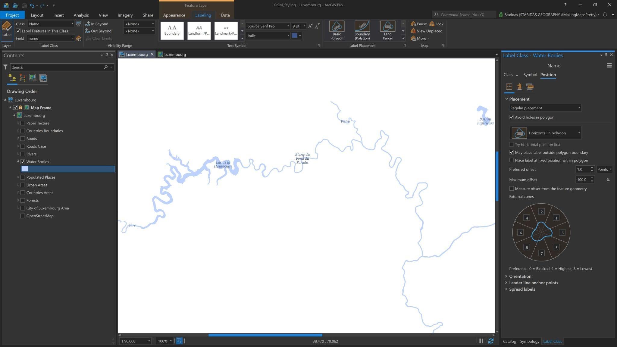
The attribute table of the Water Bodies comes with a field with their names. I will use that field to label them. So at the Label Expression I write $feature.name, for Font I select Source Serif Pro Italic with a Font size of 9pt and a Font color of #3D568F (Picture 10).
Rivers
For Rivers and other linear surface water ways, OpenStreetMap has the category Waterway in polyline geometry. From that category I will use the features with tags river and stream which will represent the Rivers on my map.
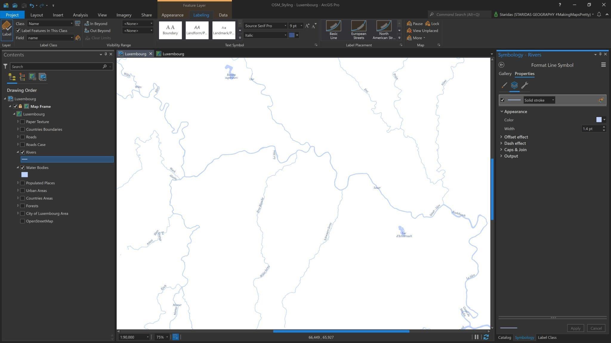
So, in ArcGIS Pro, I add the Rivers feature layer at the Contents pane. I symbolize it with a Solid stroke with Color #BED2FF and Width 1.4pt. The map looks like the one in Picture 11.
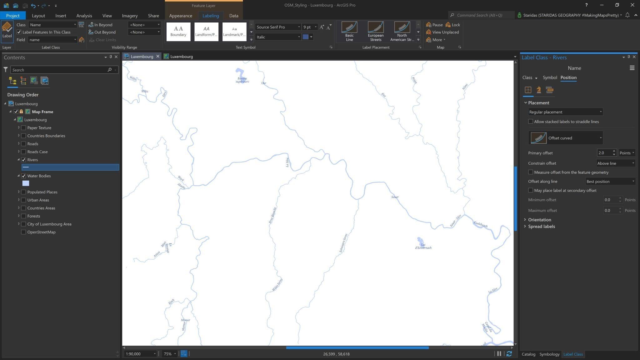
The attribute table of the Rivers layer comes with a field with their names. I will use that field to label them. So at the Label Expression I write $feature.name, for Font I select Source Serif Pro Italic with a Font size of 9pt and a Font color of #3D568F.
As for the placement properties, I choose a Regular placement with an Offset curved positioning and a Primary offset of 2.0 Points. The map looks like the one in Picture 12.
Transportation Features
OpenStreetMap has a specific category for roads, named Highway. The Highway category includes a vast variety of tags to describe all roads in the World, from the largest motorway to the tiniest alley.
For the purpose of my map I do not have to include all the types of roads, since the scale (1:90,000) is appropriate for County/Small Country maps. For this, I will only include the road features with tags motorway, trunk, primary, secondary and tertiary. To ensure a seamless representation of these road features I will also include the corresponding link roads of these types, which are those with the tags motorway_link, trunk_link, primary_link, secondary_link and tertiary_link.
All ten tags are values in the field with name highway in the attribute table of the Roads feature layer.
I will add the Roads feature layer twice on the map. The one will be used to style the lines’ casing and I will name it Roads Back, while the other will be used to style the type of each road and I will name it Roads Front.
Roads Back
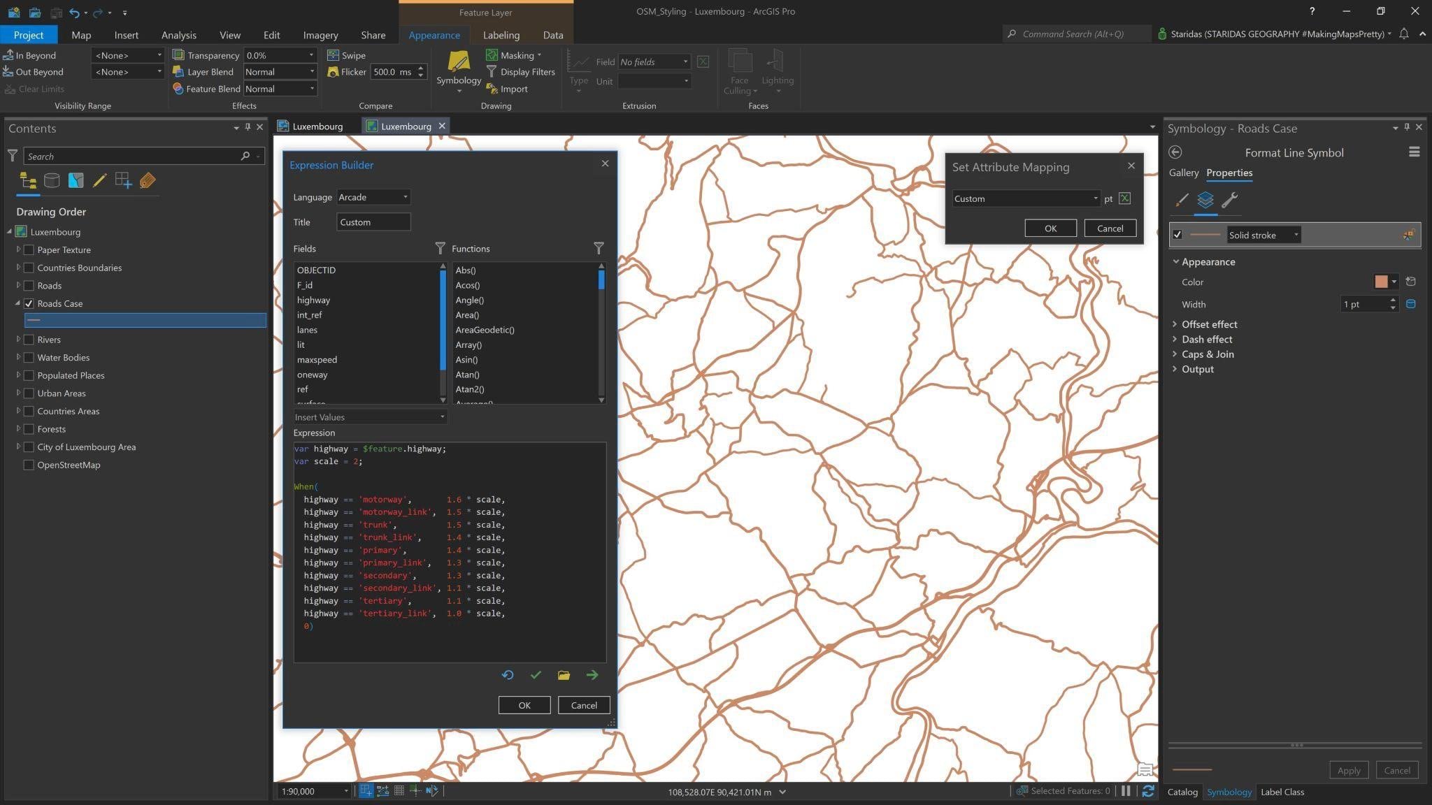
The Roads Back (or Roads Case) layer is simpler to style. Once added to the Contents pane, I open its Symbology properties and I give it a Solid stroke with a Color of #CD8966.
To distinguish the different road types, I will use an Arcade Expression to vary their line Width, according to each type. As said before, each type is a value in the field with the name highway in the attribute table of the roads layer. So the expression is:
var highway = $feature.highway;
var scale = 2;
When(
highway == ‘motorway’, 1.6 * scale,
highway == ‘motorway_link’, 1.5 * scale,
highway == ‘trunk’, 1.5 * scale,
highway == ‘trunk_link’, 1.4 * scale,
highway == ‘primary’, 1.4 * scale,
highway == ‘primary_link’, 1.3 * scale,
highway == ‘secondary’, 1.3 * scale,
highway == ‘secondary_link’, 1.1 * scale,
highway == ‘tertiary’, 1.1 * scale,
highway == ‘tertiary_link’, 1.0 * scale,
0)
In this expression, I declare a variable with the name highway which represents the attribute highway of the feature layer ($feature.highway). I then declare a second variable with the name scale to which I assign the value 2.
I then open a When() function where I state a conditional expression to control the Width of each road according to its type. I actually say: when the highway has the tag ‘motorway’, then give the line a width of 1.6pt multiplied by the scale, which in that case it has the value of 2.
In a similar manner, when the highway has the tag ‘trunk’, then give the line a width of 1.5pt multiplied by the scale, when the highway has the tag ‘primary’, then give the line a width of 1.4pt multiplied by the scale etc.
This way, I control the relative width among the different types of Roads and at the same time I multiply them with a uniform scale factor. The map looks like the one in Picture 13.
Roads Front
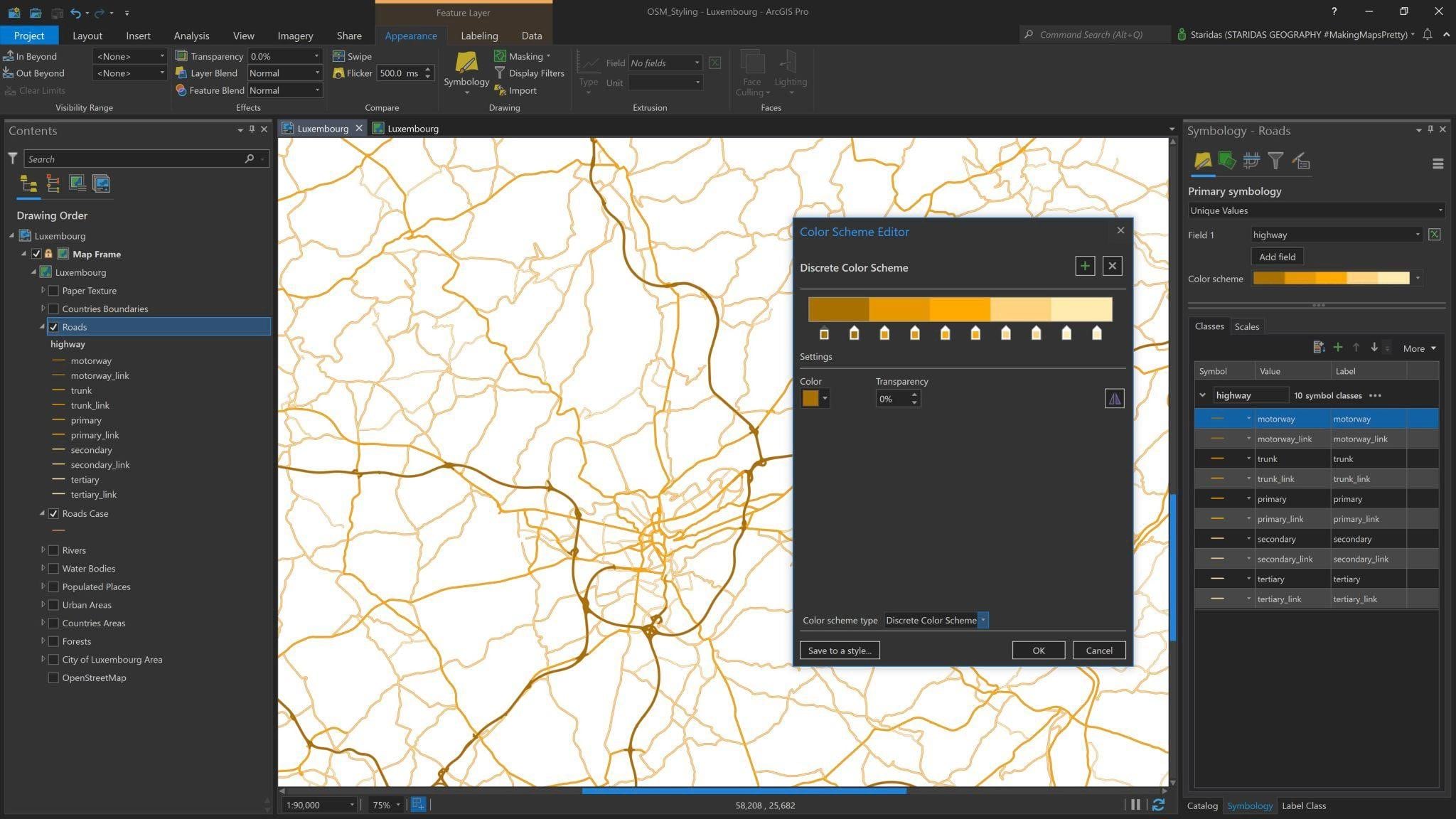
The Roads Front layer is a bit more complicated to both style and label. The first thing I have to do is open its Symbology properties and at the Primary symbology tab to select Unique Values based on the field highway (see Picture 14).
I rearrange the order of the symbol classes to match the order of the types as stated in the Arcade Expression using the arrows (or dragging each class appropriately).
Now, instead of opening the symbology properties of each class, to assign individual colors, I open the Color Scheme Editor (see Picture 14).
I select a Discrete Color Scheme and I create ten color stops, one for each highway type. I basically have five road types and their corresponding links, but I prefer to treat them as separate types, hence the ten color stops.
The colors for the five types of roads and their correspondent links are: #A87000, #E69800, #FFAA00, #FFD37F, and #FFEBAF as shown in Picture 14.
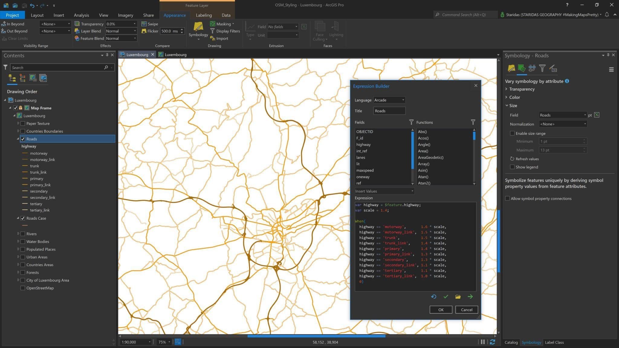
Having distinguished each road type with color is one thing. The other, equally important, is to distinguish each type by line width. To do this, I will go to the Vary symbology by attribute tab of the Symbology properties of the Roads Front layer (see Picture 15).
I basically want to Vary symbology by size, hence at the Size group I open the Expression Builder to write Arcade (Picture 15). The Expression is:
var highway = $feature.highway;
var scale = 1.4;
When(
highway == ‘motorway’, 1.6 * scale,
highway == ‘motorway_link’, 1.5 * scale,
highway == ‘trunk’, 1.5 * scale,
highway == ‘trunk_link’, 1.4 * scale,
highway == ‘primary’, 1.4 * scale,
highway == ‘primary_link’, 1.3 * scale,
highway == ‘secondary’, 1.3 * scale,
highway == ‘secondary_link’, 1.1 * scale,
highway == ‘tertiary’, 1.1 * scale,
highway == ‘tertiary_link’, 1.0 * scale,
0)
This expression is exactly the same as the one I used to control the line width of the Roads Back layer (see Picture 13). The only – and most important – difference is the value of the scale variable, which for the Roads Front layer is 1.4.
Note that the relative widths of each type are the same with the Roads Back layer, but this time multiplied by a smaller scale factor (1.4). With this way I ensure that the Roads Front layer will aptly match with the Roads Back layer and both will correctly work together. The map looks like the one in Picture 15.
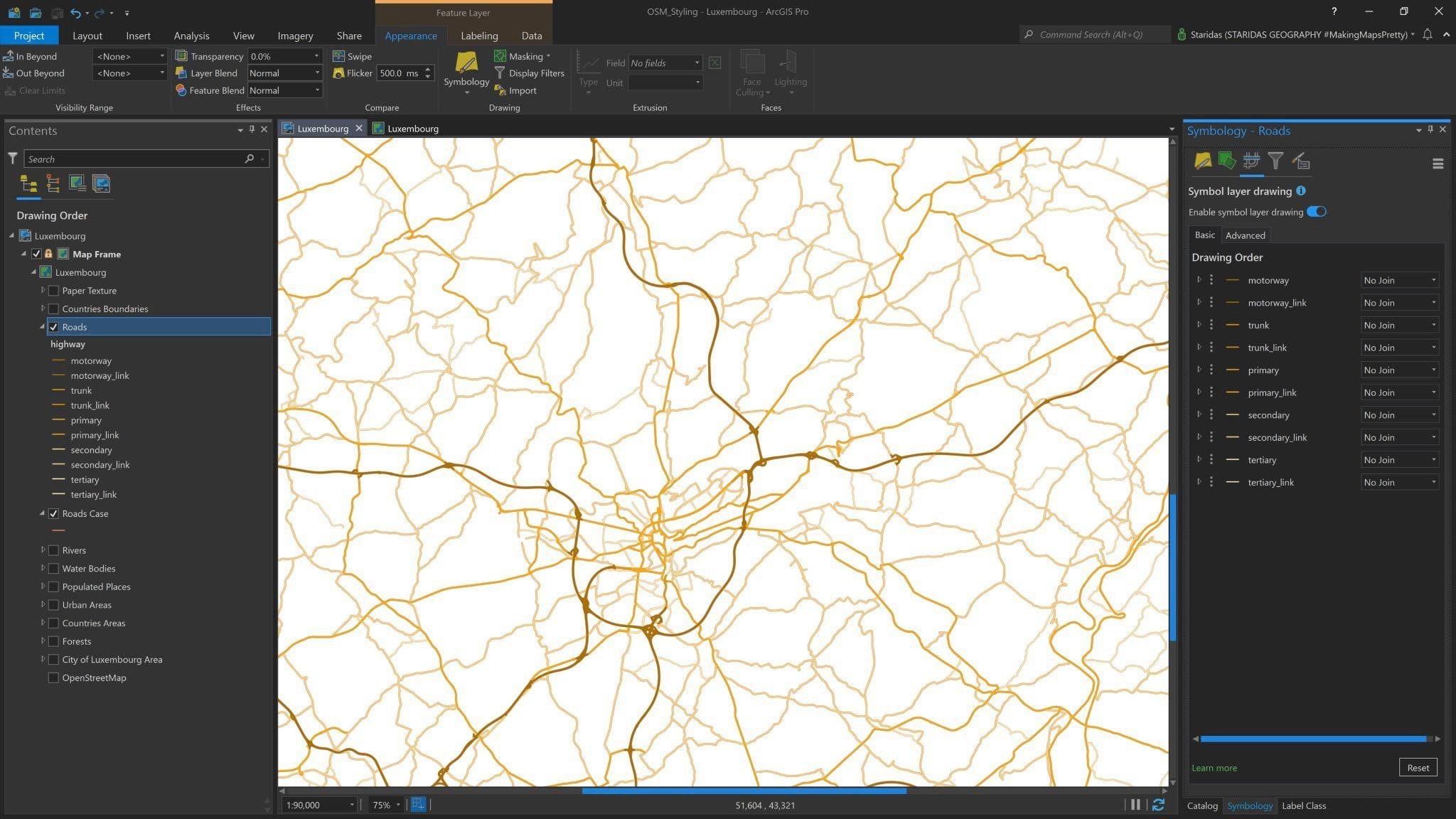
Another very important step is to activate the Symbol layer drawing for the Roads Front layer. So at the Symbol layer drawing tab I select the Enable symbol layer drawing option. The drawing order should be like the one illustrated in Picture 16.
Time to label the Roads Front layer. OpenStreetMap has a field with the name ref in the attribute table of the highway feature layer, so I will use this one to label the roads. This field is basically the code of each road.
For each type of road I want its code to have a representative label style. One way to do this is to create label classes, but why bother, since I can do it with Arcade and Text Formatting Tags.
Text Formatting Tags is a great way to style the labels manually and directly into Arcade. I actually want to create label boxes, with fill and outline, and I want to have full control of colors and font sizes. For this, I will use the tags:
- <BGD> to control the label background color, the label outline color and the label outline width,
- <CLR> to control the font color,
- <FNT> to control the font size,
- <BOL> to make fonts bold.
Next, for the Roads Front layer I open the Labelling contextual tab and for Font I select the Source Sans Pro Regular. Of course, I could control the Font Family directly in the Arcade but since I want a uniform Font, selecting it at the contextual tab properties is enough.
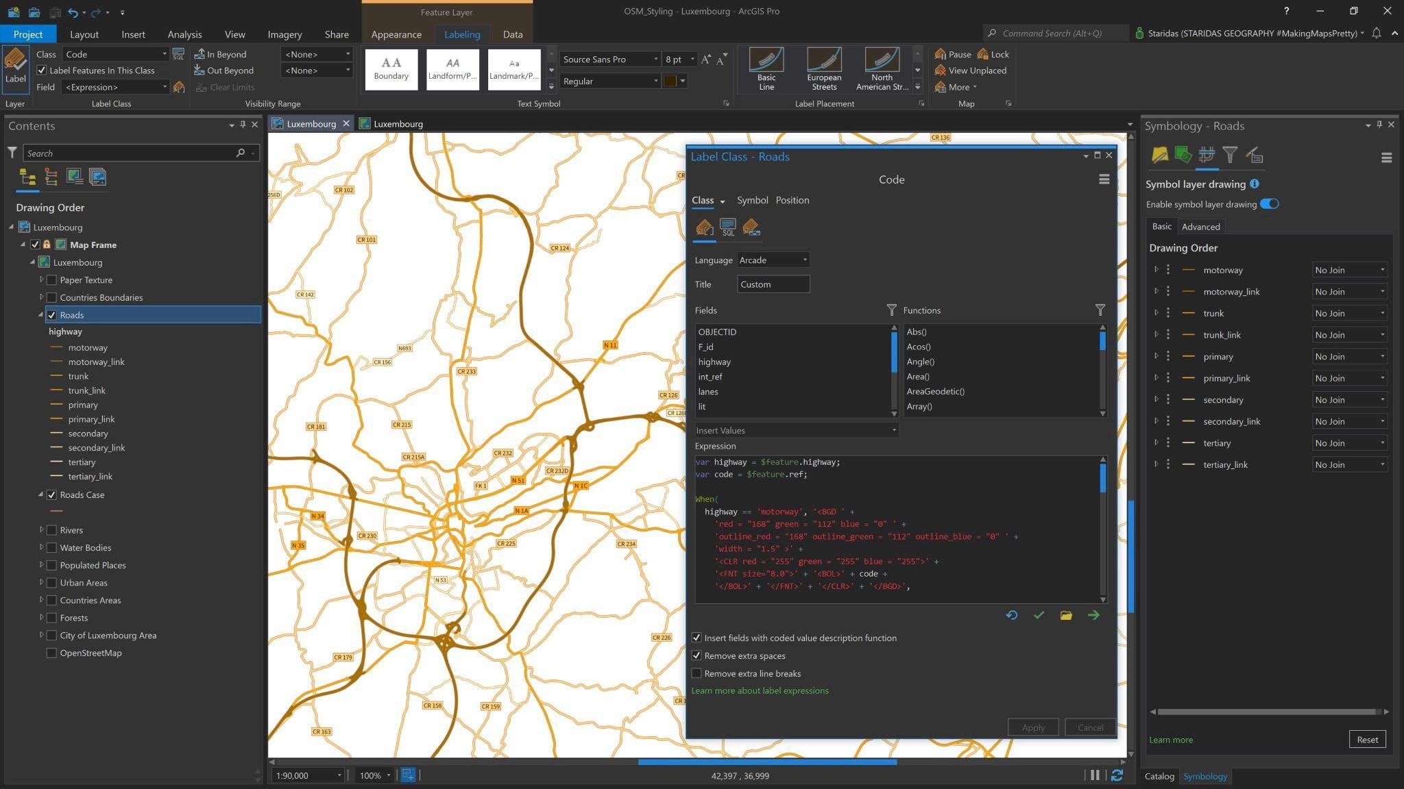
Now, I open the Label Expression Builder and I write the following Arcade Expression:
var highway = $feature.highway;
var code = $feature.ref;
When(
highway == ‘motorway’, ‘<BGD ‘ +
‘red = “168” green = “112” blue = “0” ‘ +
‘outline_red = “168” outline_green = “112” outline_blue = “0” ‘ +
‘width = “1.5” >’ +
‘<CLR red = “255” green = “255” blue = “255”>’ +
‘<FNT size=”8.0″>’ + ‘<BOL>’ + code +
‘</BOL>’ + ‘</FNT>’ + ‘</CLR>’ + ‘</BGD>’,
highway == ‘trunk’, ‘<BGD ‘ +
‘red = “230” green = “152” blue = “0” ‘ +
‘outline_red = “205” outline_green = “137” outline_blue = “102” ‘ +
‘width = “0.5” >’ +
‘<FNT size=”7.0″>’ + code + ‘</FNT>’ + ‘</BGD>’,
highway == ‘primary’, ‘<BGD ‘ +
‘red = “255” green = “170” blue = “0” ‘ +
‘outline_red = “205” outline_green = “137” outline_blue = “102” ‘ +
‘width = “0.5” >’ +
‘<FNT size=”7.0″>’ + code + ‘</FNT>’ + ‘</BGD>’,
highway == ‘secondary’, ‘<BGD ‘ +
‘red = “255” green = “211” blue = “127” ‘ +
‘outline_red = “205” outline_green = “137” outline_blue = “102” ‘ +
‘width = “0.5” >’ +
‘<FNT size=”6.5″>’ + code + ‘</FNT>’ + ‘</BGD>’,
highway == ‘tertiary’, ‘<BGD ‘ +
‘red = “255” green = “235” blue = “175” ‘ +
‘outline_red = “205” outline_green = “137” outline_blue = “102” ‘ +
‘width = “0.5” >’ +
‘<FNT size=”6.0″>’ + code + ‘</FNT>’ + ‘</BGD>’,
”)
This is a long one, so I will break down the first phrases. Firstly, I declare a variable with the name highway, which represents the attribute highway of the feature layer ($feature.highway). I then declare a second variable with the name code, which represents the attribute ref of the feature layer ($feature.ref). The highway variable will be used to separate the label classes according to each highway type and the code variable will be used to label them.
I open a When() function where I state a conditional expression to control the label parameters of each road according to its type. For the first type, I say: if the highway is a ‘motorway’ then create a label with background color ‘red = “168” green = “112” blue = “0” ‘, with outline color ‘outline_red = “168” outline_green = “112” outline_blue = “0” ‘ and outline ‘width = “1.5” ‘ , label it with the value of the field ‘ref’, give it a Font Size of 8pt and make it Bold.
This logic is exactly the same for all the other road types. All colors are defined in RGB mode.
I finally select a Regular placement for all labels and a Centered horizontal positioning. The map looks like the one in Picture 17.
Putting all Features Together
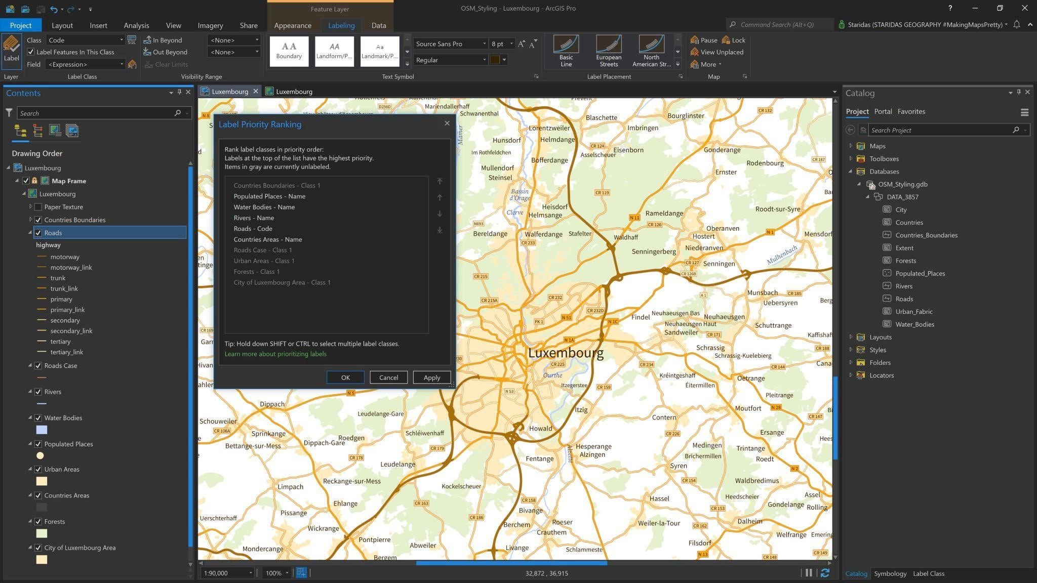
Having styled and labelled all features, is now time to turn them all on to see how they look together. In that step, it is important to define the significance of each label. To do this, I open the Label Priority Ranking and I rearrange the label classes, as seen in Picture 18.
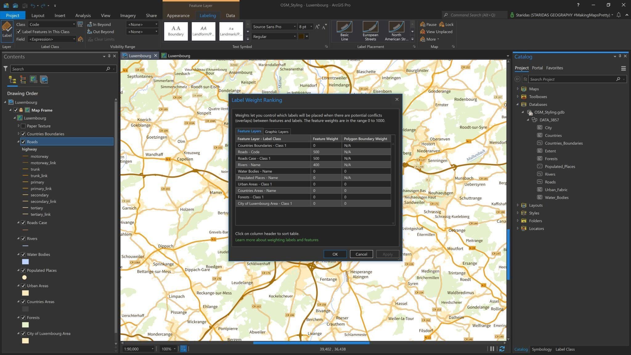
It is also important to set feature weights with the Label Weight Ranking dialog, as seen in Picture 19.
Paper Texture
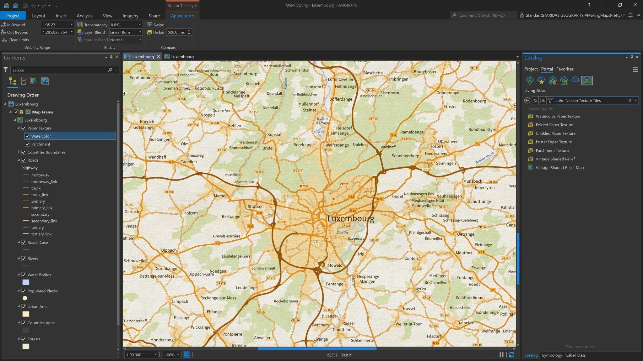
The final touch on the map is to add some paper texture. Here are some very handy Texture Tiles from Living Atlas with different paper textures.
I can access them directly from the Living Atlas in the Catalog pane as seen in Picture 20. More specifically, I add two of them, the Watercolor Paper Texture and the Parchment Texture.
I add them at the very top of the Contents pane and to both of them I give a Linear Burn Layer Blend, to make them blend with one another and with all the other layers underneath them (Picture 20).
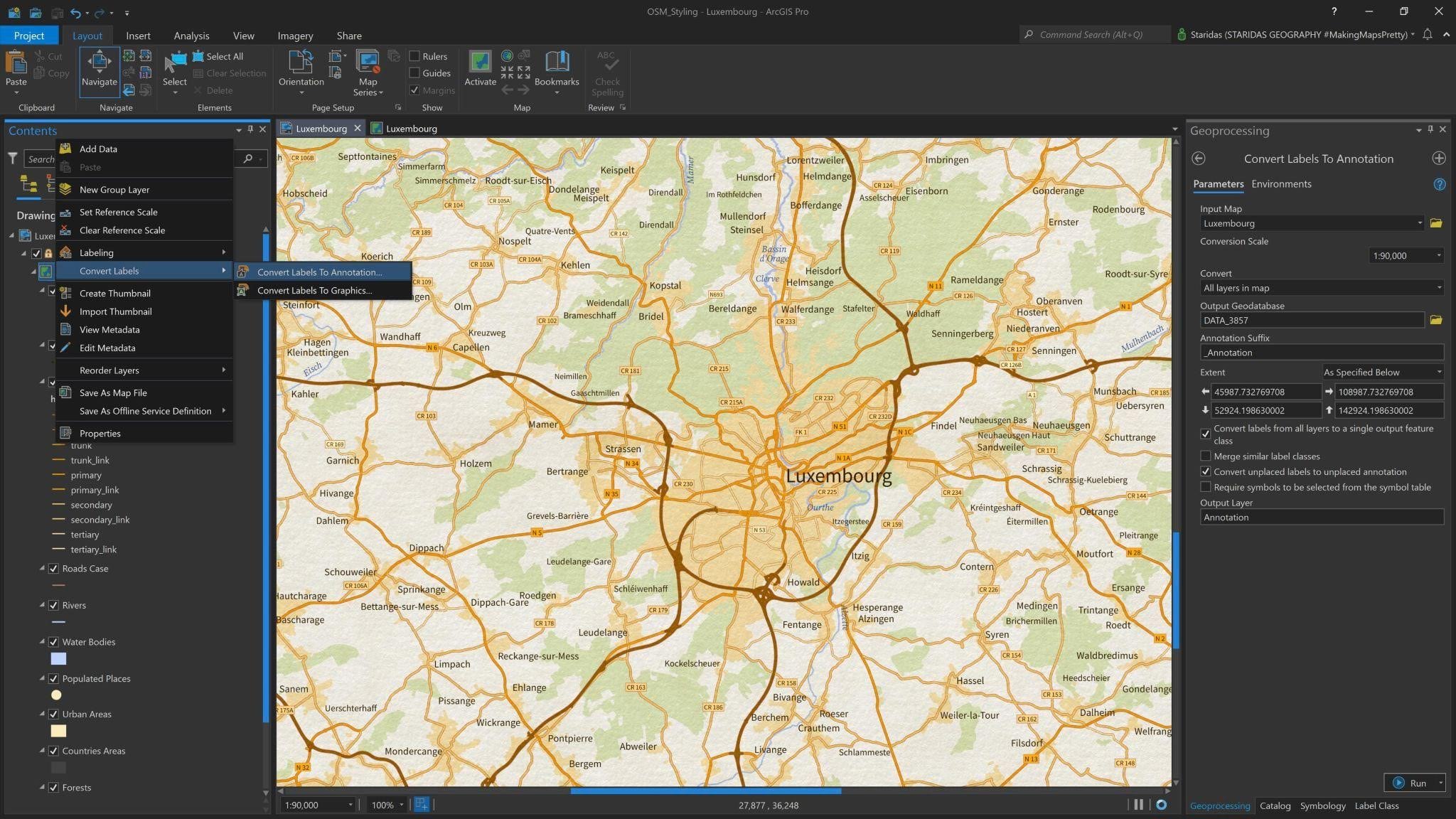
By default dynamic labels draw above all layers. This means that the labels from all features will be drawn above the paper texture, which might look unrealistic. To avoid this, it is a good idea to convert all labels to a single output annotation class (Picture 21) and then drag this annotation layer below the paper texture layers!
Conclusion
Reaching the end of this article I really hope you enjoyed it and followed my approach in understanding and styling OpenStreetMap in ArcGIS Pro.
I must confess I am a little obsessed with Arcade! In case you are not very keen to work with Arcade you may always follow the classic symbology and labelling options that Pro offers.
I have uploaded the ArcGIS Pro project, presented here, in one compact Map Package with all the associated layers, symbols and Arcade expressions on my ArcGIS Online account. You may get it from here and freely use it under a CC BY-NC-SA 4.0 license.
Kindest Regards from Crete, Greece,


Article Discussion: