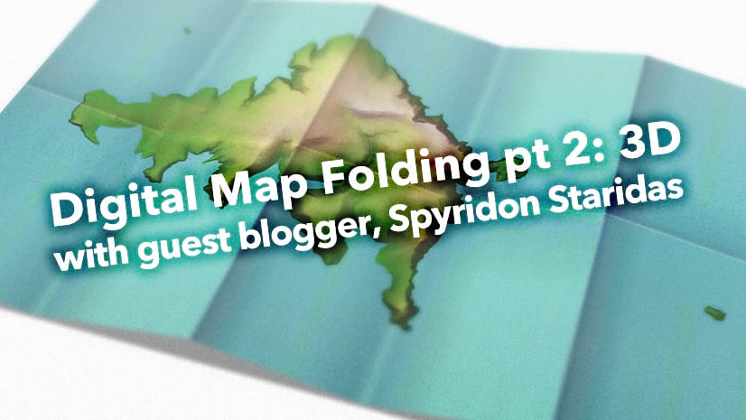
One of the many joys of being part of the spatial community is the creativity and generosity of our fellow mappers. Spyridon Staridas is a production cartographer who uses ArcGIS Pro to make lovely and information-dense reference maps for his customers. What’s more, Spyridon enthusiastically shares his tricks of the trade and reveals the inventive workflows that elevate his maps to objects that his readers don’t just use, but enjoy. I am honored to introduce Spyridon Staridas to you, with his first guest blog post of a two-part series (here’s part 2). Enjoy!

…
Making a map is cool, everybody knows that! Not everybody, though, knows how to fold a map! We all know that sometimes it might be quite frustrating to fold back a map to its flawless initial folded state. Thankfully, folding a map in digital conditions seems to be a lot easier and in the following paragraphs I illustrate the process that I have so far explored and adopted to simulate the appearance of paper map folds.
Understanding the Layout
The first step I take every time I commence a new map project is to define the project’s needs. This is determined by a considerable number of factors, especially if I am about to produce a paper map. I ask myself and my client a number of questions, such as the purpose of the map, the theme of the map, the audience that will read and use the map, the environment where the map is about to be used, the appropriate scale and stuff like that.
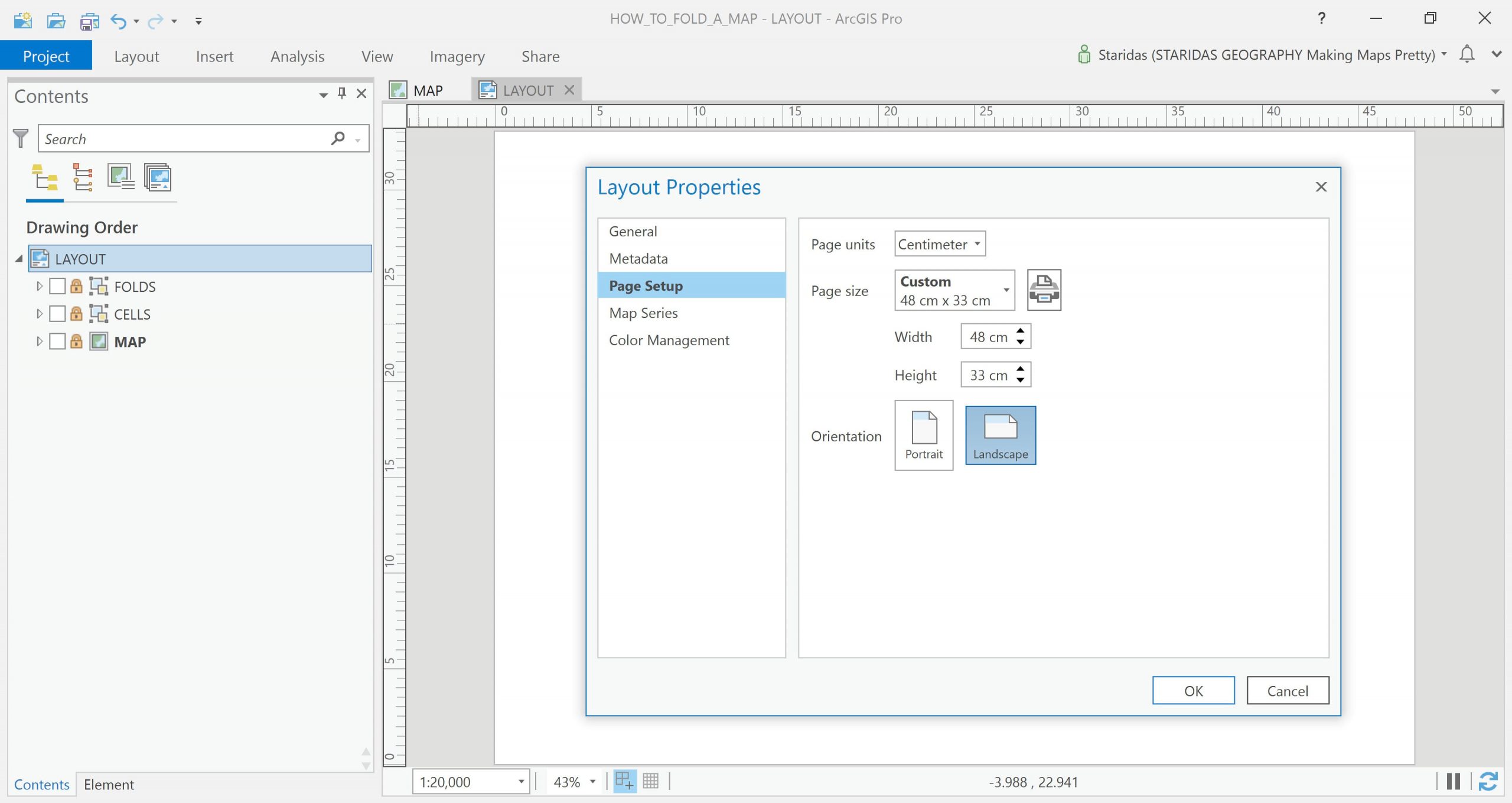
When I end up with an adequate understanding of my project’s needs, I start with the simplest, but very significant, thing: the layout. A layout really is nothing more than a rectangular area of interest for the resulting map. Here I have begun the design of a map with a layout of 48cm wide by 33cm high.
Understanding the Folds
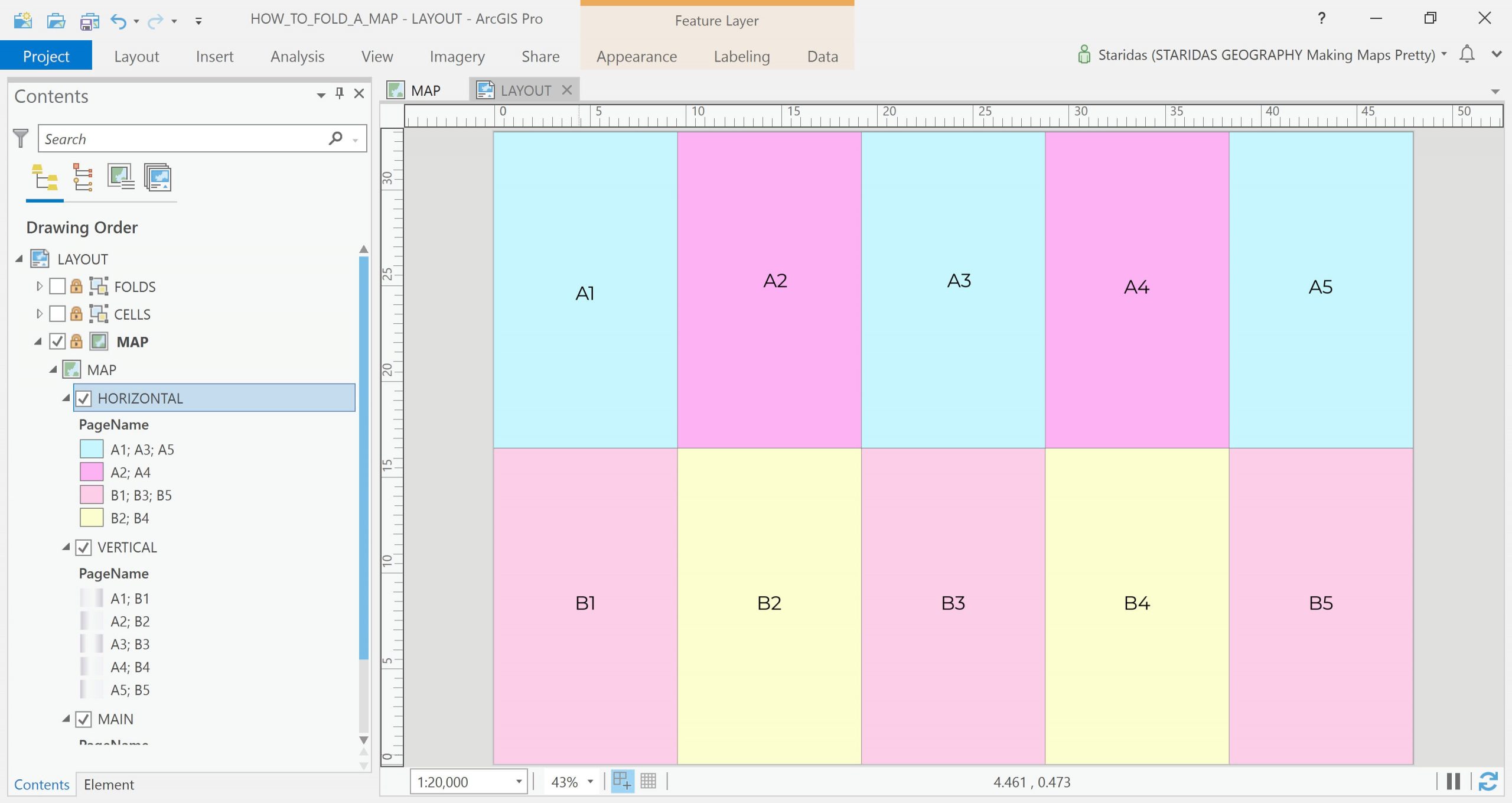
Folding a map demands critical thinking and a certain number of questions to be answered. The same is true when attempting to replicate folds in the digital environment. Most important is understanding that the folds will separate the layout into a number of cells of consistent dimension (width and height). The edges of these cells represent the actual folds, while the area of the cells represent the parts of the map in between the fold edges.
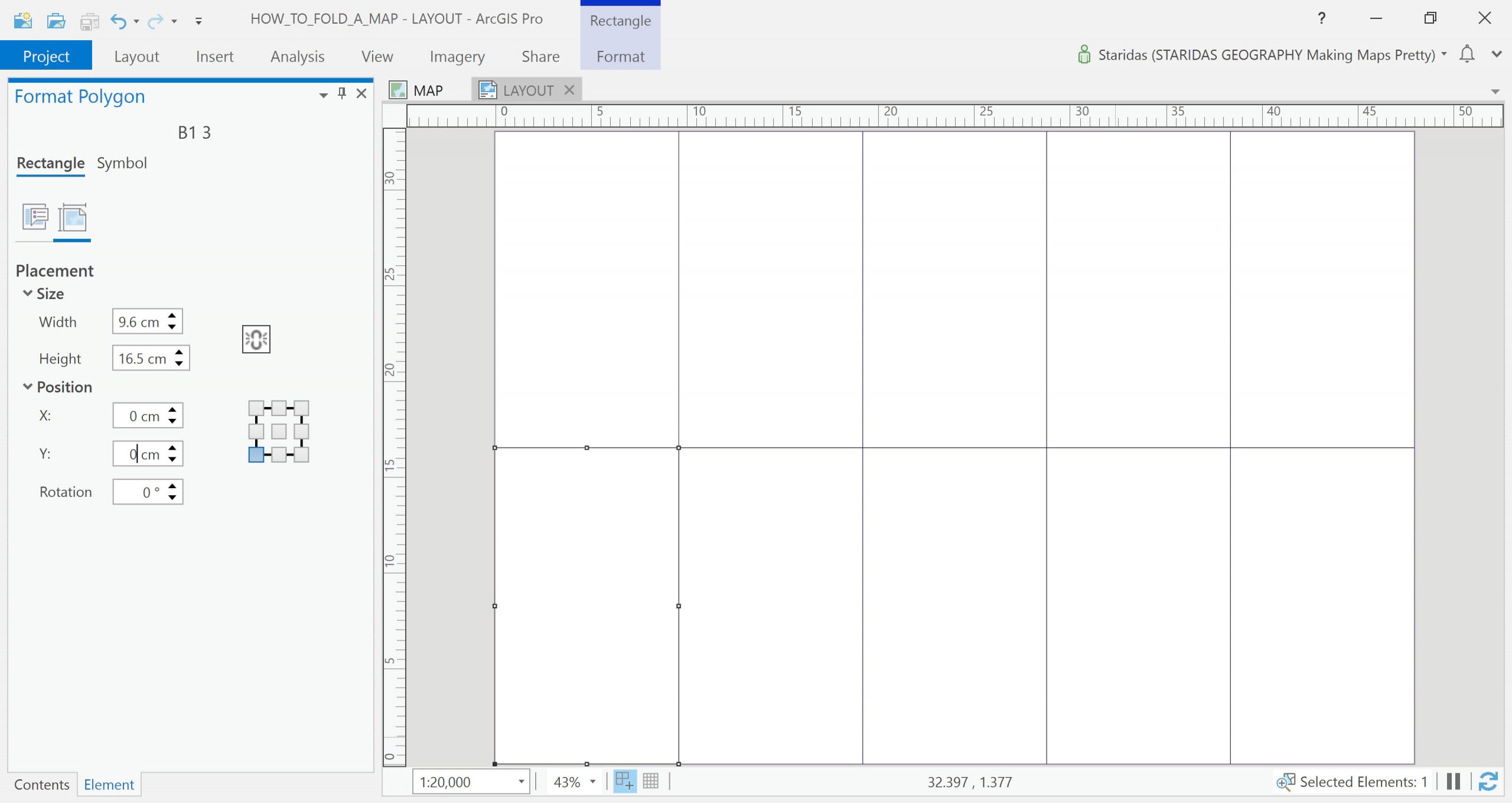
In my example, I have selected to fold the map one time horizontally, which eventually will split the map horizontally in two parts, and four times vertically, which eventually will split the map vertically in five parts.
This will produce a total of ten cells and the dimensions of each cell will be 48 ÷ 5 = 9.6cm wide and 33 ÷ 2 = 16.5cm high.
In ArcGIS Pro, I have simulated the cells by drawing rectangle graphic features with the given dimensions.
Simulating the Folds
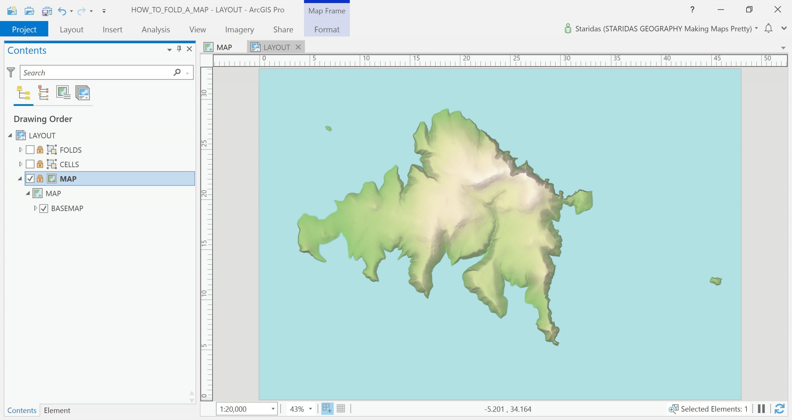
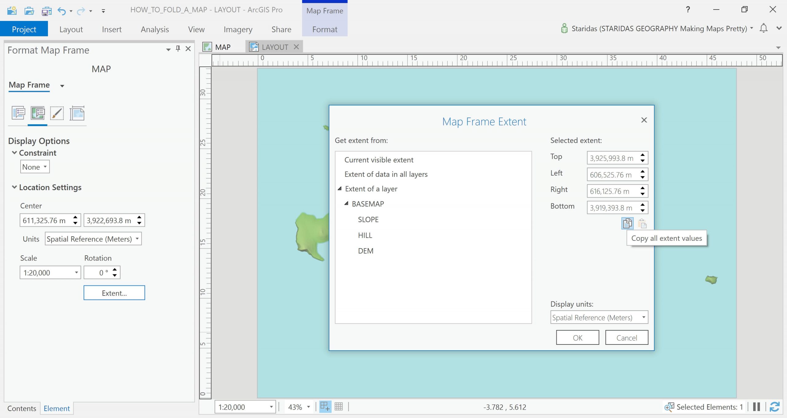
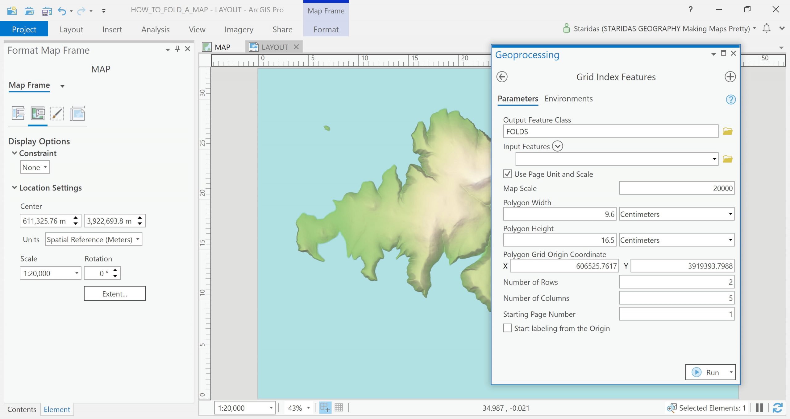
Now I am ready to load the map by inserting a Map Frame. In my example the Map Frame has the same dimensions as the layout, but what separates it from a simple graphic is that it is aware of the real World’s coordinates and has a specified map projection, extent and map scale.
The map here has a scale 1:20,000 in Greek Grid projection (epsg:2100) and the coordinates of its extent can be very easily derived (and copied) from the Display Options within the Format Map Frame dialog.
I will simulate the folds of the map with one of my most favourite tools, the Grid Index Features tool! So far I have already defined all the parameters that the tool demands to produce a grid that will simulate the folds. So I fill in the tool’s fields and I hit the run button…
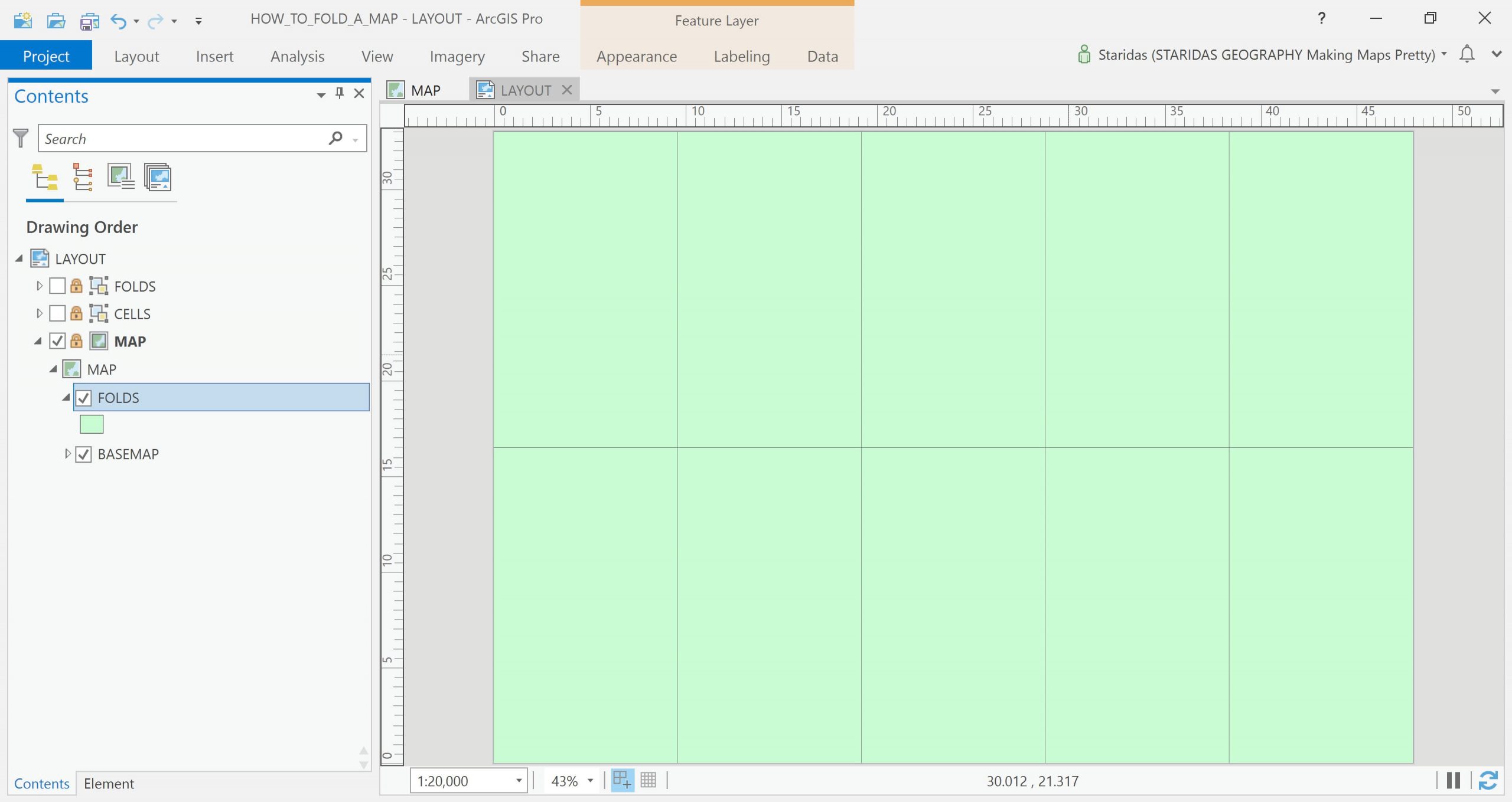
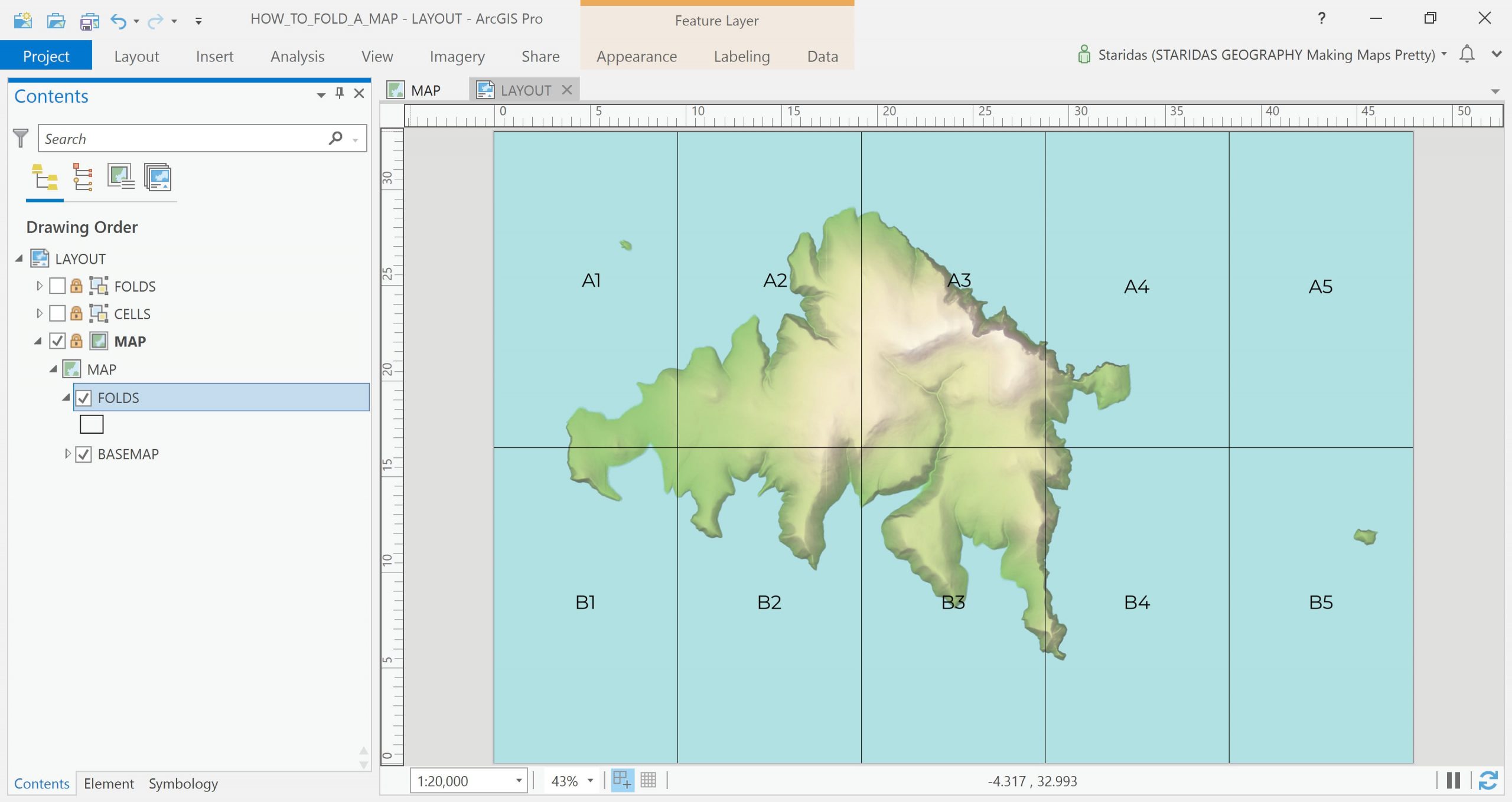
A new feature layer has been created and it looks exactly as my graphic cells with the only difference that this belongs to the map and moves along with the map.
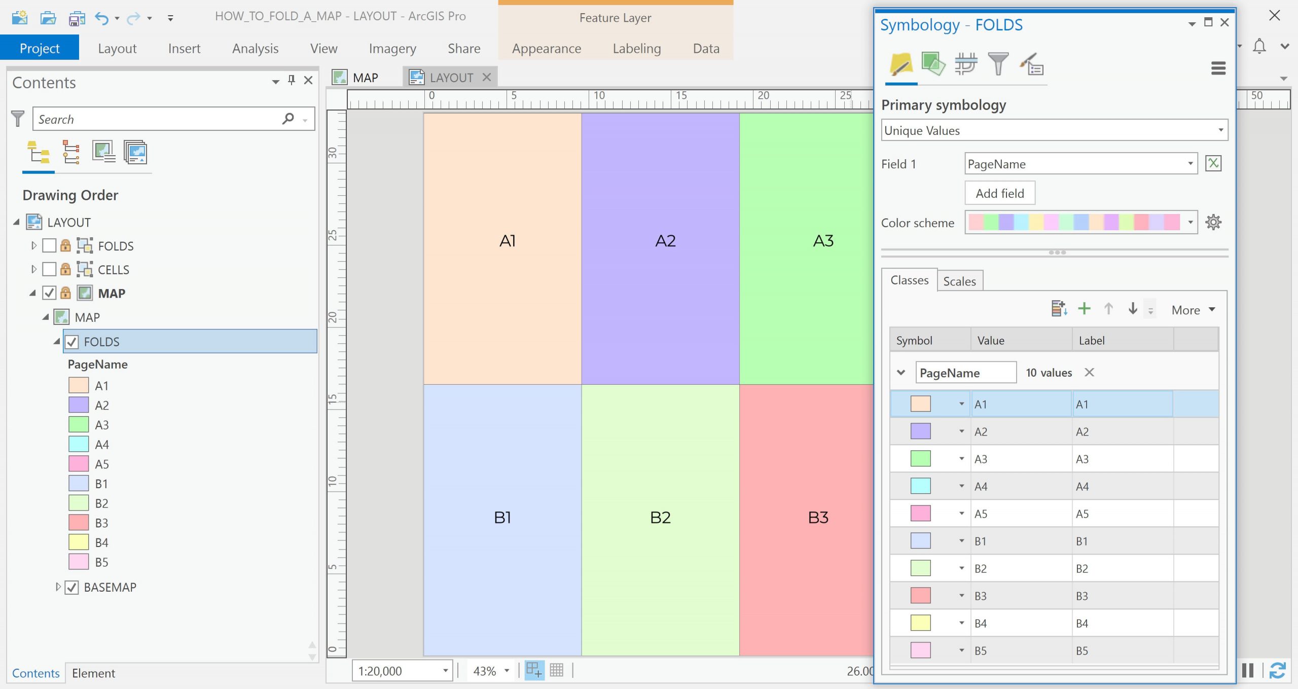
Notice that each cell has now its own name. The first row has names from A1 to A5 and the second row has names from B1 to B5.
Now all I have to do is understand how the light interacts with the folds in real World conditions and simulate it with the appropriate symbology.
Understanding the Light
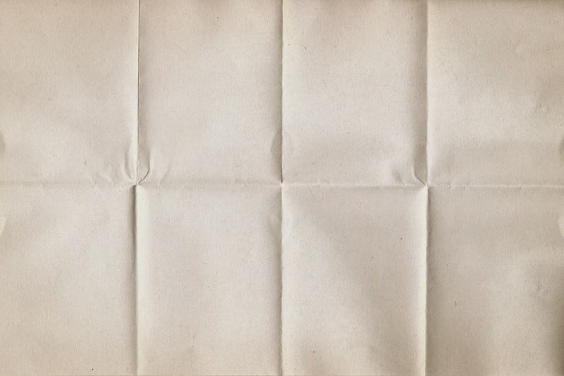
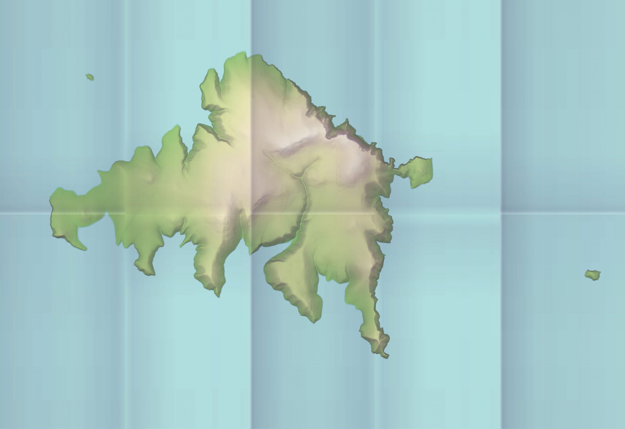
To understand the light, I must first understand the nature of the physical folds. Have a look at the following picture (just an example, I am not simulating this). Some fold edges look like they pop from the map (say like a mountain ridge) while others look like they dive into the map (say like valleys).
Another crucial observation is that the fold edges can be grouped in those that have a vertical orientation and in those that have a horizontal orientation (as I will fold the map four times vertically and one time horizontally). Additionally, since the map is folded as an accordion, the folds themselves can be grouped in those that face light and in those that are somehow hidden from light.
Provided that I have an imaginary light source from the left of the map, I can symbolize all observations above with appropriate gradients. Therefore, I need three layers of shade:
- A generic layer that will represent folds that face light and folds that are somehow hidden from light
- A layer that will represent the vertical fold edges
- A layer that will represent the horizontal fold edges
Simulate the Shades
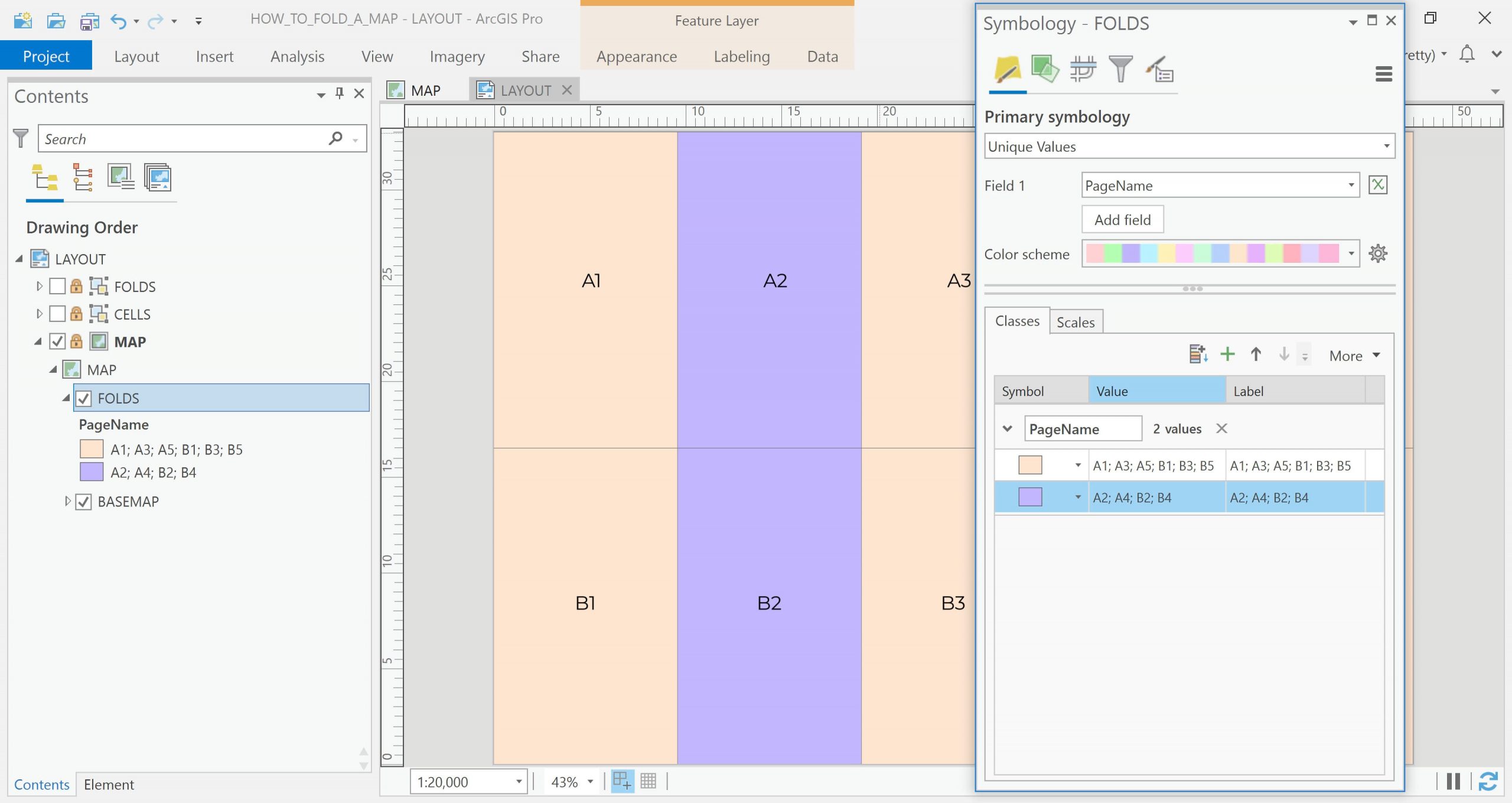
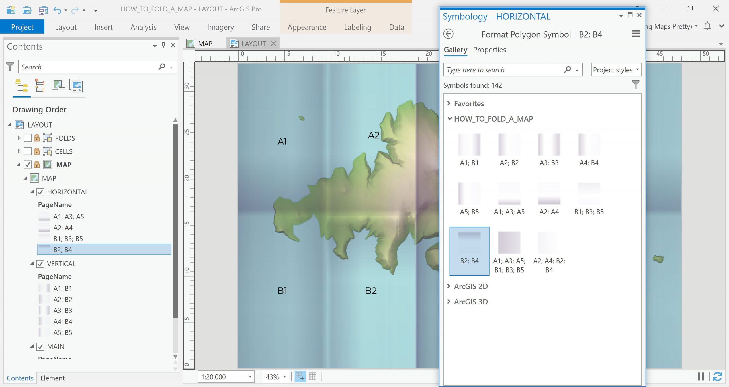
Firstly, let’s create the generic layer. I will symbolize the folds feature layer with Unique Values and I will select the field PageName.
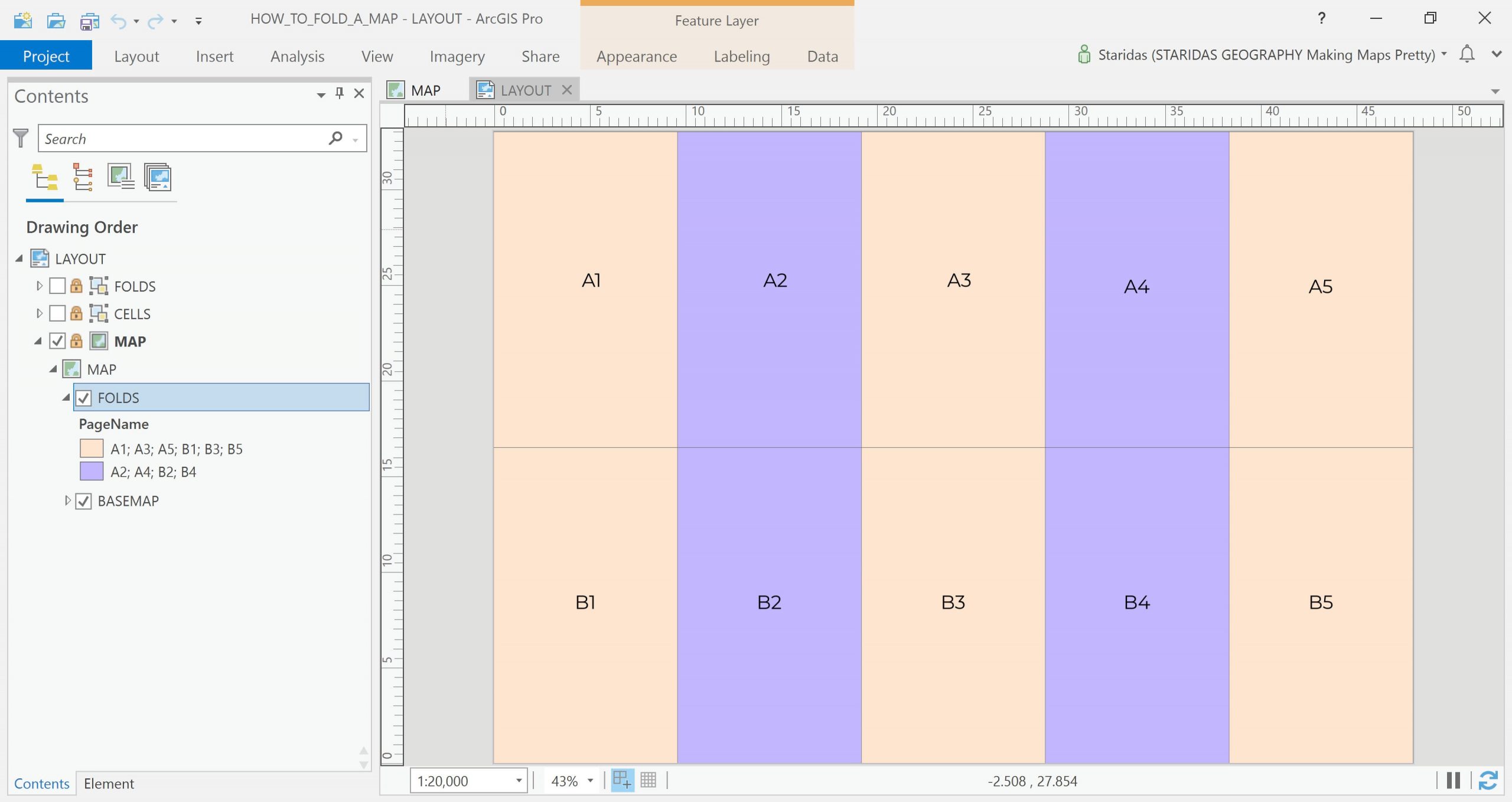
Then I group the folds as alternating columns that face light (from the left) and the folds that don’t face light. This will produce the groups A1; A3; A5; B1; B3; B5 and A2; A4; B2; B4.
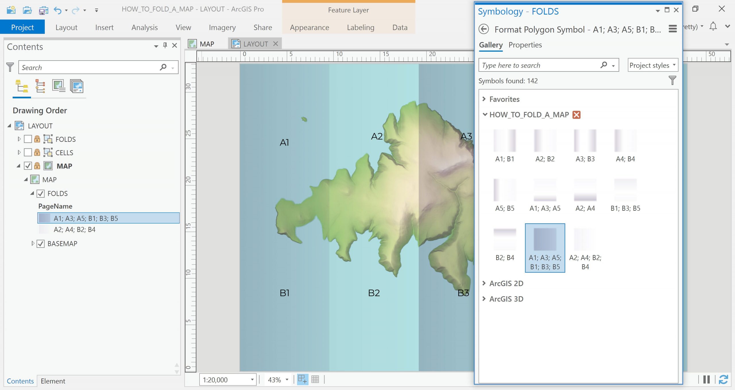
Now I must create an appropriate gradient. It took me quite a long time to experiment and to end up with a decent gradient, which I have saved and published in an ArcGIS Pro Style File here. So I go and symbolize the two groups in my feature layer with the equivalent symbol in my style.
Et Voilà!
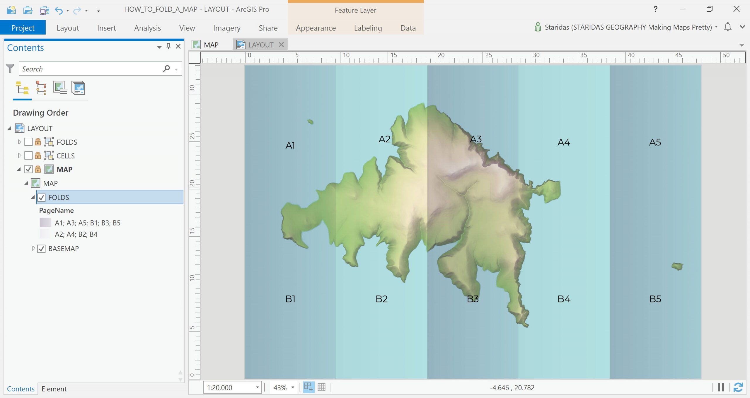
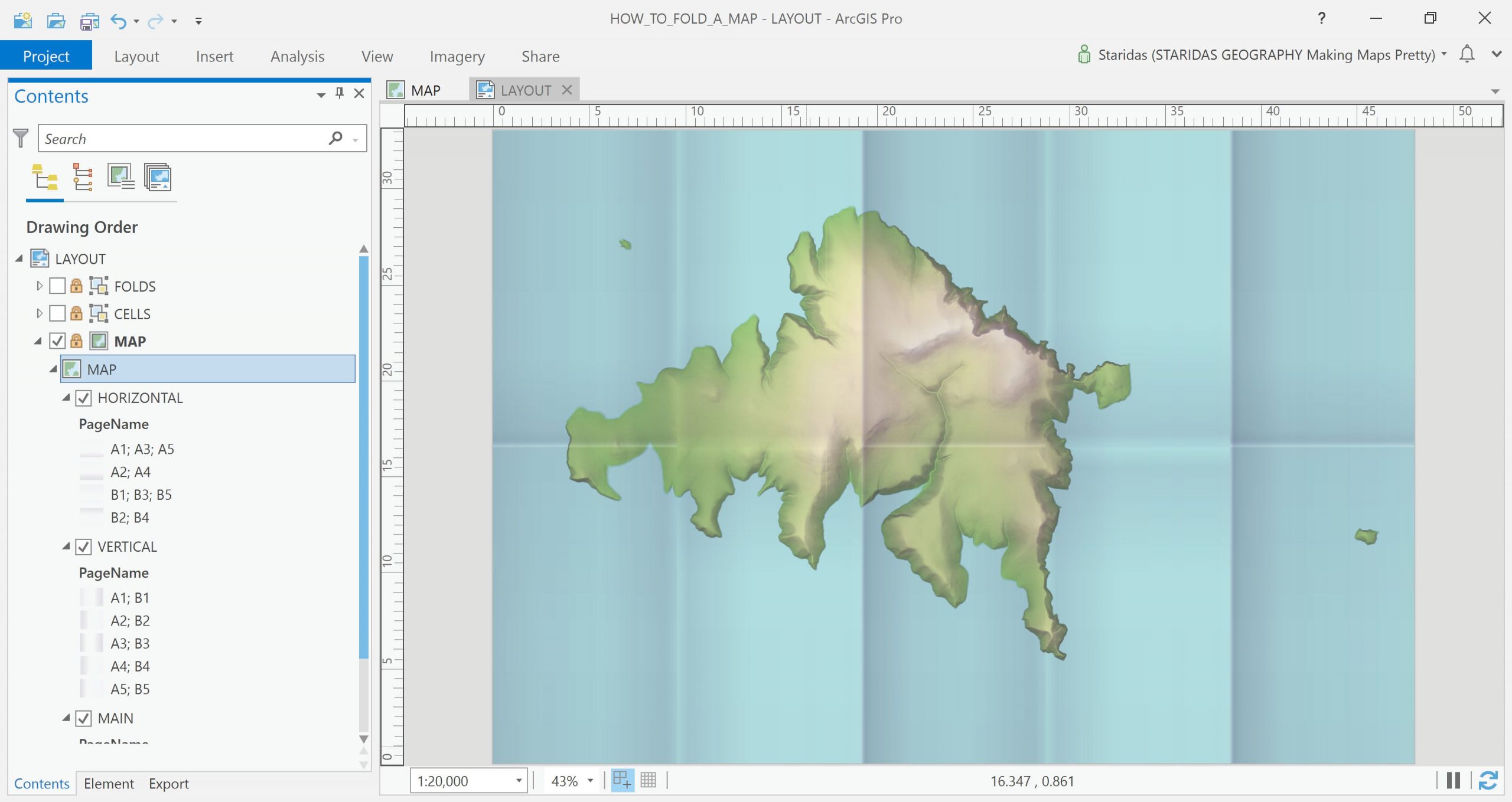
The map already looks folded, like an accordion! And that could be enough. But let’s attempt to simulate the edges. That’s where it is!
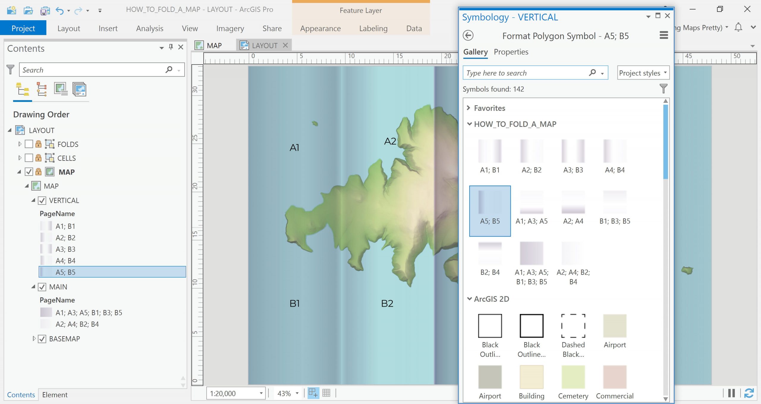
So, I rename the first layer to MAIN and then I add again the same feature layer on the table of contents, which I rename to VERTICAL. I symbolize the VERTICAL layer with Unique Values with the PageName field, as before, only this time I create a different set of groups, like A1;B1, A2;B2, A3;B3, A4;B4 and A5;B5.
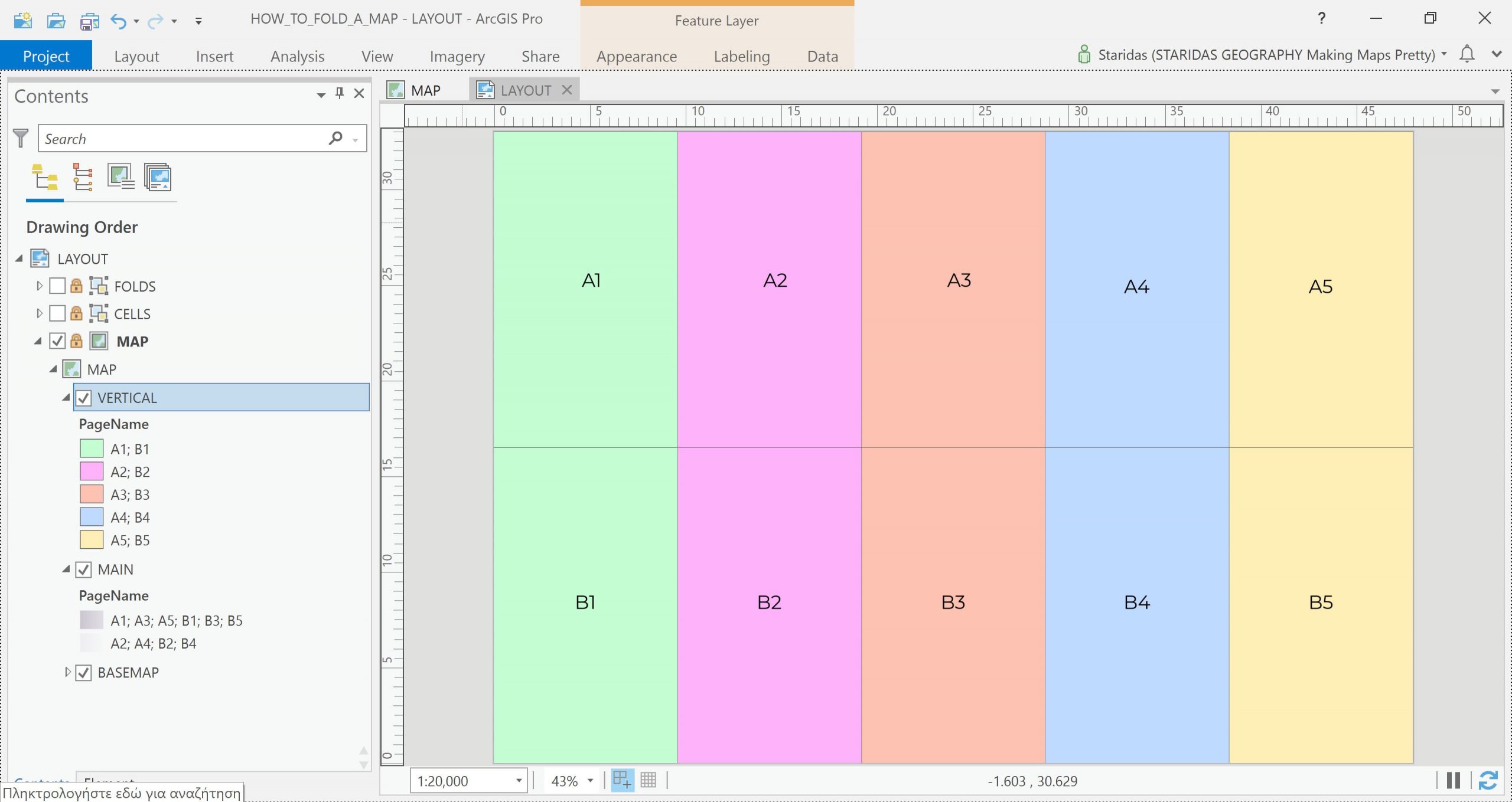
Again, I have saved the gradients of these groups to my saved style, so I can simply match each group to its correspondent symbol.
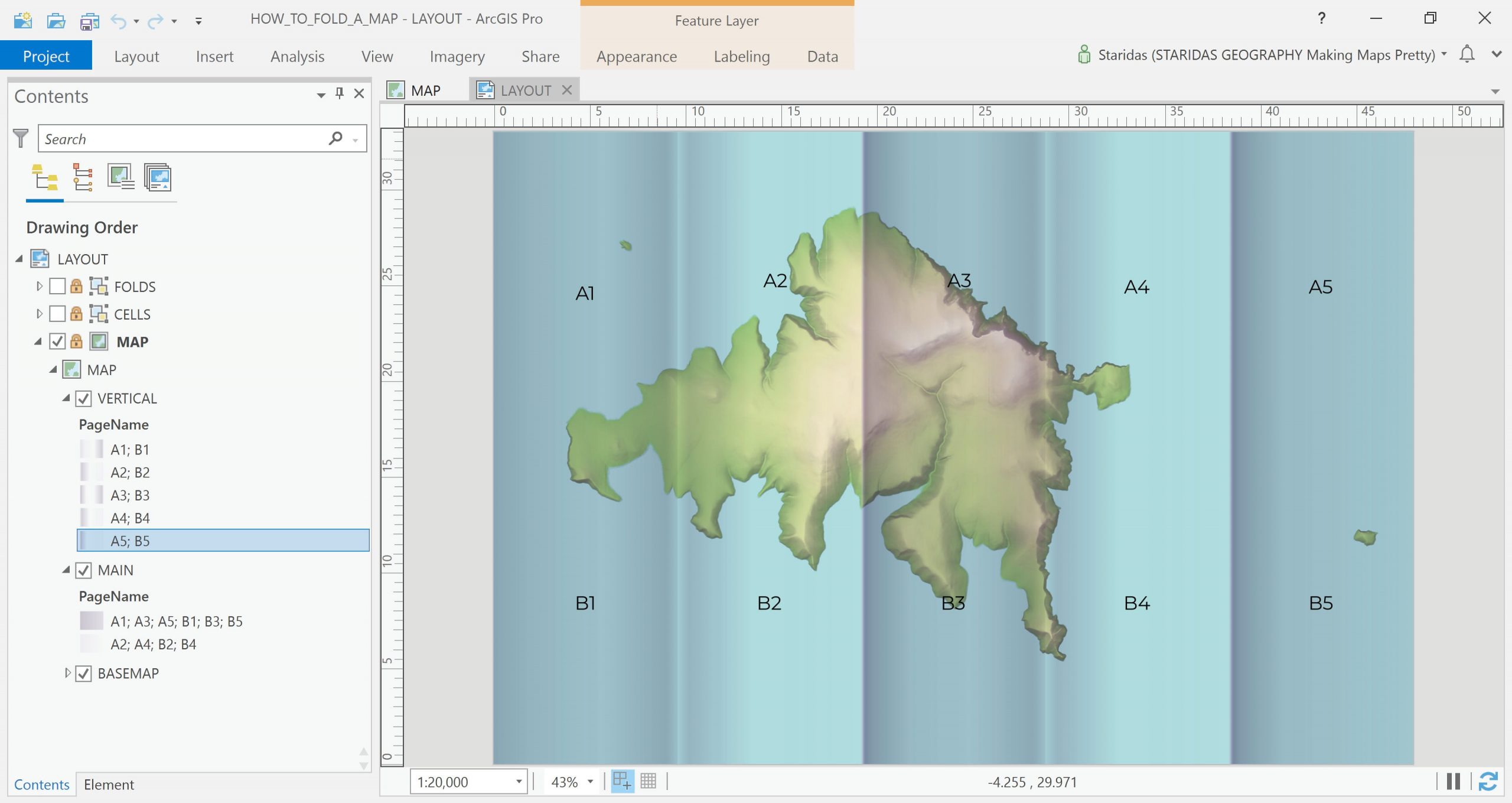
What actually happened is that I enhanced the vertical fold edges. Those that pop out of the map behave like mountain ridges (have a bright aspect and a dark aspect) while those that deep into the map behave like valleys (have dark slopes but bright bottom).
Time for the third layer, the one that will simulate the horizontal fold! I load again the same feature layer, which I rename to HORIZONTAL.
I symbolize the HORIZONTAL layer with Unique Values with the PageName field and I make the groups A1; A3; A5, A2; A4, B1; B3; B5 and B2; B4 which I symbolize according to my style.
And now I enhanced the horizontal fold edges which behave exactly as the vertical, but in another direction.
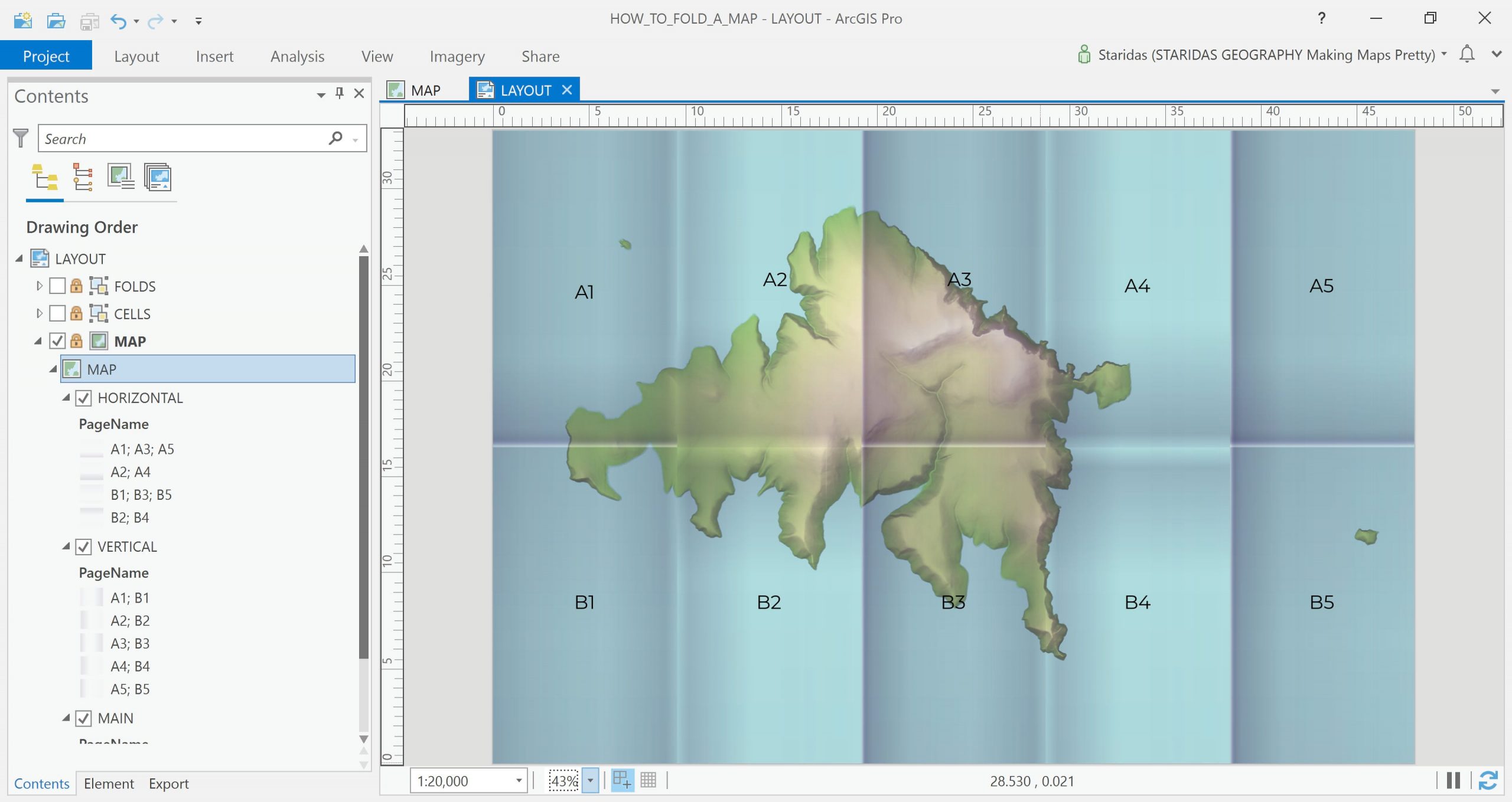
The last step is to relatively adjust the overall transparency of these three layers until I end up with some more realistic shadows.
That’s it!
Of course you may alter the gradients as you wish to match your project’s needs. I have placed the style file on my ArcGIS Online account, which you may download and use under a CC BY-NC-SA license. You are welcome to join me for part 2, where we dive into the 3rd dimension!
Hope you enjoy it!
Kindest regards from Crete, Greece
Spiros
…
Wow! Thanks so much Spyridon, for sharing this process, packed with craft and charm. And for sharing the crease shadow style. I have to admit, I learned about two features that I did not know existed. The Grid Index Features tool, and the ability to group classes within the Unique Values symbology method. Did not know you could do that.
Head over to part 2 of this series, where Spyridon walks us through a clever 3D hack to give a folded map actual dimensionality! In the meantime, I hope you try this tutorial out in your own digital maps to give those pixels a handsome and fun tactile quality. And share the results here in the comments! We’d love to see what you come up with.

Article Discussion: