This tutorial walks through some of the tasks involved in making a map of historic mines in the Mojave desert. Remember – those old-time prospectors didn’t have the luxury of a tablet to pull out of their saddle pack when they were searching for gold. No, they had to rely on a stained, creased, and torn piece of paper. The Wild West was no gentle geography, so that map had better be tough.
A lot of artistic maps seek to imitate historic ones – usually the yellow-edged, copper-plate-engraved variety. But my eye is more often drawn to maps made between 1920 and 1980 – maps made with a modern sense of graphic design but before cartography went digital. And many of the maps from the twentieth century were made with resilient, “tough” design.
These maps were designed with the knowledge that they’d be printed on cheap paper with cheap ink. They were going to be in books, or pamphlets, or newspapers. This meant you could only use one or two colors. It also meant that fine lines, delicate patterns, subtle hues, and gradient tones were all out of the question.
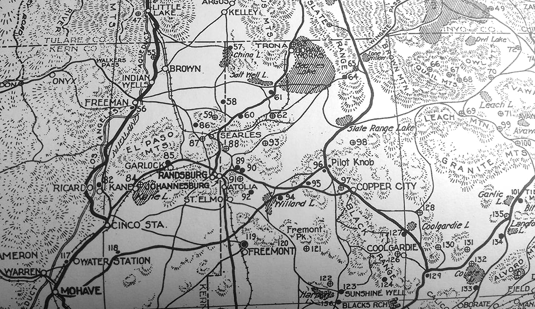
The map above was originally published by the “Auto Club” (the year and any further attribution were unprovided.) In 1976 it was reproduced in this local history book:

Last week I took a photo of it with my phone, shrunk the image, and posted it here. This cartography is “tough” because it passes the photocopy test: after all that reproduction and changing media, it is still legible and beautiful.
Today the physical limitations of color plates and paper texture rarely apply. But maybe you think that the auto club map is fantastic and want to copy its graphic style. If so, it’s a good idea to understand where those design decisions originally came from.
And maybe you need to make a map that will be photocopied or printed on the cheap. Don’t worry! You can still make it look good.
So….how do you do it?
Step 1: Gather the data
First things first, ready-made basemaps aren’t going to cut it. And that means going out into the wilds of the internet to gather data. If you’re mapping somewhere in the United States, the USGS is a good place to start. And of course, don’t forget to search ArcGIS Online and the Living Atlas.
In the interest of time, I’ll only talk about one of my datasets: the gazetteer. You can download tables of this official record of place names here: https://geonames.usgs.gov/domestic/download_data.htm The place names contain latitude and longitude values, which means you can easily draw them on a map using the XY Table To Point tool:

Don’t fall for the rookie mistakes!
1. X = longitude. Y = latitude.
2. Check your metadata. Those lat and long values aren’t going to be right if you don’t pick the right coordinate system.
Metadata can do more than tell you what datum you’re in. This particular dataset comes with all sorts of cryptic field names. One of them, LSAD, turns out to stand for Legal/Statistical Area Description. Now you known that 25 means city, 43 means town, and 57 means CDP, which in turn means Census Designated Place. These codes are super handy for setting up label classes, because you most likely don’t want Las Vegas to have the same size label as Amboy.

You will find that the LSAD codes are repeated in the NAME field, resulting in labels like “Las Vegas City” and “Amboy CDP”
Which is very irritating.
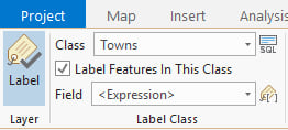
You can remove them with Arcade label expressions:
")
Step 2: Generalize the data
You’ll probably have to generalize most of your data. The National Transportation Dataset provided by the USGS contains every single footpath, service road and highway off-ramp in the nation. That’s just too much to show at 1:800,000. You’re going to have to make tough decisions about what to show and what not to show.
You have three main methods at your disposal for tackling this undertaking:
1. Filter: Use definition queries to filter out polygons smaller than a certain area.
2. The Generalization Toolset: I find Simplify Polygon and Smooth Line to be particularly useful.
3. Manual editing: Don’t be afraid to move/delete/reshape things. This is a map of mining history, not a geological analysis.
The extra benefit to this process of generalization is being forced to really look at your data – up close.
Step 3: Question the data
Once you start looking at your data up close, you’re going to find out that it’s not all that accurate. It’s never accurate. And even if by some miracle your data is perfectly and magically accurate, you should still take the time to investigate and question it. For example:
One day I was editing roads when I noticed that the polygon I had for Owens Dry Lake had a large hole in it. I compared it with the Esri Imagery basemap and decided that my polygon was lacking:

Basemaps are great for investigating suspicious geography like this. Keep a stack of them in your Contents pane and turn them on and off to compare against your data:

Hint: Can’t add more than one basemap at a time? Copy and paste them from another map.
It turned out that the hole in Owens Lake was classified as an “Inundation Area” and so was stored in a different layer, which I was able to add. Lesson learned: even when the data is accurate, it might not be complete.
Of course, all of this data checking is a slippery slope that can consume literally all of your time. You have to make the call for yourself when enough accuracy and generalization is enough for the purposes of your map, your audience, and your sanity. Most of the time you just don’t have enough time. But if you’re mapping a place you really care about, don’t you want to get it right? Making a reference map is extremely time consuming, but if your purpose is to explore and discover and to understand a place, then maybe it’s time well spent.
It’s only in questioning your data that you will really explore it, and that’s true not only for tabular and thematic data, but also for the shapes and locations of things.
Step 4: Style the data
To pass the photocopy test your map should meet the following criteria:
• No lines, symbols, or fonts thinner than 1 pt.
• No gradients (ie hillshades are out)
• No subtle textures (stick to hatches and dots)
• No color or only a few bold colors
You should set a reference scale before you start symbolizing, to make sure 1pt actually means 1pt at the scale you intend to print.
No color?!?! That sounds hard! Why would you limit yourself if you don’t have to?
Think of it this way: choosing fonts is hard. Choosing which features to show and label is hard. Choosing colors doesn’t have to be hard. You can have any color you want so long as it’s black.
Other benefits of a black and white map include:
• You can photocopy it (put it in a zine!)
• You are forced to simplify your map and throw out all extraneous data.
• You don’t need to worry about color blindness.
• You don’t need to worry about colors looking different on different screens or out of different printers. This is particularly problematic for pale colors.
• And when the time comes to add thematic data on top (Mines of the Mojave), setting it apart from your base data is as easy as making it red.
How did the auto club map handle all of these limitations?

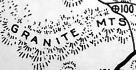
Copy what you like, ignore what you don’t like. I like how the auto club map depicts town as little nodes on the network of roads and railroads. I like the hatched fill symbol for dry lake beds:

And I like the decidedly pre-digital hachures.
Hachures are a method of terrain visualization that is now mostly abandoned. But back in the days of tough cartography they were quite a useful method.
I decided to give them a try:

You can draw hachures by hand, scan them, and add them back into your map in ArcGIS Pro. Read all about it here: Hand drawn terrain.
What about fonts?
My mountains are labelled with Courier New. But trying to match the blocky, rounded text that I see on so many pre-GIS maps proved tricky:

I ended up using Gulim, a font intended for Korean:

It doesn’t come with a bold version, but you can hack it by adding a 0.5 pt outline:

And the result isn’t that bad:

And now for a fun trick.
Earlier, I talked about passing a “photocopy test.” I used that term because every time you reproduce an image, you degrade it in some small way. Photocopying is a particularly harsh downgrade, but there can also be something charmingly naïve about a photocopied map, don’t you think?

Above is another map from the previously mentioned book. Clearly created with some help from xerox.
Here’s how to artificially imitate some of that charm:
• When you’ve completely finished your map, export the layout from the Share tab on the ribbon.
• Save it as a jpeg at 150 dpi.
• Open the jpeg in Photoshop or a similar program. You will see that the quality isn’t great. The fonts in particular suffer from pixelation:

• Upsample the image – change the resolution to 300 dpi.
• You might find that there are some grey artefacts hanging around from the downgrade. Clean them up using the levels editor:

Now your fonts and symbols all look a little bit wobbly, a little less crisp, a little less brand-new, but without the ugliness of pixelation:

If you want it to be more dramatic, export from Pro at a lower dpi. Here’s what it looks like if you start with 100 dpi instead of 150:

This hack is not unlike the time-honored tradition of staining your paper with tea to make it look like an ancient treasure map. Except you’re fooling your audience into thinking your map is from 1982, not 1782.
See the final map: Mines of the Mojave Desert.
Download the project package for ArcGIS Pro: MinesOfTheMojaveDesert.ppkx


Commenting is not enabled for this article.