Malaria is a life-threatening disease that is both preventable and treatable. Transmitted by mosquitoes, it affects millions of people worldwide, especially young children in Sub-Saharan Africa. But there’s good news- due to treatment and prevention efforts, such as insecticide-treated mosquito nets and rapid diagnostic tests, incidence rates have been shrinking.
In this article, you’ll use an adaptable workflow for quickly analyzing and visualizing your raster data to find out how much malaria rates have decreased. Using data from the non-profit Malaria Atlas Project, you’ll analyze how malaria rates for children age 2 to 10 in Sub-Saharan Africa changed since 2000. After downloading the data, you’ll use the Raster Functions analysis tool in ArcGIS Pro to calculate the change in malaria prevalence from 2000 to 2015. Then, you’ll visualize malaria rates over time in Sub-Saharan Africa.
Jennifer Bell, from Esri’s Living Atlas team, created a web app that shows this data:
Malaria Rates for Children Age 2-10 in Sub-Saharan Africa
Step 1: Download data from the Malaria Atlas Project
Note: The Raster Function used in this workflow requires either a Spatial Analyst or Image Analyst license to complete.
- Download malaria rate data and unzip it to the folder of your choice.
All malaria data comes from the Malaria Atlas Project. You can learn more about the data and find additional data sets at their site.
- Start ArcGIS Pro and under New, click Catalog.
After you name your project, the Catalog window opens.
Note: If you don’t have ArcGIS Pro or an ArcGIS account, you can sign up for an ArcGIS free trial.
- On the ribbon, on the Insert tab, click Add Folder. In the Add Folder Connection window, browse to the malaria data you unzipped.
- In the Catalog window, press the Ctrl key and click 2015_Nature_Africa_PR.2000.tif and 2015_Nature_Africa_PR.2015.tif, then right-click the layer and click Add to New and choose Map.

Note: If you see a warning about building pyramids, click Yes. Pyramids improve the drawing speed of rasters, especially for large datasets.
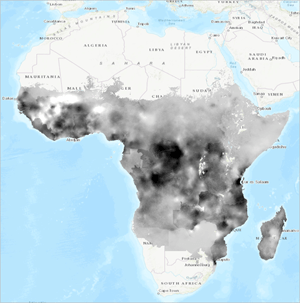
A map opens that displays the data with a black-white ramp. These two layers show malaria rates among children ages 2 to 10 in Sub-Saharan Africa in 2000 and 2015. White pixels represent higher malaria rates while darker pixels represent lower rates.

Step 2: Calculate change
Next, you’ll analyze the change in malaria rates from 2000 to 2015. Because the data is in raster format, it is represented as pixels, or cells. Each cell shows the average value of the area it covers. To calculate the change in malaria rates, you’ll subtract the value of overlapping cells using Raster Functions. The resulting layer will be calculated on the fly as a temporary layer, rather than being saved to your computer and taking up space.
- On the ribbon, click the Analysis tab. In the Raster group, click Raster Functions.

2. In the Raster Functions pane, type Minus in the Find Raster Functions search and click the Minus tool.
The Minus tool subtracts the value of the second input from the value of the first input on a cell-by-cell basis.
3. In the Minus Properties pane, click the menu for Raster and select the 2015 layer. For Raster2, select the 2000 layer. Click Create new layer.

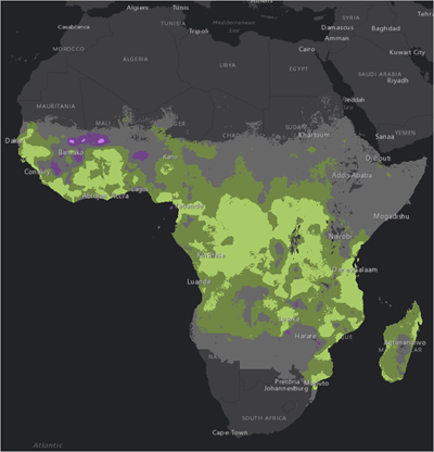
The result is added to the Contents pane. White areas represent positive values, or an increase in malaria rates, while darker areas represent negative values, or a decrease in malaria rates. It is clear from this map that there were significant decreases in malaria rates in the Congo, Burundi, Uganda, and Tanzania. Increases occurred in Mali and Guinea, but most of the other shades of gray do not show us a clear visual pattern.
Step 3: Visualize results
Finally, you’ll change the colors of your layers to better visualize where malaria rates increased or decreased.
- On the ribbon, click the Map tab. In the Layer group, click Basemap and choose Dark Gray Canvas.
Changing the basemap to a simple one like Dark Gray Canvas helps your data stand out because it removes distracting details, like topography and river features. Now, you’ll symbolize the 2015 data for malaria.
- In the Contents pane, turn off the new Minus layer and click the color ramp for the 2015.tif layer.
The Symbology pane opens for the 2015 data layer.
- In the Symbology pane, under Color scheme, click the black-white color ramp. In the Color scheme menu, click Format color scheme.

The Color Scheme Editor opens. This window allows you to create custom color schemes by specifying color values for each stop, or relative percentage of the data.
4. On the top right of the Color Scheme Editor, click the plus sign to add a color stop.

There are now three stops, at 0 percent, 50 percent, and 100 percent.
5. Click the 0 percent stop (black). Under Settings, click Color, then click Color Properties.
6. In the Color Editor, change the HEX value to #7AB6F5 and click OK.

7. Change the middle value to #805499, and the right-hand value to #F5CA7A.
8. Click OK to return to the map and view your symbology changes.

9. Apply the same symbology to the 2010 imagery.

10. In the Contents pane, turn off the 2015 and 2000 imagery layers. Turn on the Minus layer and click to select it.
The Minus layer opens in the Symbology pane.
11. Under Symbology, click Stretch, then choose Classify.
Choosing Classify breaks the data into defined categories instead of being symbolized along a single ramp, as the 2000 and 2015 layers are. The color scheme also changes to a default color ramp, like red to yellow.
12. In the Class breaks section, change the numbers in the Upper value column to -0.3, -0.1, 0.1, 0.3, and 0.4.
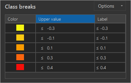
Negative values represent areas that had a decrease in malaria rates while positive values indicate an increase in malaria rates. For example, 0.1 indicates that there was 10 percent increase in malaria among children from 2000 to 2015. These values were chosen to mirror Jennifer Bell’s malaria change app, shown above.
Because this data has a clear and important midpoint (0), it calls for a diverging color scheme. By showing positive change in one color and negative change in another color with a neutral middle color, the change is clear.
13. Click the symbol box next to ≤ -0.3 and in the Color window, click Color Properties. Change the HEX value to #AACC68.
Note: If necessary, change the Color Model to RGB.
14. Change the color symbols as follows:
- ≤ -0.1 to HEX value #718845
- ≤ 0.1 to HEX value #686868
- ≤ 0.3 to HEX value #704488
- ≤ 0.4 to HEX value #CA7AF3
Step 4: Share your visualization
There are many ways to share your results. You can pick the one that best fits your needs and your audience’s preferences.
- If you want to print your data or share it statically, convert it to a Layout. For some tips on creating a map layout, check out Cartographic Creations in ArcGIS Pro.
- To share the maps online so that people can interact with them, share them to ArcGIS Online and create a Web app. For more on web apps, try Get Started with ArcGIS Online.
This workflow for visualizing data can be applied to most raster datasets. Raster functions require little processing time, making them good for quick analysis and visualization. The most difficult part of the workflow is deciding which of the hundreds of visualization techniques you’ll apply to your data.
For more ideas on raster data visualization, check out John Nelson’s Lights On, Lights Out blog. Learn more about ArcGIS Pro’s cartographic capabilities in Cartographic Creations in ArcGIS Pro.
For more information about malaria, refer to the World Health Organization fact sheet. Malaria data was downloaded from and belongs to the Malaria Atlas Project.

Commenting is not enabled for this article.