This post is a short recipe for a longer lesson that you can complete on the Learn ArcGIS website. You’re in the right place if you:
- Want to assess which parts of a city would benefit the most from a new public transit line
- Have some pre-existing GIS skills
- Want to use your own data in your own city
Full lesson: Assess Access to Public Transit. If you are unclear about anything in this recipe, consult the lesson.
Ingredients:
- ArcGIS Pro with the Network Analyst extension.
- Point data representing bus stops. The most common source for these is a GTFS dataset.
- You may be able to find one for your city at Transitland or OpenMobilityData.
- You only need stop locations, not any attribute information.
- A network dataset covering your city. If you don’t have one, you have three options:
- Use ArcGIS Online as your Network Data Source. If you do, generating service areas will consume credits. The cost is half a credit per bus stop. In addition, you can only generate service areas on 1,000 bus stops at a time, so you may need to divide your dataset into multiple pieces using definition queries.
- Purchase StreetMap Premium for ArcGIS.
- Use your own street data to build a network dataset following the Create a Local Government Network Dataset lesson.
- A polygon layer that covers your study area to store demographic information. These can be empty, without attribute information.
- If you are mapping in the United States, you can use USA Block Groups from the Living Atlas.
- Many other countries have similar datasets on Living Atlas. National statistics agencies may provide geographic unit data. Polygons representing city neighborhoods are also appropriate.
- Alternatively, you can use the Generate Tessellation tool to create a grid of polygons.
- Demographic data
- This lesson uses GeoEnrichment to populate the polygons with census data. The cost is 1 credit per 100 variables or features.
- GeoEnrichment is offered for all countries, but some offer more variables than others. You can use old-fashioned joins to attach any other demographic data that you may have access to.
Process:
Map existing bus service
1. Use the GTFS Stops to Features tool to convert a stops.txt file (from a GTFS dataset) to a feature class.
2. On the Analysis tab of the ribbon, click Network Analysis and confirm that the active Network Data Source is set to the one you want to use.
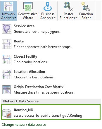
3. On the same Network Analysis menu, click Service Area. Now you have access to a Service Area tab on the ribbon.
4. From the ribbon, Run a service area analysis with the following parameters:
-
- Import Facilities: Use the bus stops point layer you created in step 1
- Mode: Walking Time
- Direction: Towards Facilities
- Cutoffs: 10
- Output Geometry: High Precision, Dissolve, and Rings
5. Export your new polygons to a new feature class.
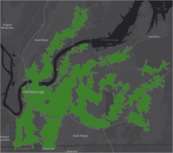
Your map shows which parts of the city are within a 10-minute walk of an existing bus stop.
Assess the map for future bus stops
1. Add the USA Block Groups layer from Living Atlas, or an equivalent. If necessary, filter it to cover only your study area.
2. Use the Enrich tool to add variables to your block group features. In the United States, try the following variables:
-
- 2019 Total Population
- ACS HHs: Inc Below Poverty Level
- ACS Owner HHs by Vehicles Avail: 0
Your new enriched layer can help you find where people live in your city with the most need for bus service.
3. Make three copies of the enriched layer and symbolize each one with a solid color and no outline.
4. In the Symbology pane, use Vary symbology by attribute to vary the transparency of each layer by one of the enriched fields, normalized (divided) by an area field.
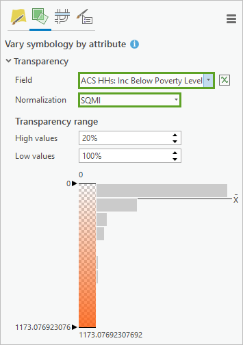
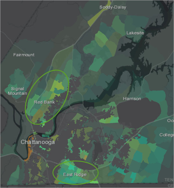
The colors blend on the map so that areas of highest need are brighter.
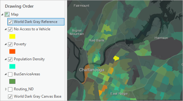
5. On the ribbon, on the Appearance tab, mask the three enriched layers with the bus service area polygons.
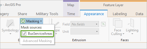
Those parts of the city that already have access to public transit are erased from the map, allowing you to visually assess neighborhoods that might benefit from a new transit line.
6. Consider adding more demographic variables. So far, you’ve mapped where people live but ignored where they work, shop, and go to school. To better map the need for bus service, you can also include variables like daytime population, total employees, and total retail sales.
7. Consider performing a more rigorous suitability analysis to help you select areas by weighing your criteria and quantifying your results.

Commenting is not enabled for this article.