In response to the Coronavirus 2019 (COVID-19) pandemic public health agencies are working to share timely and accurate information with their communities. ArcGIS provides powerful tools to tabulate, visualize, and share COVID-19 data with the public. In order to help public health agencies and officials quickly deploy and share their authoritative data, the second release of the Coronavirus Response solution includes two ArcGIS Dashboard configurations: Community Impact Dashboard and Coronavirus Case Dashboard. The Community Impact Dashboard is designed to help public health agencies share basic COVID-19 testing and case metrics along with other key community information such as school closings and meal sites. The Coronavirus Case Dashboard is designed to allow public health agencies to share more detailed COVID-19 testing and case metrics with the public. Additionally, the Coronavirus Response solution includes mobile versions of both the Community Impact Dashboard and the Coronavirus Case Dashboard. Either or both can be configured and shared to keep your community informed during the COVID-19 pandemic.
In this post, we’ll take a detailed look at the Coronavirus Response solution dashboards including their configuration, data loading options, and common configurations patterns.
Coronavirus Case Dashboard
The Coronavirus Case Dashboard allows public health agencies to share important case and testing metrics with the public. The dashboard can be configured to display information for one or many areas. For example, a county may want to share case details by zip code or municipality. The dashboard can also easily be configured to share metrics for just one area (more on this below).
There are several metrics across the top of the dashboard including active and total cases, negative tests, and hospitalizations. Each metric is a function of another measure. For example, active cases are a subset of total cases and negative tests are a subset of total tests. The relationship between the metrics is displayed in the percentage at the bottom of the indicator.

Around the dashboard case and testing data are displayed through a series charts and a map. Users can examine sources of exposure as well as cases, deaths, and hospitalizations by gender and age. The Cases Over Time chart displays cumulative totals of active cases, recoveries, and deaths which together represent the total number of cases. Similar charts display testing and hospitalizations over time. Most of the Coronavirus Case Dashboard communicates cumulative totals, however the Daily Change tab and chart displays tests, cases, deaths, and hospitalizations changes per day. The Cases by Location chart and map display case data by individual locations. The Coronavirus Case Mobile Dashboard provides the same metrics and capabilities but is optimized for viewing on mobile devices.
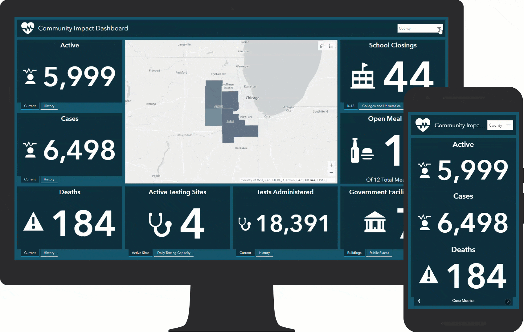
Community Impact Dashboard
The Community Impact Dashboard communicates basic COVID-19 case and testing data such as active and total cases, tests administered, and deaths. It also communicates metrics on the impact of the COVID-19 pandemic to the community such as school and government facility closings as well as metrics related to the community’s response to the pandemic like testing and meal sites available in the area. These metrics are sourced from applications included in the Coronavirus Response solution. History tabs on the COVID-19 metrics provide details on trends over time. The Community Impact Mobile Dashboard is a simplified version of the dashboard optimized for viewing on mobile devices.
Tabulating Coronavirus Cases
Both the Community Impact Dashboard and the Coronavirus Case Dashboard utilize the CoronavirusCases feature layer. CoronavirusCases has two sublayers – Reporting Areas and Cases – as well as three feature layer views (more on the views below).
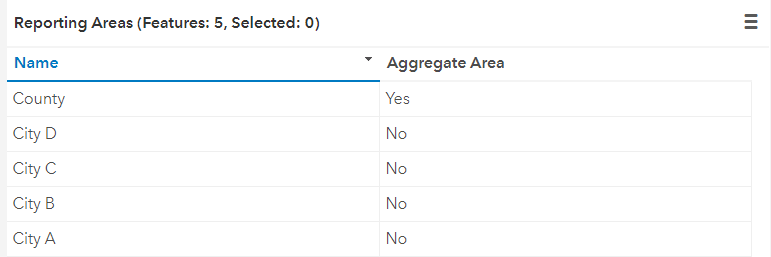
Reporting Areas are the geographic boundary (or boundaries) on which you’d like to share COVID-19 case and testing data. A reporting area can be a county, zip code, state, municipality or any other area you are using to tabulate case data. The Reporting Areas layer includes two important fields: Name and Aggregate Area. Name – straightforwardly enough – stores the names of the reporting area. The Aggregate Area field is used when you’d like to report case data by differing jurisdictions. For example, a county might want to share case data tabulated by the entire county as well as broken down by zip code or municipality. In that case, a feature representing each reporting area would be added to the Reporting Areas layer with the Aggregate Area field populated with Yes like the below screenshot.
When reporting case data on just one reporting area, the Aggregate Area field can be set to No or left empty. For help loading your data into the Reporting Areas layer, see the load coronavirus reporting areas topic in the Coronavirus Response help documentation for step by step instructions. An important step detailed in the help documentation is matching reporting area in both the Reporting Areas layer and the Case Reporter application. See below for more information on Case Reporter.
The Cases table is used to store COVID-19 data like active cases, recoveries, deaths, hospitalizations, sources of exposure, and demographic details like age and gender. A row in the Cases table represents one date-based report. For example, many public health agencies are reporting COVID-19 data daily. Each day’s numbers would have a corresponding record in the Cases table. There are a few options for populating the table.
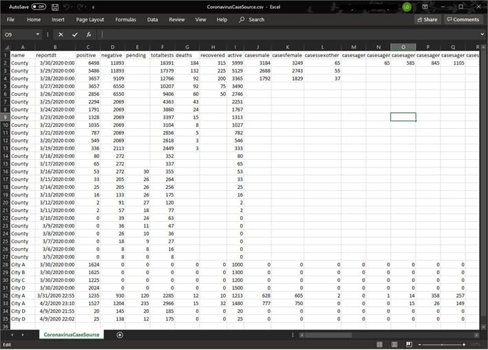
Unfortunately, the COVID-19 pandemic has now been with us for quite a while which means you may want to enter a larger amount of data at once so that the Coronavirus Case Dashboard or Community Impact Dashboard accurately display historical reports. Included with the Coronavirus Response solution is the CoronavirusCaseSources CSV table. Download the CoronavirusCaseSources CSV table from your ArcGIS Organization to tabulate COVID-19 data within Microsoft Excel. Use the table to populate date for each reporting area and report date. Importantly, values in the name column should match the values populated in the Reporting Areas layer name field.
The CoronavirusCaseSources CSV table can then be used to populate the Cases table by following these steps:
- Navigate to the CoronavirusCases feature layer in your ArcGIS Organization
- Click Update Data, then Append Data to Layer
- Navigate to the CoronavirusCaseSources CSV table on your computer
- Click Upload and Continue
- Choose Cases as the layer that you wish to append data into (If necessary, uncheck Update existing features)
- Click Apply Updates
An important note about formatting the date: The CoronavirusCaseSources CSV table contains a reportdt column that corresponds to the Report Date field in the Cases table. Formatting the Report Date field properly will ensure COVID-19 data displays correctly in time enabled dashboard charts. The reportdt field is a date/time field and should be populated in UTC format. For example, if the Report Date should be March 31st, 2:00 pm EDT, the corresponding CoronavirusCaseSources CSV table reportdt field value would be 3/31/2020 18:00:00. For more information on date fields in ArcGIS, see the helpful blog Mastering the Space Time Continuum: Considerations for Publishing Date Fields to the Web.
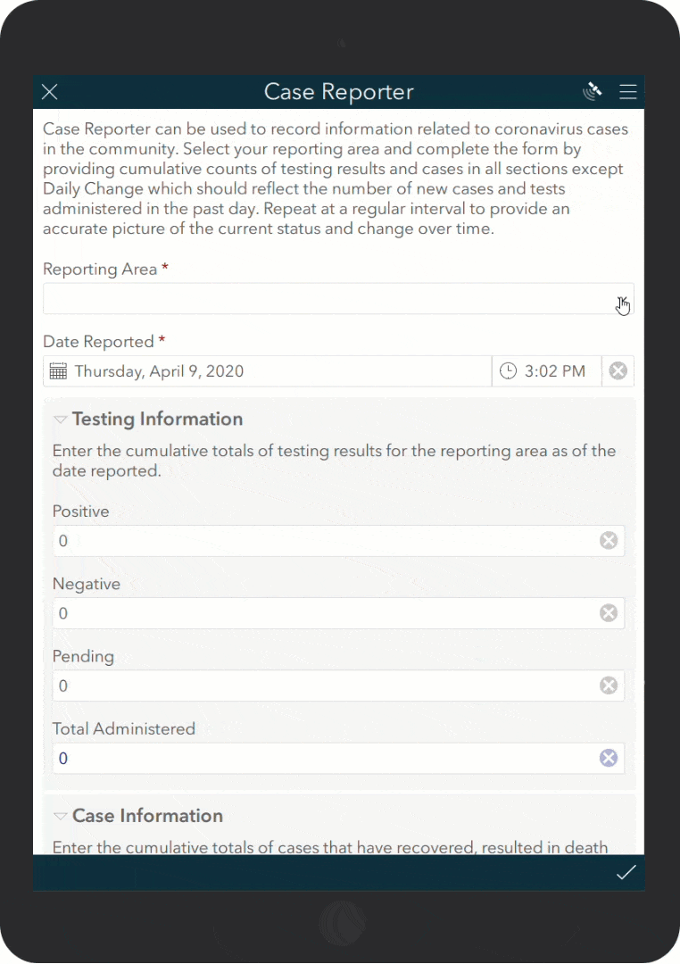
In addition to the CoronavirusCaseSources CSV table, the Case Reporter application can be used by public health staff to tabulate COVID-19 cases. Case Reporter can be used to record information related to COVID-19 cases per reporting area. Each section of the Case Reporter form provides fields for entering cumulative totals as of the report date except the Daily Change section which should reflect the number of new cases and tests administered in the past day.
It’s okay if you’re not able to populate all the case, testing, and demographic details. For example, the Coronavirus Case Dashboard supports entering hospitalizations by age. In some cases, this information may not be accessible. Ignore (or remove from the survey) the fields you don’t plan to populate and remove those corresponding elements from the dashboard.
Whether using either the CoronavirusCaseSources CSV table or Case Reporter, when the CoronavirusCases feature layer is populated with your reporting areas and case and testing data both the Community Impact Dashboard and the Coronavirus Case Dashboard come to life, providing valuable metrics and visualization that enable to the public and public health officials to stay informed.
Extending the Coronavirus Response Solution
The Coronavirus Response solution includes three feature layer views created from the CoronavirusCases feature layer: CoronavirusCases_reporter, CoronavirusCases_public, and CoronavirusCases_current. The views are used in the Case Reporter application and the dashboards. CoronavirusCases_current is a join view used to return the most recent report per reporting area. In some cases, organizations may want to add additional fields to the CoronavirusCases feature layer, use those fields on the Case Reporter application, and configure corresponding visualizations in the Community Impact Dashboard or the Coronavirus Case Dashboard. When doing so, new fields will need to be exposed in the appropriate views. Additionally, the CoronavirusCases_current join view must be recreated when a new field is added. For help with this workflow, see the Extend response surveys help documentation.
Mapping Coronavirus Cases
The Coronavirus Response solution includes several web maps used in corresponding applications. The Community Impact Dashboard and Coronavirus Case Dashboard web maps are used in respectively named dashboards both to visualize COVID-19 data and as the data source for related dashboard elements. Both web maps include symbology mapping active cases per reporting area that comes to life as data is loaded into the solution. A good practice is to modify the symbology of the web maps to correspond to your data.
Mobile Dashboards
As mentioned above, the Coronavirus Response solution includes two mobile friendly dashboards: Community Impact Mobile Dashboard and Coronavirus Case Mobile Dashboard. One option to present the appropriate dashboard depending on the user’s device is to utilize ArcGIS Experience Builder to present both dashboards – desktop and mobile – through one url. See the blog, Two dashboards, one intelligent URL for detailed instructions. After completing this workflow the newly created ArcGIS Experience Builder url could be shared within the context of a Coronavirus Response ArcGIS Hub site. Try these live Coronavirus Case Dashboard and Community Impact Dashboard examples (on desktop and mobile) to see this pattern in action.
Additional Resources
Visit the ArcGIS Solutions site to learn more about ArcGIS Solutions for COVID-19. For questions and feedback, chat with us on GeoNet or contact Esri Support Services.

Article Discussion: