In ArcGIS Business Analyst Web App, tabular infographics are presentation-ready infographic templates displaying modern data tables. Tabular infographics leverage infographic capabilities, including interactive on-screen viewing, a range of modern design elements, interoperability with Business Analyst Mobile App, and many other responsive capabilities. Using these elevated capabilities, you can recreate your favorite classic custom classic reports as infographics that focus on data tables. Say hello to the new tabular infographic styling!
What is tabular infographic styling?
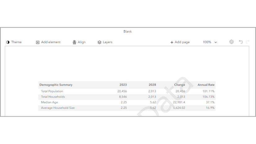
Tabular infographic styling provides presentation-ready data tables. You can use tabular infographic styling in the Build infographics interface.

What are the design advantages of tabular infographic styling?
Tabular infographic styling supports theming and modern design options. For instance, infographics provide additional styling options and interactive elements. The styling options include changing the theme of the entire template so you can quickly adapt the template to your organization’s branding. Tabular infographics are designed to display larger font sizes and high color contrast to meet accessibility standards. This improves readability for a variety of audiences. The default color scheme is designed to be print-friendly.
What are the design guidelines for tabular infographic styling?
The design guidelines for tabular infographic styling are based on design and accessibility standards. It uses an established hierarchy for color and font.


| 1 | Report title | Choose a font that is legible and offers contrast with the background color. We recommend bolding the title. |
| 2 | Subtitles | Choose a subtitle font that is consistent with the report title font. We recommend a minimum 12-point font size for readability. |
| 3 | Header background | Use a light background color so that the text is visible and meets color contrast standards. |
| 4 | Logo | The logo is customizable. The height of the logo is determined by the image you upload. For instance, the Esri logo pictured has a height of 64 pixels. |
| 5 | Page padding | Use page padding to create a margin between elements and the edge of the page. We use 24 pixels between elements and from the edge of the page. |
| 6 | Table header background | Use a table header background that is light and offers contrast with the table header text color. |
| 7 | Table header text | Choose a font that is legible and consistent with the font used in the title and subtitles. We recommend bolding the table header text and using a minimum 12-point font size for readability. |
| 8 | Table row background | Use a table row background that is light and offers contrast with the table row text. Banding is recommended for visual distinction between rows. |
| 9 | Table row text | Choose a font that is legible and consistent with the font used throughout the tabular infographic. We recommend a minimum 12-point font size for readability. |
| 10 | Footer | The footer can use dynamic fields to populate the source, vintage, and copyright information. Choose a font that is legible and consistent. We recommend a minimum 12-point font size for readability. |
How do tabular infographics leverage additional capabilities?
Tabular infographics take your favorite classic report templates to the next level using capabilities unique to infographic templates. For instance, you can run a tabular infographic for multiple sites and immediately see a side-by-side comparison of data for your sites. This stack mode is also available in ArcGIS Business Analyst Mobile App and the Business Analyst widget in Experience Builder. While you can run classic reports for multiple sites, the information is stored in multiple PDFs and is not immediately available in the comparative way that tabular infographics are.

Another way that tabular infographics leverage infographic-specific capabilities is through providing more options to preview and export templates. You can use the Run infographics workflow to view the tabular infographic prior to exporting it. This visibility can save credits since you can preview the work prior to exporting it. There are also additional options for outputs when exporting infographics compared to classic reports, including as an image or HTML.
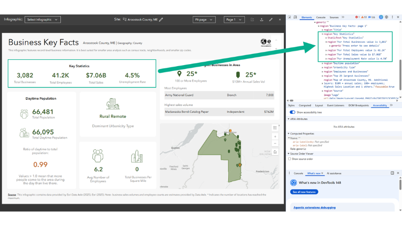
Tabular infographics also support interactive experiences, allowing you to explore variables in infographic panels to get more demographic information. For example, this enhancement can be used to click a value and show a chart to provide more context to the data. Interactive experiences are exportable. You can choose whether or not to export interactive experiences along with the main template. Another way to interact with the data is to use ToolTips. In the Executive Summary tabular infographic, hover over the value of a variable to see the ToolTip as a pop-up panel with the variable’s definition.

Where can I find tabular infographics?
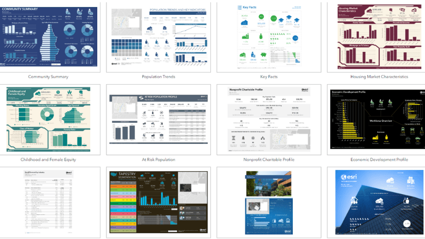
Tabular infographics are currently available in the Build infographics interface under the Tabular tab.

You can also filter the templates by category. Click the Filter button to choose which categories to show.

The categories match the organization previously provided in the classic reports interface.
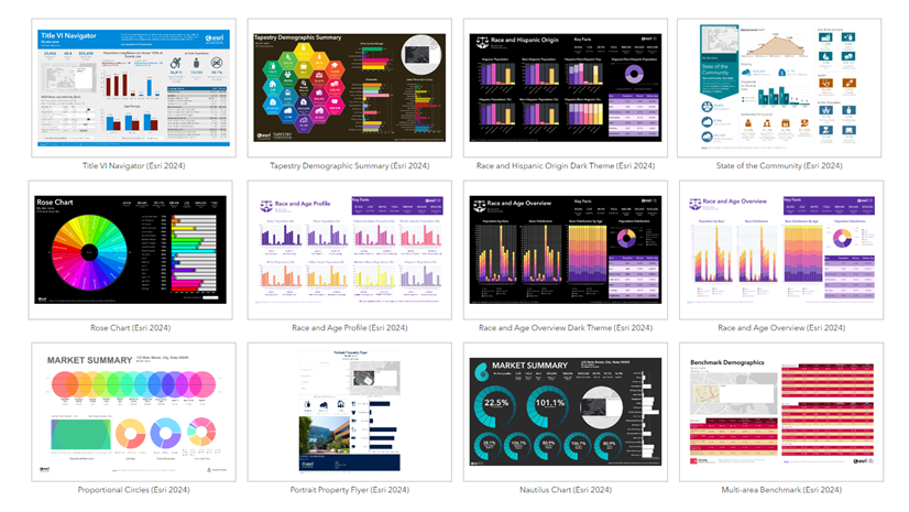
You can also browse for tabular infographics on the Gallery tab, filtering by Tabular.
How do I create a tabular infographic?
You can open and customize any of the tabular infographic templates in the gallery. Customization could look like changing just a few variables or even all the variables in the template. Add your own data using the data browser or copy data from an existing classic report. You can also change the theming to match your organization’s brand and add your logo. For a step-by-step guide, see Build tabular infographics and convert classic reports to the new style in ArcGIS Business Analyst Web App.
How can I run reports using the tabular infographic style?
Esri reports are run by default in the tabular style. For some data sources, like USA 2026, Canada, Puerto Rico, and Europe, the classic version of reports has been removed.
How can I migrate my existing custom classic reports to the tabular infographic style?
Your existing custom reports may be formatted in the classic design style. While you can still run them, it is highly recommended to migrate your reports to the tabular infographic format.
You may have created custom reports by editing Esri reports. As of the June 2026 release, Esri report templates have been migrated to the tabular format in the Build infographics interface (under the Tabular tab). To access tabular reports, do either of the following:
- Open the Build reports interface and click Go to the Tabular for access.
- Open the Build infographics interface and click the Tabular tab.
When you create a custom tabular infographic, it is saved as a custom infographic and not a custom report. To run your custom tabular infographic, browse My templates in the Run infographics interface.
How would you use tabular infographics?
We welcome your feedback! How are you using tabular infographics? Are there any functionalities in classic reports that you need implemented in tabular infographics? Please use the feedback option at the bottom of this blog article or post on Esri Community.
Resources
Now that you’ve learned about tabular infographics and converting custom classic reports, we hope you’ll explore more capabilities in Business Analyst. To continue your Business Analyst journey, visit the following resources:
- Business Analyst product overview page
- Review pricing and purchase Business Analyst
- Business Analyst resources page
- LinkedIn user group
- Business Analyst Web App video channel
- Business Analyst Pro video channel
- Business Analyst on Esri Community
- Business Analyst Web App login page
- Email the team: businessanalyst@esri.com
This article was originally published on October 26, 2023 and has been updated.
This article uses ArcGIS Business Analyst Web App Standard to run tabular infographics and ArcGIS Business Analyst Web App Advanced to create custom infographics.


I may have missed it, but is there a way to convert existing custom classic reports to the new infographic report standard?
Hi, Shaun! Thank you for the question. There are step-by-step instructions to convert an existing classic report to a tabular infographic in this blog article: https://www.esri.com/arcgis-blog/products/bus-analyst/analytics/build-tabular-infographics-from-scratch-in-arcgis-business-analyst-web-app/. We suggest that you create a new blank infographic and copy the table formatting from an existing tabular infographic (such as Retail Demand by Industry). Then select the content from your classic report, copy the variables, and paste them into your blank tabular infographic panel.