We are excited to share many new features introduced in this release, including animation, windows, data view, Bookmark, Card, and Divider widgets. Other highlights are support for more data types, the ability to populate image widgets from feature attachments, and more templates and themes. Some features, such as animation, may change the way you think about your apps. Let’s dive into these features.
Animation
Animations are visual effects that occur when widgets appear or transition in your apps. Taking Microsoft PowerPoint as an example, you can animate objects like text, images, or charts when they move onto your slide, or animate transitions when your presentation moves from one slide to the next. Similarly, with Experience Builder, you can set effects like Fade in, Zoom in, etc on widgets when they display on pages, views, or windows (we will discuss windows later). In this example, the animated trail signs are made using buttons with angles.
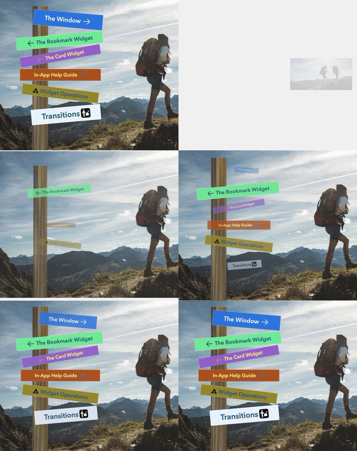
You can also animate containers like pages, sections, windows, and layout widgets themselves if you choose not to set the effect on the individual widget inside of them. In this case, widgets in the container will use the effect from the container. If both containers and widgets have effects, the effect on widgets will overwrite that on the container.
The animation property is under the Style setting.
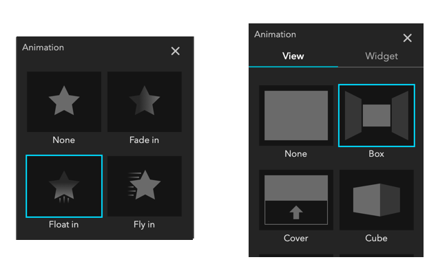
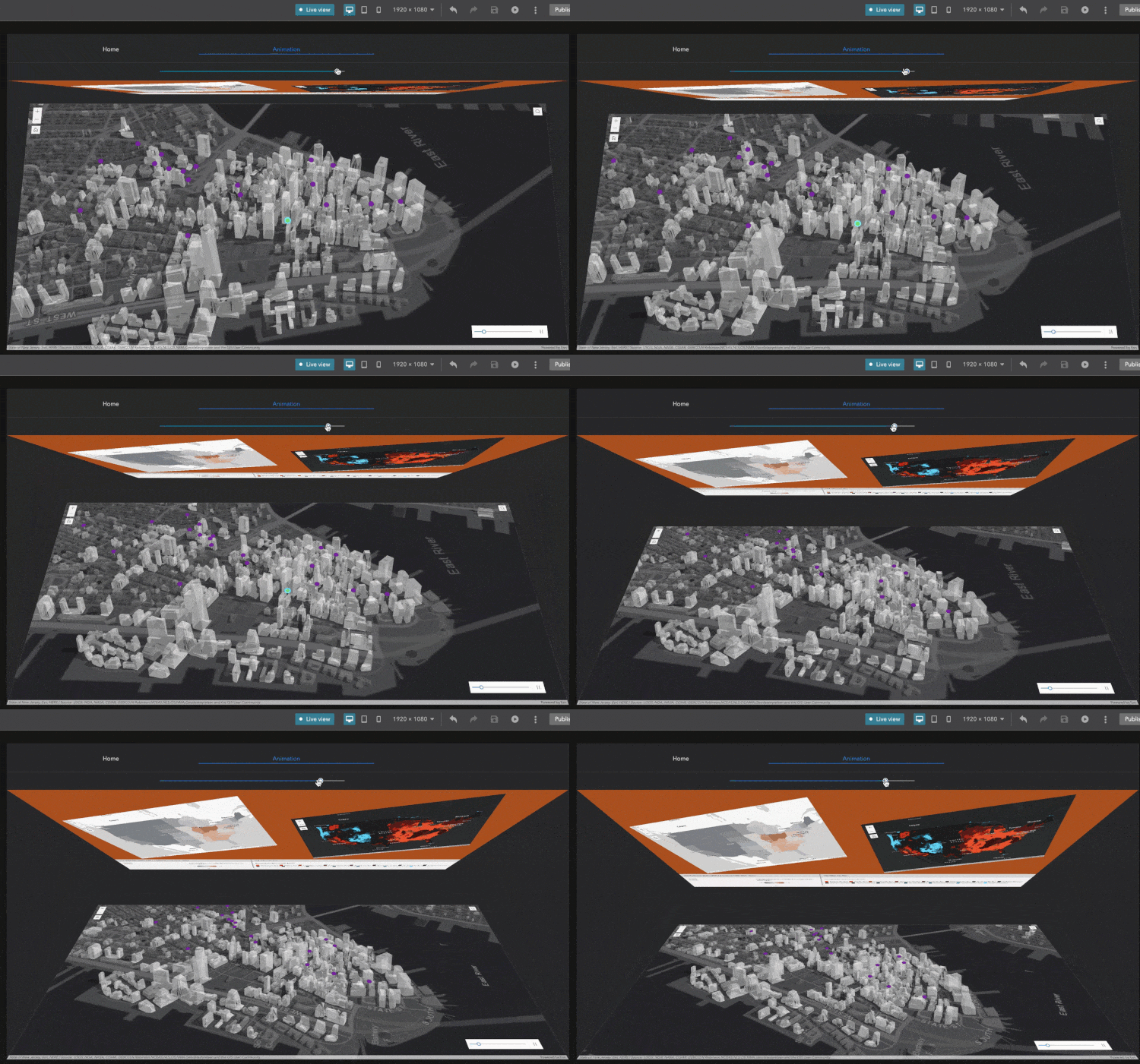
In addition, you can set transition effects like Box, Push, etc as shown above when the Section widget moves from one view to the next. In the example below, there are two views in the section: one has two 2D maps with rotated angles and legends, and the other has a 3D map. When we move from one view to the other, the effect takes place.
You can also set transition effects when the Bookmark widget moves from one bookmark to the next in the paging style, or when the Card widget is in the hover state. Keep in mind that transition effects do not apply to all widgets.
Windows
Some of you have used the Splash widget in Web AppBuilder to create splash screens. Windows in Experience Builder enable you to do this and more. Not only can you configure various types of windows, like splash screens, conformations, and alerts, but you can also open them through widgets in addition to pages. For instance, you can click a button to open a window by linking the button to it as shown below. In this example, the window is in the Anchored mode, appearing next to the button that activates it. The Fixed mode, on the other hand, displays the window in a fixed position regardless. Pages can only open fixed windows.
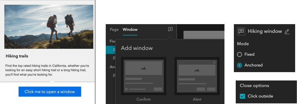
Starting with a template, you can easily configure a custom window with any widgets. For example, you may add a legend, survey, and column widget to the window when needed. Like pages, you can animate windows as well. Lastly, you can close a window by clicking any place outside it with the Click outside option enabled.
Data views
Data views are designed to help you control what appears in widgets by applying filters and sort criteria to feature layers or tables. For instance, you can create a data view called “Air quality”, with only one feature from a feature layer containing multiple indicator features such as Drought, Wildfires, etc under the Data tab.
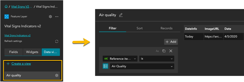
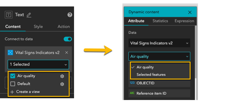
One of use cases for data views is to display field values of a feature in a Text widget directly. In the previous version, you needed to select a feature first. Now, when you connect to the Air quality data view from the Text widget and bind it to a field or fields, the field value immediately shows in the text. As a subset of a feature layer or table, a data view is updated simultaneously alongside its parent. As a feature layer or table may have multiple data views, you can display fields from more than one feature by connecting to multiple data views when applicable.
Card
The Card widget itself is a flexible container, allowing you to add text, images, buttons, and other widgets to display related information. Unlike the List widget, which does a batch processing on features in a layer or rows in a table, the Card widget takes field values from features or rows dynamically through the individual widget it contains, when applicable. Those features or rows connected to the widgets on the card can be from various data sources and updated periodically when the refresh intervals are set on layers or tables. You may use the Card widget to present key information in a straightforward way and have it clickable so users can explore details from one of the pages, views, windows, or external web addresses.
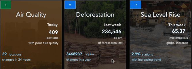
You may start with a classic template or choose an advanced template with a predefined hovering state. You can always configure your own card with various widgets, layouts, and states, and animate the card when somebody hovers over it.
Bookmark
The Bookmark widget provides flexibility to design your bookmarks for 2D and 3D maps. You have options to choose classic, scrolling, paging, or even custom design bookmarks.
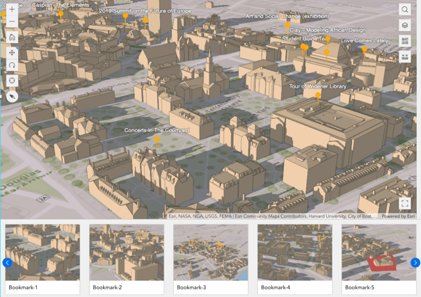
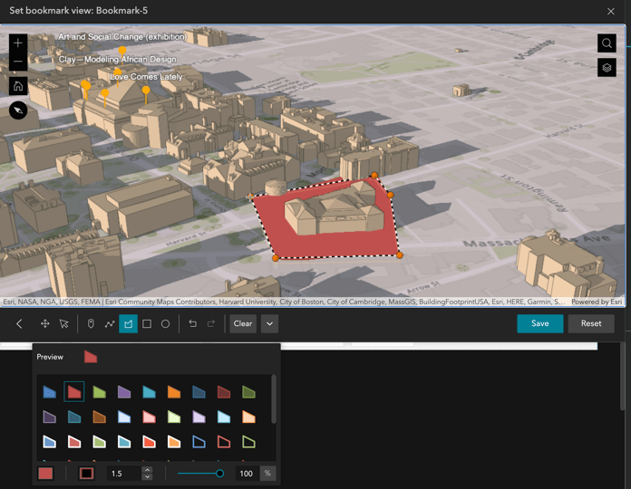
Like in Scene Viewer, a snapshot of the map is taken automatically by default when you set a bookmark using a simple template as shown above. You can upload an image to replace it later. You can also add graphics to the map, and turn on and off a layer’s visibility in the bookmark.
Divider
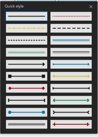
When two widgets need some space from each other, it can be helpful to draw a line between them. The Divider widget is useful where you have widgets or groups of widgets that need to be separated to create a clear hierarchy.
Copy and paste widgets and other operations
When building web pages, you often need to copy and paste widgets like text and cards on the same page or across pages for repetitive processes. You can now do so using the Duplicate button or keyboard shortcut keys: Ctrl+C and Ctrl+V. Note that you have to use the shortcut keys to duplicate widgets across pages.

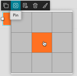
In addition, you may pin the widget to one of nine positions on a scrolling page, so it stays there when you move the page up and down.
Additionally, you can rotate widgets with angles like those trail signs made of buttons or rotated 2D maps in the animation examples.
More templates
Templates are the starting point for building experiences. Eight new templates have been added to the family of default templates, including two multi-page, two full screen, and four scrolling-page templates as highlighted below.
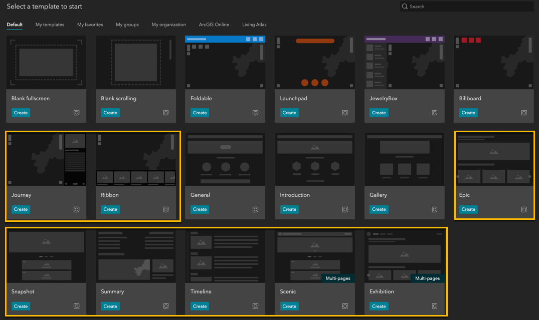
The Ribbon and Journey templates focus on the usage of the Bookmark widget. Meanwhile, Epic is designed to serve as the home page of a website; Snapshot uses Card, Section,and Views Navigation; Summary utilizes short descriptions and actions that could be the ending page of a website; Timeline is used to display your content chronologically.
So far, all the templates we have been talking about, either full screen or scrolling page, are single page templates. That means we can add each of them to an experience we are building. Starting with this release, there are two multi-page templates, Scenic and Exhibition, used to help you build websites with ease. They consist of several pages from these single-page templates.
More themes
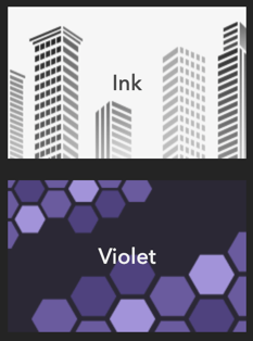
The Ink theme, with a minimalist design, lets your content take center stage while the Violet theme, as the name implies, utilizes violet as the primary color. You now have options to choose font style and size for a theme.
Interactive help guide
The help guide lets you follow along step-by-step to interactively navigate around the builder. It is very helpful if you are new to Experience Builder.

In addition, you will notice a small information icon on the List widget, indicating a help guide is available for this widget.
Other major enhancements
Data Source
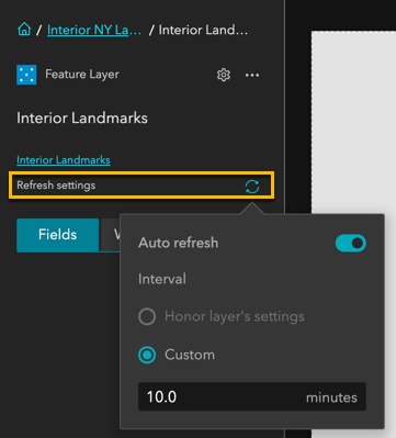
More data types are now supported, including a map service as a group layer, and tables as part of services. You can set refresh intervals for feature layers to periodically update the data connected to widgets in Experience Builder. This is important for situational awareness apps.
Map
In addition to a new Select tool, there is now an imposed limited of a maximum of 16 Map widgets in a single app. This is for performance improvements. Beyond that, a warning message will show. Refer to the note in the Map widget topic.
Image
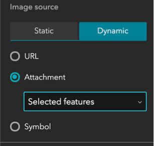
Many of you would like to populate image widgets with attachments from Collector or Survey123 apps. You can now choose feature attachments or feature symbols to dynamically bind data to image widgets.
Filter
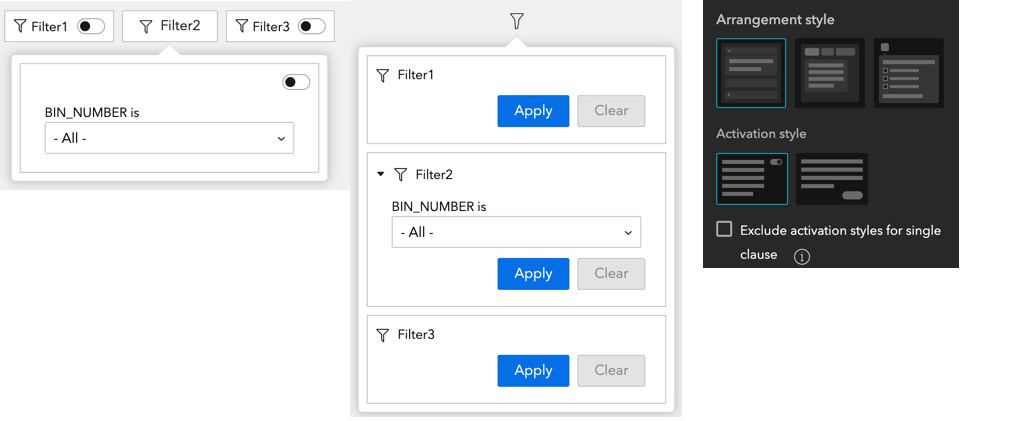
Filtering against Date has been improved, including new operators and support for relative dates and unique values. In terms of style, you can arrange filters vertically or horizontally, or even make them collapse under an icon. You also have the option to activate them with either the toggle button or classic buttons.
Text
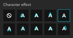
You can apply character effects and tooltips to text.
Menu
You now can display content on a menu vertically, and adjust font size, style, and color.
Views Navigation
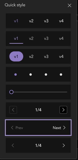
You have more options to choose a style for this widget so it fits nicely to the surroundings.
For more information about this release, see What’s new in Experience Builder.
In addition, if you are new to Experience Builder, check out Get Started with ArcGIS Experience Builder, a pre-recorded one-hour training seminar.
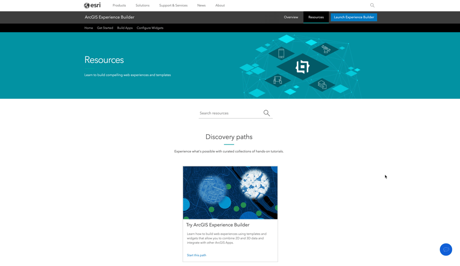
Lastly, on the product page, we have added a resources page to help you discover curated collections of useful resources.
Thank you,
The ArcGIS Experience Builder team




Thank you for all these improvements. The Theme Builder seems to have disappeared with this new version. Or maybe it can be found somewhere else? Documentation for theme development (https://developers.arcgis.com/experience-builder/guide/theme-development/) still indicates that it can be found at https://experience.arcgis.com/theme-builder/page/default/?views=variables, but that results in a page that simply states Not Found.
Hi, Dave
This is Yiwei from the Experience Builder. The theme builder has been removed in favor of the Storybook environment that will be available with the developer version 1.1 later this month.
The reasons for doing so are:
1. the current theme builder serves merely as a UI reference for developers and can be replaced by the more powerful Storybook, and
2. Internally, we need to re-evaluate the theme builder itself
Sorry for the inconsistency between the latest online build of ExB versus the developer doc. The doc will be updated along with new docs on how to use Storybook when the developer edition 1.1 is release.
Hope this helps.
Best,
Yiwei
Thanks, Yiwei! I look forward to hearing more about Storybook.
What is the version number of this update? When will the developer edition of this version be available for download? Will we be able to migrate our previous work with the developer edition to the new version (and if so, will there be any breaking changes)?
Hi Dave,
Dev edition 1.1, planned on 7/23, will pick up new features from this online edition update. You should be able to migrate apps built with the current 1.0 version to 1.1. An upgrade doc will be provided.
Thanks, Jianxia!
I am unclear regarding: “More data types are now supported, including a map service as a group layer.” I was able to add an ArcGIS Server Web Service group layer as a URL data source in ExBuilder. The same group layer could not be added into a web map using Map Viewer Classic. Is there any way to use group layers in the map widget (and the map layers widget so users can turn groups on and off)? I have heard Map Viewer Beta will support group layers (perhaps this summer), but I have not heard anything about using Map Viewer Beta with ExBuilder.
In the previous version, when you added a map service with sublayers, Experience Builder (ExB) added each sublayer in as individual layer in Data tab other than grouped sublayers under its parent as this version does. If you have a group layer in Map Viewer Beta and bring the map in ExB, the Map layers widge will display the group layer automatically because both Map Viewer Beta and ExB are built on JSAPI 4.
Is it recommended that we use Map Viewer Beta with production Experience Builder applications?
No, I would not recommend any beta software in the production.
Wow, that’s a lot of new stuff! Super happy to see the copy/paste for widgets.
Thank you for the added functionality to Experience Builder. I did notice that I see a message, ‘Upgraded from previous config’ listed under my data in the List widget. This only seems to appear for web experiences created before this latest update. Is this from the new Data View portion of the update? Is this expected?
Thank you
Jillian
Sorry for the delay. Yes, it is from the data view and is expected. Specifically, when the widget was configured with data that has any filters, sort fields, etc. in the previous version, the data source it connected to becomes (“is upgraded to”) a data view by default in the current version. We should have clarified it.