With the latest update of ArcGIS Experience Builder, you can now include the Business Analyst widget in your web experiences to display infographics. These infographics display key socio-economic and demographic and information, Tapestry segments, and business information, giving context and adding insight to your maps and location-based analyses.
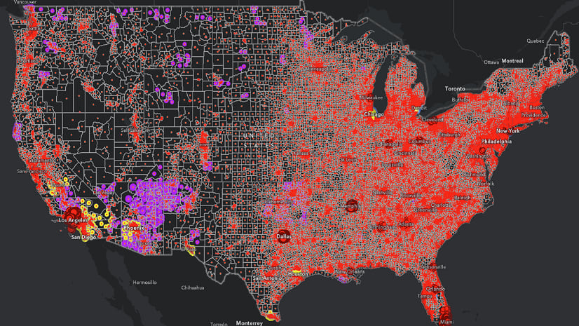
This blog article will guide you through the process of creating a web application in ArcGIS Experience Builder using a web map that displays the racial makeup of communities eligible for federal investments. The map quantifies the number and share of each racial group living in disadvantaged communities at the county level. Counties in the U.S. and its territories are colored and sized according to the number of racial/ethnic populations living in disadvantaged communities. Details of the assessment are provided in the popup for every county in the United States and its territories American Samoa, Guam, the Northern Mariana Islands, Puerto Rico, and the U.S. Virgin Islands. To learn more about this web map, see How we did it: Designing a web map to analyze racial disadvantage in the U.S.
You will accomplish this task in five steps:
- Choose a template.
- Add data to the map.
- Pair the Map and Business Analyst widgets.
- Set an action trigger on the map widget to display the infographic interactively.
- Configure the Alert widget to provide instructions about the application.
You can also view the final product: Racial Makeup of Communities Eligible for Federal Investments. (To access this application, you must be signed in with an ArcGIS organization account to use the Business Analyst widget).
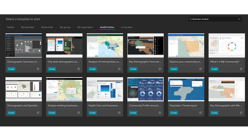
1. Choose a template.
Experience Builder has a large template gallery to create your own Experience Builder app with BA widget. All sample templates provide pre-configured layouts and contain notes explaining the use cases and configurations.
- Go to Open ArcGIS Experience Builder from your ArcGIS Online organization.
- Click + Create new.
- Use the Preview button to see how the template is designed and decide if it’s the best one for you.
- Find the Launchpad template and click Create.

2. Add data to the map.
Once you have chosen the best template for your web experience, you can customize it with your own data.
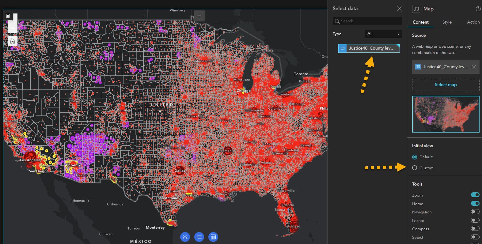
- Click Select map on the right-side panel and click Add new data.

- Click the ArcGIS Online tab and search the keyword “Race” and select Justice40_Disadvantaged Race Groups from the search results.

- Click the data and the Map widget populates with the selected data.
- You can keep the default map extent or modify it by clicking Custom on the right panel.
Now we will pair our map with the Business Analyst widget for an interactive infographic experience.
3. Pair the map with an infographic.
The Launchpad template is designed with an emphasis on the map and includes a Controller widget at the bottom of the page, containing a Table widget, Map Layer widget and Legend. You can add a new widget, and resize and reposition the controller widget as you wish.
- Drag and drop the Business Analyst widget from the Insert widget panel onto the controller widget.

- Click the Business Analyst widget and then Workflow mode on the right panel. Rename and resize the Business Analyst widget as you wish.
- Disable buffers and search.


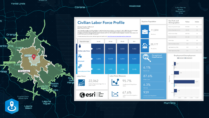
- Under Customize infographics, use the drop-down menus under Esri Infographics to choose any of the Esri Infographics’ ready-to-use templates. (For this step, we chose a custom infographic template titled Socio-economic Profile, which is available in our organization. You can also create custom infographic templates in ArcGIS Business Analyst Web App (Advanced) or ArcGIS Community Analyst. Your custom templates will be available for use in the BA widget in Experience Builder)
- Configure the Infographic settings using the drop-down menus under Infographic settings. For View mode, select Full, turn off both the Run-on map click and Display header toggle buttons.

4. Set action trigger on the map widget to display infographic interactively.
The Business Analyst widget works with other widgets (Map, List, Table, Search) that support action trigger (record selection changes). For example, you can configure action trigger on Map widget that contains polygon or point features and use the record selections from this widget to run infographics in the Business Analyst widget.
- Select the Map widget and click the Action tab on the right panel.
- Click Add a trigger and then click Record selection changes.

- Click Business Analyst and then click Select feature. The widget is now paired with the Map widget and ready to interactively display the selection changes.

5. Configure an Alert widget to provide information and instructions about the application.
- Click Window on the left panel and add the Alert widget. A window will pop up, alerting app viewers about the information you provide.

- Provide information and instructions about using the application.

- Save the application and preview it before publishing.
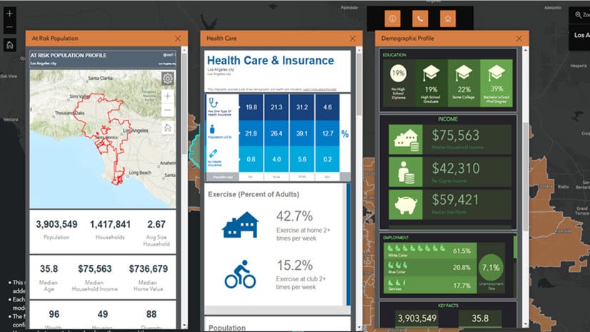
- Select a Census tract boundary on the map.
- Open the Business Analyst widget.
- Select an infographic from Esri Infographics‘ templates.
- To view the infographic, click Run Infographic.

Here, the interactive infographic displays key socio-economic information for a Census tract in Bronx County in New York.

Now you can publish the web application. Once you have published this web application, viewers of your app can click Census tracts on the map to learn about the racial composition of communities eligible for federal investments according to Justice40 criteria, as well as key socio-economic information. This information provides insight into the patterns of racial inequalities in our neighborhoods and can provide common understanding across local governments and businesses to effect positive change.
The Business Analyst Widget in Experience Builder is out of beta with great new features!


Article Discussion: