The purpose of President Joe Biden’s historic Justice40 initiative is to ensure that 40 percent of key federal investments reach disadvantaged communities across the United States. The newly released Version 1.0 of Climate and Economic Justice Screening Tool (CEJST) now includes data on race and ethnicity. This is a critical update, given that racial and ethnic minorities have historically borne the brunt of the environmental, health, and socioeconomic burdens of living in disadvantaged communities.
Using the latest version of Justice40 data available through ArcGIS Living Atlas of the World, we’ll create a web map that displays the racial makeup of communities eligible for federal investments. This information provides insight into the patterns of racial inequalities in our neighborhoods and can provide common understanding across organizations and businesses to effect positive change. National, regional, and local governments can use the information from our web map to address racial inequities and make plans to support equitable communities. Businesses can use it to comply with their corporate social responsibilities, better understand the communities in which they operate, and identify where and to whom they can contribute more equitable community outcomes.
This blog article will guide you through the process of creating a web map—using ArcGIS Pro, ArcGIS Online, and Arcade expressions—that displays the racial makeup of disadvantaged communities. We will accomplish this task in four steps using the Justice40 feature layer and its data tables:
(1) We will first calculate new fields for each racial group showing the count of their population living in a disadvantaged tract.
(2) Then, we will aggregate this data and make a chart to show the distribution of each group’s disadvantaged population as a percentage of their total population.
(3) We will visualize the data for each group at the county level in ArcGIS Online Map Viewer.
(4) Finally, we will create informative pop-ups for each group which will help us learn more about the racial distribution of disadvantaged populations in the United States.
You can also fast-forward to the end by viewing the final product: Justice 40 Disadvantaged Race Groups web map
Processing steps
1. Calculate the racial makeup of the disadvantaged population.
How many Black or African American people live in a disadvantaged census tract? With a few calculations, we can find out. We first need to determine the total number of Black people living in a tract. To do this, we’ll open Justice40 feature layer in ArcGIS Pro, add a new numeric field named Black/African American to the attribute table and calculate it by multiplying the Percent Black or African American field with the Total Population field.
Here’s a view of the equation in Arcade used to calculate the new field, along with a view of the new field.

Next, we will calculate the number of Black or African American people living in a disadvantaged tract. We’ll add another numeric field named “Disadvantaged_Black” and calculate it by multiplying the Black/African American field with the binary field named “Identified as disadvantaged” that contains data on whether the tract is disadvantaged. (Read The beauty of binary data to learn how binary values 1 or 0 make data analysis easier.)
Here’s a view of the equation in Arcade used to calculate the new field, along with a view of the new field:

We will repeat this process for each race group and determine the number of their population living in disadvantaged tracts.
Next, we will aggregate this data and make a chart that displays the percent distribution of each group’s overall disadvantaged population.
2. Aggregate the data and chart each group’s disadvantaged population.
What percentage of Black, American Indian, Hispanic, or Asian people live in disadvantaged tracts? To answer this question, we first need to aggregate the number of each group’s disadvantaged population to the national level. We can easily accomplish this in ArcGIS Pro by right-clicking one of the new fields we created and clicking Summarize. In the Summary Statistics window (shown below), add each of the newly created fields that contain data on each group’s disadvantaged population. Remember to also add the total number of these groups to calculate the percent distribution of each group’s disadvantaged population in the next step.
Here’s a view of the Summary Statistics window used to calculate the summary statistics for each group and the resulting summary table:

Now that we have a summary statistics table, we can use this aggregated data to calculate each group’s disadvantaged population as a percentage of their total population. Let’s find out what percentage of Black people live in disadvantaged tracts. We can do this by adding a new field named “PercentDisadvantaged_Blacks” to this table and dividing the number of disadvantaged Black people by the total number of Black people.
Here’s a view of the equation in Arcade used to calculate the new field, along with a view of the new Percent_Disadvantaged_Blacks field, which now shows that 54 percent of Black/African American people in the United States live in disadvantaged tracts.

After repeating the same process for each group, we can now make a chart out of this aggregated data for a more compelling visualization. Create a chart by right-clicking the summary statistics table and configure the chart to display the percentage of each race group living in disadvantaged tracts.
Here is the chart that displays the share of each group’s disadvantaged population as a percentage of its total population:

Looking at the chart, three groups stand out as having the highest share of their populations living in disadvantaged tracts: more than 68 percent of all American Indians, 56 percent of Hispanics and 54 percent of African Americans live in disadvantaged tracts.
3. Visualize the data in ArcGIS Online Map Viewer.
What is the total number of disadvantaged Hispanic people living in Denton County, Texas? What percentage of American Indian people in Robeson County, North Carolina, live in disadvantaged census tracts? We can now easily answer these questions by visualizing our data at the county level for each group using ArcGIS Online Map Viewer’s informational pop-ups and counts and amounts (size) map style. What’s more, once you have created a beautiful map using these features, you can share it with your coworkers, other organizations, and the public.
To show the number and proportion of groups’ disadvantaged populations at the county level, we followed the same process of aggregating the data as in the second step. The only difference is that this time, aggregation was at the county level. First, get summary statistics for each group’s disadvantaged population at the county level, and use the summary statistics table to calculate the share of each group’s disadvantaged population as a percentage of its total population (as shown in the second step), and voila. Here is a view of the resulting summary statistics table showing the number, as well as the share, of disadvantaged populations at the county level for each major racial group:

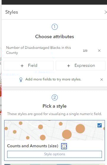
To create a map of this county-level data, we joined this summary table to our original data. Using this joined data from our project, we can now visualize it in ArcGIS Online Map Viewer. Map Viewer has many capabilities, including several styling options and multielement pop-ups. We will use Map Viewer’s Counts and Amounts (size), which allows us to visualize our numeric data as different symbol sizes to represent disadvantaged population counts from our data. The larger the symbol, the bigger the data value.
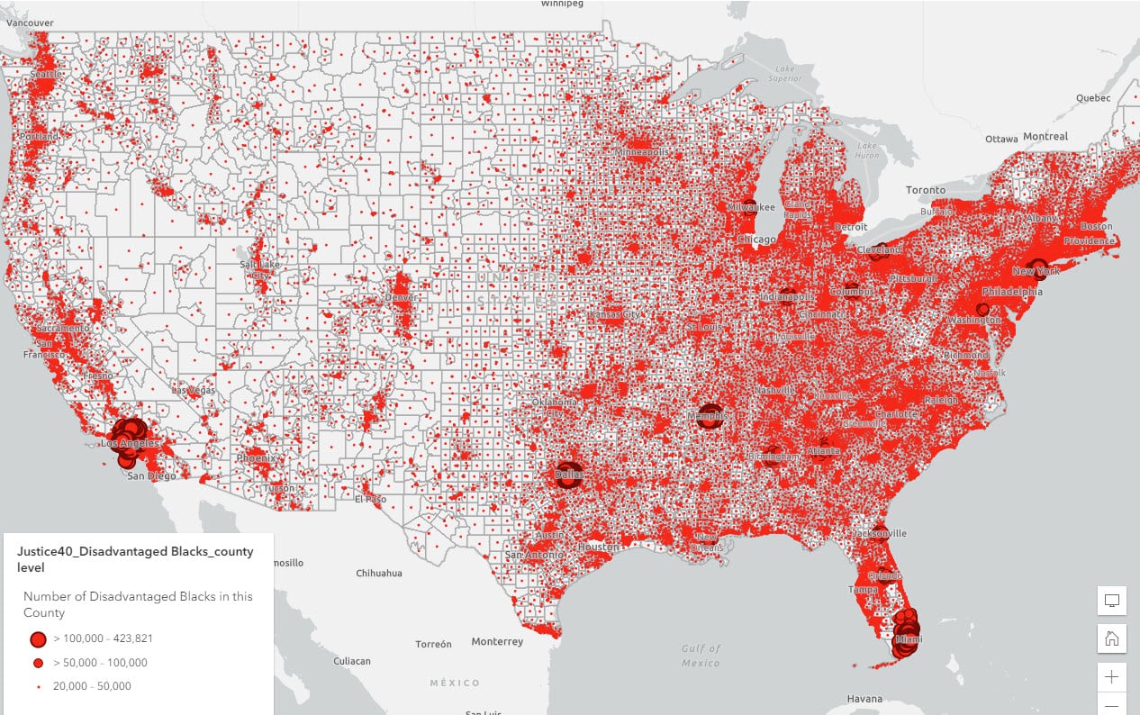
Using symbology, we add the Number of Disadvantaged Blacks field as the attribute to map and Counts and Amounts (size) as the map style.
Here is a view of the layer showing the number of Black/African American people living in disadvantaged communities in each county in the United States, with each symbol representing at least 20,000 people and the largest symbol representing a maximum count of 423,821.
We repeated this process of styling for each group. We now want to provide more information in this map, such as the number and share of the racial/ethnic groups in disadvantaged communities and statistics for the county and the state, to name a few.
4. Create informative pop-ups.
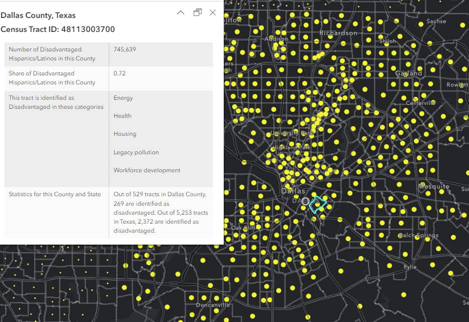
To do this, we use pop-ups that allow us to provide any information we want to display from our data. We configured our pop-ups using Arcade. Find out more about expressing your data using pop-ups with Arcade in Map Viewer. [i]
Here is a view of a pop-up window displaying important information about the Hispanic population living in disadvantaged communities in Dallas County, Texas. From this pop-up, we learn that, overall, there are 265 census tracts (out of a total of 529) in Dallas County identified as disadvantaged, and 2,372 (out of a total of 5,253) in the state of Texas. 72 percent of all Hispanic people in this county (745,639) live in disadvantaged census tracts. The tract we zoomed in to is specifically disadvantaged in the categories of Energy, Health, Housing, Legacy pollution and Workforce development.
[i] Check out this story for additional information on working with Arcade in Map Viewer.
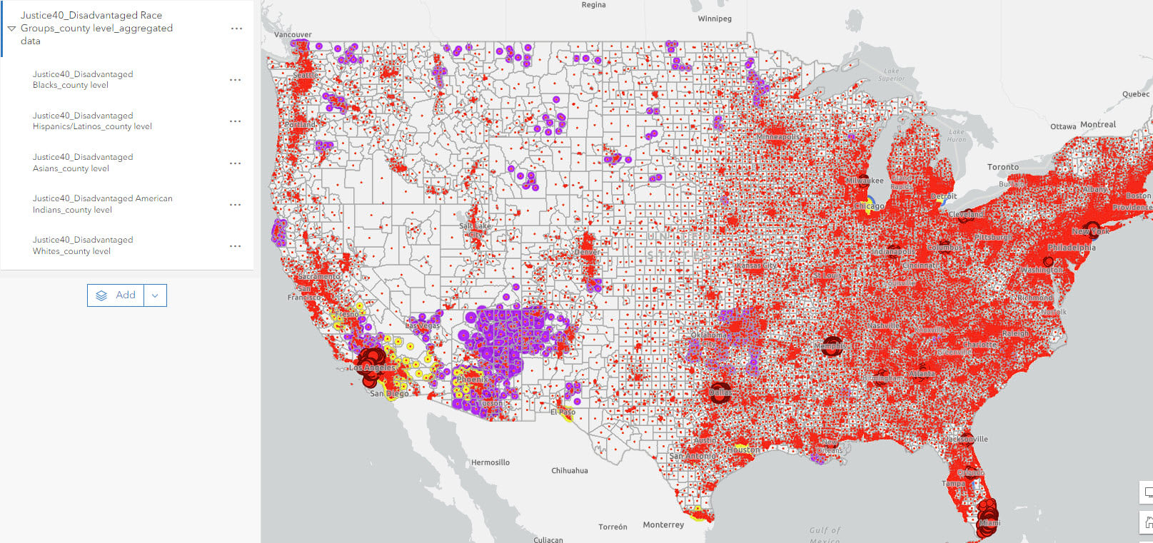
We created separate layers for each race group with counts and amount (size) styling and pop-ups. Together, the final web map helps us learn more about the racial makeup of disadvantaged communities for each county in the United States.


Article Discussion: