As of version 4.11 of the ArcGIS API for JavaScript (ArcGIS JS API), you can create interactive dot density visualizations in the browser. The following blog posts provide an introduction to dot density and demonstrate how you can use this technique to create interactive visualizations.
In this post I’ll demonstrate one way you can visualize growth over time using dot density in the ArcGIS JS API.
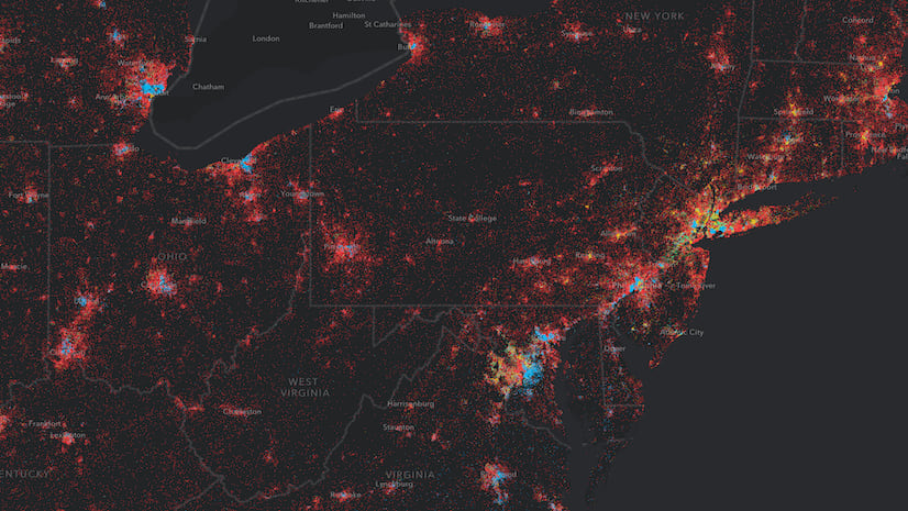
Check out this app, which renders housing data by Census tract in the United States using dot density. In this map, one dot represents one house. The color of each dot indicates the decade in which the home was built.
When you click the “Play Animation” button, each dot’s visibility will animate from full transparency to full opacity to visualize housing construction from 1940 to 2015.

How it works
To create this visualization, I started off with a DotDensityRenderer that looks like this:
const renderer = new DotDensityRenderer({
  referenceDotValue: 1,
  outline: null,
  legendOptions: {
    // Legend will display
    // 1 Dot = 1 House
    unit: "House"
  },
  attributes: [
    {
      field: "ACSBLT1939",
      color: "orange",
      label: "Before 1940"
    },
    {
      field: "ACSBLT1940",
      color: "#8be04e",
      label: "1940s"
    },
    {
      field: "ACSBLT1950",
      color: "#5ad45a",
      label: "1950s"
    },
    {
      field: "ACSBLT1960",
      color: "#00b7c7",
      label: "1960s"
    },
    {
      field: "ACSBLT1970",
      color: "#1a53ff",
      label: "1970s"
    },
    {
      field: "ACSBLT1980",
      color: "#4421af",
      label: "1980s"
    },
    {
      field: "ACSBLT1990",
      color: "#7c1158",
      label: "1990s"
    },
    {
      valueExpression: "$feature.ACSBLT2000 + $feature.ACSBLT2010 + $feature.ACSBLT2014",
      color: "#b30000",
      label: "After 2000"
    }
  ]
});
There are a couple of things to observe about this renderer:
1. I don’t set a referenceScale. I described why you should set a reference scale in dot density visualizations for web maps in a previous post. In this case, I intentionally set a dot value of one to increase the map’s legibility. One dot represents one house. It’s pretty easy to understand. I can get away with this because I set aggressive view scale constraints at a scale where a dot value of one makes sense. More on this later.
2. You can use Arcade expressions! Take a look at the last attribute in the snippet above. Instead of setting a field value, I can set an Arcade expression to the valueExpression property of the attribute to aggregate fields together on the fly. I chose to do this mostly out of necessity. DotDensityRenderer restricts you to no more than eight attributes (i.e. colors). That’s for good reason. Eight colors already pushes the limits for your eyes to be able to perceive differences between each color. So I aggregate fields together in a single attribute using an expression:
$feature.ACSBLT2000 + $feature.ACSBLT2010 + $feature.ACSBLT2014
This gives me the total number of homes built after the year 2000.
That renderer code on its own will get you a visual that looks like this:

To create the perception of housing growth through time, you can animate the visibility of each attribute’s color using the requestAnimationFrame API.
Animating visibility
On the surface, it appears the animation adds and removes fields from the original renderer, but that’s actually not the case. Before the animation starts, I assign all attribute colors an opacity value of zero, with the exception of the first attribute.
renderer.attributes.forEach( (attribute, i) => {
  attribute.color.a = (i > 0) ? 0 : 1;
});
This will display the density of houses constructed prior to 1940.
When the animation kicks off, I progressively increment the opacity of each attribute using requestAnimationFrame.
function animate() {
  let animating = true;
  let opacity = 0;
  let colorIndex = 1;  // starts animation with second attribute
  let startYear = 1930;
  function updateStep() {
    // To update an existing renderer you must
    // always clone it, update the properties,
    // and reset it on the layer
    const oldRenderer = layer.renderer as DotDensityRenderer;
    const newRenderer = oldRenderer.clone();
    if (!animating) {
      return;
    }

    // When one attribute's visibility has finished updating
    // reset the params to prepare for animating next
    // attribute's visibility
    if (opacity >= 1 && colorIndex < newRenderer.attributes.length){
      opacity = 0;
      colorIndex++;
      if(colorIndex > newRenderer.attributes.length - 1){
        stopAnimation();
      }
    } else {
      const approxYear = startYear + ( colorIndex * 10) + Math.round(opacity / 0.1);
      yearDiv.innerText = approxYear.toString();
    }

    // set incremented opacity value on current attribute
    const attributes = newRenderer.attributes.map( (attribute, i) => {
      attribute.color.a = i === colorIndex ? opacity : attribute.color.a;
      return attribute;
    });

    // set updated renderer on layer
    newRenderer.attributes = attributes;
    layer.renderer = newRenderer;
    // increment opacity for next frame
    opacity = opacity + 0.01;

    requestAnimationFrame(updateStep);
  }
  requestAnimationFrame(updateStep);

  return {
    remove: function() {
      animating = false;
    }
  };
}
I also use this function to update the displayed year every 6 frames or so to show how the growth might look from year to year.
This looks like it could be time-enabled data, but it’s not. I just take advantage of field names that display the data for multiple decades to accomplish this.
Keep in mind the opacity of all dots for each attribute updates at the same rate. So this visual doesn’t add a dot to the view at the actual year a home was built. The incremental opacity update is only intended to smooth the transition between decades.
Filter attributes using the Legend
In a previous blog post, I wrote about how to customize the Legend widget to make dot density visualizations more interactive. I added the same code demonstrated in that post to this app so you can similarly focus on one decade of homes at a time.
This allows you to explore periods of economic prosperity (e.g. the 1970s and 2000s) and economic stagnation (e.g. the 1940s — WWII and post-depression years).

Explore more cities
I added a Search widget to this app so you can explore this data in other cities in the United States. Here are a few cities I found interesting.


A final thought
As a reminder, dot density randomly renders dots within polygon boundaries to represent the density of numeric data. Therefore, you should use extra caution when creating dot density visualizations where one dot represents one unit of measure. In this scenario, users may mistakenly interpret each dot as the exact location of the mapped phenomena.
For that reason, I placed cautionary text below the legend informing the user to not interpret dot locations as real-world locations. Dots are strictly used as a cartographic technique to visualize patterns of density between polygon features.
I also added strict view scale constraints to keep the user from zooming in too closely or out too far. If you don’t take scale into account while creating a dot density visualization, your users will be susceptible to interpreting dots as discrete features.
Stay tuned for more dot density inspiration in coming weeks!

Commenting is not enabled for this article.