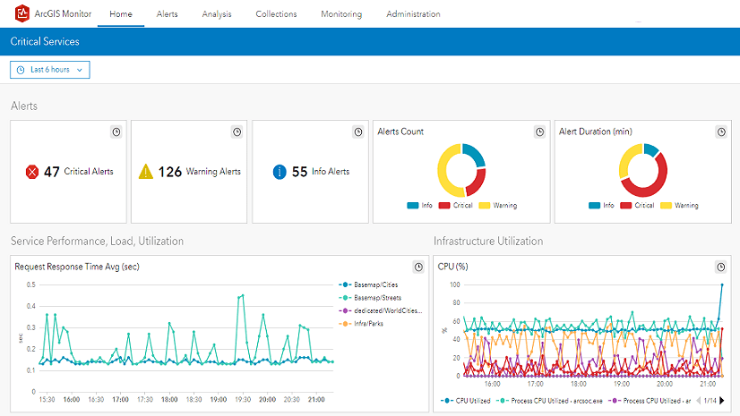
ArcGIS Monitor collects metrics focused on both ArcGIS Enterprise components and the underlying infrastructure. It provides a comprehensive overview of system health, performance, and helps administrators get the most from their GIS and IT investment.
In ArcGIS Monitor, you can create custom analysis views to help identify trends in the data collected. Analysis views are composed of charts and indicators which are populated by data expressions. Learn more about creating analysis views in this help topic.
The objective of this blog is to demonstrate how to build some useful charts and indicators that provide insight into your Enterprise portal content. Defining the data expression and how the element is configured are explained. The analysis elements discussed are:
- Portal item types
- Portal group types
- Portal user types
- Portal item/group count
- Total portal members
- Active users
Configuring these analysis elements can yield the Enterprise portal analysis view below:
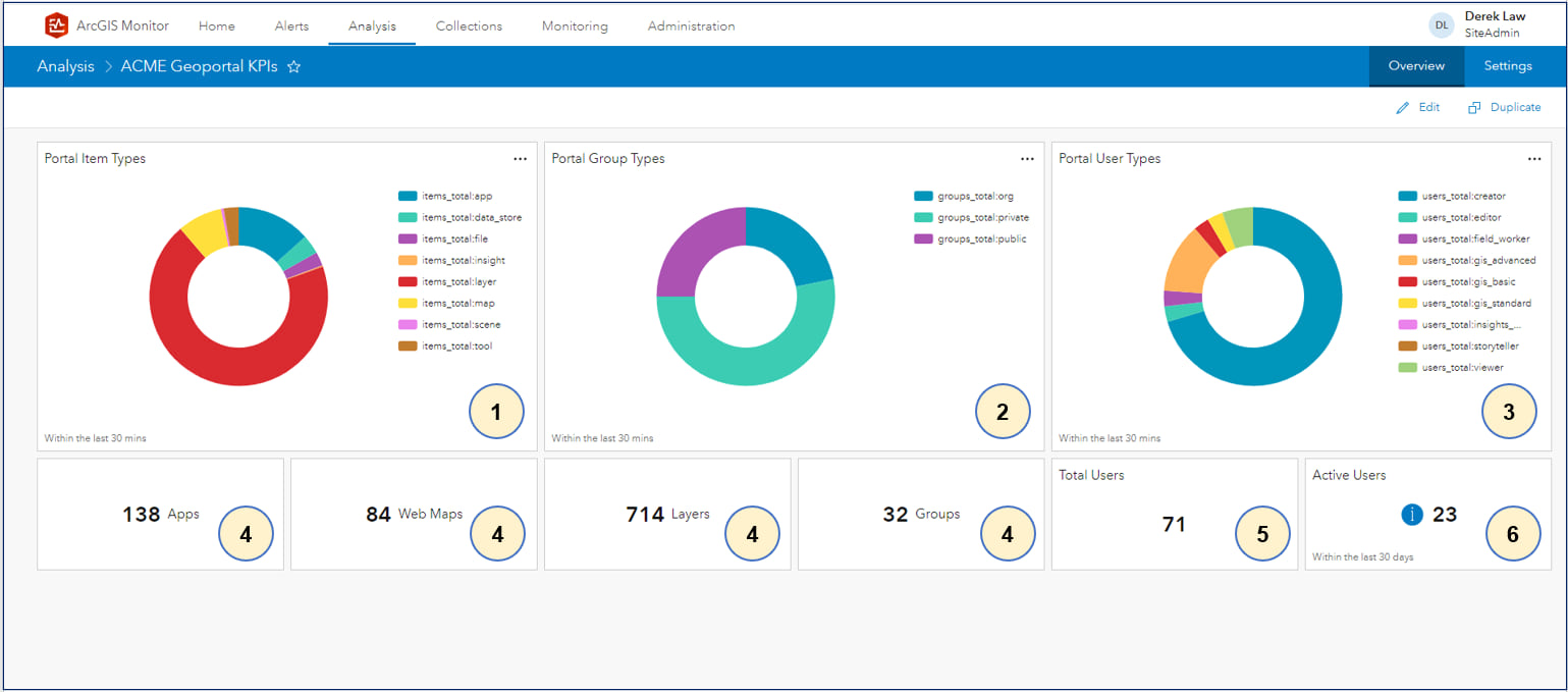
This analysis view displays Enterprise portal metrics and can help administrators better understand the type of content being created, how it is shared, and portal member activity. For the purposes of this blog, the Enterprise portal is named “ACME Geoportal” – this will be referenced throughout the blog when configuring the data expressions for the various analysis elements. This is the first of two blogs, the next blog will discuss analysis elements that focus on Enterprise portal performance metrics.
1. Portal Item Types
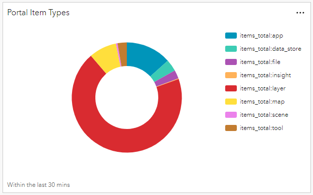
This pie chart displays the different portal item types and the proportion each item type contributes to the total Enterprise portal content. Using this chart, admins can identify which item types are the most common and a specific count is shown when you hover the cursor over a segment. In this case layers are the most common, followed by apps and web maps.
The data expression for the Portal Item Types element,
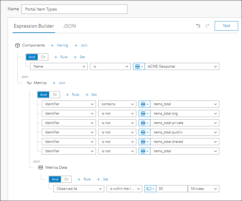
- Components where name is ‘ACME Geoportal’
- Join Metrics
- Identifier contains ‘items_total’
The query will find all metrics with syntax “items_total”. - Identifier is not ‘items_total:org’
- Identifier is not ‘items_total:private’
- Identifier is not ‘items_total:public’
- Identifier is not ‘items_total:shared’
The query will exclude these metrics, because we are only interested in count information for each item type; not a count of their sharing settings. - Identifier is not ‘items_total’
The query will exclude the total number of items in the portal. - Join Metrics Data
- Observed At is within the last 30 Minutes
Conceptually, you are building an expression that is querying information across three tables in the ArcGIS Monitor database: Components, Metrics, and Metrics Data. FYI, “Metrics” refers to what is being measured and “Metrics Data” is the actual measurement.
Side note: Similar to other GIS workflows, there are multiple ways to generate the same result. FYI, an alternative data expression that can yield the same result is as follows,
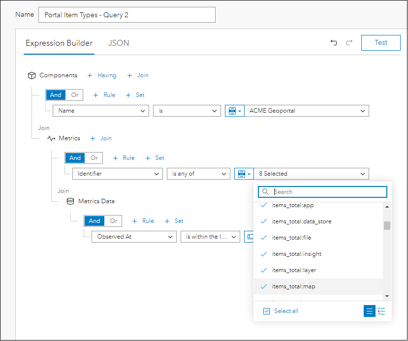
- Components where name is ‘ACME Geoportal’
- Join Metrics
- Identifier is any of ‘items_total:app’
When you use the “is any of” operator, you can select multiple metrics from the dropdown list. After selecting “items_total:app”, continue to select the following:
-
- “items_total:data_store”
- “items_total:file”
- “items_total:insight”
- “items_total:layer”
- “items_total:map”
- “items_total:scene” (not shown in the screenshot)
- “items_total:tool” (not shown in the screenshot)
This is a multi-select query that will find the 8 metrics selected.
- Join Metrics Data
- Observed At is within the last 30 Minutes
Both data expressions will yield the same results. You can choose whichever data expression approach you prefer. This alternative approach could also be applied for elements 2 and 3, but they will not be discussed in this blog.
The pie chart element can be configured as follows:
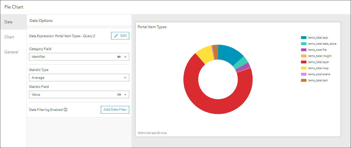
For Data
- Category Field is “Identifier” – this will display the portal items by type
- Statistic Type is “Average”
- Statistic Field is “Value”
For Chart
- Select Type as donut
- Deselect labels
- Select legend and position the legend at the right
For General
- Add a custom title for the chart
- For Description, input “Within the last 30 mins”
Additional properties can be configured for the pie chart, but they are not essential for the purposes of this blog.
2. Portal Group Types
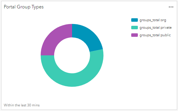
This pie chart displays the different portal group types and the proportion of each type in the Enterprise portal. Using this chart, admins can identify which group types are the most common and a specific count is shown when you hover the cursor over a segment. In this case private groups are the most common, followed by public groups and organization groups.
The data expression for the Portal Group Types element,
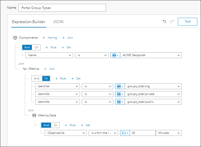
- Components where name is ‘ACME Geoportal’
- Join Metrics
- Identifier is ‘items_total:org’
- Identifier is ‘items_total:private’
- Identifier is ‘items_total:public’
The query will get a count of all the different group types. - Join Metrics Data
- Observed At is within the last 30 Minutes
Side note: Alternatively, the “is any of” operator could be used to select multiple metrics from the dropdown list as described in element 1, Portal Item Types – Query 2.
The pie chart element can be configured as follows:
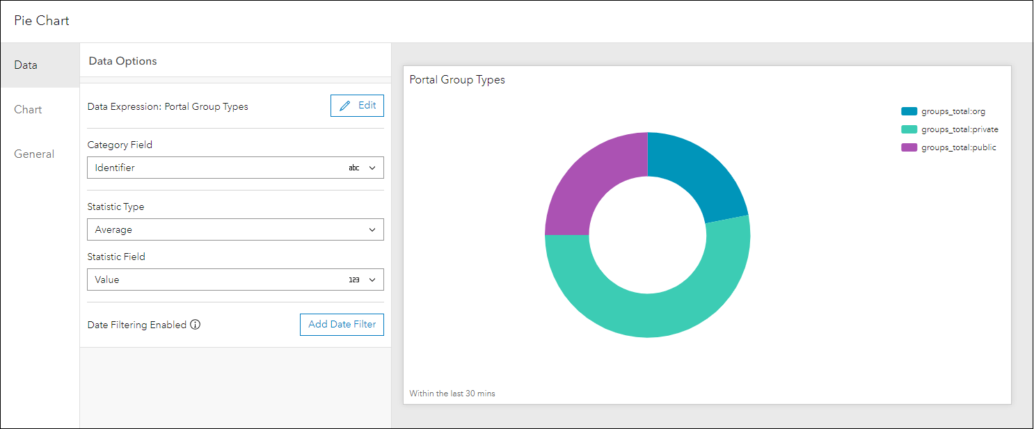
For Data
- Category Field is “Identifier” – this will display the different groups by type
- Statistic Type is “Average”
- Statistic Field is “Value”
For Chart
- Select Type as donut
- Deselect labels
- Select legend and position the legend at the right
For General
- Add a custom title for the chart
- For Description, input “Within the last 30 mins”
3. Portal User Types
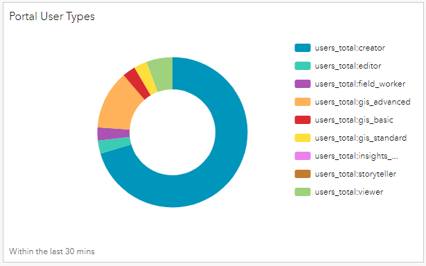
This pie chart displays the different portal user types and the proportion each user type contributes to the total Enterprise portal membership. Using this chart, admins can identify which user types are the most common and a specific count is shown when you hover the cursor over a segment. In this case creators are the most common, followed by advanced and viewer user types.
The data expression for the Portal User Types element,
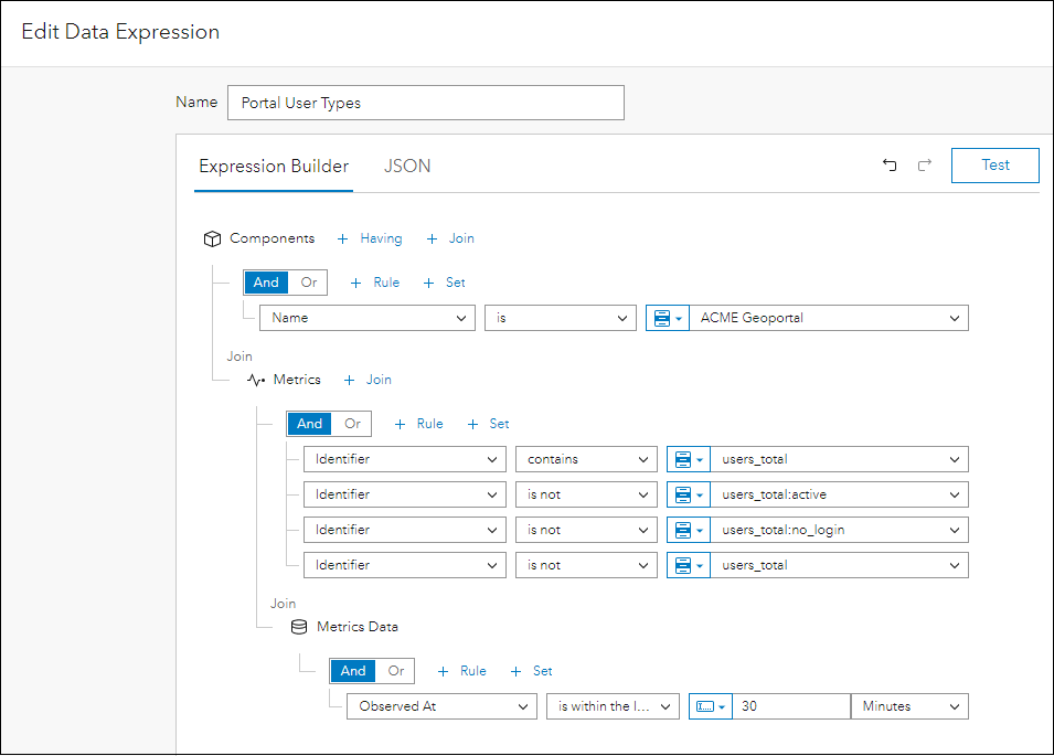
- Components where name is ‘ACME Geoportal’
- Join Metrics
- Identifier contains ‘users_total’
The query will find all metrics with syntax “users_total”. - Identifier is not ‘items_total:active’
- Identifier is not ‘items_total:no_login’
The query will exclude these metrics, because we are only interested in count information for each user type. - Identifier is not ‘users_total’
The query will exclude the total number of users in the portal. - Join Metrics Data
- Observed At is within the last 30 Minutes
Side note: Alternatively, the “is any of” operator could be used to select multiple metrics from the dropdown list as described in element 1, Portal Item Types – Query 2.
The pie chart element can be configured as follows:
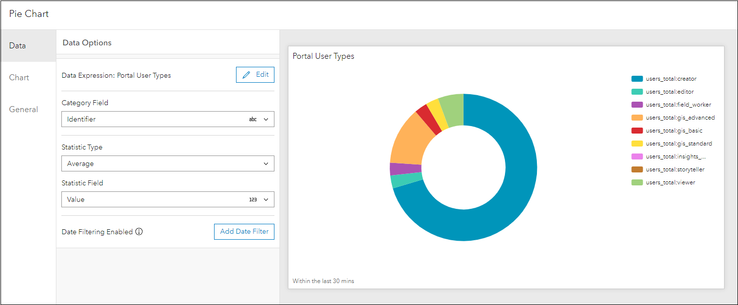
For Data
- Category Field is “Identifier” – this will display the different portal members by user type
- Statistic Type is “Average”
- Statistic Field is “Value”
For Chart
- Select Type as donut
- Deselect labels
- Select legend and position the legend at the right
For General
- Add a custom title for the chart
- For Description, input “Within the last 30 mins”
4. Portal Item/Group count
This element is used four different times in the ACME Geoportal KPI analysis view to show item counts for apps, web maps, layers, and groups.

This can be helpful, because it highlights the item or group count in the display; instead of being shown as a segment in the Portal Item Types pie chart. This could be useful for analysis views displayed on a large screen.
For the purposes of this blog, we will focus on the first element that shows total number of apps in the Enterprise portal,

The data expression for the Portal App Count element,
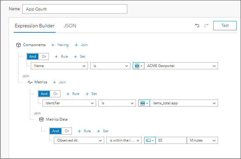
- Components where name is ‘ACME Geoportal’
- Join Metrics
- Identifier is ‘items_total_app’
This will query for the total number of apps in the portal. - Join Metrics Data
- Observed At is within the last 30 minutes
The indicator element can be configured as follows:
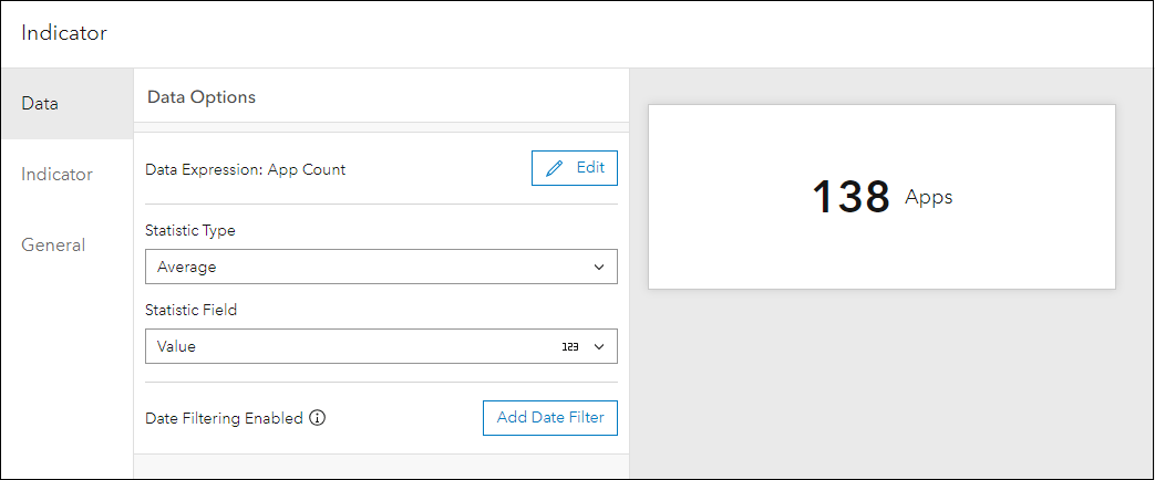
For Data
- Statistic Type is “Average”
- Statistic Field is “Value”
For Indicator
- Value format is number
- For Suffix, input “Apps”
- No symbology
To configure the other indicators, modify the data expression by querying for each portal item type and groups – specifically the Identifier parameter. For example,
- Identifier is ‘items_total_map’
This will query for the total number of web maps in the portal. - Identifier is ‘items_total_layer’
This will query for the total number of layers in the portal. - Identifier is ‘groups_total’
This will query for the total number of groups in the portal.
5. Total Portal Members

This indicator shows the total number of members for the Enterprise portal. The data expression for the Total Users Count element,
- Components where name is ‘ACME Geoportal’
- Join Metrics
- Identifier is ‘users_total’
This will query for the total number of users in the portal. - Join Metrics Data
- Observed At is within the last 30 minutes
The indicator element can be configured as follows:
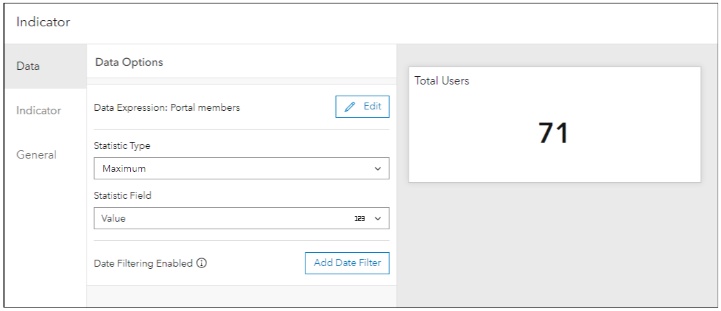
For Data
- Statistic Type is “Maximum”
- Statistic Field is “Value”
For Indicator
- Value format is number
- No symbology
For General
- For Title, input “Total Users”
6. Active Users
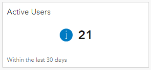
This indicator displays the total number of portal members who have logged into the Enterprise portal in the last 30 days. Admins can use this element along with the previous element, to help gauge the activity level in portal. (Note: the screenshot above was taken at a later date than the first blog image.)
The data expression for the Active Users element,
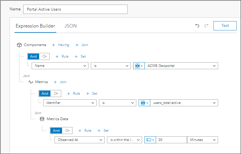
- Components where name is ‘ACME Geoportal’
- Join Metrics
- Identifier is ‘users_total:active’
This will query for the number of users who have signed into portal within the last 30 days. - Join Metrics Data
- Observed At is within the last 30 Minutes
The indicator element can be configured as follows:
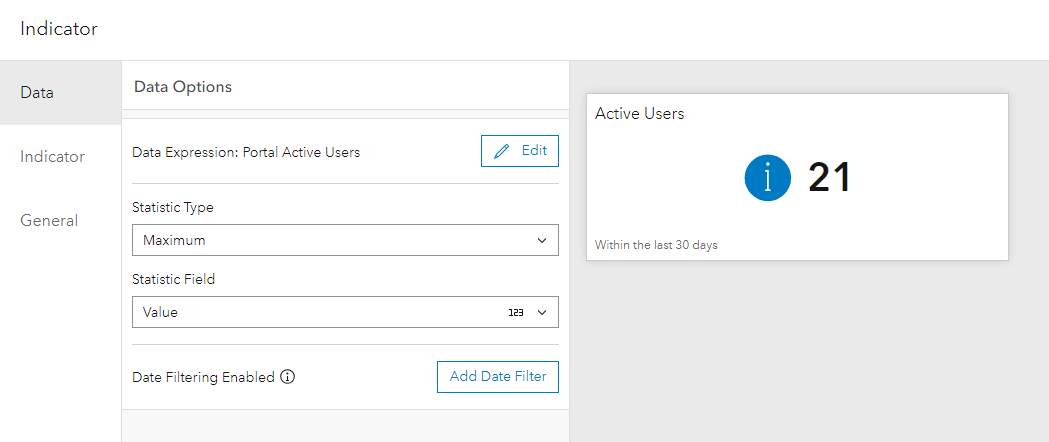
For Data
- Statistic Type is “Maximum”
- Statistic Field is “Value”
For Indicator
- Value format is number
- Select symbology
- Icon position on left
- Select the Status:Info icon
For General
- For Title, input “Active Users”
- For Description input “Within the last 30 days”
Analysis View of Enterprise portal content metrics
Configuring these analysis elements for an Enterprise portal can provide insight into your portal content in ArcGIS Monitor. This can help administrators better understand how the Enterprise portal is being used by the organization.
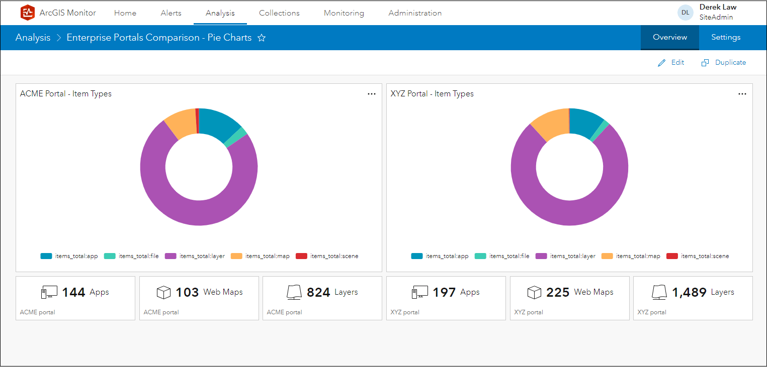
If your organization has more than one Enterprise portal, you could configure an analysis view that compares the contents of two different portals. For example, a comparison between ACME Geoportal vs. XYZ Portal using pie charts and indicators to summarize their content:
Another option is to display the portal content as serial charts:
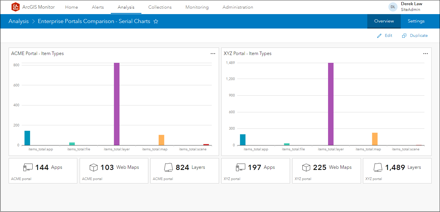
For the purposes of this blog, only five item types are shown in the charts – but additional item types could be displayed. The next blog will discuss analysis elements that focus on Enterprise portal performance metrics.
Some additional resources,
- Content Management Strategies for your ArcGIS Enterprise Portal technical paper
- ArcGIS Monitor help documentation
- ArcGIS Monitor: An Introduction – Esri UC 2023 tech session video
- ArcGIS Monitor: Operational Scenarios – Esri UC 2023 tech session video
- Esri Community
Sincerely,
The ArcGIS Monitor team


thank you very much, do you have any more useful examples, possibly ink json export`?