ArcGIS Monitor collects metrics focused on both ArcGIS Enterprise components and the underlying infrastructure. It provides a comprehensive overview of system health, performance, and helps administrators get the most from their GIS and IT investment.
In ArcGIS Monitor, you can create custom analysis views to help identify trends in the data collected. Analysis views are composed of charts and indicators which are populated by data expressions. Learn more about creating analysis views in this help topic.
The objective of this blog is to demonstrate how to build five useful charts that provide insight into your ArcGIS Server web services. Defining the data expression and how the element is configured are explained. The five useful analysis elements for ArcGIS Server are:
- Requests received per service
- Average response time (seconds) per service
- Average instances used per service
- Instance saturation (%) per service
- Number of ArcGIS Server services by type
These analysis elements can be used separately and/or collectively, to help administrators have an effective analysis view of ArcGIS Server metrics in ArcGIS Monitor.
1. Requests Received Per Service
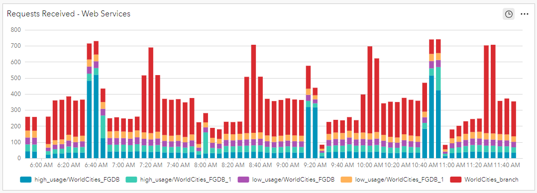
This serial chart displays the number of requests for ArcGIS Server services as a stacked bar chart, allowing admins to gauge the level of activity per ArcGIS Server service. Using this chart, admins can identify which services are used most and which are least used. This can help drive resource allocation decisions and answer questions such as “How many ArcSOC processes should I allocate to this service?” (More information about ArcSOC processes is provided in the element #3 section below.)
The data expression for the Requests Received – Web Services element,
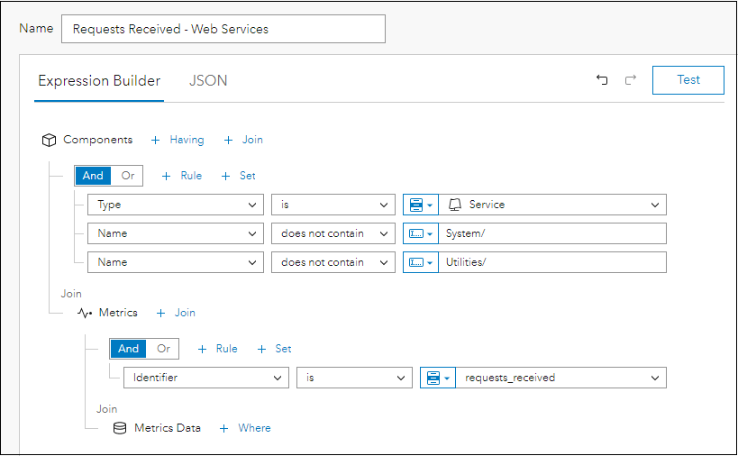
- Components where type is ‘Service’
- The component name does not contain ‘System/’ and ‘Utilities/’
(Both of these parameters will filter out any system services included with ArcGIS Server) - Join Metrics
- Identifier is ‘requests_received’
- Join Metrics Data
Conceptually, you are building an expression that is querying information across three tables in the ArcGIS Monitor database: Components, Metrics, and Metrics Data. FYI, “Metrics” refers to what is being measured and “Metrics Data” is the actual measurement.
The serial chart element can be configured as follows:
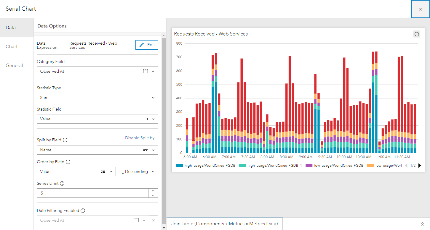
For Data
- Category Field (i.e. x-axis) is “Observed At”
- Statistic Type is “Sum”
- Statistic Field is “Value”
- Split by Field is “Name” – so you can see data for each registered service
For Chart
- Select Type as bar
- Enable the stacked property
- Orientation as horizontal
- Position the legend at the bottom
For General
- Add a custom title for the chart
Additional properties can be configured for the serial chart, but they are not essential for the purposes of this blog.
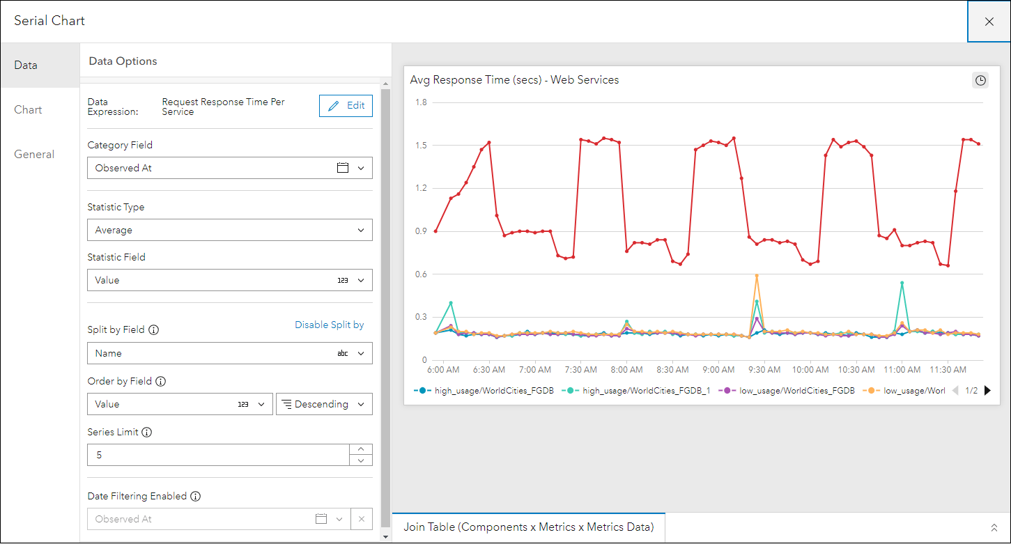
2. Average Response Time (seconds) Per Service
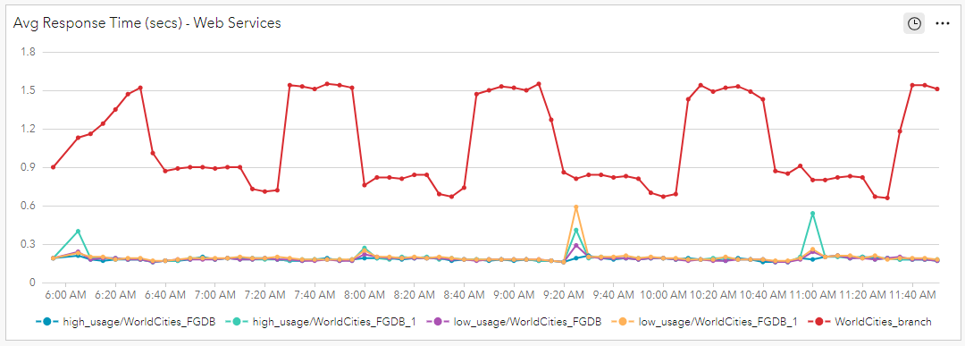
This serial chart shows the average request response time (in seconds) for ArcGIS Server services in a line chart. Average request response time is a good indicator of whether the ArcGIS Server services have been allocated an appropriate amount of resources to meet demand. Low request response times indicate an appropriate amount of resources have been allocated, while high request response times may indicate the service is under heavy load. Services with high request response times might warrant investigation, perhaps additional resources might be needed to meet their demand.
The data expression for the Avg Response Time (secs) – Web Services element,
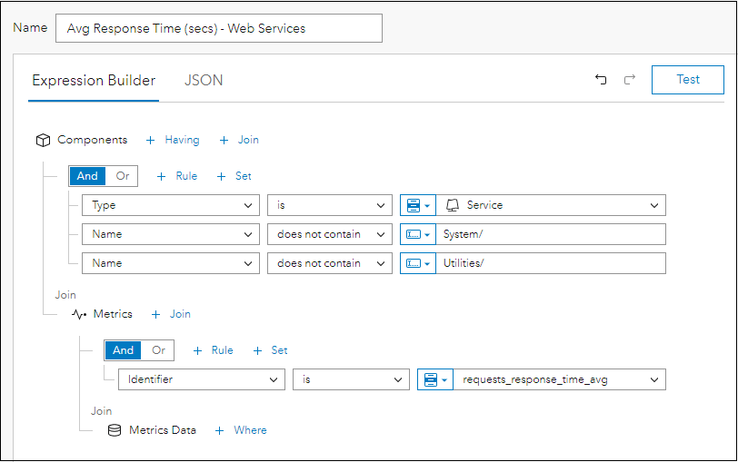
- Components where type is ‘Service’
- The component name does not contain ‘System/’ and ‘Utilities/’
- Join Metrics
- Identifier is ‘requests_response_time_avg’
- Join Metrics Data
The serial chart element can be configured as follows:
For Data
- Category Field is “Observed At”
- Statistic Type is “Average”
- Statistic Field is “Value”
- Split by Field is “Name” – so you can see data for each registered service
For Chart
- Select Type as line
- Orientation as horizontal
- Position the legend at the bottom
For General
- Add a custom title for the chart
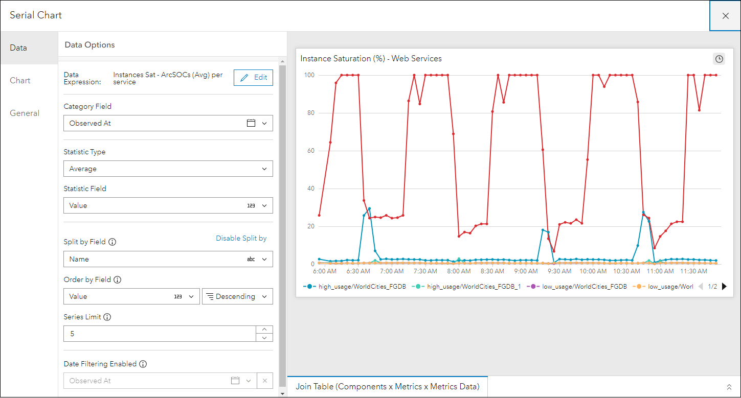
3. Average Instances Used Per Service
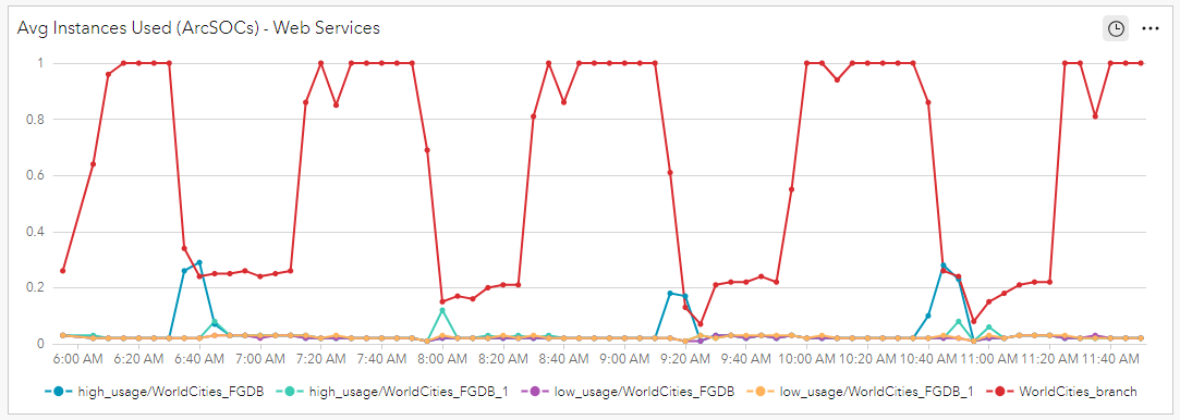
This serial chart shows the average number of instances used by ArcGIS Server services in a line chart. A “service instance” refers to the ArcSOC process that is running on the ArcGIS Server machine. Each service is assigned a minimum and maximum number of instances that you can adjust in ArcGIS Server Manager. Please review this help topic to learn more Introduction to service instances.
This chart is another good way to identify usage trends on a per-service basis and can help answer questions such as “What ArcGIS Server services might be good candidates to move to the shared instances pool?” If a service uses few instances on average, you may want to move it to the shared pool. If a service uses many instances on average, it should probably have a set of dedicated instances to process incoming requests.
The data expression for the Avg Instances Used (ArcSOCs) – Web Services element,
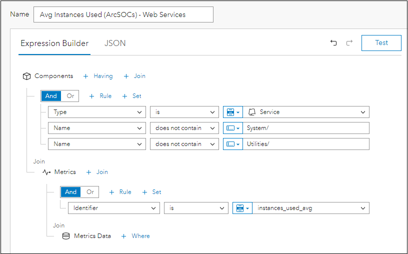
- Components where type is ‘Service’
- The component name does not contain ‘System/’ and ‘Utilities/’
- Join Metrics
- Identifier is ‘instances_used_avg’
- Join Metrics Data
The serial chart element can be configured as follows:
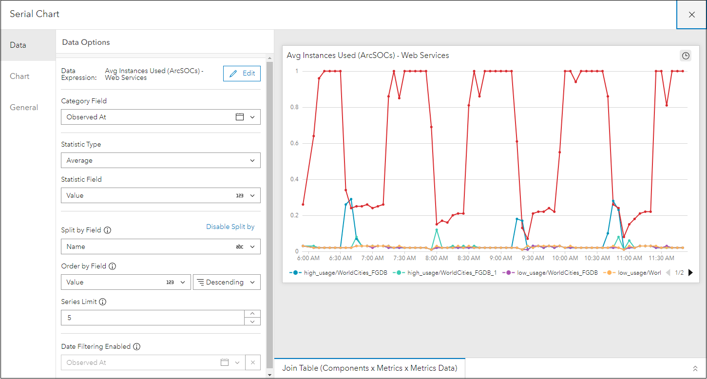
For Data
- Category Field is “Observed At”
- Statistic Type is “Average”
- Statistic Field is “Value”
- Split by Field is “Name” – so you can see data for each registered service
For Chart
- Select Type as line
- Orientation as horizontal
- Position the legend at the bottom
For General
- Add a custom title for the chart
4. Instance Saturation (%) Per Service
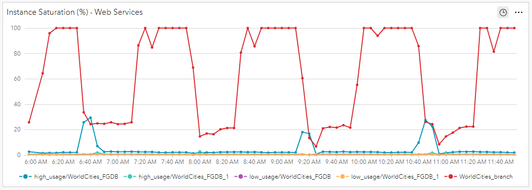
This serial chart shows how saturated the instances dedicated to a specific ArcGIS Server service are in the line chart. “Instance saturation” refers to the percentage of ArcSOC processes that were busy during the specified time-period. For example, if a service is allotted four dedicated instances and all four were busy processing requests for the entire time period, instance saturation would be 100%. If the four instances were only busy 75% of that time period, instance saturation would be 75%. Services with values approaching 100 percent instance saturation suggests that more instances are needed to handle incoming service requests.
The data expression for the Instance Saturation (%) – Web Services element,

- Components where type is ‘Service’
- The component name does not contain ‘System/’ and ‘Utilities/’
- Join Metrics
- Identifier is ‘instances_saturation’
- Join Metrics Data
The serial chart element can be configured as follows:
For Data
- Category Field is “Observed At”
- Statistic Type is “Average”
- Statistic Field is “Value”
- Split by Field is “Name” – so you can see data for each registered service
For Chart
- Select Type as line
- Orientation as horizontal
- Position the legend at the bottom
For General
- Add a custom title for the chart
5. Number of ArcGIS Server Services by Type
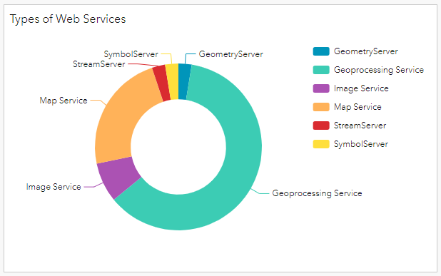
This donut chart shows a breakdown of all the registered ArcGIS Server services with ArcGIS Monitor by type. It is a nice visual showing an admin the count of each service type in the enterprise GIS deployment. A specific count is shown when you hover the cursor over a donut segment.
The data expression for the Types of Web Services element,
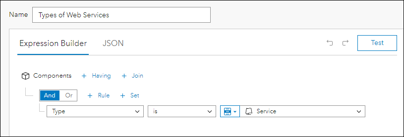
- Components where type is ‘Service’
For the purposes of this blog, the ArcGIS Server system services were not filtered, so they could be included (as geoprocessing services) in the chart.
The pie chart element can be configured as follows:
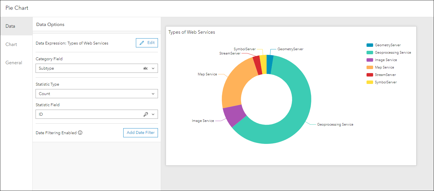
For Data
- Category Field is “Subtype” – this will display the services by type
- Statistic Type is “Count”
- Statistic Field is “ID”
For Chart
- Select Type as donut
- Position the legend at the right
For General
- Add a custom title for the chart
Analysis View of ArcGIS Server Metrics
If you decide to implement the five charts discussed in this blog in an analysis view, you will have a centralized display to quickly gauge the health of ArcGIS Server metrics reported by ArcGIS Monitor. For example, positioning the four serial charts as a “stack”:
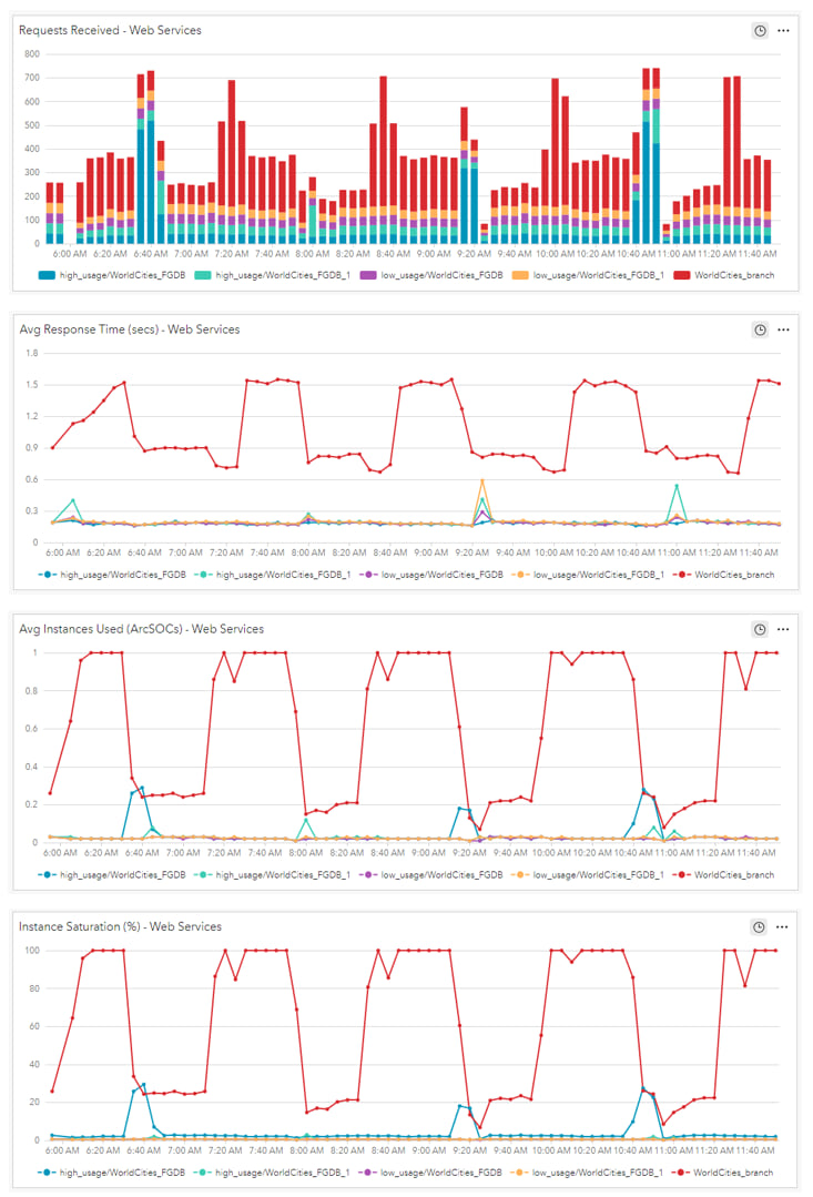
Observing the analysis view, usage trends can be easily identified on a per-service basis that you can use to help drive resource allocation decisions. For example, observe WorldCities_branch service (red color); it is receiving noticeably more requests, has a much higher average response time, and uses more instances on average that the other services. These indicators suggest that more resources should be allocated to support the demand for this service.
Configuring an analysis view, then observing the reported ArcGIS Server metrics over time can potentially help identify trends. Are certain services being used more during certain time periods? Or certain days of the week? Perhaps resources could be re-allocated to address the activity of select services during these high peak demand periods. Optimizing services can help with overall performance, reduce wait-times, and eliminate service down times.
Some additional resources:
- Tune services using best practices
- ArcGIS Monitor help documentation
- ArcGIS Monitor: An Introduction – Esri UC 2023 tech session video
- ArcGIS Monitor: Operational Scenarios – Esri UC 2023 tech session video
- Esri Community
Sincerely,
The ArcGIS Monitor team


Article Discussion: