ArcGIS Monitor provides observability by collecting metrics on the health, performance, and usage of your enterprise GIS. It is designed to help administrators and managers ensure their ArcGIS Enterprise deployments are working efficiently by reducing and preventing system downtime, resulting in operational cost savings.
For organizations that have multiple ArcGIS Enterprise deployments (e.g., dev | staging | production environments or in different locations) and/or using different release versions, ArcGIS Monitor provides a single console where you can view key performance indicators (KPIs) across all deployments as well as a single UI/UX to help you manage and optimize your enterprise GIS and its underlying infrastructure.
ArcGIS Monitor 2025.1 includes two new features to help administrators better manage their enterprise GIS deployments:
- Component relationship graphs
- Custom database query monitoring
The release also includes several bug fixes. A complete list of updates are listed in the ArcGIS Monitor 2025.1 release notes.
Understanding component relationship graphs
This functionality helps admins and managers better understand how different enterprise GIS assets are related to each other, this includes ArcGIS Enterprise and its infrastructure. There are two main objectives:
- Identify and show dependencies between ArcGIS components and their supporting infrastructure to minimize system downtime and help plan for system maintenance.
- Determine “upstream” dependencies of web applications and web maps to quickly isolate outages and/or bottlenecks that may impact system availability and performance.
In ArcGIS Monitor 2025.1, enterprise portal web apps (e.g, ArcGIS Dashboards, ArcGIS Experience Builder apps, ArcGIS Instant Apps, and ArcGIS StoryMaps) and web maps are new component types. Both are child components of enterprise portals and will be discovered as part of an enterprise portal component’s inventory when the portal is registered with Monitor. It may take some time for Monitor to assess the complete inventory of a portal’s web apps and web maps. On the Monitoring page, two new component type filters Web Application and Web Map have been added.
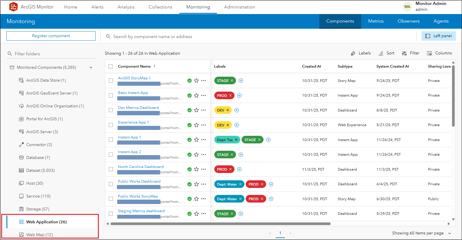
Figure 1: Viewing web application components in ArcGIS Monitor 2025.1.
Selecting a web application component in the components table will display its Overview subtab. Observe that no metrics are collected for the web application.
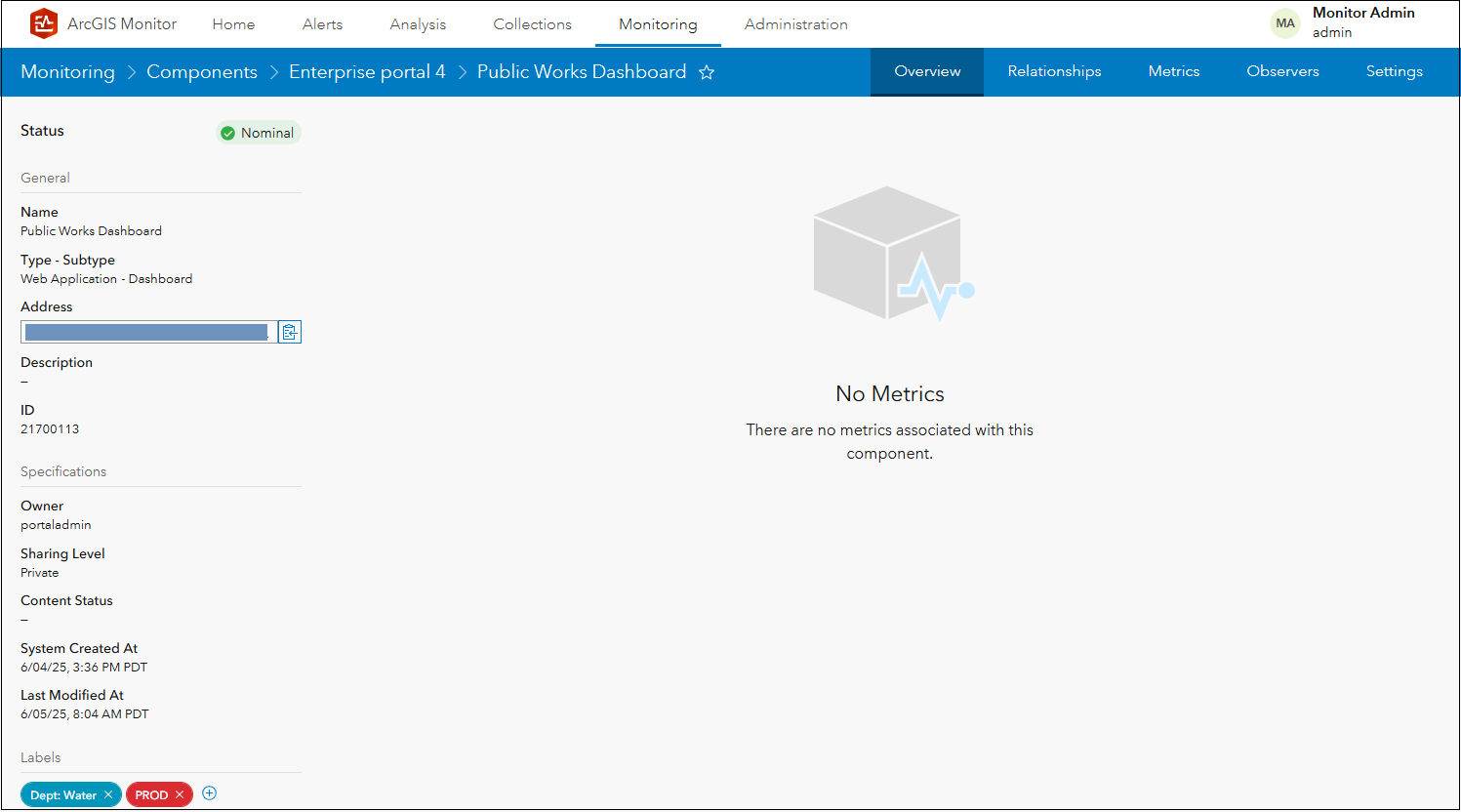
Figure 2: Public Works Dashboard Overview subtab display.
If you navigate to the Metrics subtab, you will see the same message. In this release, ArcGIS Monitor does not currently report any metrics for the web application and web map component types. The priority for this release was to ensure their dependencies and relationships were mapped correctly across the enterprise GIS. KPIs for these component types will be added in a future Monitor release.
Navigating to the new Relationships subtab will display the web application component’s relationships as a tree diagram.
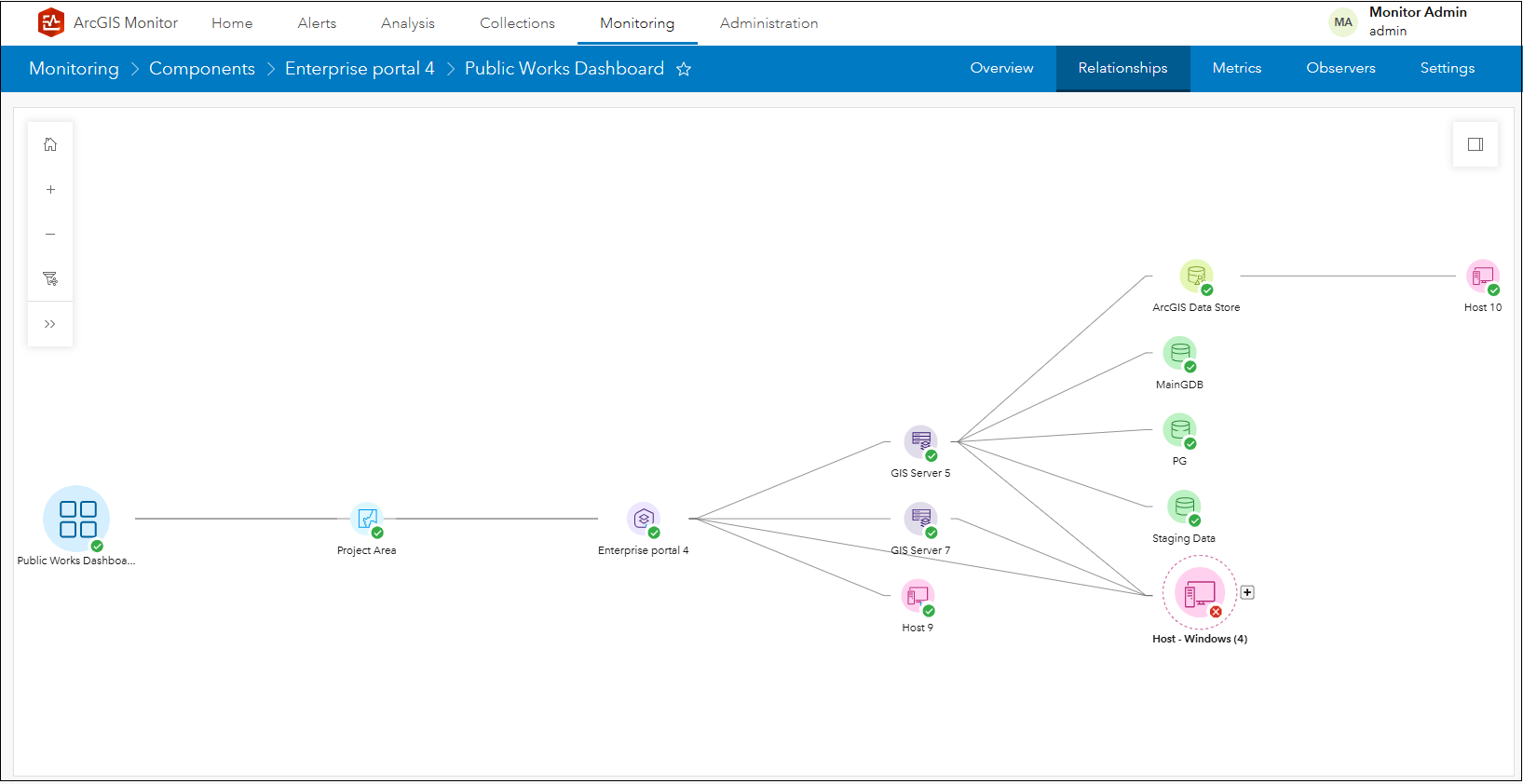
Figure 3: Public Works Dashboard relationship graph.
In this style of tree diagram, the selected item serves as a “base” and associated items “branch out” from it. This graphical representation provides a hierarchical view of enterprise GIS assets and makes it easier to identify component dependencies. Each node in the graph represents a component (different component types have different icons) and each link in the graph represents one level of association between components. Monitor renders the tree diagram with its base item on the left and branching items towards the right, with incrementing “levels” as you navigate links from left to right in the graph. The component status (e.g., nominal, warning, and critical) is also shown (in the lower right corner of each component icon), so you can quickly review and assess the health of each component.
For example, in Figure 3 the Public Works Dashboard is the base component and displayed on the left side of the graph. Linked from the dashboard is the Project Area web map which is one level of association and rendered to the right of the dashboard component. The web map is considered to be “upstream” from the web application component, because the web app is dependent on the web map. Linked to the right of the web map is the Enterprise portal 4 component; it represents one level of association from the web map and is considered to be “upstream” from the web map.
The next “level” of the graph is more intricate. The Enterprise portal 4 component has four branches extending to the right. The first links to GIS Server 5, the second links to GIS Server 7, the third to a group of Windows host machines (labeled Host – Windows (4)), and the fourth to Host 9. The Enterprise portal 4 component has associations and/or dependencies with all of these other components.
The graph shows dependencies for both ArcGIS components (i.e., the two ArcGIS Server components) and infrastructure components (i.e., the host machines). Clicking the + icon for the Host – Windows (4) group will expand and display more detail about its contents.
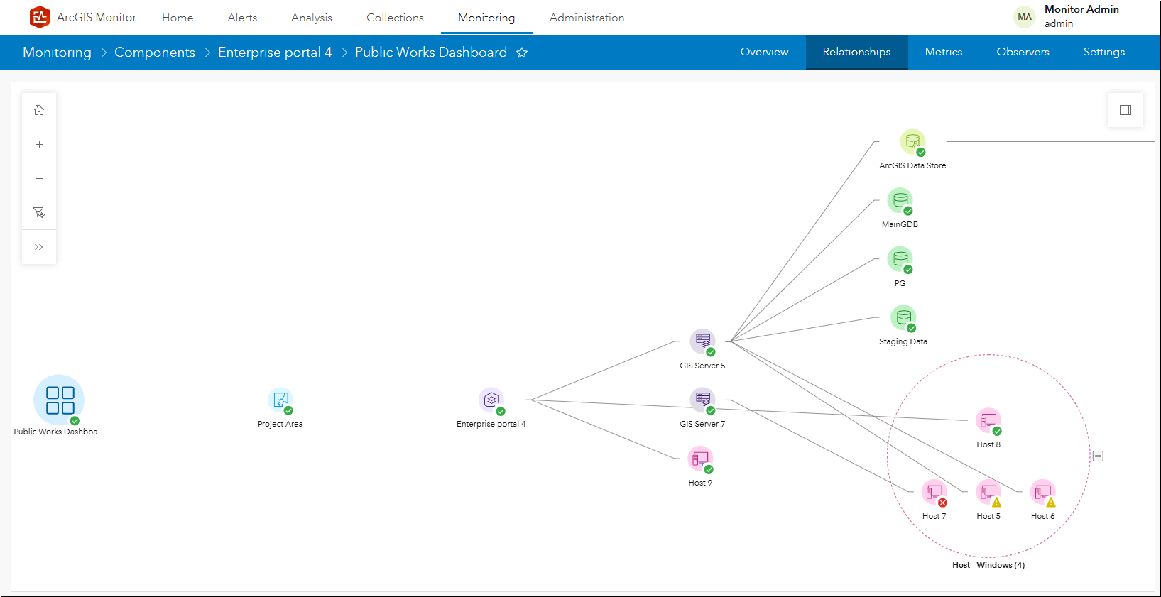
Figure 4: Expanded Host – Windows (4) group on the component relationship graph.
Note that Host – Windows (4) group contains four host components: Host 5, Host 6, Host 7, and Host 8. And observe the additional links:
- Enterprise portal 4 links to Host 8 and Host 9
- GIS Server 5 links to Host 5 and Host 6
- GIS Server 7 links to Host 7
Side note: When there are many components of the same type (and level) that need to be rendered in the graph, to avoid clutter in the layout Monitor may group some of them together, as shown by Host – Windows (4) group. The display algorithm in the graph is designed to help scale the number of component icons that need to be rendered.
Continuing to navigate the graph, GIS Server 5 has four branches extending to the top right. The first links to an ArcGIS Data Store, the second links to MainGDB, the third to PG, and the fourth to Staging Data. Lastly, the ArcGIS Data Store component links to Host 10 (see Figure 3).
Any of the components in the graph can potentially affect the Public Works Dashboard web application component. The graph displays the lineages and how different component types are directly/indirectly associated with the Public Works Dashboard.
Working with component relationship graphs
Selecting a component that is “upstream” from the base component can reveal its lineage path. For example, if you select Host 5 on the graph, only the components in the lineage that “connect” Public Works Dashboard with Host 5 via associations will display.
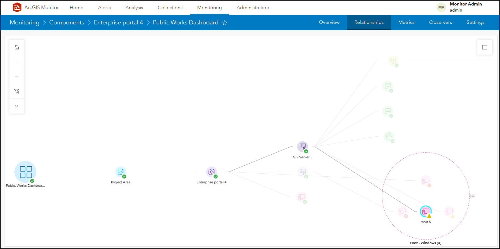
Figure 5: Lineage of Host 5 to the Public Works Dashboard.
The lineage: Host 5 links to GIS Server 5, links to Enterprise portal 4, which contains Project Area web map, which is linked to Public Works Dashboard. Host 5 currently has a warning status and may cause a performance issue that may indirectly impact the Public Works Dashboard. Click an open area in the canvas layout to unselect the Host 5 component in the graph. Alternatively, you could select the MainGDB component to view its lineage to the Public Works Dashboard.
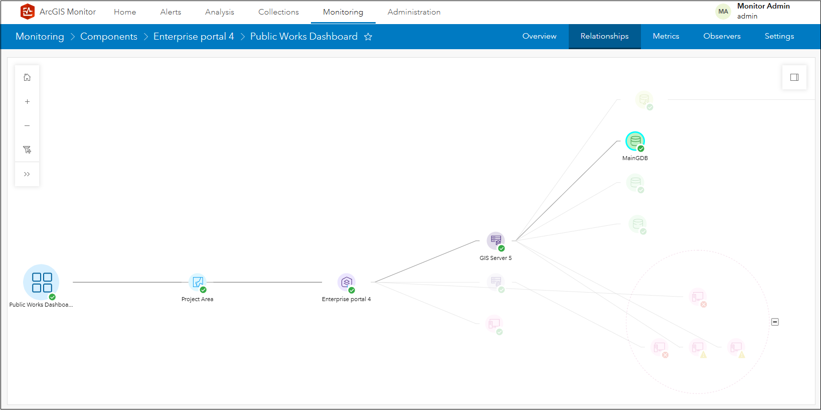
Figure 6: Lineage of MainGDB to the Public Works Dashboard.
As before, only the components in the lineage that “connect” Public Works Dashboard with MainGBD via associations will display. The lineage: MainGDB links to GIS Server 5, links to Enterprise portal 4, which contains Project Area web map, which is linked to Public Works Dashboard. Both of these examples illustrate the lineages of how a base component has dependencies on the other components that are “upstream” from it.
While you can interactively navigate the component relationship graph with your mouse, some navigation tools and the filter graph option are provided in the upper left corner of the Relationships subtab canvas.
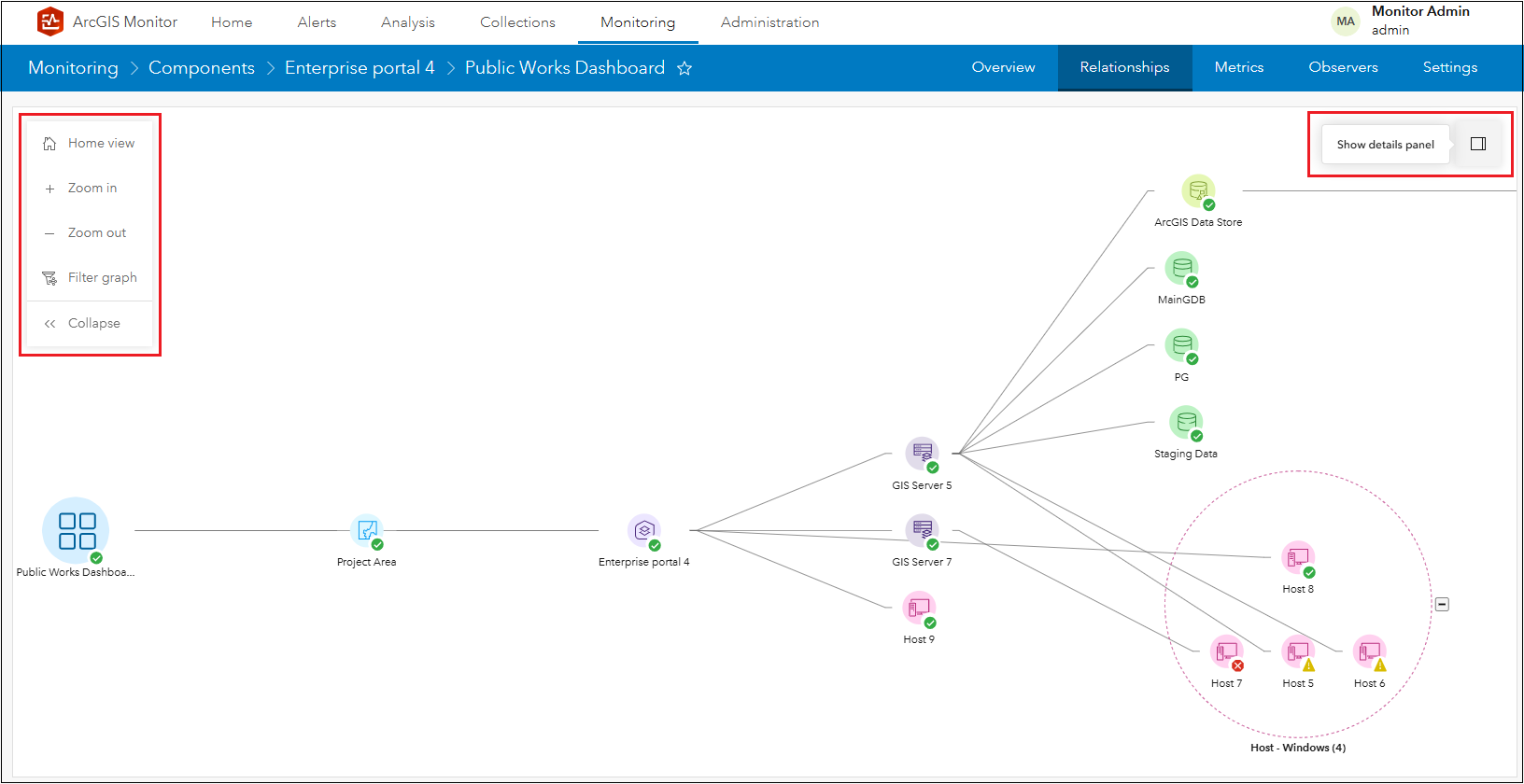
Figure 7: Additional tools in the Relationships subtab canvas.
The filter graph option enables you to hide components displayed in the graph based on conditional statements. For example, you could set the filter to only display components with a warning status that are associated with the Public Works Dashboard.
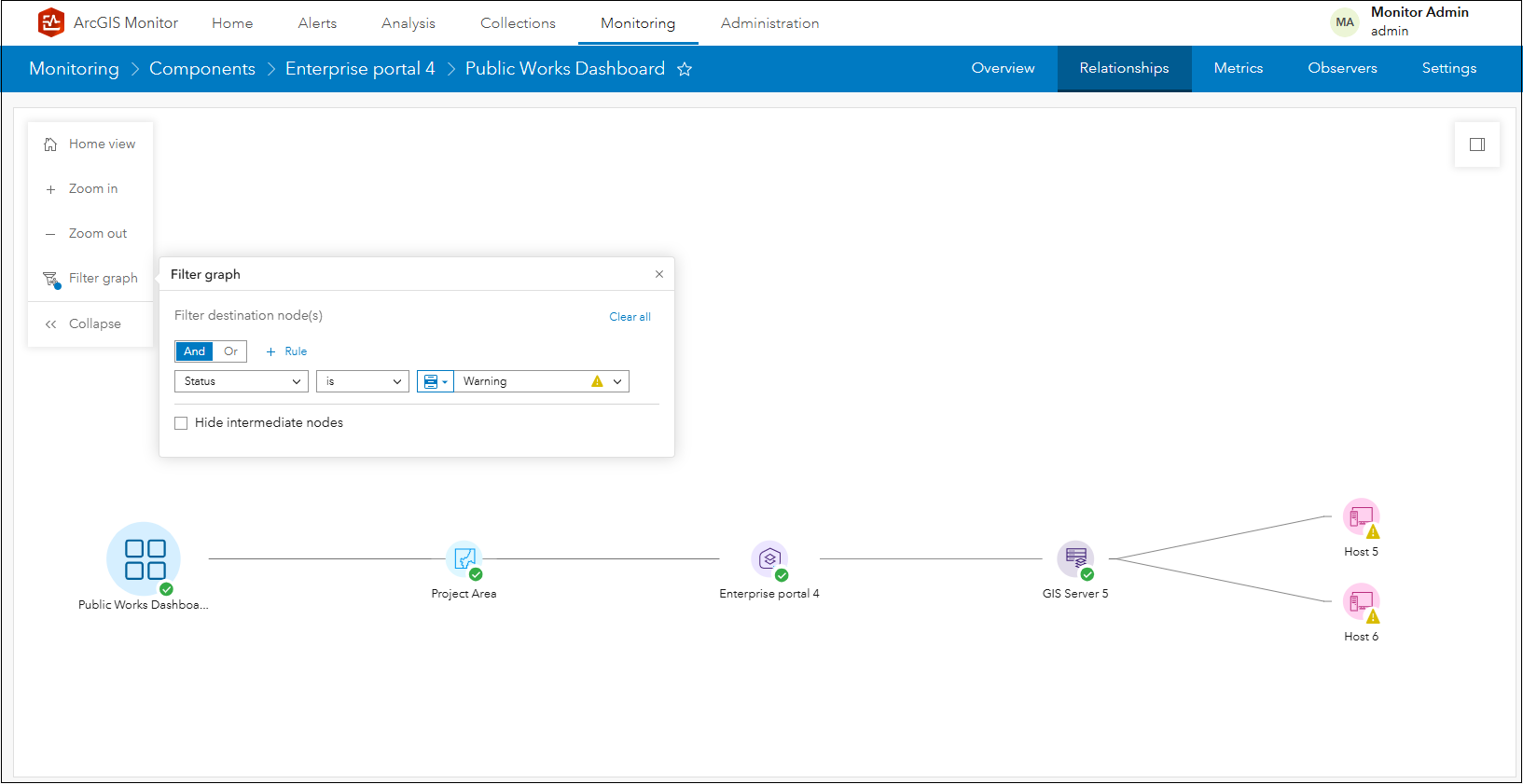
Figure 8: Filtering the component relationship graph to show components with a warning status.
Components that do not meet the filter criteria are hidden, except for components that form the lineages (e.g., GIS Server 5, Enterprise portal 4, and Project Area) of the components with a warning status. These are known as intermediate nodes and can be hidden in the graph.
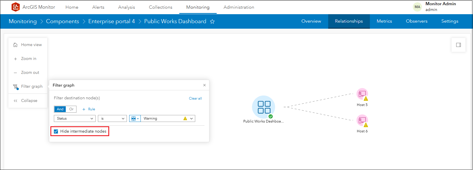
Figure 9: Filtering the component relationship graph with intermediate nodes hidden.
This capability enables you to easily isolate and determine potential components that might be affecting the performance of the selected base component in the graph. In this case, Host 5 and Host 6 have warning alerts and might be worth investigating.
In the upper right corner of the canvas is the Show details panel (see Figure 7) which lists in alphabetical order, all the associated components to the base component in the graph.
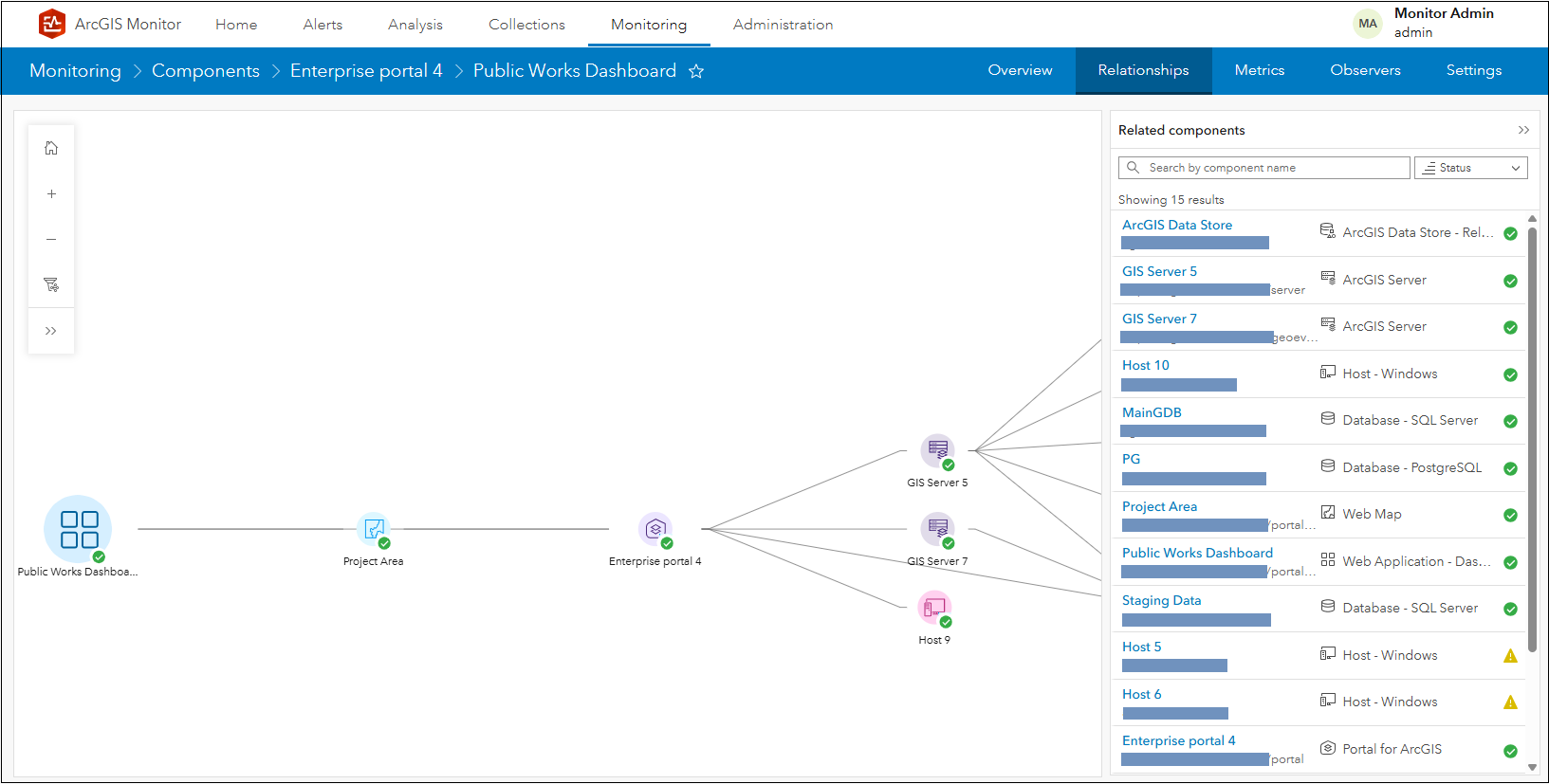
Figure 10: Viewing the Show details panel for the Public Works Dashboard.
When you hover the mouse over a component in the list, it will highlight on the graph – this helps you to visualize its association relative to the base component. Components in the list can also be searched and sorted by name.
Clicking a component in the Show details panel, for example Host 5 which has a warning status, will navigate you to view its Overview subtab.
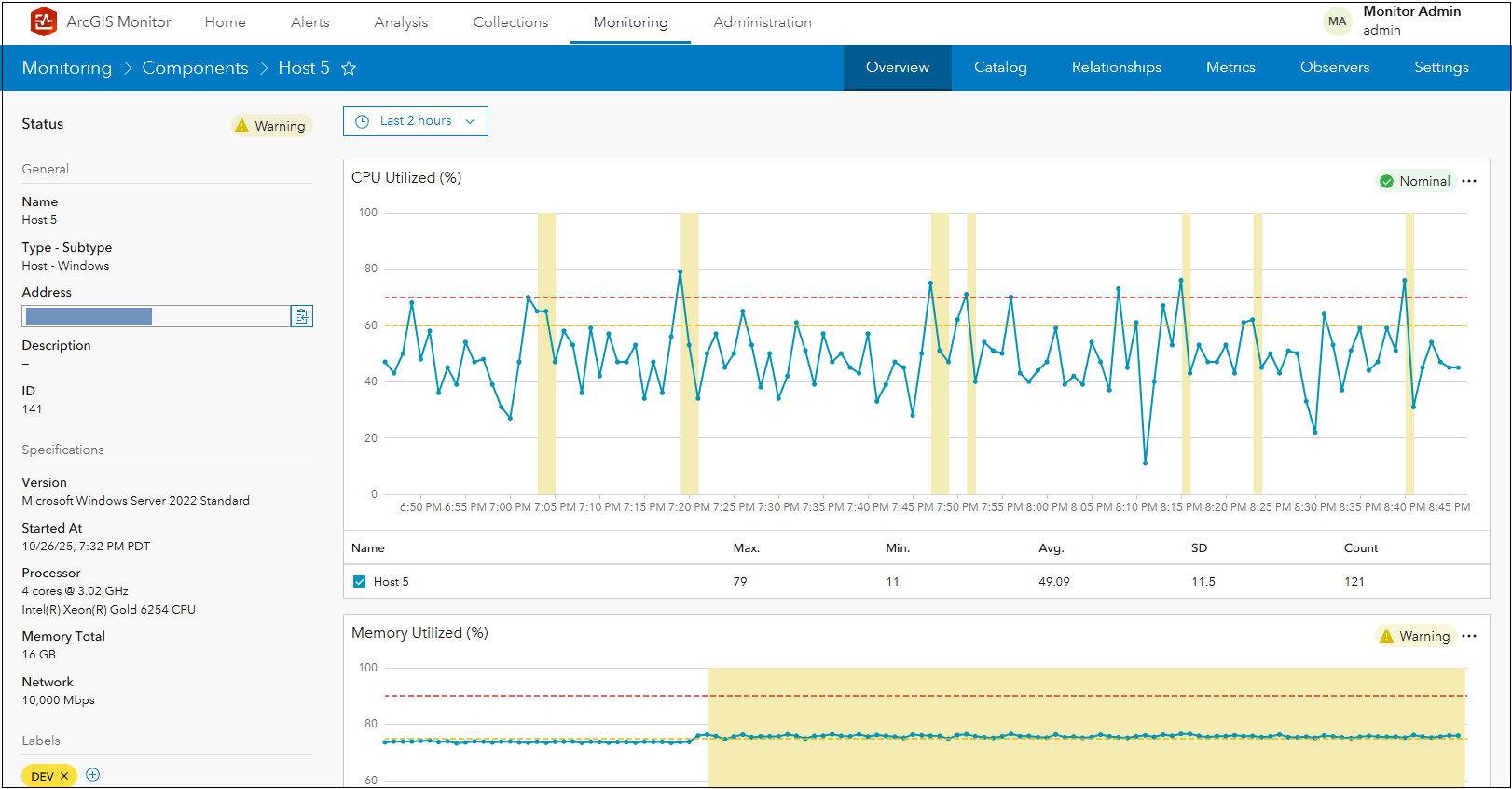
Figure 11: Host 5 Overview subtab display.
In this case, Host 5 has a warning status because its Memory Utilized (%) metric exceeds the warning alert threshold. You can return to the connectivity relationship graph, by clicking the previous display button in the web browser.
Component relationship graph example scenarios
All registered components in ArcGIS Monitor can participate in component relationship graphs. On the Monitoring page, you can select a registered component then visualize its associated components and their lineages. The complexity of the relationship graph will vary depending on what component type is selected.
Enterprise portal component
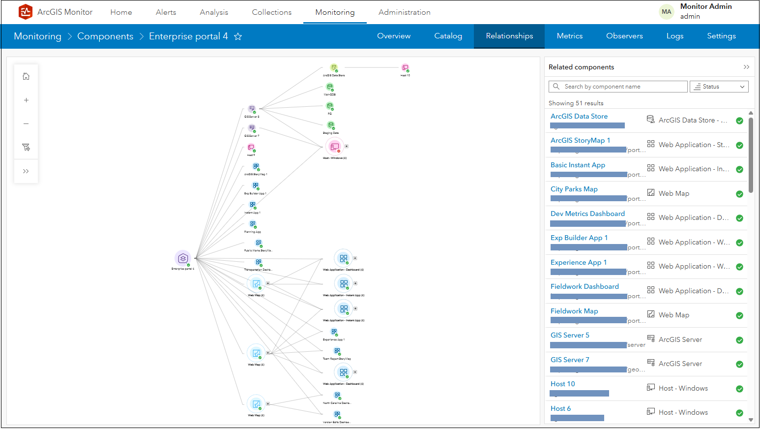
Figure 12: Enterprise portal 4 relationship graph.
The component relationship graph for an enterprise portal can be extensive. Keep in mind, it contains many web apps and web maps, each with their own dependencies. The information products could also be associated with many different data sources. An enterprise portal can also be associated with several ArcGIS Server sites. Figures 13 and 14 show Enterprise portal 4’s graph in more detail.
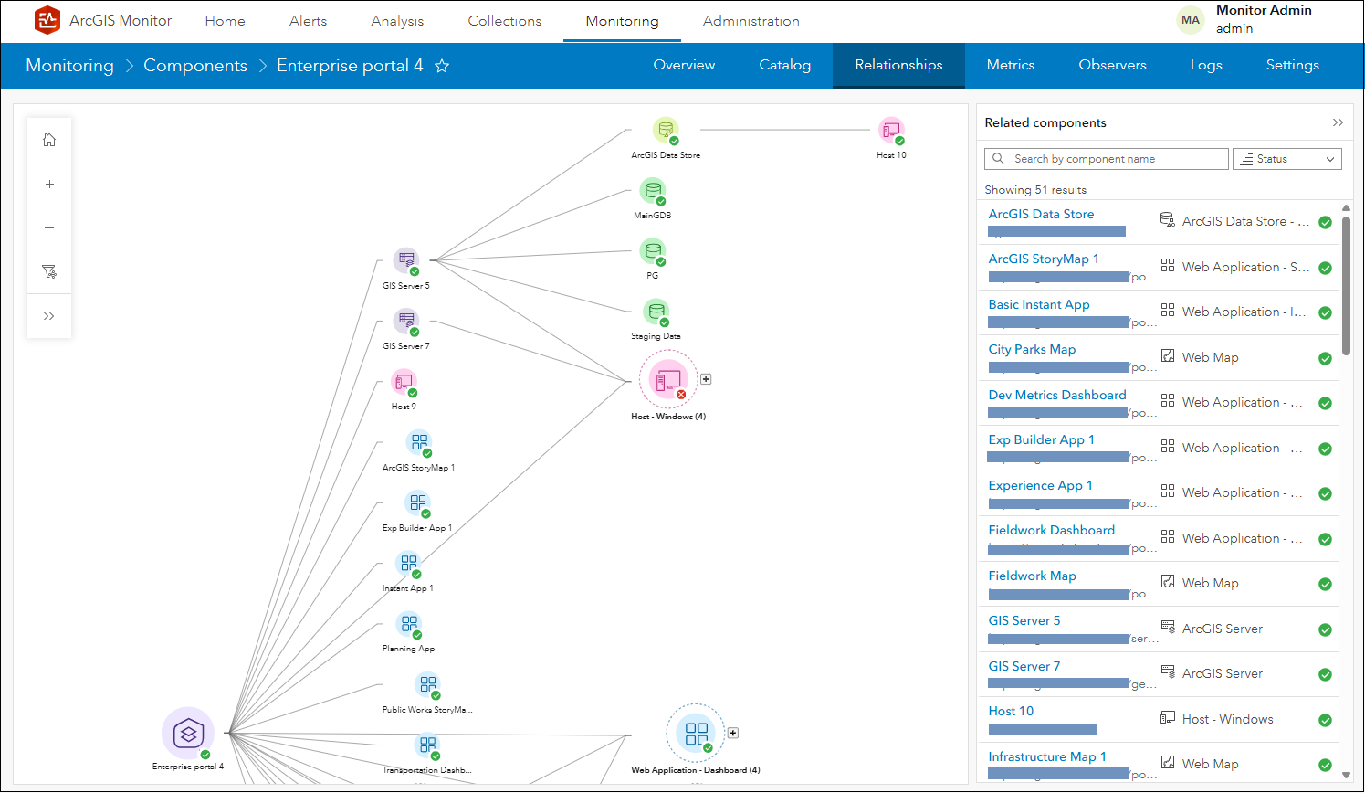
Figure 13: Upper section of Enterprise portal 4 relationship graph – infrastructure associations.
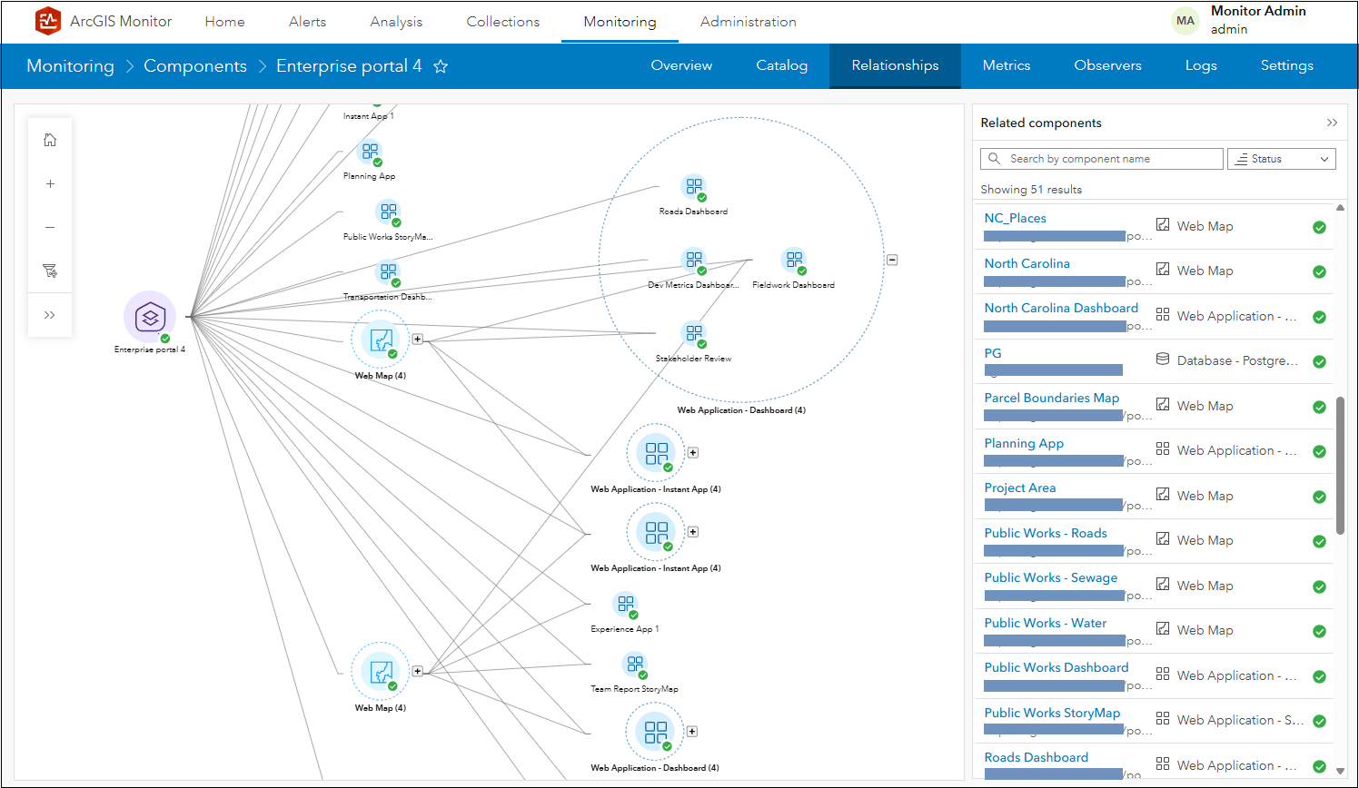
Figure 14: Lower section of Enterprise portal 4 relationship graph – portal content associations.
In Figure 14, the Web Application – Dashboard (4) group is expanded to show its contents. You could also leverage the filter graph option to only display specific component types. For example, only the web maps in Enterprise portal 4 are shown in Figure 15.
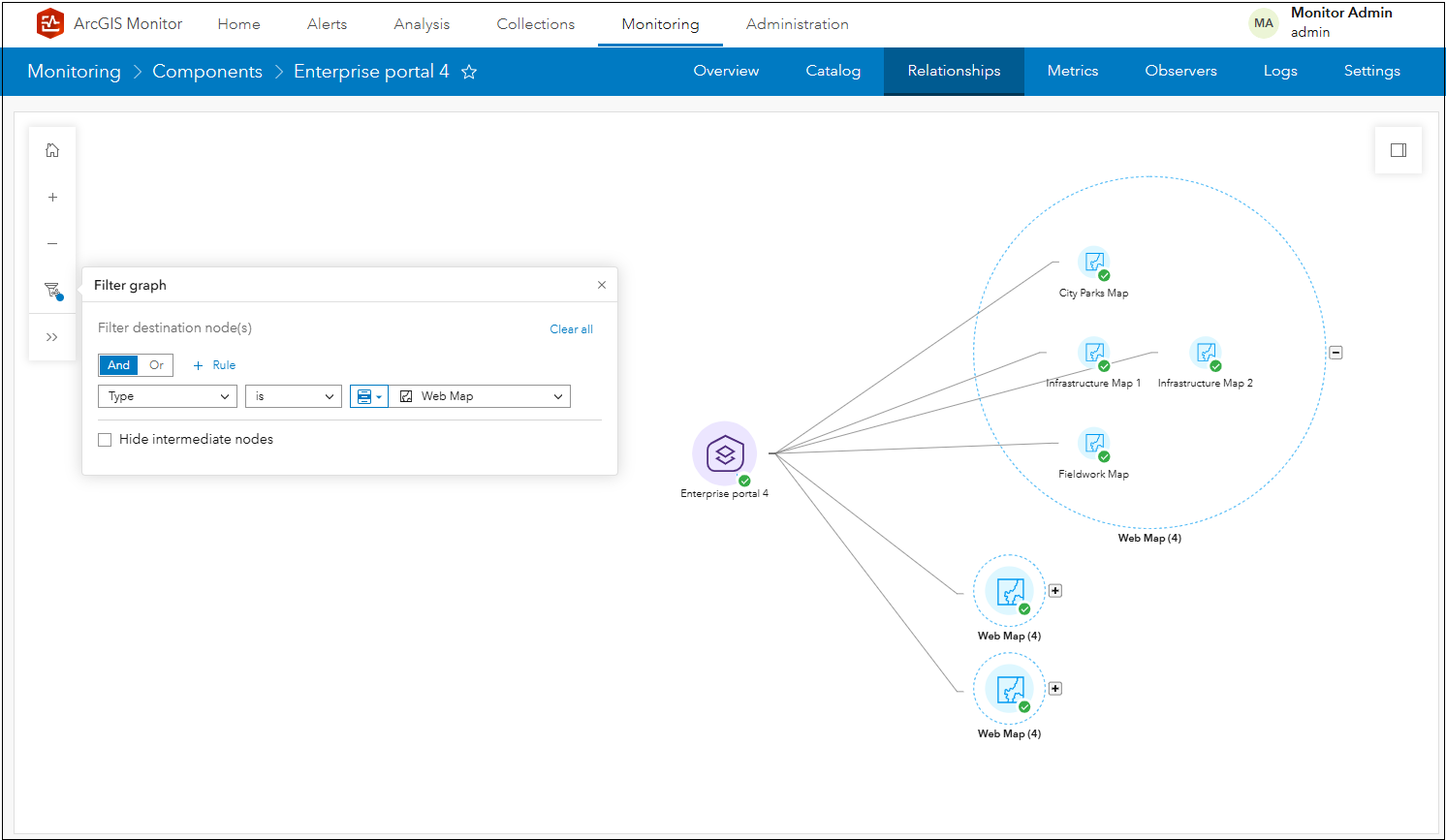
Figure 15: Relationship graph of web maps in Enterprise portal 4.
ArcGIS Server component
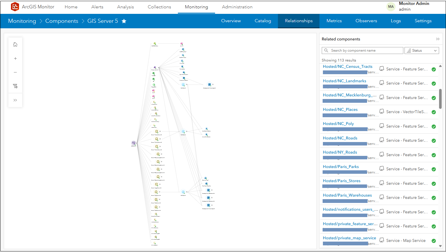
Figure 16: GIS Server 5 relationship graph.
ArcGIS Server components can also have complex component relationship graphs. An ArcGIS Server node can have many services, all being utilized by various web apps and web maps. In terms of infrastructure, its services can reference many different data sources and the Server site could be associated with an enterprise portal. Figures 17 and 18 show GIS Server 5’s graph in more detail.
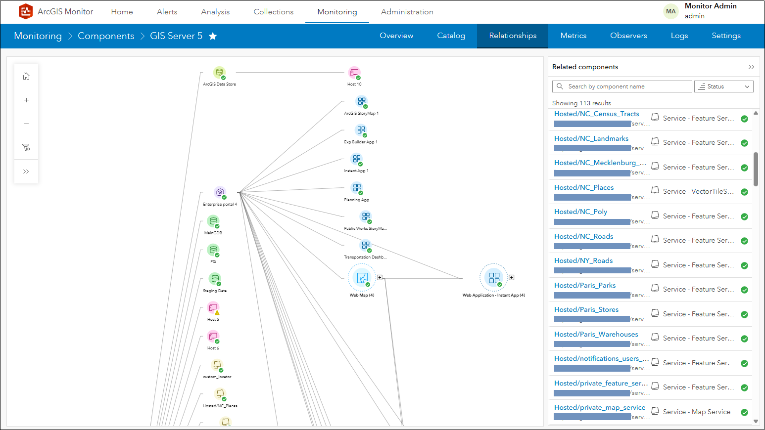
Figure 17: Upper section of GIS Server 5 relationship graph – infrastructure associations.
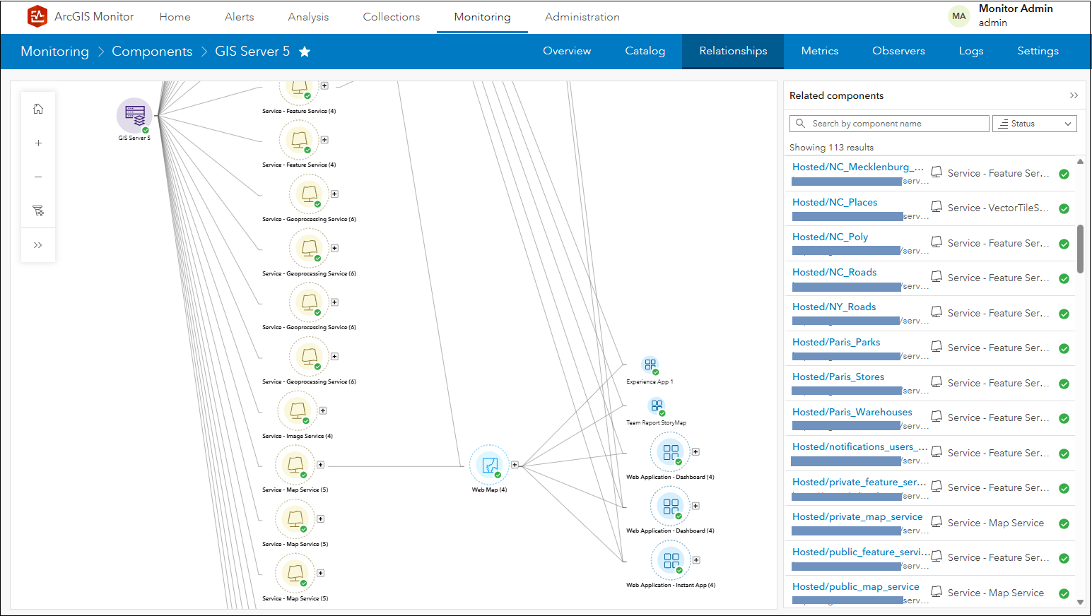
Figure 18: Lower section of GIS Server 5 relationship graph – services, web map, and web app associations.
You could select a web application component in the graph such as North Carolina Dashboard and view its lineage back to GIS Server 5.
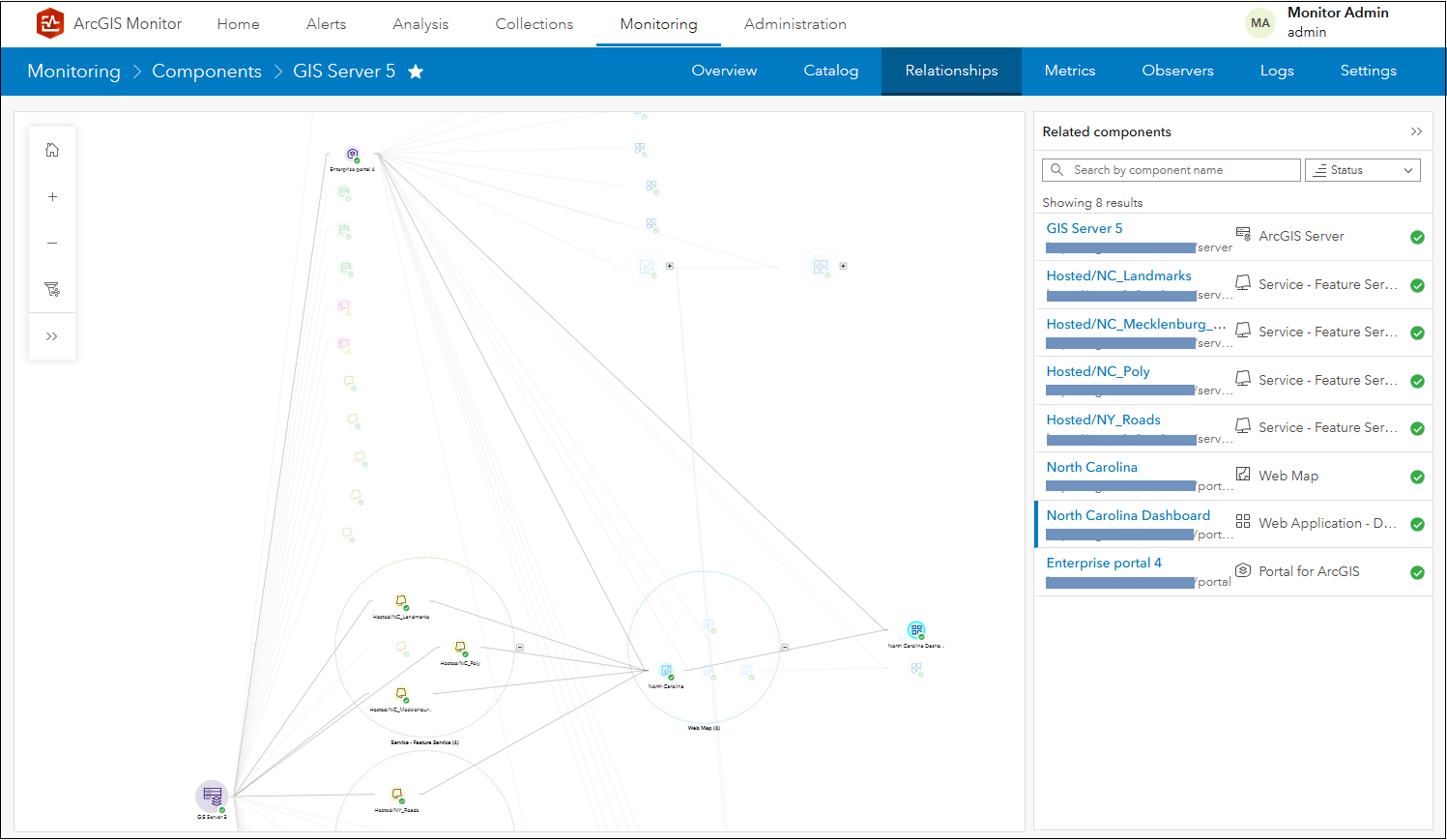
Figure 19: Lineage of North Carolina Dashboard to GIS Server 5.
The Show details panel only lists the components currently displayed in the graph; these are all the intermediate nodes in the lineage. You could also leverage the filter graph option to only display services that are not part of the default geoprocessing services included with ArcGIS Server, see Figure 20.
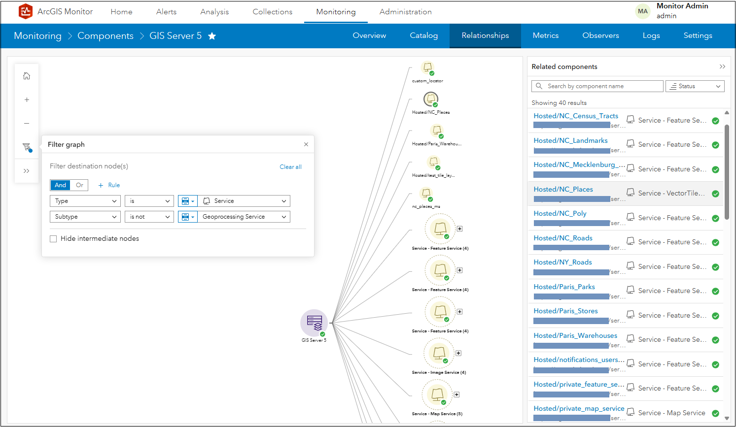
Figure 20: Displaying all non-geoprocessing services in GIS Server 5.
ArcGIS Data Store component
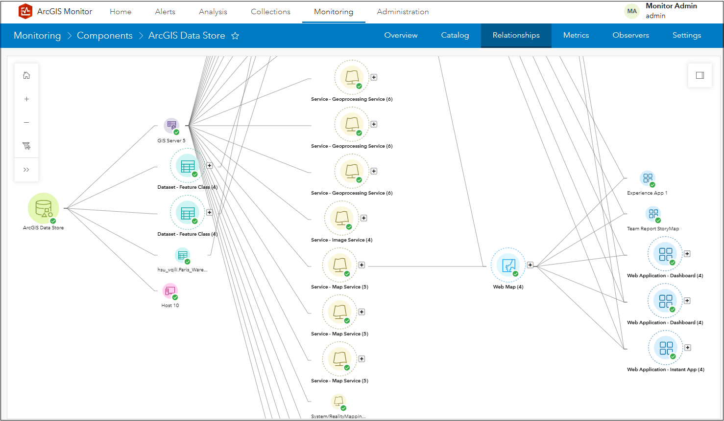
Figure 21 ArcGIS Data Store relationship graph.
Figure 21 shows the component relationship graph for the ArcGIS Data Store component (zoomed in so its immediate linked components are visible). It is associated with GIS Server 5, has several branches that link to its dataset components, and Host 10.
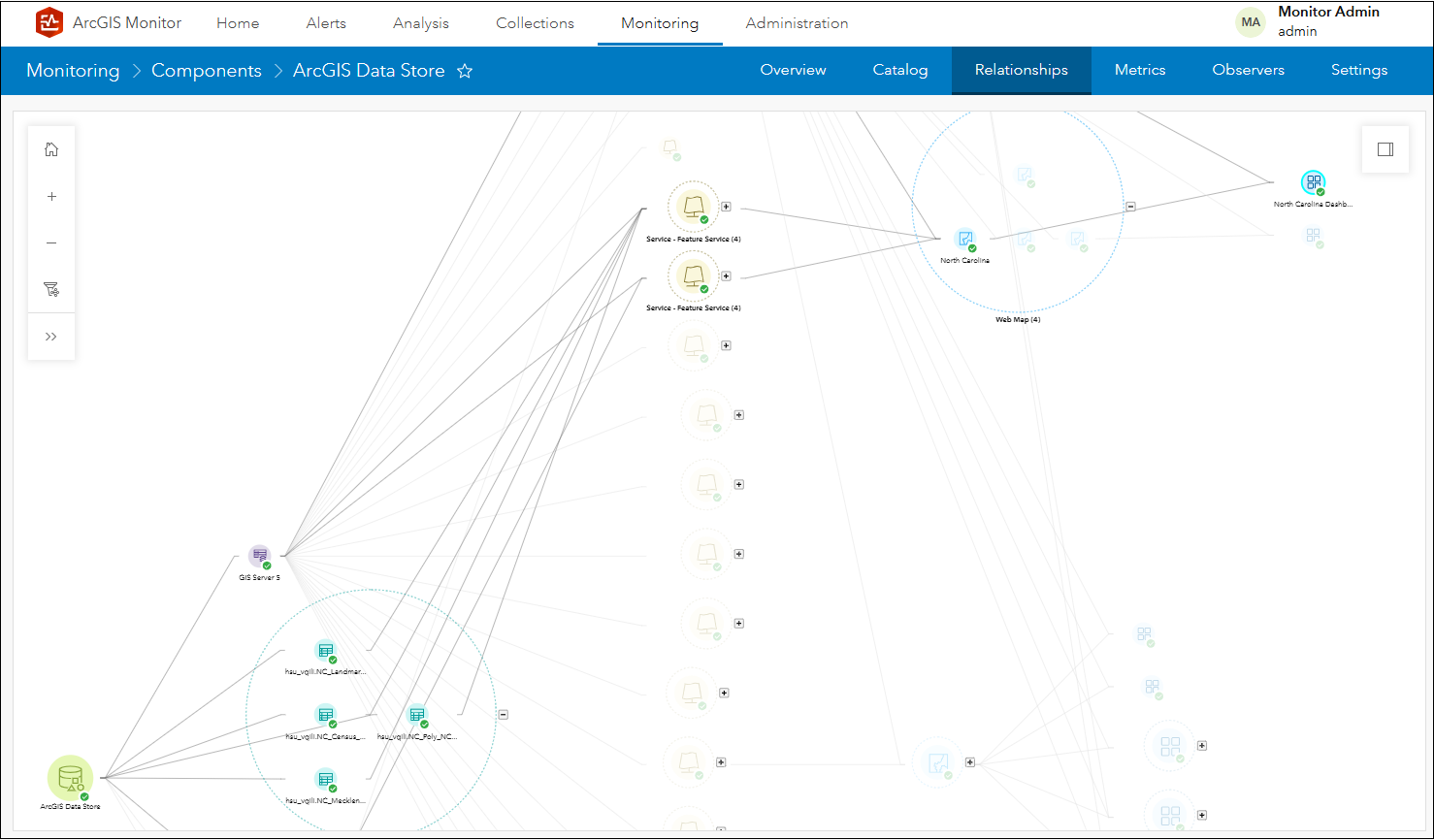
Figure 22: North Carolina Dashboard lineage relationship graph.
Figure 22 displays North Carolina Dashboard selected and its lineage back to the ArcGIS Data Store; note that some of its datasets are supporting hosted feature services which are in North Carolina web map used by North Carolina Dashboard.
Hosted Feature Services component
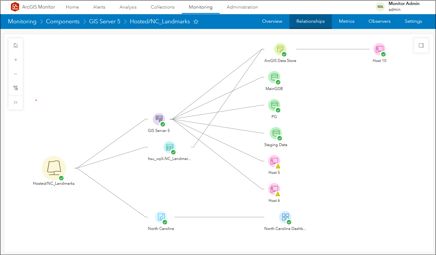
Figure 23: NC_Landmarks hosted feature service relationship graph.
The component relationship graph for NC_Landmarks hosted feature service is very similar to the Public Works Dashboard relationship graph (see Figure 3). The first branch linked to GIS Server 5 references the same infrastructure components. The second branch links to NC_Landmarks dataset stored in the ArcGIS Data Store, linked to Host 10. The NC_Landmarks service has dependencies on both GIS Server 5 and NC_Landmarks dataset. The third branch links to North Carolina web map used in the North Carolina Dashboard; this is considered to be “downstream” from NC_Landmarks service, because the web map and web application are dependent on the service. This graph can help you understand which web maps and web apps may be affected when making changes to a hosted feature service.
Web Map component
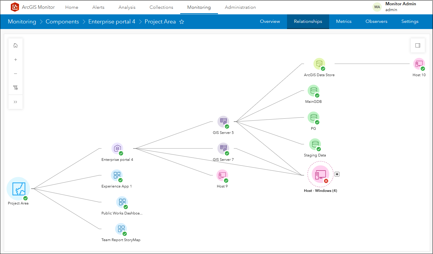
Figure 24: Project Area component relationship graph.
The component relationship graph for the Project Area web map component follows the same pattern as described in the Public Works Dashboard relationship graph (see Figure 3). The first branch references the same infrastructure components (linked by Enterprise portal 4), but three additional branches all reference web application components (e.g., Experience App 1, Public Works Dashboard, and Team Report StoryMap). These three web application components are considered to be “downstream” from the Project Area component, because they are all dependent on the web map. This graph can help you understand which web apps may be affected when making changes to a web map.
Be advised there are some limitations with the component relationship graph functionality in this release:
- Relationship graphs for web services from an ArcGIS Online organization or 3rd party ArcGIS Enterprise site are limited.
- Relationships for ArcGIS Server referenced web services (e.g., services that have enterprise geodatabase data sources) are not currently supported.
- When there are changes to enterprise GIS assets (e.g., a web app or web map is added or deleted), it may take several minutes for ArcGIS Monitor to refresh related component relationship graph(s).
This help topic lists all the components and their associations in Monitor. This is the first iteration of the component relationship graph functionality and it will be enhanced in future ArcGIS Monitor releases.
Custom database query monitoring
Many users have asked for the ability to apply custom SQL queries on database and geodatabase components in Monitor. This functionality allows user-defined SQL queries to be applied to these component types to generate custom metrics. Conceptually, this is similar to the check-service observer functionality. This can be helpful to report database specific configuration parameters and can help diagnose performance issues. For example, the status of database routines such as automated backups.
To enable this functionality, on the Monitoring page > select a database or geodatabase component > Observers subtab. Click the Add observer button to display the Add Observer dialog. For Observer Type, select Database Query and click Next.
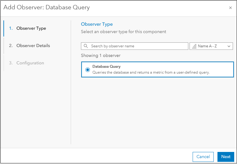
Figure 25: The Add Observer panel in ArcGIS Monitor.
Provide a name and description for the new observer that will be added to the database component. Click Next.
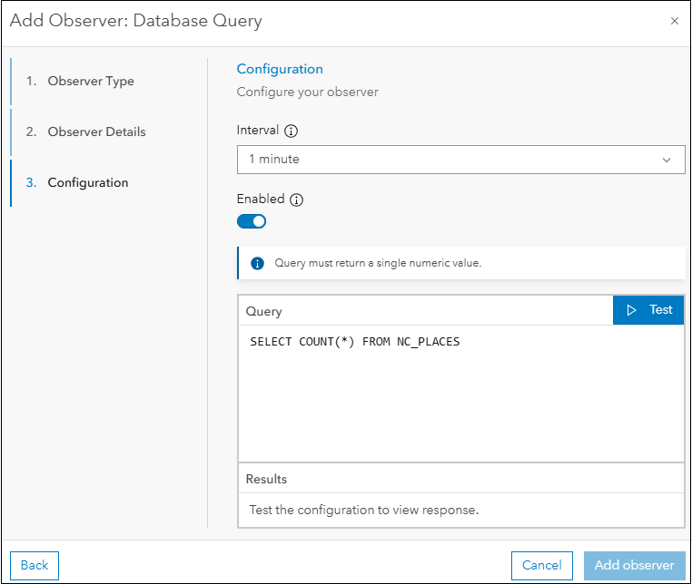
Figure 26: Configuration panel of the Add Observer – Database Query dialog.
In the Configuration panel of the Add Observer – Database Query dialog, this is where you can input a custom SQL query that can be applied to the database component. The SQL query must return a single numeric value. For example, SELECT COUNT(*) FROM NC_PLACES. SQL queries that do not return a single numeric value will not work with this observer.
You can click Test to ensure the SQL query for the observer works. If valid, results will be returned in the dialog. Click Add observer to add it to the database component. A new metric with the name Database Query – [observer_name] is added to the database component and will appear on the component’s Metrics subtab.
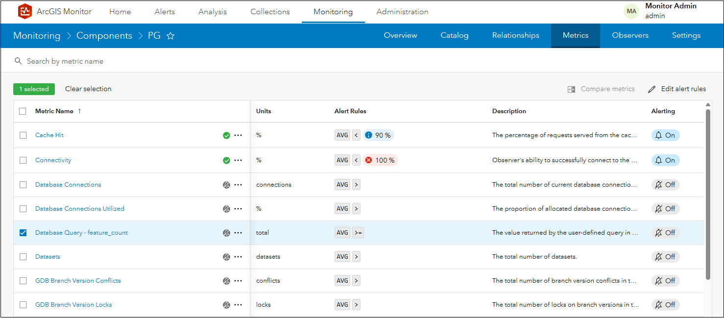
Figure 27: New Database Query – feature_count metric added to the PG component.
After configuring the Database Query observer, alerts and notifications could be configured on the new metric. This can help indicate when there might be an issue with the database component.
Side note 2: You can define any SQL query that returns a single numeric value, including SQL queries that alter tables. Therefore, it is recommended to register databases and geodatabases with ArcGIS Monitor using a database user with read-only access.
To learn more and connect with us about ArcGIS Monitor, please visit:
Sincerely,
The ArcGIS Monitor team

Article Discussion: