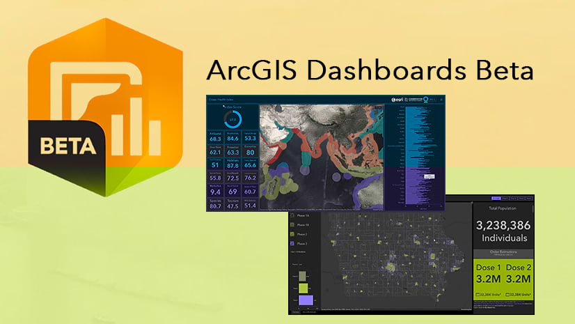
Dashboards give you information at a glance using different types of visualizations. When there’s a lot of information available at once, it’s hard to bring focus to the information your users want to see. Sometimes the data you’re displaying needs context. Many authors have found creative ways of guiding user interaction with their dashboards and providing users some context to the data they see. Some use the side panel to include instructions. Others use the title and description fields to provide more context on their elements.
In the newest release of the ArcGIS Dashboards Beta, we added the ability to configure element displays to be selection-based, helping dashboard authors fine tune what their users see and when they see it.
What is selection-based display?
Selection-based display allows authors to set conditions or dependencies for when and how data is displayed on a dashboard. Think of it like this – if you have no conditions, your dashboard and all its data visualizations display at run-time for users to see all the information at once. With selection-based display, you can choose to display a selection of your data only when one or more conditions are met.
Having dashboard elements display data only when necessary can be beneficial to a lot of dashboards and their audiences. Prompting users to make a selection before an element displays information allows authors to create dashboards that have a more specific focus and show only relevant data. This can make dashboards easier to read.
See it in action
Here’s a dashboard with water quality samples in the state of Maryland. Each record contains details of a sample taken from a site.

At a glance, it looks like this dashboard is easy enough to read – but not all the important information can be seen right away. Some areas are overloaded with information and relevant information is hidden.
List of sites
Let’s start with the list of sites – it’s long. There are some quick ways to sort the list to try and make it more relevant. For example, we can sort it by date or by status. Even if we sort the sites, it’s still a lot of information to scroll through to find the most relevant site or sites.
Instead of sorting, we can use the new selection-based display option. We can make the list of sites display only after a user interacts with the category selector in the header of the dashboard, and chooses the county that they are interested in.
Setting selection-based display
In the Actions tab of the category selector’s configuration, choose the list element as a target for a filtering action. Then, enable the Render only when filtered toggle button. This option determines that the list items will only render once a selection is made from the selector.

Once enabled, the list element no longer has any sites listed. Instead the element shows the default message “Selection required on one or more elements”. This message gives some indication of what a dashboard user needs to do in order to see the list. However, if we have several elements on which selections can be made, we can make it more obvious which element needs a selection.
In the list element’s configuration, we can go to the General tab and configure the No Selection label. For this element, we can change it to instead say “Select a county”.

Now when a user opens the dashboard, they know to first select a county from the category selector to see a list of sites in that county.
Sample details
The sample details is another element that could be improved with selection-based display. The details element displays the pop-up information for each data point. With this many points, users don’t see the sample details of a specific site right away. Again, we could sort the details, but users would still likely need to sift through a few samples to find the one they need. Users need to see the sample details for the site they are interested in.
We can do the same thing we did with the category selector, but this time set the action for the details element to render only when a site is selected from the Sites list. In the Actions tab of the list’s configuration, we can choose the details element as a target for a filtering action and enable the Render only when filtered toggle button.
Then, we can change the label shown on the details element when there is no site selected to give more guidance to the user.
After setting up both these elements with selection-based display, the two elements don’t display data when the dashboard first opens. Instead, we get a dashboard that looks like the following.

This is just one example of a way selection-based display can be used to give more context to your dashboard and to better guide users on how to interact with a dashboard in order to see the information most relevant to them.
You can open this dashboard to see this technique in use. As always, we would love to see the dashboards you create that incorporate selection-based display. If you can, share your innovative dashboards with #ArcGISDashboards.

I’ve created a dashboard that uses selections within a map to populate a table and a couple indicators. It works wonderfully for displaying the data I need it to, but I’m wondering if there are ways to give the user fewer options. Is there a way to 1) default the user to having the map selection tool active when the page loads and 2) remove selection type options (the user only needs the point selection and not polygon/lasso/etc.)? Thank you!