REDESIGNING
As map makers we make maps. However, that doesn’t mean that each map is made from scratch. It is just as often the case that a map is updated, tweaked, or redesigned. I want to share some of my journey redesigning the Navigation Basemap.
WHY REDESIGN?
There were several reasons why a redesign was in order. Other than needing a freshening up (as all maps need periodically), there were areas identified as needing adjustment to better serve some common use cases. Some of the main concerns were road widths being too thin, the label hierarchy, and some colour selections.
OTHER CRITERIA
This map is a heavily used map with many different users, so the changes couldn’t be so drastic as to radically change the look.
FIVE MAJOR COMPONENTS WHEN REDESIGNING
Any map redesign is nuanced, but I want to look at five things that helped make this redesign more successful and that can be applied to similar projects:
- GRATITUDE
I think this is one of the most important steps: feel gratitude. I was/am very grateful for what came before. The original map was a really nice design, which was a huge bonus. It made the redesign easier in many ways. Even if it hadn’t been, what comes before is one of the pillars for building that which comes after.
- ONE CHANGE LEADS TO ANOTHER
The map changes were focused around road widths, label hierarchy, and some colour adjustment. At first glance that doesn’t seem like a lot, but it really is. One change leads to another. By the end of the project, every single feature had been adjusted, and it really is a new map in so many ways.
- DIALOGUE WITH THE INVOLVED PARTIES
It is important to have an open dialogue with the parties involved. Listen to their concerns and explain your choices. The more openness, the better a chance of success.
- MEASURING SUCCESS
One obvious metric is whether the stakeholders are happy. Another measure of success in this project’s redesign was whether the changes generally went unnoticed by everyone else.
- THERE WILL ALWAYS BE OTHER UPDATES
The update process never ends. There are already some tweaks that are needed. In the future, maybe I will have to do a complete redesign again, or maybe someone will have to update what I have done. The point is, it is never-ending journey.
LET’S TAKE A LOOK
Here is a look at some of the Navigation redesign. The new design is the first image in the following breakdown.
At the smallest scales the changes were very minimal. The colours are a hint more vibrant, and the city label positions were changed.


At this scale, some of the focus was on changing the colour balance. It is also a good scale to see how the changes aren’t drastic and are mainly noticeable only in a side-by-side comparison.


A goal at this scale was to help the transition and tone down the road density.


This was another scale where that same road transition technique was applied.


Again, that road transition technique was applied. It hasn’t been mentioned, but at this scale and others, the city labels are larger and darker than on the original map.


This scale is a good example to again show how the maps are fairly similar but the new one is a bit more vibrant and the colours are balanced slightly differently.


One goal at this scale was to promote the roads slightly more.


This scale is a good example of the increased importance placed on street names in the hierarchy. The adjusted symbology also opens the map up too.


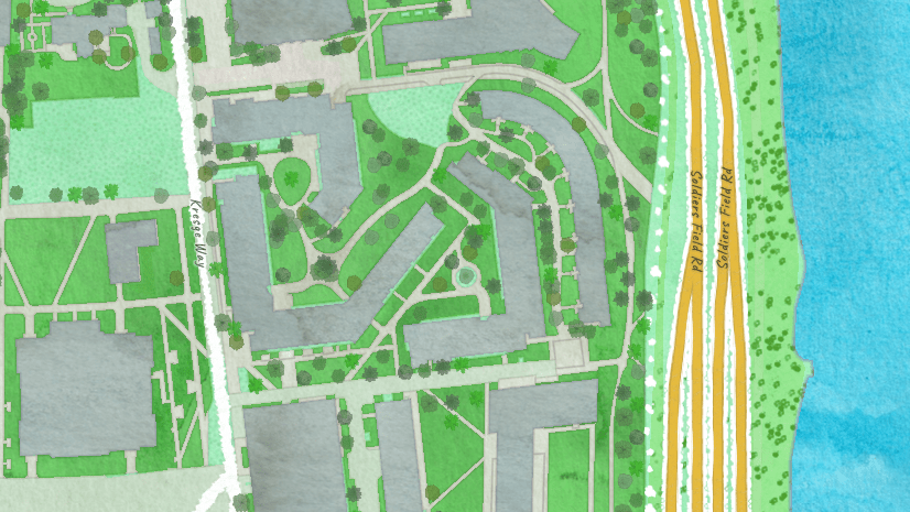
The map changes the most at the largest scales. The roads start to become much wider, and the labels are much darker and larger. The buildings stand out more too. The colour scheme follows the previous patterns and is brighter and the map moves away from a slightly backgroundy look that is had before.


This is the last example and a good illustration that shows how maps evolve. Our maps continue to get more detailed, and greater emphasis is placed on larger and larger scales. The maps have to continue to evolve to better represent those scales and details.


Thanks for coming along with me on this journey. I had a great time. I want to note that the ArcGIS Vector Tile Style Editor was the tool used to redesign this map. If you haven’t used it, it is totally worth your time!

Commenting is not enabled for this article.