For me, as for so many others, the Grand Canyon is my favorite place in the world. I have worked, backpacked, rafted, fished, spent time with friends and family, and had my geology field camp there — imagining those experiences without a flowing Colorado River was, well, unimaginable.

Meet Anna Riling and Sinjin Eberle, co-authors of Caught in the middle: A river between two dams and the future of the Grand Canyon and finalists in the 2023 ArcGIS StoryMaps Competition.
Anna, the owner of Four Corners Mapping and GIS, creates maps and place-based stories to advocate for meaningful environmental causes and protection of the natural world. Sinjin is the Southwest Communications Director with American Rivers and Executive Producer of American Rivers Media. As a child of the Southwest, Sinjin has spent the vast majority of his life in Southwestern landscapes and advocating for the protection of both land and water across the Southwest. Anna and Sinjin share a deep connection to the wildlands of the Colorado River Basin.
Learn how they — along with co-authors at AMP Insights and the Environmental Defense Fund — collaborated with scientists, Tribal leaders, historical experts, and agency officials to create a previously untold narrative around the increasing water risks to the Grand Canyon and Colorado River Basin. The following conversation has been edited for brevity and clarity.
StoryMaps team (SM team): Your story was recently named a finalist in the 2023 ArcGIS StoryMaps Competition. Can you share a little bit about the story?
Anna: I clearly remember an early Zoom call about Caught in the middle, our story centered around the Grand Canyon in Arizona. Sinjin said something like, “There’s a very real possibility of no water flowing through the Grand Canyon.”
I have worked, backpacked, rafted, fished, spent time with friends and family, and had my geology field camp there — imagining those experiences without a flowing Colorado River was, well, unimaginable.

Sinjin: Throughout 2021 and 2022, national and international media focused on the rapidly falling volumes of water in Lake Powell in Utah and Arizona and Lake Mead in Nevada. This attention brought the increasingly dire impacts of water supply challenges across the Colorado River Basin to the forefront for policymakers and the public. Combined, these two reservoirs are the storage facilities for water that serves more than 40 million people and a $1.4 trillion dollar economy across the American Southwest.
What if lake elevations fell below the lowest point where electricity could be generated and water could not pass through the dam? What if the Colorado River was relegated to the Colorado Creek, essentially drying up the Grand Canyon?
This was the scenario we wanted to contemplate and communicate with the ArcGIS StoryMaps project.
SM team: How do the Colorado River water supply challenges reflect challenges faced by communities and landscapes worldwide?
Sinjin: With the increasingly apparent impacts of warming temperatures – both globally but especially present in the American Southwest – water supplies around the world are becoming increasingly unpredictable, scarce, or disappearing. In the Colorado River system, climate scientists have identified that the physical volume of water traveling throughout the basin has decreased nearly 20% since the year 2000 alone and likely will increase to 30% by 2050. This is water for cities, water for a vast agricultural economy, water for recreation, and water for fish and wildlife. And in the United States, nearly two-thirds of all clean, safe, reliable drinking water comes from rivers. This problem literally touches every person in America in one way or another.
SM team: Your story beautifully blends maps and data with media. How did geospatial information help you tell this story?
Sinjin: Even with complex, technical questions like contemplating management decisions across a 247,000 square mile watershed, art and beauty and data visualization help a wider audience interpret and absorb the impact of this information. GIS and maps in particular are generally recognizable and apparent to nearly everyone who has ever traveled outside of their homes at all. So tying geographic features and beautiful, recognizable imagery to descriptions and contemplations of difficult policy decisions is one way to break through the mental clutter and to understand what the world is facing in terms of sustainable water supply for all.
Anna: I used to volunteer as a Preventative Search and Rescue Ranger in the Grand Canyon — handing out salty foods and water, chatting with folks, and making sure they were safe on their hikes. Many people flat out didn’t believe me that the river was 500 feet wide and a vertical mile below us. The scale of the Grand Canyon is very hard to grasp – there’s no context for it in our everyday lives. The same goes for the Colorado River.
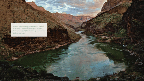
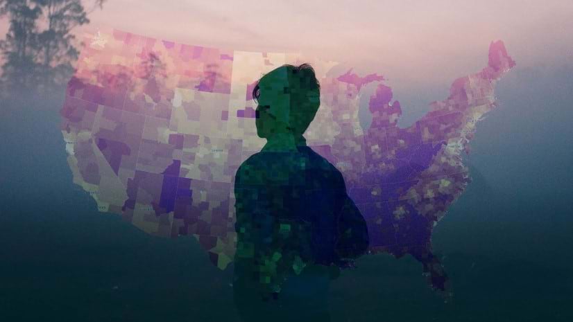
The first slide in Caught in the middle is a gorgeous photo by Amy S. Martin Photography taken from the bottom of the Grand Canyon of the Colorado River flowing into the distance. As the reader scrolls, the image blurs radially, maintaining focus on the river, and a map of the Colorado River Basin is overlaid on the image. Right out of the gate, this effect marries the beauty and majesty of the Colorado River with the vastness of the geography of its basin and all those that depend on its continued flow.
Likewise, to try to convey the difference between Tribal territories versus modern-day reservation boundaries, you could talk about it, or put it on a chart, which are fine. But a map shows that the territories of peoples with ancestral ties to the Grand Canyon reached at least from southern Arizona into Idaho, from California to Kansas, and are nebulous and overlapping. This, contrasted with the smaller, rigid geometry of federally recognized Tribal boundaries, burns an image into someone’s mind more effectively than words alone.

The Tribal territories data was compiled by native-lands.ca as a crowdsourced, oral history sort of effort; this kind of thing would be difficult to record, visualize, and share without the use of GIS.
SM team: How does your story reflect the voices of local communities?
Anna: It’s a common misconception that people “used to” live in the Canyon, that the structures and other evidence of human presence happened “in the past.” Georgie Pongyesva reminds us — “We’re still here” — in her quote paired with a Colorado River landscape. While other Tribal voices resonate through audio clips as when Ophelia Watahomigie-Corliss’ says “It is our land. No past tense allowed.”
In other parts of the story, quotes by subject matter experts and authoritative voices add credibility to the story’s narrative. U.S. Department of Interior quotes verify the uncertain future of the Colorado River if Lake Powell drops below Minimum Power Pool. And scientists from the National Park Service, working locally in the Grand Canyon, add weight to the discussion as they introduce risks to native fish species.
SM team: Why ArcGIS StoryMaps for this story? What features, in particular, supported your storytelling goals?
Anna: The swipe block is a must-have in my StoryMaps toolbox. It’s so versatile!

When I saw Sinjin’s 2022 photo of Lone Rock at Lake Powell standing high and dry with nary a drop of water in sight and another photo taken from the same vantage with the rock surrounded by water in 2017, I knew that I wanted to use the swipe block to show the difference between the two images.
For Groundswell on the Rio Grande, another ArcGIS StoryMaps project produced with American Rivers, I used the swipe feature with a web map to show the change in irrigation methods in the San Luis Valley over time.
One of my favorite ArcGIS StoryMaps hacks is using an image as a “separator.” For Caught in the middle, I used ArcGIS Pro to create an image of an interesting, twisty, slightly braided section of the Colorado River. Then I knocked out some squiggly rapids and exported it to use as a separator between story sections.

These small elements tie into the theme and keep the reader engaged and focused on the thread of the story. And in ArcGIS StoryMaps, the built-in theme builder includes options for customizing typography and colors, link styles, buttons, quote blocks, and logos. With a custom theme and separators, I built the elements of the story — from web maps to graphs and charts to images — for a consistent look and feel and cohesive story.
With inspiration from John Nelson’s Vector Tile Style Editor tutorial, I customized our base map to create a version that matched our color palette and typography and then toned down the hillshade so that shadowed areas weren’t quite so dark and dramatic in the Grand Canyon. This made for a nice mellowed-out base map on which to throw our data.

I tried very hard to maintain consistency in the graphs and charts, from the size to colors to fonts used. That said, creating graphs and visualizations like this is time-consuming, and you probably want to weigh your budget against all the cool data that’s available.
SM team: What were your greatest challenges in telling the story?
Sinjin: The vast expanse of the geography, the complex nature of Colorado River water policy and the Law of the River as it is colloquially known, and the competing water demands in the fastest growing region of the country is an incredibly complex and wide-reaching challenge to tackle. Then you layer on the long legacy of Indigenous people of the region.
Anna: The biggest challenge was knowing when the story was “done.” There were so many eyes on it — our team and partner, legal, and Tribal reviewers — at each step of the process. With large partner projects, it helps to have someone in a project manager-type role who can plan and facilitate meetings, create timelines, contribute editing to the script, and generally have a 30,000-foot view to keep the project on track.
And with such a big topic, the Grand Canyon, there was an endless amount of photo and video archives, interviews, research papers, aerial photos, lidar, spatial data, hydrologic data, and artwork. That’s where it helps to have a good outline and plan for your story.
For this project, we had several planning meetings to craft the general sections of the story, and then wrote the script collaboratively in a Google Doc. The group used a task tracking Google Sheet so nothing slipped through the cracks. We stored all project materials in a Google Drive folder, including illustrations for the story, media we gathered, meeting notes, and reviews of the script. We even tracked resources and citations through a web-based platform that autogenerated a bibliography stored in the shared Google Drive.
SM team: Where can our storytellers find more information about the topic and your work?
Sinjin: Aside from this story, there are lots of resources online where we advocate for people to learn more about all the issues that American Rivers and our partners are confronting. Starting with AmericanRivers.org as a landing place, we publish blogs, press releases, action alerts like any other conservation organization. We also have unique expertise in the conservation space with our robust and award-winning film program, where we leverage the power of film and character-driven storytelling to communicate with people interested in topics like these.
Anna: As a best practice, the Caught in the middle story ends with clear calls to action — with visible buttons and logo links to resources. The story provides the context and rationale for action. The ending provides the “how.”

For more storytelling inspiration, explore a few additional Four Corners Mapping & GIS stories created with ArcGIS StoryMaps.

This featured storyteller interview was prepared as a part of the February 2024 Issue of StoryScape℠ | Follow the flow.
For more interviews and articles like this one, be sure to check out StoryScape℠, a monthly digital magazine for ArcGIS StoryMaps that explores the world of place-based storytelling — with a new theme every issue.
Article Discussion: