
...the more I work on different projects, with different design needs, the more I feel like you don't have to paint yourself in a corner. There are so many ways to approach a visual language. That's what makes this so fun.
Gustavo Cardenas, a senior graphic designer, balances two equally important roles on Esri’s StoryMaps team — product design and development and graphic design for editorial work. In his editorial role, Gustavo creates unified story themes, illustrations, and other design elements to ensure each story, video, or social media post resonates with intended audiences.
His professional background extends across illustration, web design, branding, print production, and more. Outside of work, Gustavo enjoys camping, photography, and sketching in coffee shops.
Gustavo and three StoryMaps colleagues recently chatted about illustration and design in ArcGIS StoryMaps narratives and the simple design choices with the greatest impact on readers. The following conversation has been edited for brevity and clarity.
Q: Thanks, Gustavo, for sharing your experience and advice with our storytelling community. Can you kick things off with a little bit about your design background?
A: Sure. I worked several years at a print shop before eventually landing at a small digital marketing agency. There I handled everything from website layouts and social media posts to bigger projects like interactive experiences where event attendees walk through digital experiences.
My favorite was the Jack Ryan experience that promoted the Amazon Prime television series. We created a “set” that people could walk through. The staged environment included a giant map on the wall and activities or challenges to complete. The work called for a consistent in-person and digital experience.
Being a graphic designer at a digital marketing agency afforded me opportunities to work with clients big and small, from entertainment studios to local hardware stores.
Q: How does that differ from your work on the StoryMaps team?
A: With marketing and advertising, you’re selling goods and services with a really simple message. It’s short and sweet.

At Esri, stories are complex and cover significant topics. And so the illustrations must complement the topic and writing. Each story component, whether writing or illustration, matters. And what really matters is accuracy.
For a recent story about Doing conservation on the ground, I thought that I understood the diagrams needed. But my first drafts reflected only a surface-level understanding of the subject, and one of my slides was inaccurate. By spending more time with the partners and information, I could pivot that illustration and make sure that I was accurately representing the conservation work. I think getting up to speed on a topic is one of the bigger challenges because you want to do the topic justice.
When comparing my previous work to current projects, there are many similarities. The design techniques and tools are often the same, but the intention is the biggest difference.
Q: With any project, some organizations know what they want when they walk through the door, and others need more guidance. What’s your experience been with stories created by the team or with partners?
A: Marketing and advertising customers often came in with a vague idea or vision but really turned to us for the end result.
With most Esri partnerships and projects, we’re really talking to experts. They know their primary messages and audiences. That’s the baseline, which is a little bit easier. It gives you more to work with upfront.
Q: When you approach these projects, where do you get your inspiration?
A: A couple different areas.
Nature is a first go to for me, especially for color. Sometimes I’m just walking around campus or on a trail and see interesting color combinations. I’ll take a photo of it and save it for later. I don’t always know what I’m going to use, but it could be interesting for a project down the line.
I also like finding old brochures or books or other tactile things. The internet and digital assets still relatively new. A lot can get lost in translation. For me, tying digital design to real world tactile things just makes sense. The same could probably be said for cartography. Historic print maps carry a lot of tactile detail into the digital space.

Beyond personal experiences and records, I think it’s important to stay up-to-date on design communities. See what people are creating and what cool ideas are emerging on design boards and even on social media. I save the textures, colors, and styles that make me stop scrolling.
Q: How would you describe your design style and do those “things that make you stop scrolling” change your style at all?
A: If I had to define my style, I would say adaptable. If a project comes along and the author wants to try watercolor illustrations, I turn to my bucket of saved inspirations for reference. I can use these references and identify common illustration patterns by asking a few questions. What are the common things that occur in this style? Are there standard textures or colors? Are there common line qualities?
Q: That’s really interesting, Gustavo, because I think so many visual artists make a point to articulate their own unique style and what you’re describing is getting a lot of fulfillment from having that creative flexibility and opportunities to test out different kind of, you know, different design patterns or approaches, which is really neat.
A: Yeah, I previously thought that style was a really important part of my identity as a designer.
But the more I work on different projects, with different design needs, the more I feel like you don’t have to paint yourself in a corner. There are so many ways to approach a visual language.
That’s what makes this so fun.
Q: A follow-up of sorts. Could speak to what other levers you can adjust that you think have the biggest impact on creating a little world from a story?
A: In terms of color, there are many tools that you can use to generate new palettes. You can even reference old design books. Color has been explored in so many different ways that are lots of references out there.

I think typography also plays a huge part in setting a theme for a story. If you look across the web, there are a lot of brands that use very clean typography. I think a lot of that is for legibility reasons, but you can have a lot of fun with your heading styles and things like that. Try different fonts that might work for your story. You could go for a sans serif font that’s very clean, or you could try something a little more out there, like a Western-style font that’s got more style.
Separators are a big piece of establishing that world for your story. If you’ve got the colors drilled in, and you’ve got the typography drilled in, you could create a custom separator that’s representative of your story or your topic. It sort of reiterates the visual language of your story. Typography, color, and separators are all super quick wins.
Q: What’s your favorite custom separator you built for one of these stories?
A: The Doing conservation on the ground story represents my creative thinking behind separators. It’s very simple — a marsh with some water and rough squiggles.

It began as a really complex illustration, with many iterations. I finally landed on the simplified version that emphasizes organic shapes and line qualities.
Q: You’ve described some of the different ways you can adjust the look and feel of the story to suit a particular topic or theme. Why is this important? Why does design matter? Would you say there’s more to it than just creating an aesthetically pleasing kind of experience?
A: Humans are naturally driven by visual things, so of course, there’s a desire to create a visually appealing story. But you want the tone of your story to match or even create the visual language.
I wouldn’t pair a somber topic with vibrant colors and whimsical typography. The written language and visual language should complement each other to ensure the greatest chance that your reader understands the message.
Harmonize the two languages.
Q: Is it possible to overdesign a multimedia story?
A: Yeah, I think so. It has to do with the balance of written information and visual information. If you’re including illustrations or photos just for the sake of making something pretty, then you may be breaking the story into too many different parts, and not allowing it to flow naturally. It’s also important that your illustrations are reflective of what you’re writing about. I think the ArcGIS StoryMaps story and theme builders allow you to stay focused and not add too many bells and whistles.
Q: Right, you don’t want the design to get in the way of the story.
A: Readers are going to read the story, but they might not engage with every single illustration or video you’ve included. It’s helpful to ask yourself: what are the key components that somebody needs to understand this topic, and what’s the most immersive experience that you can deliver without adding too many elements?
If you create an image gallery with 40 photos, is somebody really going to view all 40 of those photos? At a certain point, once you’ve gone past like, six or seven really powerful photos, then the rest are just filler. If you add too many design elements then you can sort of water down the story. I think the readers can get lost in that.
Q: You’ve mentioned intentionality several times, like intentionally choosing colors, typography, and separators. Over the past year, you’ve done a lot of work on custom designs for interactive ArcGIS StoryMaps features. Can you share a recent example?

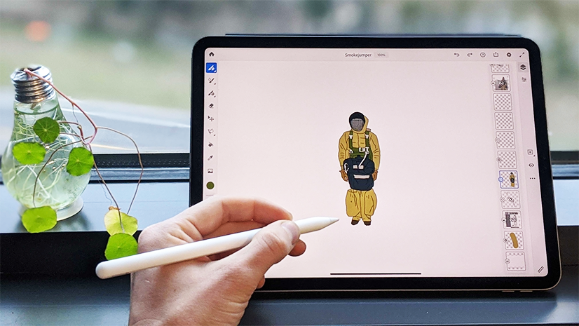
A: The Picking apart the school lunch story comes to mind first.
We wanted to use a really lighthearted illustration and typographic style to convey an elementary school feeling, so we’ve got these simplified illustrations and bright, punchy colors. To reinforce the narrative we wanted to create a sort of nostalgic feeling, like what it felt like to be back in elementary school.
For example, there’s an illustration of a cafeteria kitchen, there were a couple of different ways that I could have tackled that. I could have illustrated it in a hyper-realistic style — but I wanted to approach it with a more playful style to fit the visual language. So the lines are a little wavy and the color palette is a bit punchier. It ties back into the theme of the story.
Q: This may be one of the most creative ways we’ve seen map tour used, especially using an illustration as the base map. What inspired you to take that approach?
A: Well, we did have some photos of the equipment, but I didn’t think they’d be as engaging as an interactive illustration. Additionally, I don’t think we could’ve gotten a photo from this perspective unless we took the roof off the building and had a crane to take the photo.

Some of the photos do appear in the story, but I think this approach just makes that section a little bit more interactive and engaging.
Q: Speaking of map tour, are there any specific features or capabilities that have transformed the way you approach incorporating design or illustration into stories
A: Sure. The kitchen illustration highlights the ability to add a media layer to a map and use map tour in that way. With a map you have these interactive zoom in, zoom out, and panning controls. Being able to bring that same sort of interactivity to a static image really got me thinking, ‘okay, what are some other opportunities to use this technique?’
I’m also excited about 3D possibilities. There are so many readily available 3D assets that you can download. And that’s something that I’m sort of interested in. How can we incorporate an interactive 3D model in a story? I’m really looking forward to doing more with 3D.
It will also be interesting to see how AR and VR might come into stories. For example, consider engineering use cases: how do you bring that 3D model into a story and really make sure that it’s got the most interactivity that you can get out of 3D?
Q: Final question, Gustavo. For aspiring designers or even storytellers without design skills, do you have any advice?
A: Yes! To all storytellers, give yourself the freedom and try new things. Some things will not make it into a story, but experimenting is a great learning experience.
With that said, I do want to share a few tools that make it easy for anybody to create custom illustrations or custom graphics. If you’re intimidated by bulky design software, you could start with a web-based tool like Adobe Express or Canva. There’s not a steep learning curve and you can sign up for a free account. These programs are very user-friendly and provide a quick way to get some illustrations out the door. I think Adobe Color is another useful tool, especially if you’re not sure if your colors are going to harmonize.
And lastly, Google Fonts has an extensive knowledge library that can help you understand how fonts play a crucial role in shaping the identity of your story. Google Fonts are readily available within the ArcGIS StoryMaps theme builder, making it a convenient way to add that extra polish to your story.
And to all storytellers, have fun. Enjoy the writing and designing process. Stories are most powerful when your excitement and knowledge shine through.

This featured storyteller interview was prepared as a part of the January 2024 Issue of StoryScape℠ | Drawing storylines.
For more interviews and articles like this one, be sure to check out StoryScape℠, a monthly digital magazine for ArcGIS StoryMaps that explores the world of place-based storytelling — with a new theme every issue.

Article Discussion: