
About the author: Mark Gallant is a geographer and GIS professional from Ottawa, Canada. Before recently starting a new position with Esri Canada as a Senior Consultant, he spent 12 years at the National Capital Commission where he leveraged ArcGIS Online technology to help tell the story of Canada’s Capital. Outside of work hours he creates story maps covering topics not normally found within the traditional scope of geography for his non-profit website EntertainMaps.com.
Throughout 2019, the National Capital Commission (NCC) is celebrating 120 years of planning Canada’s Capital with a special initiative focused on its own legacy as well as the organizations that preceded it. Before my time at the NCC came to an end a few months ago, I was able to participate in a working group of professionals from different departments and disciplines that was tasked with generating creative content for the Web portion of this initiative.
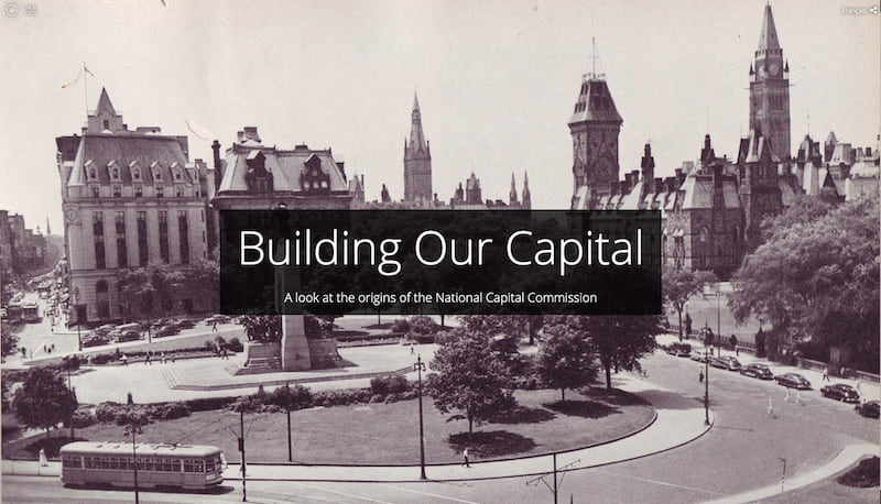
One of our first items to tackle was presenting the first 60 years of planning in the Capital in a way that was highly visual, interactive and easy to understand. We had no set format or list of rules to follow, but because so much of the NCC’s planning content is map-based, I knew that Esri Story Maps had something to offer us by bringing some of the old, static plans and policies to life in as an interactive narrative. Plus, we had success in using story maps for other Web projects at the NCC, so the group was comfortable with me prototyping an application that eventually became the Building Our Capital story map (which, coincidentally, has also been selected as the Story Map of the Month for April).
The main reason I chose Story Map Cascade as the template for this story map was the functionalities found within immersive sections, both from the point of view of an author and as an end user. Immersive sections allow story map authors to manipulate map actions by disabling map controls, turning layers on or off, zooming in, zooming out or panning to an area when setting up the display of a web map.
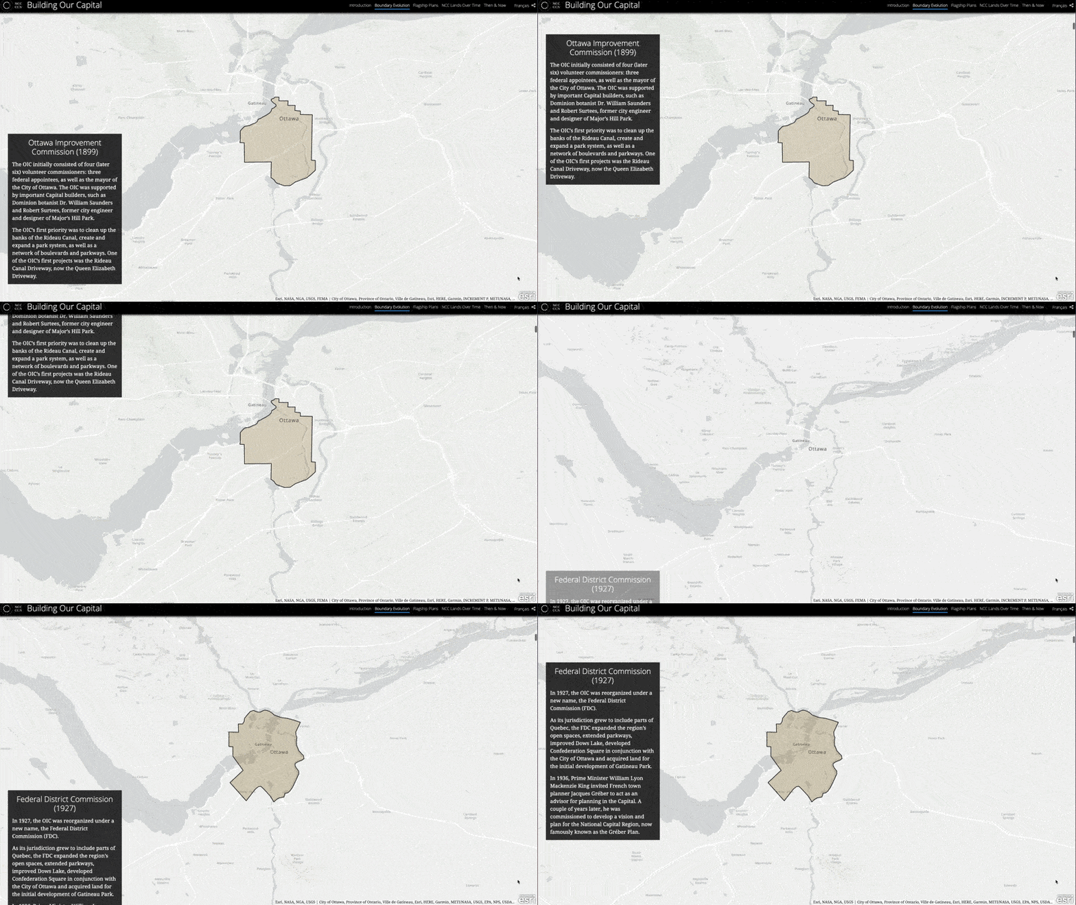
I knew that in order to show how the planning boundaries have changed over time, I was going to have to start at a large scale in 1899 when the organization was responsible for only a small area, then eventually zoom out to a small scale to capture the entirety of the region that is covered by the National Capital Act today. By being able to set each map view to appear how I wanted it to with the map controls disabled, the transition from each boundary by year is seamless and readers do not have to worry about zooming or panning around the map—it happens for them as they scroll. The floating panels included text to describe what is being shown for each year, sequentially. I used this same technique for the overview of NCC land ownership by year shown later in the story. The big advantage here is that Cascade relieves the reader from having to perform map actions and allows them focus on the narrative.
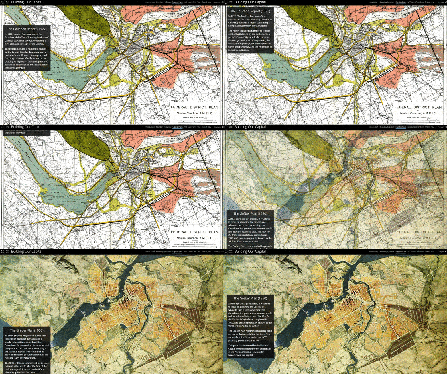
Immersive sections within Cascade also lend themselves well to presenting high-resolution images in a full-screen format. I knew that for the section of the story focused on historic plans, I might have a few nice, static maps or visuals to use but no actual web map component. So, in this case, the static map or image filled the screen as we overlaid text describing the main takeaways from each plan.
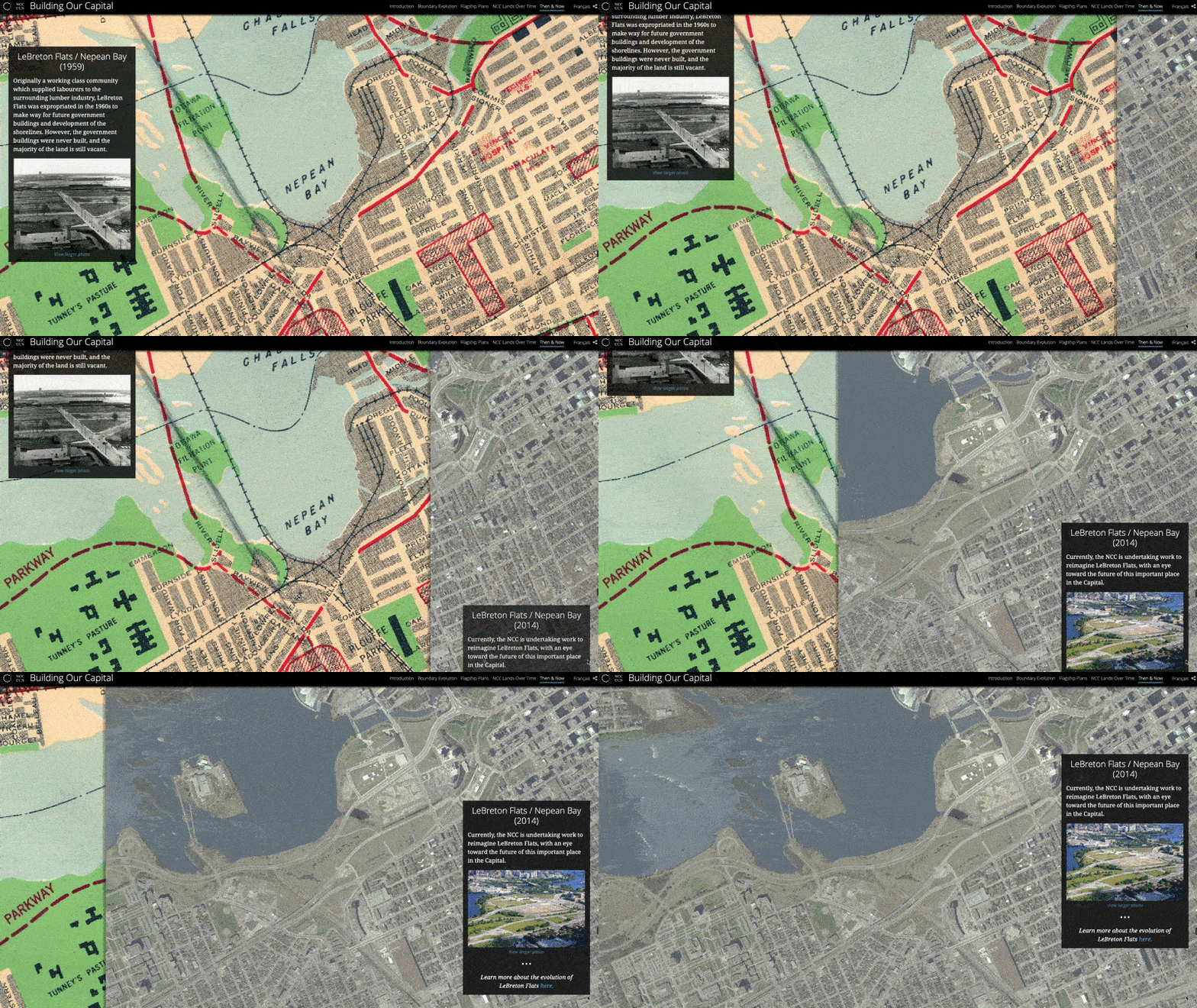
Something that we really wanted to include in the story was a comparison between the 1959 NCC Street Map and our modern-day aerial photo at a few flagship sites around the Capital. 1959 was the first year of existence for the NCC and we had a copy of the published paper street map from that year as a georeferenced TIF, so I used ArcMap to export two high-resolution images of each site at the exact same scale, extent and pixel size: one with the paper map visible and one with our modern aerial view. I was able to bring these into an immersive section and use the ‘Swipe Horizontal’ option when transitioning between each image. The result for the reader is a swipe action as they scroll between the street map and the aerial image for each site; it’s almost as if they are peeling back a piece of history and looking at what’s on the ground today.
In summary, the immersive sections found within the Cascade template allowed us to create a highly visual narrative that is not dependent on a reader performing any tasks other than reading. The success of this story so far also demonstrates that story maps can play an important role as a communications tool for organizations that are rich in map-based content.
You can learn more about the NCC’s celebration of 120 years of Capital Building here.



Article Discussion: