We all know the adage a picture is worth a thousand words. In the world of transit advocacy, that picture can be the difference between a “maybe” and a decisive “yes.” Decision-makers on Capitol Hill, at state transportation departments, or in regional grant offices are inundated with data, reports, and endless slides of information. Their attention is understandably overburdened, their schedules packed, and the transit competition for every dollar is fierce. As an agency, if you can compress a complex economic perspective into a single, instantly understandable visual in your proposal, you give yourself a rare advantage: the ability to firmly capture a busy mind in the short window of a first impression.
Geographic Information Systems (GIS) is the tool that makes this possible. By simply upgrading how we present our information and our story to tell, GIS creates a visual narrative that is both quantitative and insightful. A map shows not only how much transit moves, but where it moves, who it moves, and what economic activity follows. The result is a story that a traditional bar and pie chart report simply cannot convey in a few minutes.
Transit as an Economic Mobilizer
Saying that “transit is an economic engine” is not a feel‑good slogan; it is backed by hard data. In September of last year (2025), the American Public Transportation Association (APTA) released a comprehensive study that quantified the sector’s contribution to the U.S. economy: transit has a $93.4 billion annual economic output, and directly employs 430,000+ people with full‑time jobs. It also indirectly supports millions of jobs across private‑sector supply chains and generates economic activity from approximately 87 % of all its trips. These numbers confirm two complementary realities. First, transit is a massive employer, not only of drivers and maintenance crews but also of engineers, planners, IT specialists, and countless other workers. Second, the vast majority of rides—whether it’s a commuter heading to work, a student traveling to a university, or a shopper heading to a grocery store—directly generate economic activity by linking people to jobs, retail, health care, and other essential services.
Beyond the headline figures, transit’s ripple effects reach into micro‑economies, and its statistics often remain invisible to the average person. Consider the following:
- In construction and materials, every new light‑rail line requires steel, concrete, signaling equipment, and specialized labor. Suppliers particularly in the Midwest and Southwest see order spikes from transit whenever there is construction, that can sustain local factories for years.
- In professional services, engineering firms, environmental consultants, and legal practices also experience sustained demand whenever a transit expansion is planned.
- Agencies are now going a step further and creating business interruption funds and other initiatives to support locally impacted business during construction, to minimize the impact of the disruption.
- Transit also creates recurring revenue streams for software companies and hardware vendors, including real‑time passenger‑information systems, contactless fare collection, and data analytics platforms.
These supply‑chain linkages are not confined to the city where the project is built; they usually span a nation, if not the world, creating a web of economic interdependence that amplifies the ROI of transit’s involvement. Yet—again—because the story is dispersed across many sectors and geographies, it is rarely told in a cohesive way—unless you use GIS to stitch the pieces together.
The Science Behind Location Analytics
A typical funding application includes data tables of projected ridership, a cost‑benefit analysis, and a detailed narrative that describes the benefits. Quite often, these elements don’t explore visualizing a more detailed spatial context of the impact, which is inherently geographic. Asking readers to do mental math on rows of numbers, footnotes, and prose is a lot. The effort required to see the “big picture” is often too high, especially when the examining audience is juggling dozens of other written proposals. By visualizing the proposal and its benefits with location analytics, you’re letting pattern‑recognition faculties do the heavy lifting of telling the story for you.
Turning Data Into a Persuasive Visual Narrative
I once worked with a marketing team to do an analysis of contractors and consultants that engaged with my agency. There was a major funding opportunity ahead, and we thought, what if we could show that our agency supports businesses nationwide? Using data we got from the finance team, we created a one pager that told an even greater story than what we had originally imagined. The resulting visual showed a web of contracts stretching from the Pacific Northwest to the Gulf Coast, instantly communicating that the agency’s spending was a catalyst for economic activity far beyond its own service area. Our executives were now armed with a compelling visual in addition to their talking points. We would not have been able to do that without leveraging location analytics. It cost us nothing but a little imagination to deliver (ok, we had to have the software and the data, but you get the point). We were spatially empowered to be able to do this on the fly.
Here’s how I typically go about leveraging GIS to tell a better story:
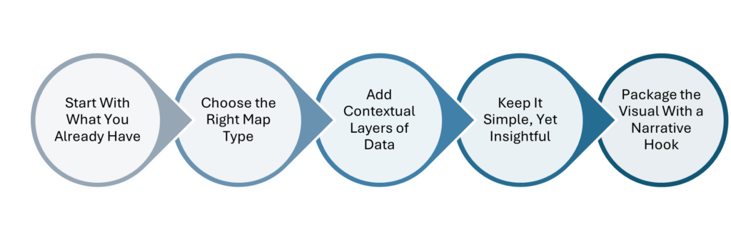
Start With What You Already Have
After you’ve defined what story you want to tell, look in house for the content to tell it with. Most transit agencies already collect the core data needed for a GIS‑driven story: ridership counts, service frequency, financial data, demographic and socioeconomic data, for example. The key is to re‑package that existing data in a spatial format, then load them into a simple mapping tool—ArcGIS Online would be my choice. From my previous example, we pulled contract‑award data from the finance department, geocoded the vendor addresses, and plotted them on a map.
Choose the Right Map Type
A well‑chosen map type reduces the need for explanatory text; the visual itself tells the story. Clarify the funder’s ROI focus—jobs, tax revenue, congestion reduction, etc.—and geocode the data, applying clear symbology and layering complementary datasets.
Add Contextual Layers
A single layer rarely convinces on its own. Combine at least two complementary layers to create a cause‑and‑effect narrative. For example, layer your transit service area and routes (if not too complex) with one that shows economic activity – such as the number of jobs, schools, or services in general, within a half‑mile buffer of each stop. The juxtaposition makes it obvious that each stop is a node of economic activity, turning a map of your system into a concrete, location‑specific impact.
Keep It Simple, Yet Insightful
A funding decision maker does not need a full GIS workflow; they need a clear takeaway. Limit the map to three to four visual elements, use a clean legend, and include a concise caption that states the key insight in one sentence. The visual should be printable on a single page and easily embeddable in a presentation slide.
Package the Visual With a Narrative Hook
Even the best map can use a short, punchy narrative that frames the visual, for example: “Every dollar spent on our transit contracts fuels jobs in 42 states, creating a nationwide economic impact far beyond the tracks we build.” Follow this with your map, then close with a call‑to‑action that ties the visual to the funding request, like “An additional $150 million in capital funding will add 12,000 jobs and unlock $2.3 billion in private‑sector investment over the next decade, in addition to providing community benefits.”
It would be naïve to claim that a beautiful map alone guarantees funding. A successful grant or allocations request still requires:
- A clear financial position that shows cost‑effectiveness and responsible use of funds.
- Clear alignment with policy or grant priorities such as climate goals, equity, or congestion reduction.
- Stakeholder engagement to show community support and inter‑agency collaboration.
GIS, however, amplifies each of these components. Financial models can be linked to spatial outputs, showing where cost savings will occur. Policy alignment becomes evident when you overlay where climate‑resilience zones or low‑income neighborhoods are on your service map. Stakeholder support is easier to achieve when you can point to a map that shows the geographic distribution of community partners, contractors, and beneficiaries – again, where they are.
Put Location at the Heart of Your Funding Story
The bottom line is simple: the better you can do to get a compelling, location‑driven story into the hands of decision‑makers, the higher your chances of securing the money you need. GIS does not require a massive new data collection effort; it leverages the data you already have, adds spatial context, and transforms it into a visual narrative that is instantly understandable.
So, the next time you sit down to write a grant application or prepare a briefing for a senator, ask yourself: What does my data look like on a map? How will I stand out from the crowd to show the value of an investment in us? When you combine visual power with solid financial analysis, clear policy alignment, and stakeholder endorsement, you create a funding package that is both credible and memorable. When every agency is competing for limited dollars, the agency that can show, in a single map, how its investment will generate jobs, revenue, and equitable mobility will be the one that gets the “yes.”

![Hello [Transit] World!](https://www.esri.com/en-us/industries/blog/app/uploads/2026/01/googleshareimage_helloworld.png)