I’ve got a visceral aversion to those blocky white halos around labels that used to be such a part of the look of an online map. It goes back to my days as a print cartographer, when we did all that we could to break lines and symbols around labels without affecting the background. In the manual cartography days, that meant painting the lines back from labels on a film negative
On computers, we developed sophisticated tricks involving overprint settings and 1 percent color values. They worked really well, but they confused and irritated our printers. Eventually we had software that could block background symbols, selectively—what we called variable depth of mask. For example, we could block out road casings but leave the background colors intact.
But online maps are different. They work in RGB, and they are dynamic, which doesn’t lend itself to this type of solution. In the early days, the screen resolution made the halo an essential part of achieving any sort of clarity. These days, resolution has improved to the point where an online image is as clear (if not more so) than a printed image.
Despite that, the halo is not going away. In fact, my recent work with trying to build accessible basemaps has proved that, if anything, it is coming back. The relationship between the text and its background is a key part of the developing standards for visual accessibility online.
The Problem with Halos
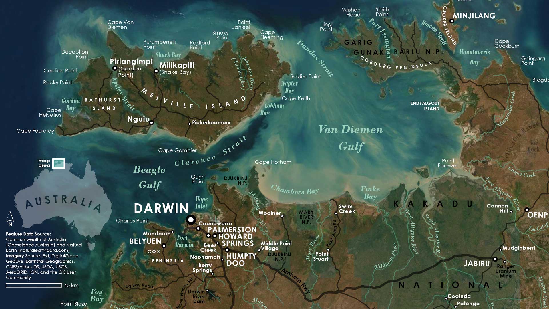
I work with the basemaps team at Esri. The complexity of most basemaps epitomizes the problem: How do you maintain the legibility of labels over the top of a dense network of lines and symbols and do this without breaking up or concealing background information?
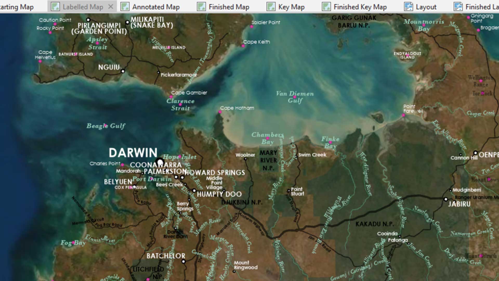
Well, you can subdue the symbolization so there is nothing that competes with the label, but that may give you a washed-out and confusing map. Or you can, (and this pains me) … add a halo to the label. Figure 1 is an example of a label over a busy and intrusive background that is adapted from the National Geographic Style basemap. In Figure 2, that label has a blocky white halo—the sort that I hate so much. So how can we minimize the destructive effect of the halo? Well, it’s a lot easier than it used to be, and we have various tricks at our disposal now.

Don’t Make It Too Big
A label halo doesn’t need to be so big that it dissolves into a single block. Adjust the width down until you find the point at which you feel it no longer works, then nudge it up again. (Compare Figures 2 and 3 to see the effect of a thinner halo.) The value you end up with may depend on the size of your labels and the amount of interference they face.


Don’t Use White
Well, if the background of your map is predominantly white, then it makes sense, but if not, white can be jarring. So, change the color of the halo to be the same as the background, as shown in Figure 4. If you don’t have one predominant color, then change the halo to something neutral. Experiment with blends of all the background colors to find a suitable compromise.

Add Transparency
Transparency (or opacity, if you are working with vector tiles) is your friend in this circumstance. Opacity is the reverse of transparency. The lower the opacity setting, the higher the transparency. You may be able to set either as high as 50 percent and get enough of a muting effect to make the halo work. If you are using a color halo, then try adjusting it a bit, and then balance the color against the level of transparency to make the halo as innocuous as possible. In the example in Figure 5, with a high degree of transparency set, white may be more effective because the halo will adopt a subdued version of the background color.

Vector Tiles
If you are working with vector tiles, there is another tool you can use. Open your map in the ArcGIS Vector Tile Style Editor, choose a label, and look for the font settings. You will find halo color, width, and opacity and another option: blur. Use this setting to soften the edges of the halo. Experiment with adjusting the width of the halo and the blur value to find a good combination. Figure 6 shows a good example of the result. It has a slightly lighter version of the background color with a blur.

So Halos Are Good Then …
Halos can be good. I mentioned my work with accessible basemaps. Web Content Accessibility Guidelines (WCAG) suggest that there should be a contrast ratio of 1:4.5 between a piece of text and its background. On maps, halos are an effective way to achieve this, and that’s why I see them coming back.
I would still rather not use them, but that’s a personal thing—at least in part. Anything you can do to make map information clearer is a good thing, but that means all of it, and not just labels. So if you do use a halo, your aim is to make it as effective and as invisible as possible. If a user can read the labels on a map easily, but is not aware of how or why, then you have the balance about right. These concepts can be used, in any combination, to try to achieve this.
About the author