
July 16, 2020 |
Greg Milner | GIS for Good
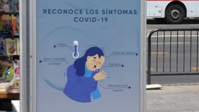
Chile has achieved one of the quickest distributions of COVID-19 vaccines in the world. By mid-April 2021, more than 50 percent of the population had received at least one shot, well beyond any other Latin American country and behind only a few countries elsewhere in the world.
Chilean epidemiologists credit this rapid response to both the country’s network of clinics—placed even in the most remote regions—and its modern information infrastructure that receives input from every community.
“We incorporated the concept of territorial intelligence to share data with partners and the general population so they can make better-informed decisions,” said Cristián Araneda, executive secretary for the Chilean National System for the Coordination of Territorial Information (SNIT).
During the pandemic, SNIT gained stature because it spans all ministries as a permanent mechanism for institutional coordination. A regular meeting led by Julio Isamit, the minister of National Assets, convened to discuss the status of COVID-19 across all territories and to share Ministry of Health data. A team of analysts created the country’s COVID-19 case index and vaccination index to analyze and present this data to the various ministries to gauge impacts and guide policy.
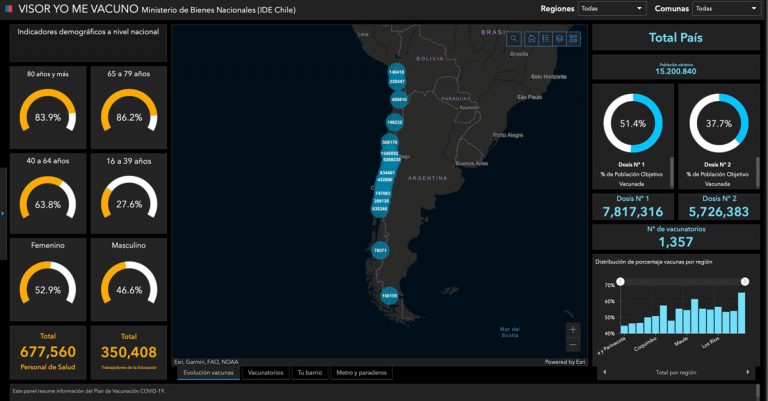
SNIT also worked to share COVID-19 updates with the public. The team first created the COVID-19 dashboard to provide a way to see and share infection rates. They quickly pivoted to track progress on vaccine distribution with the #Yo Me Vacuno (I get vaccinated) dashboard.
“The first thing we asked ourselves was why, what is the purpose of the dashboards?” Araneda said. “Our goal is keeping the public informed on progress and giving citizens a tool to make decisions. We want to be transparent and improve the quality of life. We also want to share good news, such as with our elderly population who are so happy after getting vaccinated, they feel as if they have another chance at life. Now in Chile, the population has the same information that the President of Chile and the Minister of Health have to make decisions about the pandemic.”
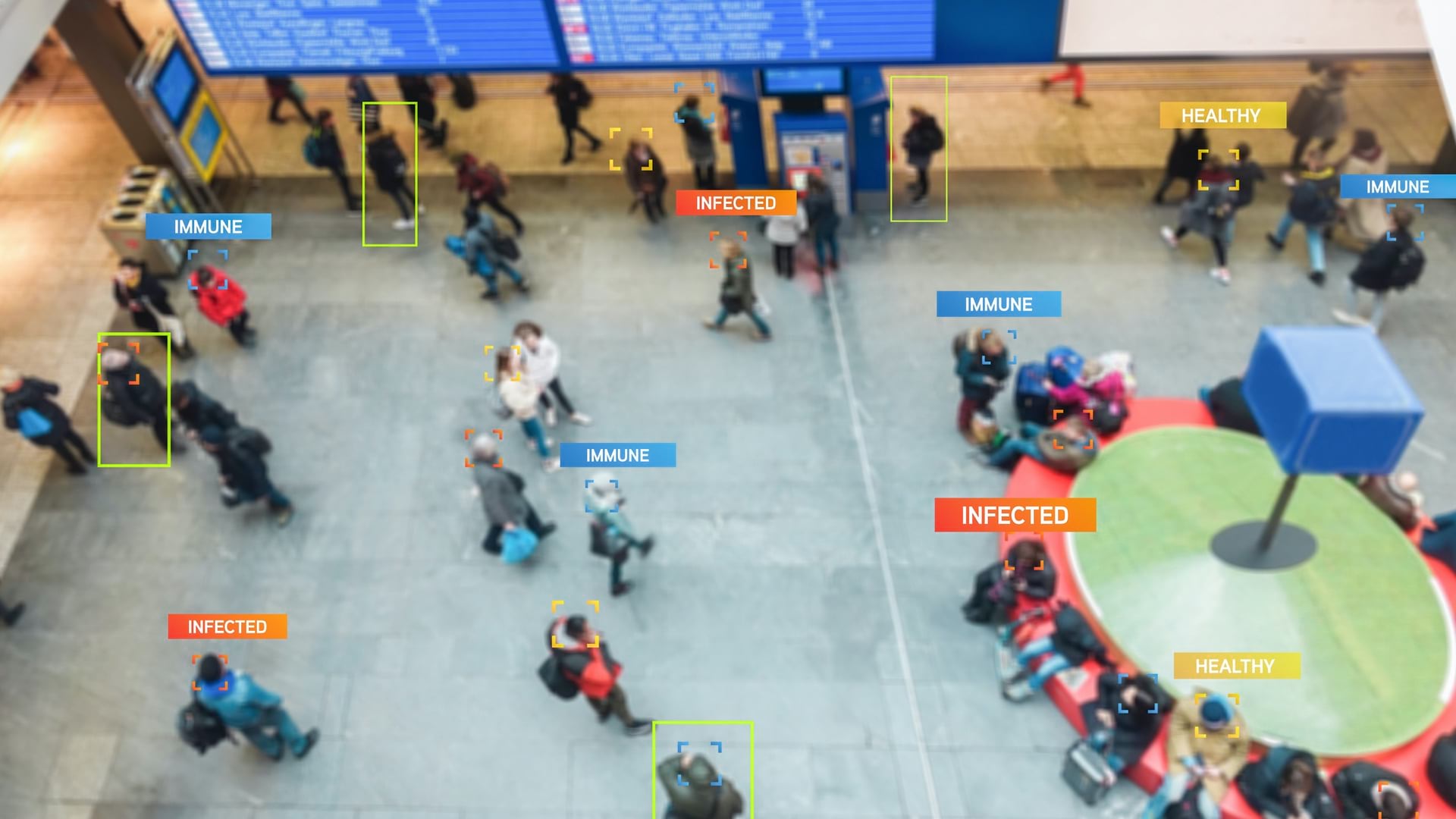
SNIT, also known as IDE Chile, is the spatial data infrastructure organization that established a data exchange mechanism and optimized the management of geospatial information in Chile. This includes many datasets regarding people, energy, environment, transportation, natural resources, government property, and disaster response. Every dataset SNIT manages contains the foundational element of location to be visualized and analyzed as layers on a map using a geographic information system (GIS). Now that SNIT has aggregated all the data, they spend more time on analysis to generate knowledge.
“Our territorial intelligence policy is intended to get us closer to the population,” Araneda said. “We are very technical, but we know that maps can tell a better story than raw data and present the information in a way that makes it easy for the general public to absorb and understand.”

With the COVID-19 crisis, SNIT helped the Ministry of National Assets become a trusted source for public guidance, allowing everyone to see infection rates as well as vaccine management and distribution. The COVID-19 dashboard alone has received more than 4 million visits in this country of 17.5 million people. The dashboard approach has been successful with the public, politicians, and the media.
“Today, it’s not uncommon to see the President making decisions using the COVID-19 dashboard or talking about the dashboard on television,” Araneda said. “Every week we can with famous doctors on TV presenting information and drawing conclusions with the dashboard in the background.”
For every effort, SNIT applies great rigor to get the representation of the data right and make the tools easy to understand.
“We run a validation step with people who are not GIS specialists to make sure users can understand the details at a single glance,” Araneda said. “I also want to emphasize the importance of our multi-disciplinary approach to gain a variety of perspectives and to avoid reworking a project at the final stage. We have a well-tuned development process, like any R&D center, that allows us to achieve quick implementation.”
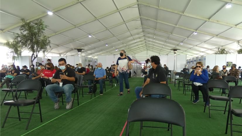
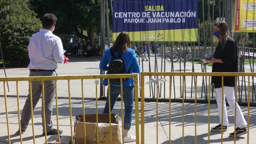
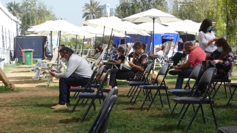
In preparation for vaccinations, SNIT analysts first used GIS to determine the location of vaccination sites. The vaccination team could look at sites and data on a map to consider such things as how to reach the most people, and to make it easy for the public, including factoring the location of metro stops.
Next, the team created the Yo Me Vacuno dashboard to inform the public about the progress of the vaccination campaign while providing a map to guide people to vaccination hubs. It took SNIT just 10 days from the idea of the vaccination dashboard, to receiving and processing the data, and launching it for public use.
“Showing the vaccination hubs helps the public make fast decisions,” Araneda said. “It gives people official up-to-date information without confusion, so people can go to their nearest vaccination center, for example.”
Measuring response to the Yo Me Vacuno dashboard has been done in a more qualitative than quantitative way. Rather than views of the dashboard, SNIT has been tracking public sentiment.
“We have seen comments on social media and our website, such as ‘Thanks to this dashboard I have been able to get a vaccine quickly and safely,” Araneda said. “People are taking the time to let us know it has had a positive impact on their lives.”
During the pandemic, the SNIT team put together many dashboards on other topics such as which national parks or small businesses are open.
They also built a dashboard with voter registration information and demographics for Chile’s election coming in late May when voters will elect governors, mayors, city councilors, and members of the assembly who will draft a new constitution. This dashboard is very popular, and the public has come to expect informative and interactive maps.
“Without a doubt, awareness of GIS has grown during this crisis,” Araneda said. “Various government departments and non-governmental organizations are getting in touch with us to set up more systems because they now understand how important these systems, maps, and dashboards have become.”
Agencies and other groups are discussing ideas for future dashboards, such as systems for fire fighters, environmental issues, and maps for children. SNIT’s efforts have been recognized both inside and outside the country.
“Recently, the ambassador of Peru had a meeting with the Minister and one of the main points of the conversation was how to replicate the dashboard in Peru based on the Chilean experience,” Araneda said.
The country’s vaccination efficiency remains a marvel, but like most first-movers Chile has learned lessons others should heed. A recent rise in COVID-19 cases indicate that Chileans may have let their guard down too soon.
“The situation is very fluid,” Araneda said. “A month ago, we were very happy and claiming success, and now we are in quarantine again.”
Chile had been restrictive, with closed borders between March and November 2020. When cases dropped to less than 1,000, and to help a faltering economy, borders Chile opened its borders to international travelers for the holidays and summer season in the southern hemisphere.
Officials are attributing the latest surge to many factors, including new COVID-19 variants and the easing of personal protection steps such as masks and frequent hand washing.
“Right now, it’s very difficult for us to have a strategic long-term plan,” Araneda said. “Like before, we continue to have consistent meetings to look at data and make improvements to our response.”
Read more examples of how understanding the impacts of place leads to better health.