


August 24, 2021 |
Anne Taylor | Infrastructure
Scientists with the Kentucky Division of Water are looking for things the human eye can’t see—such as bacteria and levels of pollutants—to determine whether a waterway meets minimum quality standards. But in some places, eyes can see clearly.
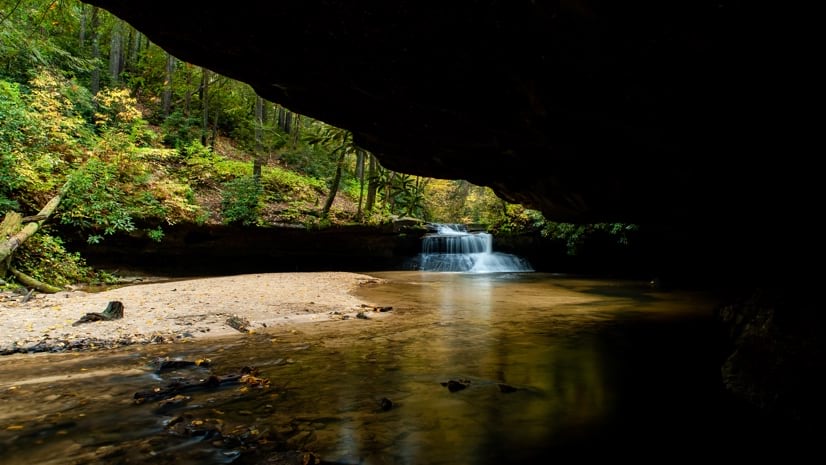
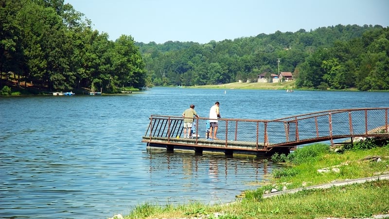
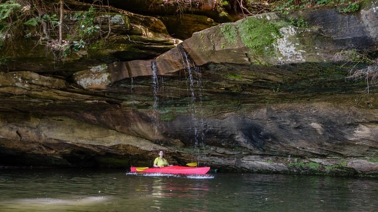
“I’ve been in streams in the middle of the Red River Gorge and it’s just lovely,” said Katie McKone, an environmental scientist with the Kentucky Division of Water. “Then I’ve been in other places I couldn’t wait to get out of.”
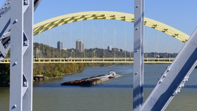
With nearly 92,000 river and stream miles, roughly 440,000 acres of lakes and reservoirs, and thousands of acres of springsheds (the area of land that contributes groundwater to a spring), Kentucky is rich with water resources.
To deal with the variability of water quality and report accurate findings to the US Environmental Protection Agency (EPA), McKone and her colleagues include geographic information systems (GIS) technology in their work to record, visualize, monitor contamination levels, and communicate results.
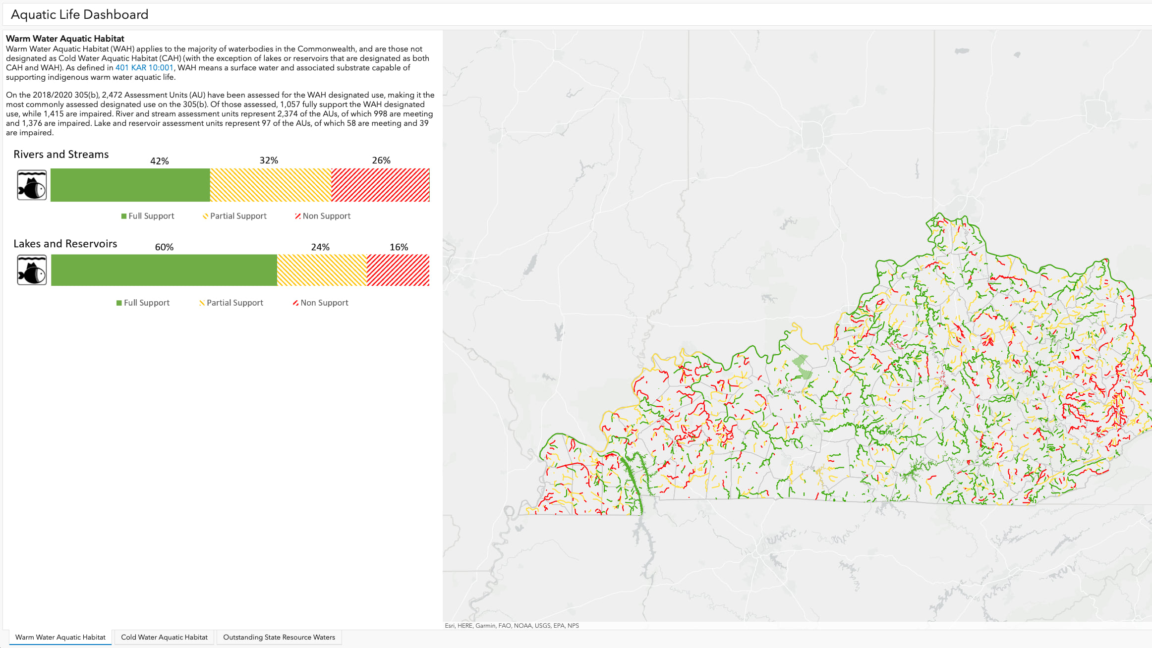
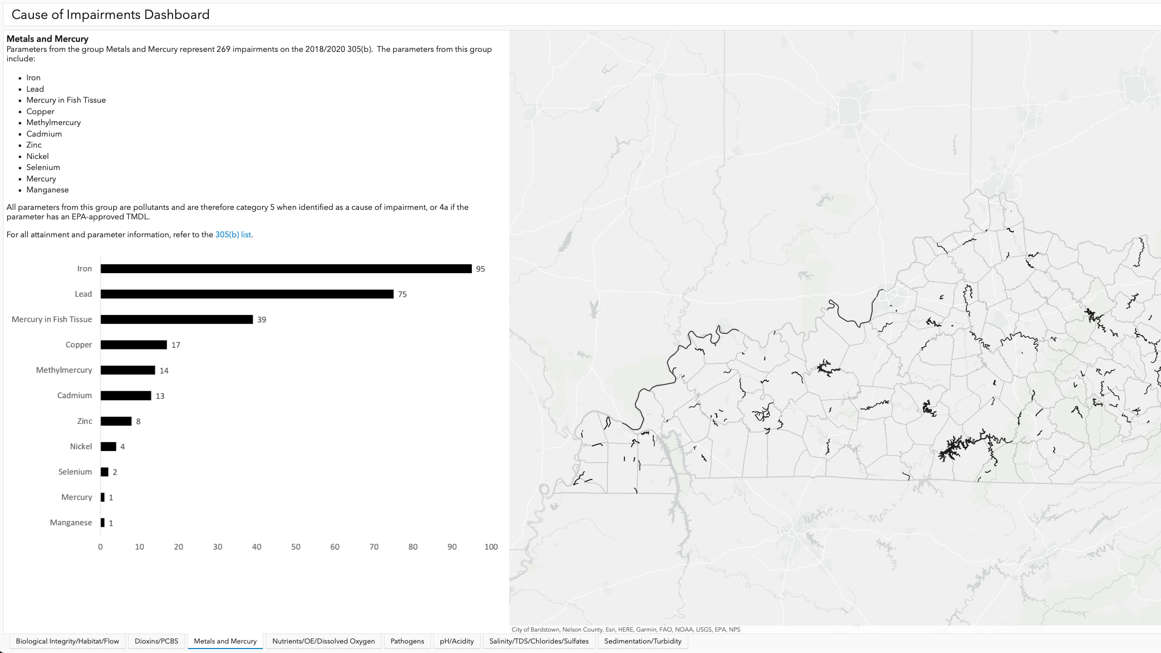
The US Clean Water Act requires states to report current water quality conditions every two years to the EPA. This year, in addition to the traditional integrated report, Kentucky developed an ArcGIS Hub site with interactive maps and dashboards showing assessment results and impaired waters, while also providing explanations for concepts central to assessment, such as designated uses, reporting categories, monitoring programs, and assessment methods.
“On a map, you can look at the state and zoom in and ask an almost infinite number of questions,” said Lara Panayotoff, supervisor of the total maximum daily load (TMDL) program at the Kentucky Division of Water. “You couldn’t cover a millionth of what we cover in a static report.”
For each assessed body of water, the maps and dashboards show what designated uses (such as swimming and fishing) have been assessed and whether it meets particular water quality standards. There are also links to TMDL reports, assessment summaries, and implementation summaries, so that all available resources for a waterbody are consolidated.
“You don’t want to get it wrong,” McKone said. “You don’t want to call it impaired if it’s not, and you don’t want to say it’s meeting the standards when it might be impaired. You have to have the data to support your decisions, and GIS is a key tool in the entire process.”
With GIS, the team of water quality assessors can see the contours of the land in 3D—the ridges that mark the extent of every basin and how the water flows across the landscape. Mapping technology also lets them review land use to determine the location of possible pollution sources, such as farms, coal mines, manufacturing, and wastewater treatment facilities. Maps showing layers of data about the land and its uses guides the assessors’ work and investigations.
From the perspective of those reviewing the report, an interactive map, rather than pages of spreadsheets, turned out to be a much friendlier way to consume and understand an impressive amount of information.
“Just meeting the requirement of the water quality report yields a 100-to-200-page document,” McKone said.
By building the report into an interactive website—integrated with narrative, maps, images, and dashboards—McKone had hoped to make it more accessible and transparent. “The report is an important resource where major statewide results are discussed, but it can’t present a lot of detail about a given question someone might have,” she said. “But the underlying information in the Hub site is different… it’s totally cliché, but it’s an onion. The interactive format allows a user to really peel back layers to get to what interests them most.”
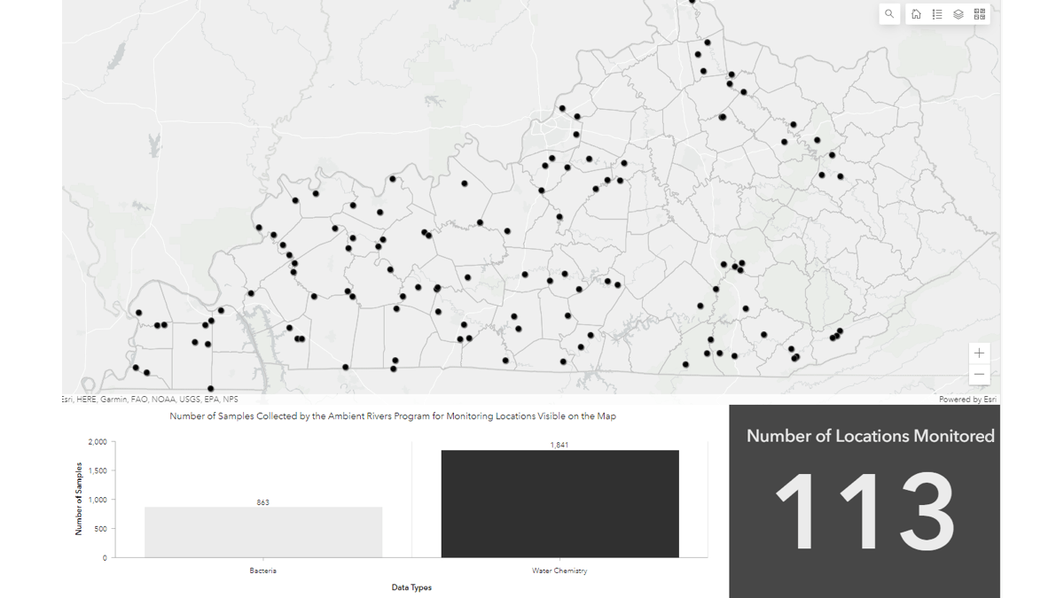
For the Kentucky water quality team and outside data contributors, the maps support ongoing work. Field biologists are endlessly gathering measurements such as water temperature and hardness, pH, and dissolved oxygen levels; then analyzing samples to detect metals like iron or manganese, nutrients including phosphorous and nitrogen, pesticides, herbicides, and bacteria.
With so much ground to cover across the state, the maps help everyone see where data has been collected and what the data says about the state’s water quality. Individual businesses that are regulated now have easy access to this information, as do residents interested in seeing the quality of their local waterways.
Residents often reach out to the Division of Water when they see something in the water that concerns them, or when they just want to know about the health of their favorite creek or lake. “We’d be on the phone with somebody trying to talk through their questions, using spreadsheets and fairly coarse maps from the report. It was just difficult to communicate with each other,” Panayotoff said. “Now, we can have them visit the interactive map and we can walk through it together.”
Putting the data on an interactive map has helped communicate water quality issues and successes, and has allowed the division to consolidate resources, educational materials, and program information in one place. While the water quality team knows that not all waterways will become the Red River Gorge, the hope is that all will meet water quality standards.
“We are public servants, and we need to be able to explain our programs so they can be understood by those we regulate and by the public, whose waters we are charged with protecting,” McKone said. “By engaging more people, the hope is to increase awareness about water quality issues, and the work that is being done to address those issues, throughout Kentucky.” Having more people engaged means having more partners in proctecting and improving Kentucky’s water quality.
Read more about how GIS supports watershed management.