displaying 998 results
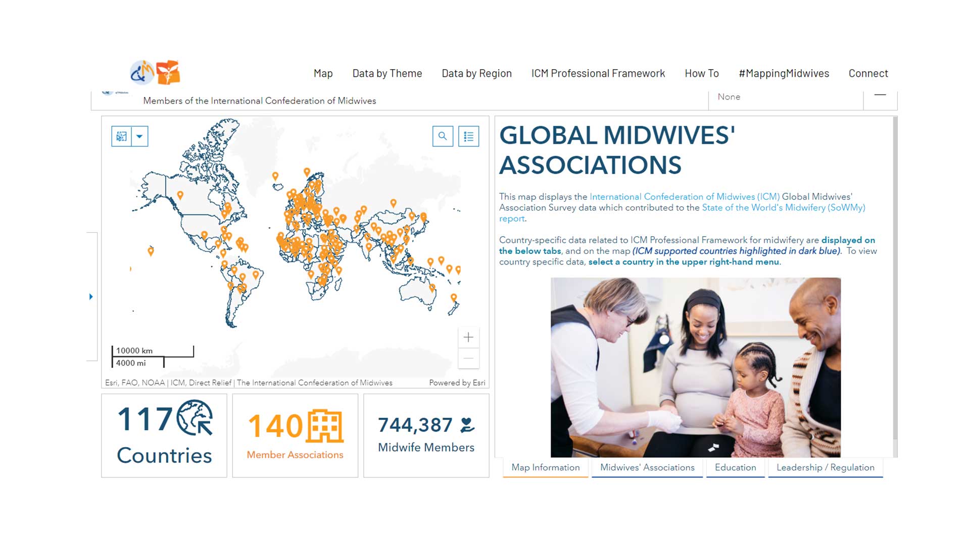
GISCorps volunteers aids Direct Relief to create a data sharing site for the International Confederation of Midwives.
Johns Hopkins University published a now-famous coronavirus dashboard to track and fight the spread of COVID-19 cases.

An enterprise GIS approach fueled workflows to increase safe water access on the Navajo Nation while keeping people informed about progress.

Charlotte Smith taught herself GIS using Esri’s Learn Lessons. Now, she’s a GIS professor and practitioner who’s making waves in the field.

The California Department of Public Health uses ArcGIS Open Data to share its open data with other experts and the community.
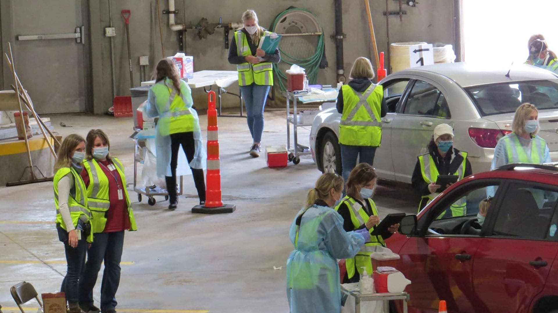
A drive-through influenza clinic went digital, thanks to a team in Carlton County, Minnesota, that used Esri technology.

Esri Press books: Mapping Community Health: GIS for Health and Human Services; Mapping by Design: A Guide to ArcGIS Maps for Adobe Creative Cloud

Deaths from extreme summer heat are preventable so public health teams use online maps that show neighborhoods likely to experience extreme heat.
Dr. Charles (Chuck) M. Croner, retired geographer, survey statistician, and editor at the US Centers for Disease Control and Prevention (CDC)...

DashFLUboard allows users to monitor wild bird migrations and connect outbreaks of Highly Pathogenic Avian Influenza (HPAI) around the world.

Researchers apply GIS technology on the micro scale to add image classification to spatiotemporally stamped human health data.

As record-high summer temperatures make many neighborhoods less safe, maps are helping public health teams find people who are at risk of dying.