Many enterprise systems require you to maintain special fields or implement a particular software to integrate with other systems. This not only stifles potential within an organization but makes collaboration with other organizations or public collaboration nearly impossible. This limitation is not present with a GIS and is the reason why the geographic approach is one of the most powerful techniques you can learn. Any two datasets that represent spatial information can be combined for analysis, even if they were developed by different organizations, with different objectives and no knowledge of each other.
This article is the third in a series where we explore how the GIS can be used to analyze and respond to risks against critical infrastructure. If you haven’t already, I strongly recommend you read the previous two articles where we discuss how you can calculate risk factors for infrastructure and how you can estimate the consequence of an asset failing. When we left off, we developed a model to calculate different scores for our assets using internal datasets but were still looking for a way to turn the data into meaningful information we could present to our managers and their stakeholders.
Context is everything
Up to this point, our model has been focused entirely on the intrinsic risks in our data. We can make our results more meaningful by leveraging the spatial aspect of our data and overlaying it with other public or paid datasets to help identify additional risk factors. Maybe we want to identify metal pipe installed in soil known to be more corrosive, we may want to incorporate zoning information from a county landbase dataset that identifies high-consequence areas.
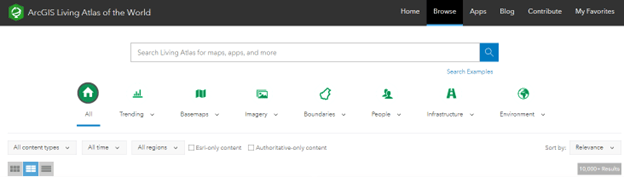
One easy way to add context to our maps is to leverage the ArcGIS Living Atlas found through ArcGIS Online. This repository contains thousands of layers that we can use to provide a wealth of additional context to analysis using both desktop and web applications.
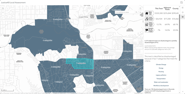
One of the most important pieces of spatial context to consider in a project plan is information about the communities surrounding the work being performed. In the earlier days of spatial analysis, you may have pulled in raw demographic data; however, using the Living Atlas, you can pull in datasets that have already been analyzed and classified to help you make more informed decisions. In our example, because our project is focused on improving water infrastructure. One example of a layer in the living atlas that is of interest to this problem is the Justice 40 layer. This layer contains an index that identifies communities that are disadvantaged according to one or more criteria. For our model, we can use information about whether the community is lacking in water and wastewater investment or has known water and wastewater risks. By overlaying our project boundaries with areas that we know have historically lacked investment we can identify locations where investment will make the greatest impact.
At this point we now have many data points that give us a comprehensive picture of the risks in our system, along with a means of establishing project areas, as well as a methodology for identifying communities that would most benefit from these projects. The next question is, how do we turn this data into something actionable?
Analysis
In a traditional capital improvement planning process, a consultant would typically be hired to develop a model that produces reports that could be used by management. The problem with this approach is that the models are relatively static, and the process of maintaining or adjusting the model is opaque and often requires re-hiring the consultant to make any adjustments. By using our own tools, knowledge, and the power of GIS, we can provide transparency to management about how these values were calculated and are fully capable of making our own adjustments to the model based on feedback from our stakeholders.
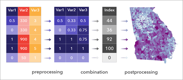
But how do you create a model that ties all this information together? One of the most common ways to calculate a risk model like this is to use a Composite Index.
Creating a composite index allows us to take all the individual values that we’ve calculated and create a model for weighting and deriving a score for each asset (or project) that reflects the values of our organization. A common workflow for achieving this would be to create a model or Python notebook that collects all the data points and then uses the Calculate Composite Index tool to produce an output layer containing all the scores for your projects.
The benefit of performing the work in-house, with existing toolsets, is that the entire process is transparent and can be easily modified to suit the changing requirements of your organization. One added benefit of this approach is that it becomes easy to create different indices using the same common datasets scores to prioritize projects using a different set of weights for various departments with different priorities. Operations may place a greater value on reducing the likelihood of an event occurring while an engineering department may want to prioritize projects that increase network resiliency and reduce the maximum consequence that any given failure can have.
Making sense of it all
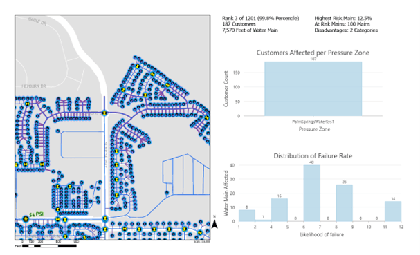
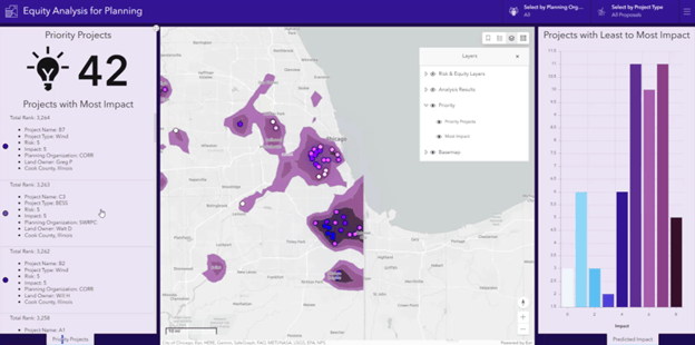
At this point we now have a clearly defined set of scores for each of our projects that allows us to quickly rank and prioritize hundreds or thousands of projects. The biggest challenge we face now is how to present our findings. Fortunately, ArcGIS provides many options for presenting your findings to your peers and stakeholders.
A common approach when presenting this information to management is to prepare slides or printed materials highlighting some of the key project areas identified by your research. In this case, you may use something like ArcGIS Pro to produce a spatial map series for each of your projects that highlights the risk factors and benefits associated with each project.
This approach is great for creating a highly polished, engaging, highly curated experience for a small audience. However, once the meeting is over you will need to stay engaged with your management, without the requirement of a formal presentation with every change or update based on their feedback. Fortunately, you can take the same data you used to prepare your static presentation and easily turn it into a web or mobile application that you can put directly into their hands. This not only provides them with immediate access to all the updates you make, but also allows them to become the experts as they present your findings to their stakeholders to get organizational buy-in.
Conclusion
The ability to quickly create compelling web and mobile applications is one of the most powerful tools a GIS Professional has in their toolkit. This helps turn data into stories and allows anyone in your organization to become a champion for your message. I hope that by reading this series of articles you’ve been able to learn new ways of applying geographic thinking to your daily life and can put these lessons in practice.
You can learn more about the best practices for this process by reading this technical article on creating your own composite index. If you want a quick overview of how a risk index can be used in utility and infrastructure applications, this article by Greg Baird of Cityworks is a good read to understand infrastructure risk assessments.


Commenting is not enabled for this article.