When you look at the window and see the beige haze that has been covering the United States, do you know how safe it is to be outside?
Air quality is a complex thing – there are different constituents like PM 2.5 (small particles), PM 10 (larger particles), and low-level ozone that can impact the air we breathe. Each of these changes hour by hour and day by day.
Luckily the U.S. EPA’s AirNow program has consolidated all of that information into air quality indexes (AQI). Now, accessing, mapping, and understanding the impact of that information is even easier with the Air Quality Aware application.

Using official EPA data available in ArcGIS Online and Living Atlas of the World, Air Quality Aware merges this and other contextual information like wind forecasts and at-risk population demographics to answer some fundamental questions.
What is Your Number?
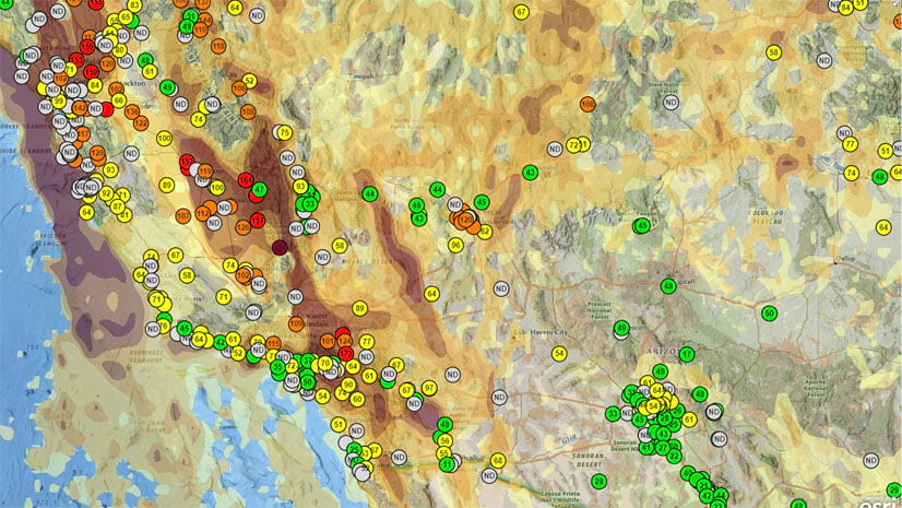
It’s a new catch phrase on the West Coast. With nearly 3,000 air quality sensors deployed around the United States, you can see the near real-time index and concentration values for PM 2.5, PM 10, and ozone near you. Are you a 47? No excuse not to go on that run. 415? Better stay inside and seal those windows.

Should we cancel outdoor plans for later?
Click on any location in the map (or search) and three circles will appear: the AQI now, the forecast for later today, and the forecast for tomorrow. Per the EPA, “much like a weather forecast lets you know whether to pack an umbrella, an air quality forecast lets you know when you may want to change your outdoor activities.”

When will the wind blow this smoke away?
Using the NOAA National Weather Service’s 72-hour wind forecast, you can see a graph with hour-by-hour forecasts for wind speed in your area. While winds may make fires, smoke, and air quality worse, usually they help clear the skies.

Which at-risk groups may be impacted?
The CDC has identified several groups as being at a greater risk for air quality health impacts:
- People with asthma or other cardiovascular conditions
- Elderly
- Minorities
- People living in poverty
- People working outdoors
Using the latest data from the American Community Survey, we have included several demographic summaries at the Census tract level (neighborhoods) to help identify areas with at-risk populations. A donut chart shows the percentage of different races living in the area. A series of statistics helps to break down different demographic components of the neighborhood, including:
- Percentage of elderly (65+)
- Percentage of asthmatics (based on asthma prescription data)
- Percentage of school age children 5 – 17 (maybe recess isn’t such a good idea?)
- Occupations that work outdoors and are more exposed to air pollution, such as police/fire, construction, delivery drivers, agriculture, grounds maintenance, etc.
If the values for these statistics are above the national average, they are displayed in orange.

Air Quality Aware is the latest in a series of easy-to-use applications available from ArcGIS Living Atlas of the world that try to simplify access to environmental and demographic information. Check out other apps such as Hurricane Aware, Sea Ice Aware, USA Wildfires, Drought Tracker, Public Policy Maps, and CovidPulse.


Intersesting and nice application.