With a handful of tricks, you can turn the most minimalist basemap into something positively decadent. In this video you’ll see the thoughtful and intentional use of blend modes, surprisingly simple use of the Vector Tile Style Editor, reckless and wild use of effects, and a blatantly mischievous use of paper textures from Living Atlas.
We’ll start with this, the Human Geography Khaki basemap and turn it into the Georgian-era-looking basemap thing…

The process is mostly one of fun exploration of effects in the form of fast and intuitive messing about with sliders. Here’s a how-to, if you’d like to see the process and follow along. And here is the Georgian basemap, itself, if you’d like to check it out or use it in one of your maps.
If you are like me, and just skipped to the end to see the results, here is how (in the event you liked the results) to add the Georgian basemap to your web map. Note: this map uses effects so it will not render as designed in ArcGIS Pro. It will work in the ArcGIS Online Map Viewer and apps.
Using This Basemap in an Existing Map
Here’s how you can make it your web map’s basemap. In the list of webmap options (Georgian won’t be in your list), find the Living Atlas button at the bottom:

Then search Living Atlas for Georgian:

Then, just, like, add it:

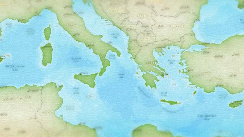
Here are some snapshots of the Georgian basemap…


And guess what? If you want to change it up, you totally can! Get some inspiration from the video to push and pull this basemap style in any direction you want. The visual capabilities for customization are brimming with opportunity. Have fun!
Love, John
P.S. The Old Timey labels are also available in Living Atlas if you’d like to give your basemap reference an 18th Century vibe.


Article Discussion: