A large subset of data from the American Community Survey (ACS) was recently added to the ArcGIS Living Atlas of the World. This data, sourced by the U.S. Census Bureau, covers topics such as housing, income, education, healthcare, and more. These ready-to-use ACS layers are updated annually to contain the most current 5-year estimates. This means that if you make a map using these layers, your map will always have the most current data!
Creating a useful map on a subject important to your community can be done in 4 easy steps:
1 – Find a topic of interest
2 – Filter to your area
3 – Map a new variable
4 – Finalize and save
Let’s get started!
Step 1 – Find a topic of interest
To find the current ACS data layers, browse the Living Atlas layers for a phrase that helps refine the results. For example, the phrase “current year ACS” will help you find the layers. You can find these layers by searching the Living Atlas website, or directly within your map by browsing the Living Atlas in ArcGIS Pro, ArcGIS Online, and others. You can also find the layers within this ArcGIS group that categorizes the layers by topic.
Step 2 – Filter to your area
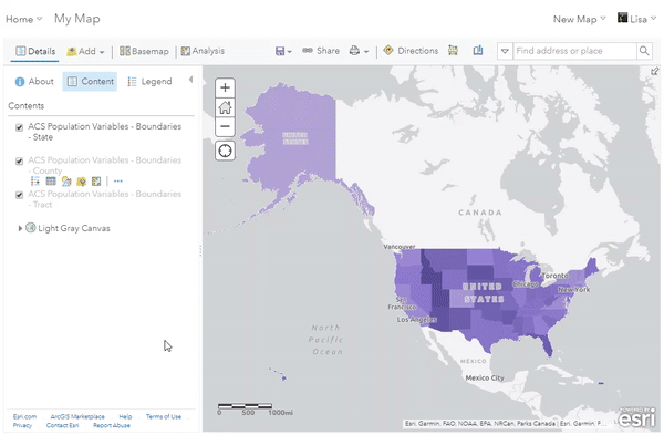
Each ACS layer contains state, county, and tract geographies, each with the same list of attributes. Start by deciding if you want to show all three geographies, two, or just one. Remove any layers you aren’t using so that the map isn’t cluttered with un-used layers.
Go into the layer settings to filter the layer to your region or area of interest. If you are showing counties, you can refine by state. If you are showing tracts, you can refine by state or county.
For example, the GIF below shows how the ACS Population Variables – Boundaries layer can be easily filtered to show only the state of Illinois in order to make a map more specific to Chicago, IL.
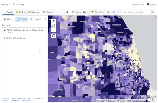
Step 3 – Map a new variable
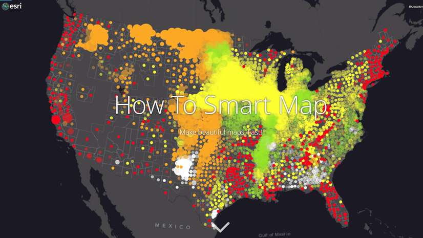
Within the layer properties, choose “Change Style” to adjust what is being shown on the map. You can use this interface, known as smart mapping, to easily explore different attributes within the layer. Smart mapping will offer you smart defaults based on the data from the layer.
For example:
- Map a percentage. The Living Atlas ACS layers contain some data values represented as percentages in order to save you the time and hassle of calculating them on your own. Smart mapping will offer you default breakpoints based on the
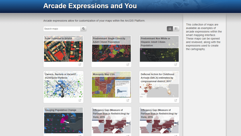
- Compare similar topics by choosing multiple related attributes and selecting the predominance mapping style. This shows a quick comparison of two numbers, and which one is larger. For example, this map of predominant education shows which education level is most prominent in an area.
- See a pattern using both color and size in your map. Choose an attribute that is a percentage and then choose the count (total) of that attribute. This will show you the distribution of a pattern and the count of where it is occurring. For example, this map shows the percentage of employed teens using color, and the count of total employed teens using size.
- Use Arcade to construct custom attributes. Add up multiple attributes, calculate an index, and so much more. For example, this map uses arcade to calculate veterans into different age categories and then compares them using a predominance calculation. If you use this method, make sure to name your expression with a meaningful title, since the expression name will appear in your map legend.
If mapping all three geography levels, we recommend starting with the tract level. This will contain the largest range of data. Then, copy the breakpoints into county and states, so that the colors in the map mean the same thing at every geography level. You’ll notice that the ACS layers have this configuration by default. We also recommend using meaningful breakpoints such as a national figure, or a goal that your city would like to reach. This blog provides some insight into setting valuable breakpoints.
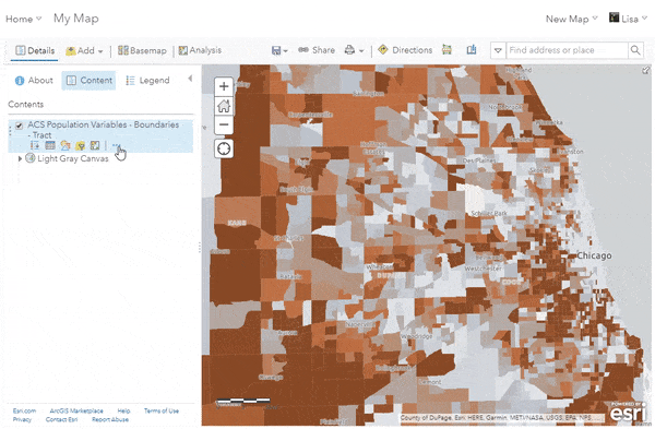
In the GIF below, you’ll see that there are many other attributes that can be mapped from this ACS layer. This example switches the mapped attribute to show one of the pre-calculated percentage values (% child population), and then simply changes the color ramp to make it unique.
Step 4 – Finalize and save
Each layer will have a default popup related to the attribute that is being mapped in the layer. Re-use portions of these pre-configured popups, or reset them and create your own unique popup using the attributes within the layers. Finish by choosing a beautiful and informative reference basemap such as the Human Geography Basemap.
Click Save at the top of the map to save your creation as a new web map. Web maps can easily be used within Story Maps, Applications, dashboards, and more.
In this example, we want the pop-up to only provide information about the youth population (<18), so we remove things that aren’t necessary. The map then gets a custom basemap using the Human Geography Basemap in order to provide a reference for freeways and other features that will appear on top of the data within the map.
Extra points for going one step further!
- Once you have your new filtered map, reuse some of your work to make more maps. Do steps 3 and 4 again with a different attribute, and save as another new web map.
- Add your own data to the map. Overlaying ACS layers with your data can show new patterns and relationships.
- Create a dashboard, Story Map, or other configurable app to tell a story about the data patterns.

Article Discussion: