Sometimes it seems we are obsessed with using red and green in our maps. It’s an easy option! Red for bad, green for good … yes? But some users have difficulty differentiating between red and green. About 8% of the world’s population (overwhelmingly, but not exclusively, male), suffer from some form of color blindness, and over 99% of them have a red-green deficiency.
However, it’s not an all or nothing prospect. There are differing degrees of color blindness, and no two people will see colors in exactly the same way.
So maybe we are overstating it! – The number of badly affected people is much smaller … And that red-green combination is such an intuitive connection …
Well, ask around your colleagues. I know of at least 3 people I work with on a regular basis who have problems with red and green, and those are the ones that are aware of it. Many sufferers are not, and they might find your map confusing, if not unreadable. At best they might think it’s a bad design.
But I need my red and green!
Well, try to get over it… but if you really must use them there are things you can do to make the map clearer.
The biggest problem is with mid-range reds/oranges and greens.
On the left is a red and green as seen by a person with normal color vision, and on the right a simulation of what someone with the most common deficiency, ‘Deuteranopia’ (green-blindness) might see.
Note, if these two look similar to you, you may have color blindness.

For people with this condition both colors tend to devolve into a muddy yellow. That suggests that one way we can make a distinction between them is to reduce the amount of yellow in one of these colors.
Let’s start with the Red. Here, using the HSV color picker, I’ve moved the hue away from the yellow:
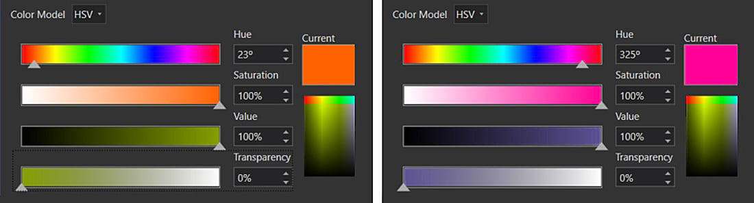
Use a color blindness simulator (I use Color Oracle) to see the effect. For Deuteranopia, there is a ‘sweet spot’ where the red appears gray (go further, and it will start to appear blue). Here are the new colors:

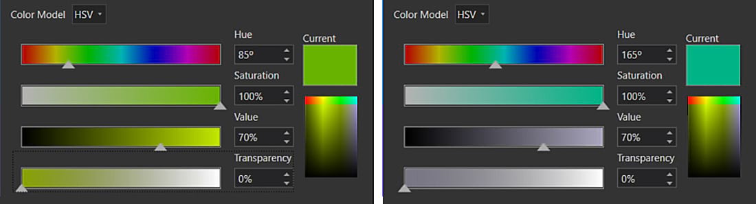
Now let’s switch this around. I’ve left the red alone and changed the green, again by moving away from yellow:

So that’s solved then …
Well, it depends on your personal definition of red and green. My choice of ‘red’ above is more of a magenta, and my ‘green’ is moving towards teal. But my example above is not the only safe red-green combination. Here is a webmap from Lisa Berry with a different take on it, showing US Census self-response rates (was it higher in 2010 (Red) or 2020 (Green)?).
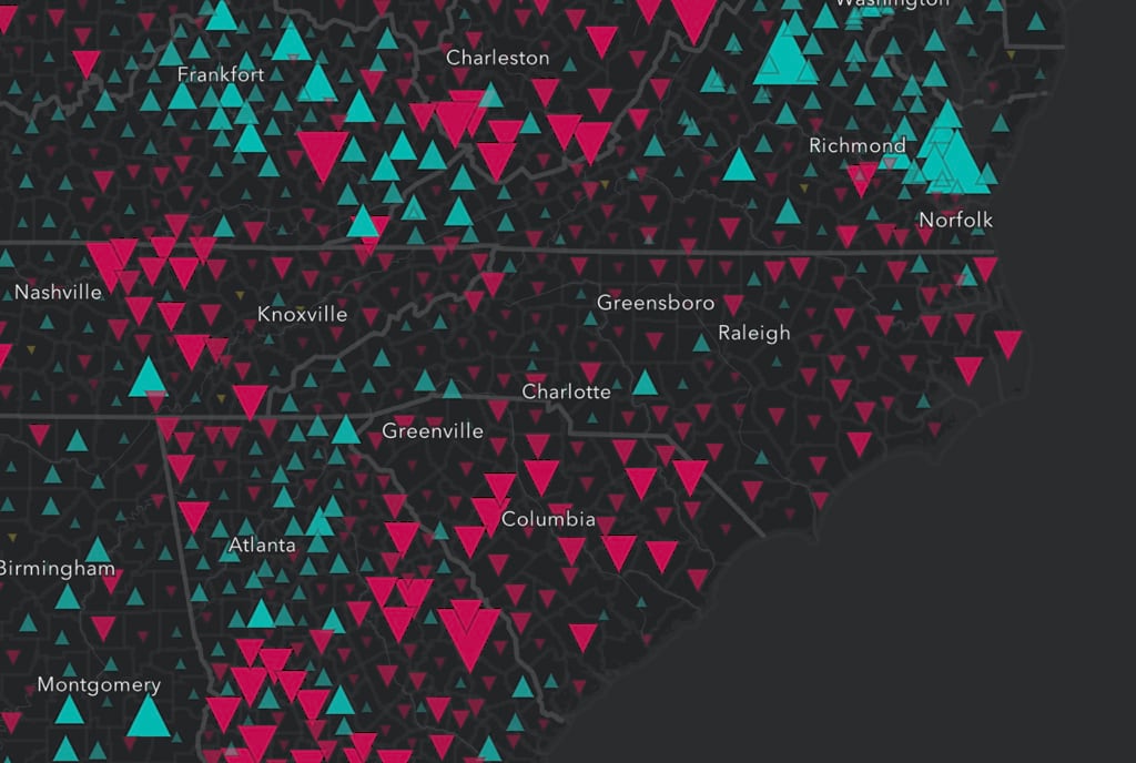
And don’t forget there are other forms of color blindness, including a small percentage of people who do not see color at all. Really, you should be taking them into account as well when you build your palette. Lisa’s map works for most color-blind cases, and it’s pretty good in monochrome as well.
It’s tricky, and it’s restricting, but it’s important. We are all part of the effort to increase understanding of data and maps, and that should include this 8%. So give it a chance! You will find that the more you work with color blindness in mind, the more intuitive it will get.
‘Peppers’ Photo by Steve Johnson on Unsplash


Article Discussion: