Many of the configurable applications available in ArcGIS Online allow you to choose a custom color scheme for the application. This lets you customize the app color scheme to match your organization colors, fit your app theme or just pick your favorite colors.
When choosing colors for your app it’s a good idea to consider the color contrast ratio to ensure that there is enough contrast between the text color and background so people with low vision can read the text. This is especially important if your web application needs to conform to 508 or WCAG 2.0 standards.
The WCAG 2.0 success guidelines require that text meet the following standards.
Contrast (Minimum): The visual presentation of text and images of text has a contrast ratio of at least 4.5:1, except for the following: (Level AA)
- Large Text: Large-scale text and images of large-scale text have a contrast ratio of at least 3:1.
- Incidental: Text or images of text that are part of an inactive user interface component, that are pure decoration, that are not visible to anyone, or that are part of a picture that contains significant other visual content, have no contrast requirement.
- Logotypes: Text that is part of a logo or brand name has no minimum contrast requirement.
If you, like me, have a hard time eyeballing text and determining if the contrast ratio is at least 4.5:1 then you’ll want to take advantage of one of the many freely available color contrast checkers.
My favorite tool for checking the contrast ratio is the Accessibility Developer Tools extension for Chrome. Installing this extension adds an accessibility audit and an accessibility sidebar to the browser’s developer tools. To test the tool open this sample app in Chrome then right-click the title text and select the Inspect option from the menu.
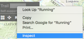
Inspect opens the developer tools with the element that contains the text highlighted to allow you to inspect the properties. Click the Accessibility Properties tab and view the contrast ratio. I like this tool because it shows you the current contrast ratio and if your colors don’t meet the criteria it suggests alternate colors that do.

There are many other contrast checkers available including the WebAIM Color Contrast Checker and the Pacielleo Group Color Contrast Analyzer. Do you have a favorite color contrast tool? If so, leave a comment with the details.

Article Discussion: