As the U.S. broils in the summer heat, it is nice to know that sometimes the weather can be just the way you want it. Well…maps of the weather.
Many of the real-time weather resources available in the Living Atlas of the World offer the ability to customize the display of the data. The key is looking for the Change Style icon within the service layer options while also exploring the attributes table for each layer.

Don’t see a Change Style option? Sometimes by accessing the REST service page that is linked in the bottom right of each item description page, you will find the REST link to the underlying features for each service. Add that link to your web map and change away! This workflow also applies to ArcGIS Pro: if you cannot access the Symbology options, adding the REST link to the feature service may open up the symbology options.
One of the most useful and flexible weather datasets available in the Living Atlas is the Current Weather and Wind Station Data layer. Open this map and you see plain old wind vectors. Explore this layer a bit more, however, and you will find a wealth of options. There are actually 11+ variables for each METAR or buoy location, including things like temperature, humidity, wind speed and direction, and derived variables like wind chill and heat index.

Heat Mapping of a Different Kind
Since it is the middle of the summer, I want the current weather map to focus on hot areas, but also with a nod to wind speed/direction. The following recipe is how I came up with the map below using the Heat Index variable mapped using Counts and Amounts.
- Color is used to indicate heat index and size indicates wind speed.
- The layer is duplicated and an arrow symbol is placed on top of the circle layer. Using the same attribute mapping (besides swapping the circle for an arrow) ensures that the two layers will scale evenly.
- The arrow is rotated using the Rotate Symbols option, based on the Wind Origin (Degrees) attribute. This step takes some trial and error and a good quality control – there are two arrow options (up and down). Referring to the original map, you will want to use the downward facing arrow in order to make the arrow point in the direction the wind is going. I know…not the meteorological standard, but it makes more sense to me.
Since both the circle and arrow are scaled based on wind speed, the windy areas are slightly differentiated in the map.
There are also labels indicating the temperature, humidity, and wind speed that appear when zoomed in by using the Visible Range option. Use the different label offset options so that they stack.
111 degrees Fahrenheit at Ontario International Airport? To quote Robin Williams, “It’s hot. Damn hot!”

And consider this map a BOGO: in the winter, the heat index attribute can easily be swapped out for wind chill.
Classing Up Active Hurricanes
There are currently three active cyclones in the Pacific and Atlantic, so we can also have some fun with the Active Hurricanes layer. Having lived through many hurricanes (and evacuations), I like a hurricane forecast map that clearly defines the storm intensity. Additionally, it is nice to know where the storm was, but more important is to know where it is going.
To start, I created 5 icon styles using a hurricane symbol and numbers 1-5 in the middle.

You will notice that the attribute table for the layer does not have the Saffir-Simpson scale (tropical depression, tropical storm, Category 1, 2…). Easy fix:
- On the forecast position layer, map the attribute MAXWIND with Counts and Amounts.
- Classify the data into seven bins that match the Saffir-Simpson scale.
- Load the custom hurricane icons to a server.
- Click the Legend menu and use the custom images for each class.
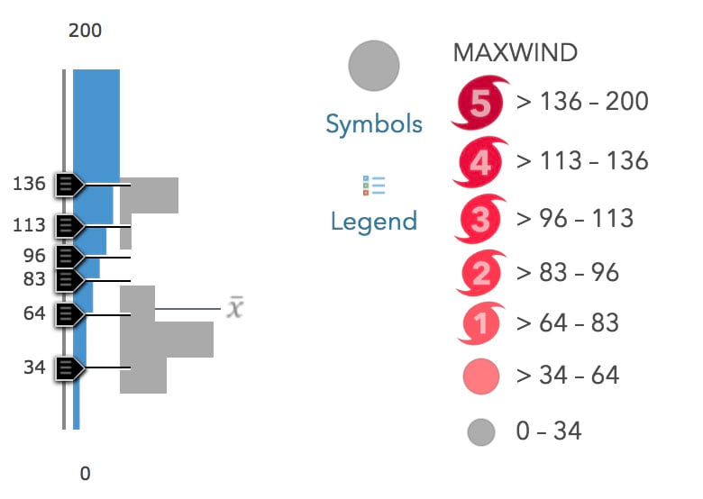
Granted, the Saffir-Simpson scale is not used for typhoons, since it is based on destructive potential in the U.S., but it is still a useful reference. I used the basic shape options for tropical depression and tropical storm, which render more cleanly than an uploaded PNG.
Other layers included in the Active Hurricanes dataset are also customized to match the cartographic style, albeit somewhat less prominent. And don’t forget to customize those pop-ups!

Considering the Basemap
While we’re at it, let’s take one of the gridded forecasts from the National Weather Service. I created two versions of the National Weather Service Precipitation Forecast. Why? To account for different basemaps. ArcGIS provides dozens of basemap choices, and with the new ArcGIS Vector Tile Style Editor, the options are endless.
I always like to pick the best one that minimizes noise and accentuates the data. Elements such as mountains or land imagery that are not integral to interpreting the data are minimized for excluded. Since we often combine multiple weather variables together, that “best one” will change from map to map. Plus some days I’m more of a light basemap person, some days I like a dark one. Some days I’m even an imagery basemap person, albeit rarely.

A general best practice is to have high intensity data values (e.g., heavy rain) in high luminance color values on a dark basemap and low luminance on a light basemap to provide the greatest contrast. This map uses the blue to yellow color palette from ColorBrewer2.og – my favorite for mapping precipitation. It gives a sense of “wet” while preserving the brightness function. Transparency is adjusted and the palette is inverted based on which map is used – easily done by using the Invert Color Ramp option.

Now I have three similarly styled maps that will update in real-time, making them a great start for a weather dashboard.
Have questions or comments about this blog? Post them in our GeoNet.


Commenting is not enabled for this article.