During the devastating fire season this past year I looked around at the data services that were available and wondered at how I might wish to see them presented. What visualization method honored the phenomenon? Could fire size be shown naturally on a map? What about the containment percent or the age of active fires? What might be a way to show the landscape of all active fires at a glance? Things like that.
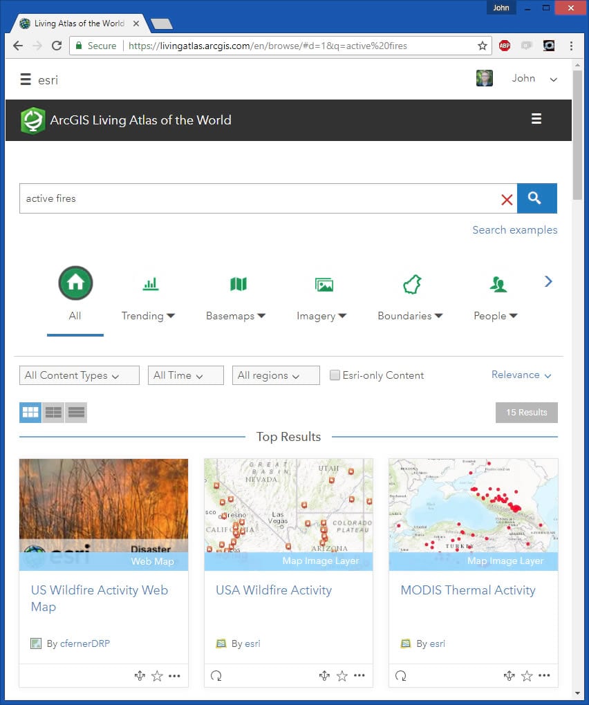
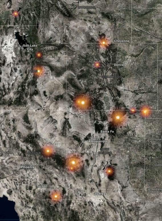
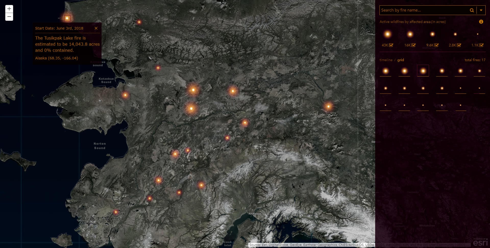
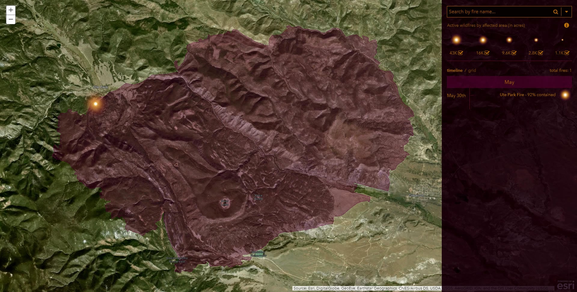
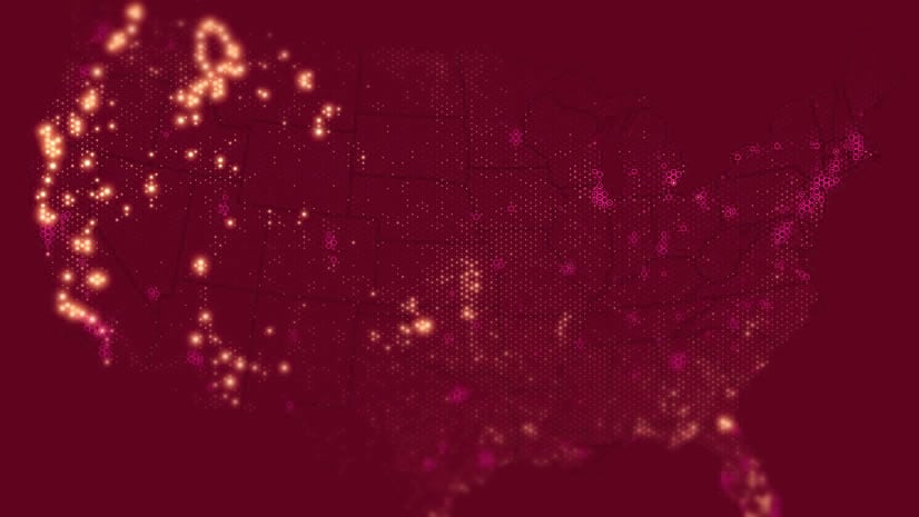
I searched the Living Atlas for an Active Fires feed and found a fantastic resource in the curated GeoMAC fires service, which shows active fires and their burn perimeters. When represented with firefly symbology these fires actually looked fire-like and the Firefly basemap provided the topographic context so important to understanding a fire’s “habitat.”
I reached out to my friend Jinnan Zhang, a fantastic developer here at Esri, and asked if he’d like to partner (as we are wont to do: PhotoChrome, BlastMap, Brick-ifier, NYC Cab Map, and two cool secret work-y things) on making an application that could provide pertinent fire information efficiently. He agreed it would be pretty fun and maybe useful. One of the many thrills of working here is the hive of amazing folks excited to dive into maps and technology. Jinnan is the embodiment of that. It’s a pleasure.
Here’s a mockup I sent over to him, describing the idea and design:
We chatted about the search bar and came up with a hybrid search/select box. Another mockup:
Anyway, I added the data to ArcGIS Online and applied some style rules. Then I bundled it up as a Web App and collaborated with Jinnan about how to enhance it. I would sketch something up and he would delve into the JSAPI, breathing life into the ideas and invariably improving them.
Here are Jinnan’s words describing what’s going on under the hood, which I only understand, at best, on a tepidly conceptual level…
–From Jinnan–
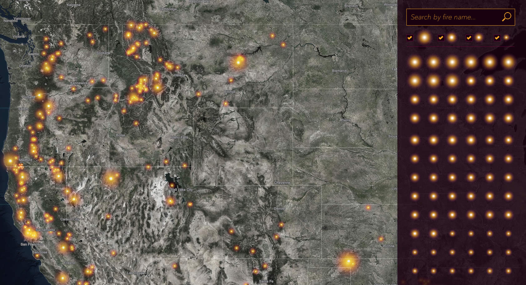
This app was built using ArcGIS API for JavaScript. We initially started with an ArcGIS Online Map Viewer, adding the “Active fire report” from the USA Wildfire Activity layer and giving it a sneaky blending of Firefly symbols graduated in size to represent burn area. Super simple!
But we knew that an automated application would have to have a dynamic, living, classification method to maintain the symbology of “large” and “small” fires as seasons intensify and diminish.
To do that we used the ClassBreakRenderer to tie the firefly symbol size of each fire based on the value of its burn area. The Active Fire Report layer’s Generate Renderer operation can whip up a renderer object in JSON with five classes for us to pour our data into. Now we just need to replace the default symbol for each item in the classBreakInfos with a Firefly point symbol.
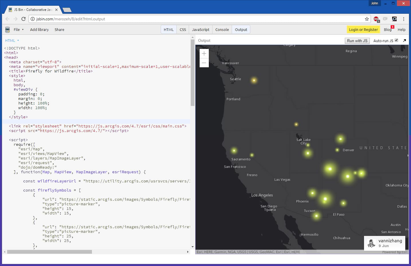
This new ClassBreakRenderer, with the modified renderer object, presents the Active Fire Report layer as graduated glowing Firefly points! Here is a test app on JS Bin if you want to take a live look. We duplicated this layer with a slightly different hue/size to create a blended effect similar to the “Outbreak” recipe described here.
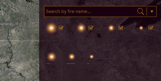
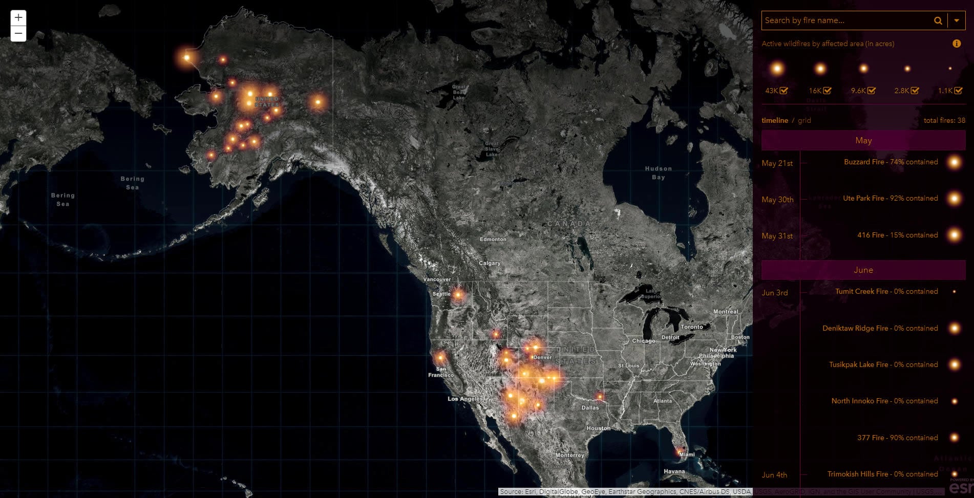
We wanted to also show a searchable tabular view of the fires in addition to their mapped location, like a scorecard of the current situation, showing the fire symbols sorted by size, with a graphic indication of the percent that the fire had been contained. After seeing this grid view it was clear that a timeline view would be valuable as well. The timeline view stacks up all the fires chronologically and parses them out by month.
This was all built using only HTML and CSS. The visualization panel and the map are linked to each other via an event listener tied to the map extents, so they remain in sync as a user pans and zooms. You can check out a snippet of the timeline HTML/CSS here. And if you are feeling dangerous feel free to fork the source on GitHub.
Here is the link to the application, itself: esriurl.com/ActiveFires
— Back to John–
Thanks for reading! I hope you check out the app here.
What’s next? This is a side project and we’re getting lots of good feedback from folks on Instagram. Some of those ideas include smoke risk, visualizing by intensity rather than size, and providing a pop-out link to a fire’s dedicated page. If you have ideas, feel free to shoot us a note. We’d love to hear from you and look forward to making this as useful as it can be.
Happy Collaborating! John Nelson


Commenting is not enabled for this article.