Everyone has gazed in wonderment at documentary footage of coral reefs, dreamed of having a saltwater aquarium, or lived vicariously through the Microsoft Windows reef screensaver circa 2000.

Coral reefs capture our attention from their pure natural beauty, foreignness, and calm.

But coral reefs are not just important for their beauty. They are biological hotspots – home to 25% of the ocean’s biodiversity. They protect our shorelines – baffling the coast from the relentless pounding of wave energy. They are critical habitat for fisheries – acting as nurseries for juveniles and spawning grounds for adults. They are economic powerhouses – driving ecotourism for many island nations and coastal towns.
A Threat to Corals
In the late 90s, I had my first scientific job doing research on coral reefs (note: get Esri to pay me to SCUBA again). Back then we were concerned with the emergence of a phenomenon called coral bleaching – whereby the coral animal’s symbiotic algae are expelled, weakening the coral and resulting in the reef transforming from a bouquet of colors to ghostly white.

We have learned much since those days about the processes and causes, and ecological and economic impacts of coral bleaching, and have also witnessed an increasing frequency and severity of bleaching events around the world.

Satellite Data Helps Us Monitor Coral Reefs
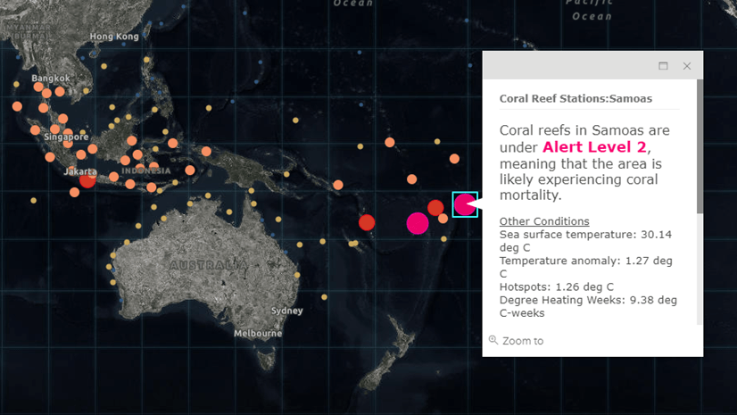
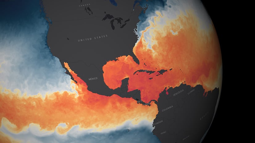
Bleaching occurs when ocean temperatures warm beyond the coral’s natural tolerance. Using satellites, NOAA’s Coral Reef Watch has developed methods to monitor ocean temperatures and estimate the likelihood that these temperatures may exceed certain critical thresholds. Besides the global raster datasets with years of continuous monitoring, NOAA also produces a summary using polygons and points to describe ocean temperatures and bleaching indexes for major reefs around the world.
These 213 global Coral Reef “Virtual” Stations are now available as a real-time updating hosted feature service in the Living Atlas, along with a new Coral Reefs at Risk of Bleaching Operations Dashboard.

These two offerings allow you to not only monitor conditions as they evolve, but also analyze for other potential regional impacts. Each location has five fields:
Alert Level: an index of the likelihood of coral bleaching, scaled from 0 (no heat stress) to 4 (coral mortality likely) based on the attributes below
Sea surface temperature: average temperature of the ocean surface derived from satellite measurements
Temperature anomaly: a comparison of the current sea surface temperature to the historical average measured by satellites
HotSpot: number of degrees above the coral’s threshold tolerance
Degree Heating Week: accumulated thermal stress experienced by corals (sum of HotSpots). Values above 8 Degree C-Weeks are associated with widespread bleaching and mortality.
Why is this information important? While we may not be able to do much to stop the rise in ocean temperatures in the short term, organizations that manage reefs from a tourism or ecological perspective may be able to take steps to mitigate additional stressors that can exacerbate bleaching and mortality.
For more information also check out this Story Map developed by NOAA that provides classroom learning activities about coral bleaching.
This new feature services leverages the Live Feeds Methodology for updating web services, and has been featured in a recent webinar (with code examples) along with an upcoming Learn ArcGIS lesson. Also check out this blog that reviews how to use Arcade to color features in your pop-ups like is shown in the dashboard.
For comments or questions about this blog, please visit our Living Atlas of the World GeoNet site.


Commenting is not enabled for this article.