ArcGIS Dashboards enables you to use a variety of visual elements to see the status of people, services, assets, and events in real-time. A dashboard is often an essential piece of an operations center, displayed prominently to keep people informed and to enable at-a-glance decision making. The following is an example of this at California Governor’s Office of Emergency Services (Cal OES).

In such cases when a dashboard is on display, it can be useful to have it automatically focus on details of the latest event or an asset of interest—such as a vehicle—without human interaction. This blog article provides a few techniques for configuring visual elements and selectors to do just this for events. Let’s create an auto-focusing dashboard using recent earthquake event data from the USGS, available in ArcGIS Living Atlas of the World.

Display Attributes of the Latest Event
A dashboard is composed of a layout of elements. Several elements are “feature based”, meaning they display attributes of features as opposed to statistics on a collection of features. The Details element is one such example.

By default it displays the attributes of up to 50 features. By using the arrows at the top, a user can page through to see each feature. For the earthquake dashboard, let’s show the latest earthquake event (one feature). Apply a sort order based on the event time in descending order. This ensures the latest event will appear first (i.e., on top). Change Maximum Features Displayed to 1, as only the latest event is relevant for this dashboard.

This Details element displays the event location along with attribute information (defined in the layer’s popup) for the latest event. Press Done to add it to the dashboard.

In the web map, a refresh interval of 1 minute was defined on the earthquake layer. As a result, this element will check once a minute if there has been any new earthquake. When there is a new event, its information will be displayed.
Use an Indicator to Display Magnitude and Event Time
An Indicator element can used to show the numeric attributes of individual features, or it can be used to display a summary statistic. For this dashboard, let’s create one to prominently display the magnitude and event time of the latest earthquake event. For the Value Type, choose Feature. For the Value Field, choose Magnitude.

As with the Details element, let’s sort by event time in descending order and change Maximum Features Displayed to 1. This ensures that the attributes for the latest earthquake are always shown.
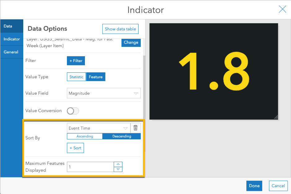
In the Indicator tab, add descriptive text such as “Magnitude” and display the event time field.

Press Done to add the indicator to the dashboard.

The indicator prominently displays essential magnitude and time information for the latest earthquake with large, readable text. It too will check for new events once a minute.
Automatically Zoom Map to Latest Earthquake
The map in this dashboard is effective in showing locations of recent earthquake activity. However, the goal of this dashboard is to focus on the latest event. Let’s configure the dashboard so it automatically zooms the map to the last earthquake and makes the epicenter apparent.
Add a Category Selector to the Header. Choose Categories From Features and select the earthquake layer.

Sort By the Event Time field in Descending order to display the latest event as the first option. Set Maximum Categories equal to 1, so that only one event (the latest) appears in the selector and will always be selected.

For the Line Item Text, use an identification field, such as {place}. This provides information about the feature selected. Give the selector a Label, such as “Auto Zoom” (we will add a Zoom action later).

If you want simply a toggle without any identification of the feature, you can enter “On” for the Line Item Text. It will keep the latest event selected even though the text will always read “On”.

Enable the None Option so that you can unselect the latest event. This gives the user the option to turn off the auto-selection (which drives the zoom action) when desired. Make the Placement equal to Last so that it is the secondary option. Give it a label of “Off”.

Set the Preferred Display Type to Button Bar so that it is easy to toggle on and off with a single click.

Configure the Actions tab. Add a Zoom action and target the map. You can also add a Flash action to highlight it on the map.

Press Done to add it to the dashboard.

When the dashboard loads, the category selector will keep the most recent earthquake selected, which in turn keeps the map zoomed to that event along with a pulse animation. To pause this, the user can click Off and the X on the follow tool (upper left of the map).
Note: To control the scale to which it zooms (i.e., level of detail), configure the map element and update the Point Zoom Scale property. In this dashboard I used 50,000,000. Make sure to enter the number without commas.
Summary
Dashboards can be used for many different purposes and thus have many configuration options. This article covered a few techniques for creating elements and selectors to be used in operational types of dashboards to keep focused on the latest event without human interaction. You can view the dashboard or create a copy to edit (sign into your account).
The following dashboard includes several additional elements that might be useful: a serial chart with colored guides, a serial chart with the magnitudes of recent events, a complimentary map to show satellite imagery, a list showing tsunami warnings, and a number selector to limit the minimum magnitude of earthquakes displayed. Feel free to make a copy and see how they are configured.

We’d love to see what dashboards you’ve created! Please share your dashboard on Twitter or LinkedIn tagged with #OpsDashboard. Post questions and feedback in GeoNet.


Article Discussion: