We are excited to announce a new look and design for the organization page. Over the past two years, we have continually worked to improve the user experience in ArcGIS Online, delivering powerful features and an easy-to-use design for both users and administrators. In the June 2018 update, we introduce the first phase of the organization page redesign. This update features a tabbed interface, new overview and members pages, and minimal changes to the licensing, status, and settings pages. We’re excited for you to explore the new functionality.
Updated Organization Page
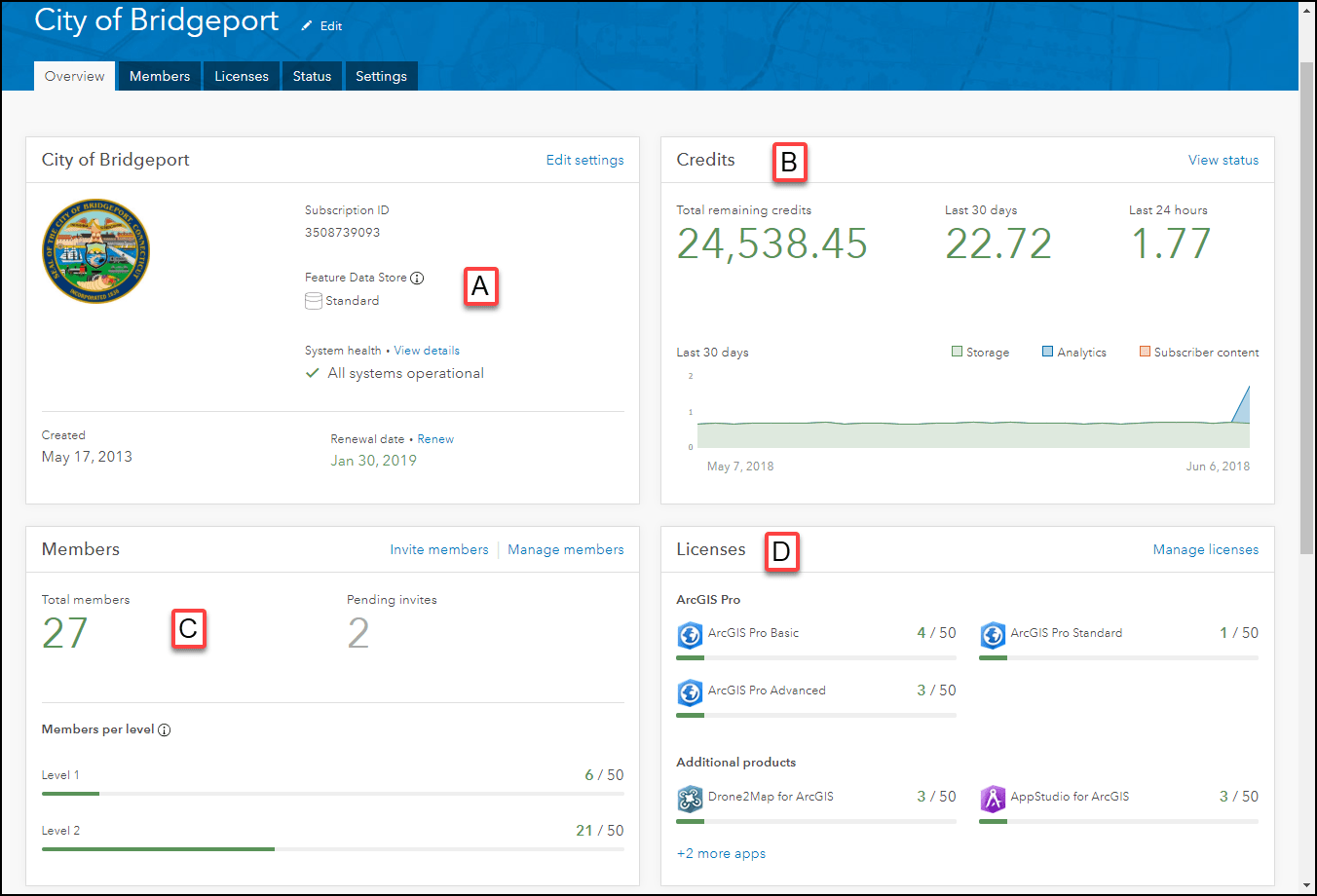
Overview Page
The first thing you’ll notice are the updated tabbed interface and the new overview page. When viewing the new overview page, highlighted information about key features are displayed to administrators as cards. The overall system health of ArcGIS Online (A), a quick overview of credits (B), members (C), and licenses (D) will be visible to administrators with the initial load of the organization page. To find out more details about the topics displayed on the cards, admins can quickly navigate to the full page by either clicking the blue text in the right-hand corner of the card or the corresponding tab.
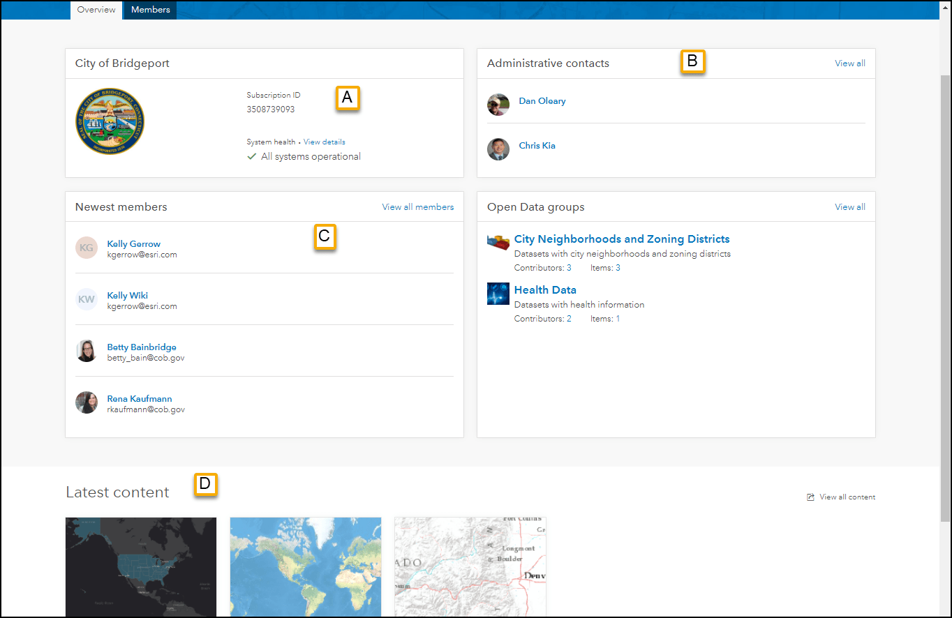
Don’t worry non-admin users, we didn’t forget about you. Although you may not be managing members and licenses, the non-administrative user overview displays helpful information like the subscription ID (helpful when getting in touch with support), system health (A), and your administrative contacts (B). If you want to know who and what content is new in your organization, just check out the newest member card (C) or the latest content cards (D) (also available for administrators but not in screenshot).
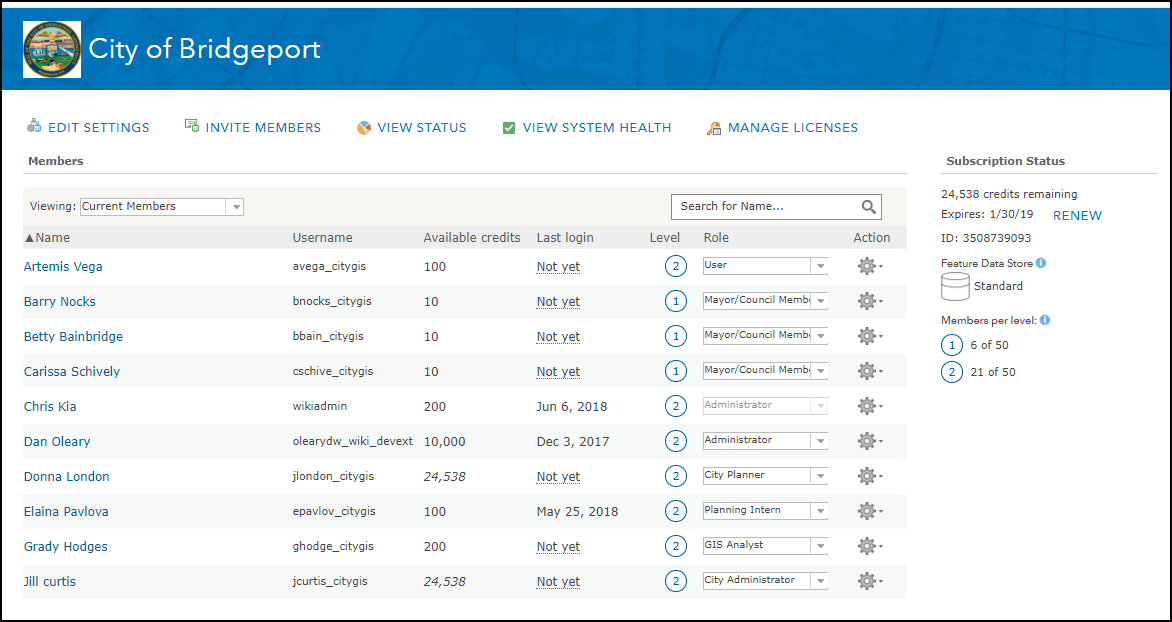
Updated Members Page
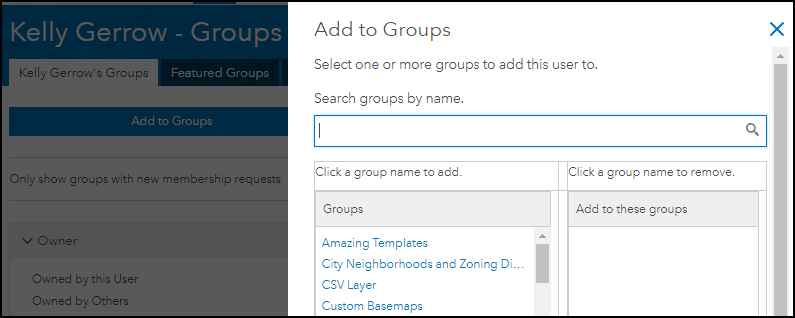
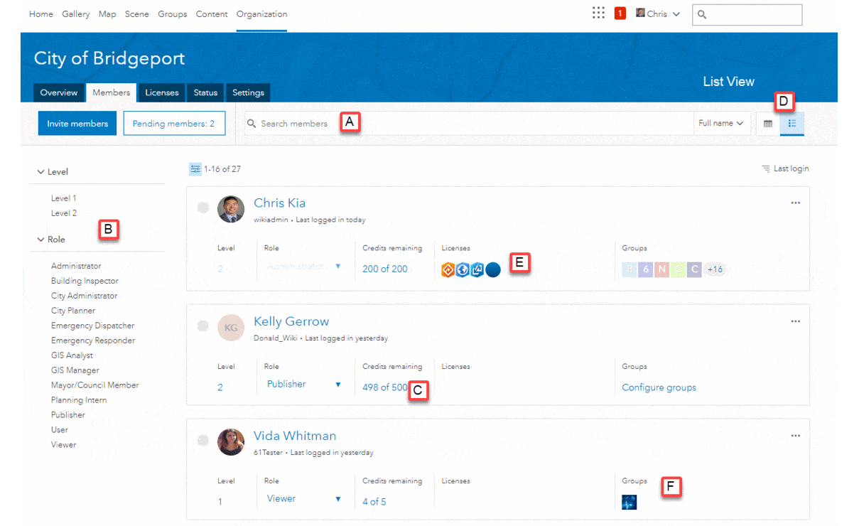
The updated members page shows new ways to search and organize users. Organization administrators can now search by name (first, last, or both) and username (A), and filter based on the user level and role (B). The “Credits remaining” column now includes both the initial amount of credits allocated to the user and those remaining (C). This provides a better reference for the number of credits used by a member. The new design includes both table and list views to browse members (D). The table view is similar to the current design, while the list view provides some additional information about members, such as licenses assigned (E) and groups they have joined (F). Some attributes in list view link to an action for the member. For example, clicking on groups will take administrators to member’s group page where they can manage the group membership for the member (Fig. 1).
Refreshed License, Status and Settings page
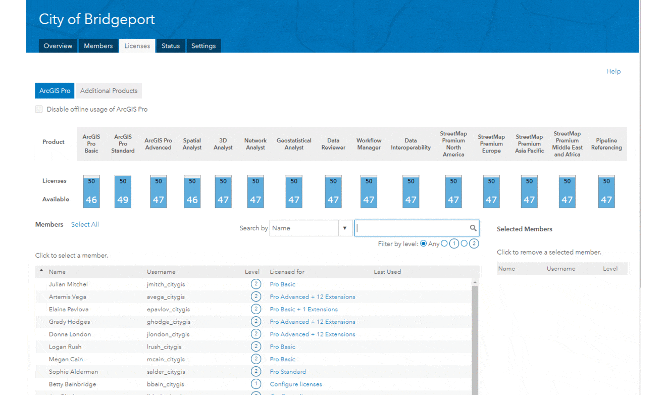
While the overview and members pages had a complete facelift for both administrators and users, minimal changes have been made to licenses, status and settings pages. You’ll notice some updated fonts and a tabbed design for the settings page, but the design and workflows are the same. The licenses tab is where administrators assign licenses to organization members. The status page has the same great reporting capabilities as before. You can use this page to drill into credit usage, content creation, and member activity, using the dashboard or by downloading some CSVs full of data. The settings page is where to go to configure your organization’s security, roles, and design. What has changed is the simple navigation experience.
What’s Next
This update is the first phase for the organization page, laying a framework for exciting changes to come. In the future, administrators can look forward to using the new members page to bulk select and apply actions, like disabling users or updating roles based on a filter, making it easier to manage a large number of users. We know that even small changes to the user interface can take time to get used to but are confident that you will love the new design and features. The updates are the result of feedback and requests from users, so please keep sharing your ideas and thoughts about how you manage your ArcGIS Online resources.


Commenting is not enabled for this article.