Pop-ups are essential for allowing users to interact with GIS data visualizations. They provide context to your visualizations and allow users to view the detailed data for a specific area in your maps and apps. With pop-ups, you can display attribute information, charts, images, browse related records, and more. The possibilities are endless!
In the June 2023 release of ArcGIS Online and ArcGIS Maps SDK for JavaScript version 4.27 (JS Maps SDK), a few design enhancements were made to the pop-up for an even better user experience. The best part is that the map author or developer doesn’t have to make any changes to the map or application to see these updates – they come out of the box! Let’s dive into the pop-up design improvements.
Overview
The new pop-up updates include:
- Redesigned feature pagination and menu button
- Improved media pagination experience
- Streamlined color ramp with matching tooltips and interactive experience for charts
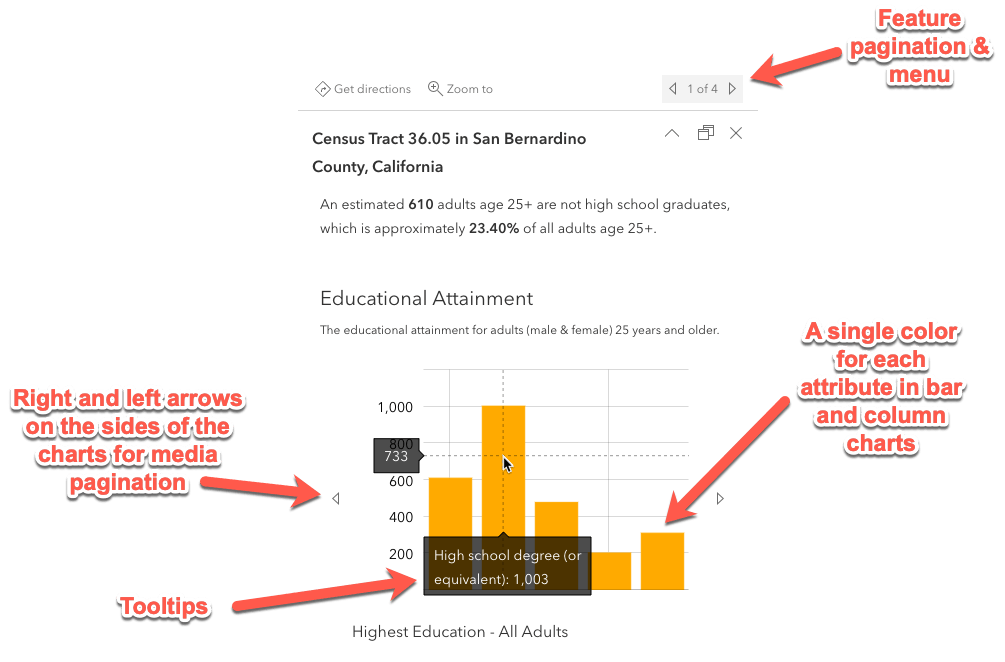
First, let’s check out a pre-configured pop-up in an ArcGIS Online web map to see what it used to look like:
Now when you open that same map in ArcGIS Online or a JS Maps SDK version 4.27 application, the pop-up looks like this:
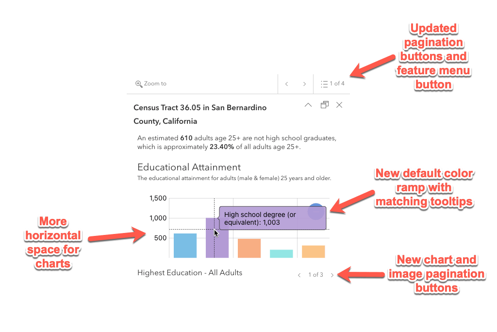
Feature pagination and menu
The feature pagination buttons appear if you select an area on the map that returns multiple features. These allow the user to page through all the features that were returned from that selection.
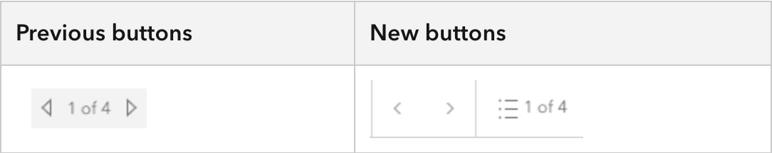
Often, users did not realize that clicking on the numbering in between the arrow buttons would open a feature menu to browse a list of features returned in the pop-up. Now, this button is more intuitive with an added Calcite icon so that users know that this is an interactive button.

Media pagination
When displaying multiple charts or images within a pop-up, you can generate a carousel to page through the items. The buttons to page through existed on the side of the charts and images, which took up space for those items to display. This layout also made it difficult for the user to page back and forth between items to compare chart data or images.

With the new media pagination design, charts and images have more horizontal space to display content. The buttons to page through items were moved below the content so the user does not have to move the mouse much. An added count helps the user understand how many charts or images are available to visualize as well.

Charts
The pop-up charts themselves got a reboot! With new colors to represent your data and a modernized interaction, the user experience is now more refined.
Default color ramp & tooltips
Pop-up charts now have a new default color ramp! Previously, charts would render with a rainbow color palette that was bright and not aesthetically pleasing. Our UI/UX team designed the color ramp to work well with light or dark themed applications. See the new color ramp in action with the dark theme in this application.
Bar and column charts were also updated to display a different color for each value depicted in the chart, so the user can distinguish that the values are showing different fields. Tooltips used to be all one color and now the tooltips match the color of the value, making it easier to distinguish which value the user is hovering over.

Interaction experience
The chart interaction experience was updated to easily visualize data in the charts when many fields are displayed. Zooming in via mouse or pinch (if on a touch screen) provides a scroll bar to visualize smaller subsets of the data.

Conclusion
These new improvements for the pop-up design are available out of the box in web applications such as the Map Viewer, Instant Apps, and Experience Builder and apps built with the JS Maps SDK – no changes necessary! If you’d like to explore the web map utilized in this blog, check out the pop-up configuration here. You can also take a look at the same configuration built out with the JS Maps SDK in the live application and source code.
Happy mapping!


Article Discussion: